Ready-made dashboards
- Latest Dynatrace
- Reference
- 9-min read
Dynatrace ready-made dashboards offer preconfigured data visualizations and filters designed for common scenarios like troubleshooting and optimization.
- Use them right out of the box
- Save a copy and customize your copy
Where to find ready-made dashboards
-
In Dynatrace, go to
 Dashboards.
 -
Choose a way to list all ready-made dashboards.
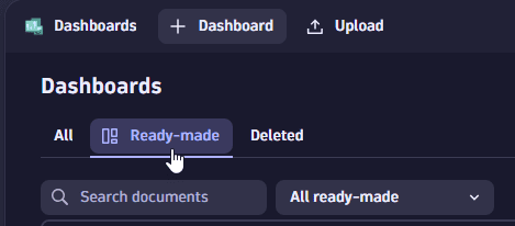 Dashboards: Select "Ready-made" tab
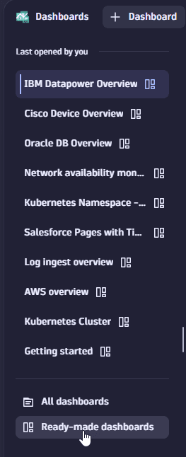 Select "Ready-made dashboards" under list of recent dashboards
 -
Select the ready-made dashboard you want to use.
Try the Explore in Playground links below to see them in action.
Using read-only dashboards
When you open a document (dashboard or notebook) for which you don't have write permission, you can still edit the document during your session. After you're finished, you have two options:
- Save your changes to a new document
- Discard your changes
Example:
-
Go to
Dashboards, list the ready-made dashboards, and select the Getting started dashboard.It says Ready-made in the upper-left corner, next to the document name.
-
Select the Pie chart tile and then select Edit.
-
Change the visualization from Pie to Donut.
Now you are offered two buttons: Save as new and Discard changes.
-
Use the updated dashboard as needed. You have full edit access for this session.
-
When you're finished, select what to do with your changes:
- Save as new—saves your changes in a new copy of the edited dashboard.
- Discard changes—discards your changes and returns you to the unedited read-only dashboard.
 AI Observability
Explore ready-made dashboards owned by AI Observability.
AI Data governance and audit trail - AI Observability
AI Model versioning and A/B Testing - AI Observability
Amazon Bedrock - AI Observability
Monitor Amazon Bedrock model health and token usage. Spot the most expensive prompts, detect PII leaks and denied topics, and trace slow or failing model invocations end to end.
The Amazon Bedrock - AI Observability dashboard contains the following sections and tiles:
- Token Usage Forecast
 Dynatrace Intelligence forecast
Amazon Bedrock Service Health & Performance
- Open Problems single value
- Top 10 expensive prompts table
- Denied Topics single value
- PII Leaks single value
- Toxicity single value
- Guardrail Executions single value
- Filtered Content single value
- Prevented PII Leaks single value
- Blocked Toxic Prompts single value
- Overall Guardrail Activation single value
- Cost single value
- Number of Total Requests single value
- Service Health pie chart
- P99 Request Duration single value
- AVG Request Duration single value
- Top 10 slowest prompts table
- Grounding single value
- Relevance single value
- $ Saved single value
- AVG Time Saved single value
- Cache Hit single value
- AVG Cache Read Tokens single value
- AVG Cache Write Tokens single value
- Total Token Consumption single value
- Completion Token single value
- Prompt Token single value
Identify which model is costing more based on the incoming amount of requests
- Top 10 expensive prompts table
Azure AI Foundry - AI Observability
Monitor Azure AI Foundry model health and performance. Track request volume, response time, cost per model, and P99 latency to identify expensive or unreliable AI calls.
The Azure AI Foundry - AI Observability dashboard contains the following sections and tiles:
- Response Time per Model line chart
- Cost single value
- Number of Total Requests single value
- Service Health pie chart
- P99 Request Duration single value
- AVG Request Duration single value
- Open Problems single value
Azure AI Foundry Service Health & Performance
- Token Usage Forecast Dynatrace Intelligence forecast
- Token Consumption per Model line chart
- Top 10 expensive prompts table
- Top 10 slowest prompts table
- $ Saved single value
- AVG Time Saved single value
- Cache Hit single value
- AVG Cache Read Tokens single value
AI Observability
- Total Token Consumption single value
- Completion Token single value
- Prompt Token single value
Identify which model is costing more based on the incoming amount of requests
- Top 10 expensive prompts table
Google Gemini and Vertex AI Studio - AI Observability
Monitor Google Vertex AI and Gemini model performance end to end. Track request counts, response time, cost per model, and P99 latency across your AI application.
The Google Gemini and Vertex AI Studio - AI Observability dashboard contains the following sections and tiles:
- Response Time per Model line chart
- Cost single value
- Number of Total Requests single value
- Service Health pie chart
- P99 Request Duration single value
- AVG Request Duration single value
- Open Problems single value
VertexAI and Gemini Service Health & Performance
- Token Usage Forecast Dynatrace Intelligence forecast
- Token Consumption per Model line chart
- Top 10 expensive prompts table
- Top 10 slowest prompts table
AI Observability
- Total Token Consumption single value
- Completion Token single value
- Prompt Token single value
Identify which model is costing more based on the incoming amount of requests
- Top 10 expensive prompts table
Kong AI - AI Observability
Monitor AI applications built on Kong AI Gateway. Track request counts by model, token consumption forecasts, P99 latency, and service health.
The Kong AI - AI Observability dashboard contains the following sections and tiles:
- AI requests total per AI model bar chart
- Forecast Token Consumption Dynatrace Intelligence forecast
- Service Health pie chart
- Number of Total Requests single value
- P99 Request Duration single value
- AVG Request Duration single value
- Token Usage Forecast Dynatrace Intelligence forecast
- Token Consumption single value
- Total Token Consumption single value
- Completion Token single value
- Prompt Token single value
- AI latency per service/route line chart
- Forecast Token Consumption per AI Model Dynatrace Intelligence forecast
- Token Consumption per AI Model pie chart
AI Observability
- Open Problems single value
NVIDIA - AI Observability
Monitor AI applications built with NVIDIA NIM. Track request counts, average and P99 response duration, token cost estimates, and open problems.
The NVIDIA - AI Observability dashboard contains the following sections and tiles:
- DQL Cost Calculation (1token = 1$) single value
- AVG Request Duration single value
- P99 Request Duration single value
- Number of Total Requests single value
- Open Problems single value
- Time To First Token single value
- Throughput (tokens/second) single value
- KV Cache Utilization single value
- Number of Running Requests single value
- Token Usage Forecast Dynatrace Intelligence forecast
- Token Consumption per Model line chart
- Response Time per Model line chart
- Top 10 expensive prompts table
- Top 10 slowest prompts table
AI Observability
- Service Health pie chart
OpenAI - AI Observability
Monitor OpenAI and Azure OpenAI service health, request counts, response time, and cost. Identify which models are most expensive and trace the slowest or costliest prompts.
The OpenAI - AI Observability dashboard contains the following sections and tiles:
AI Observability
- Cost single value
- Number of Total Requests single value
- Open Problems single value
- Service Health pie chart
- AVG Request Duration single value
- P99 Request Duration single value
- Token Usage Forecast Dynatrace Intelligence forecast
- $ Saved single value
- AVG Time Saved single value
- Cache Hit single value
- AVG Cache Read Tokens single value
- Response Time per Model line chart
- Token Consumption per Model line chart
- Total Token Consumption single value
- Completion Token single value
- Prompt Token single value
Identify which model is costing more based on the incoming amount of requests
- Top 10 expensive prompts table
Find the trace id of the most expensive prompts to investigate more deeply the costs
- Top 10 expensive prompts table
- Top 10 slowest prompts table
Amazon ECR
Explore ready-made dashboards owned by Amazon ECR.
Container Scan Events Coverage
Identify coverage gaps in container image scanning. View scan coverage by security product and see the latest 50 scan events across registries, repositories, and images.
The Container Scan Events Coverage dashboard contains the following sections and tiles:
Coverage report for container image scan events
- Container image coverage by product categorical chart
- Registries single value
- Container repositories single value
- Container images single value
- Scanning products single value
Coverage overview
- Scan events over time by product bar chart
- Total scan events single value
- Repository coverage based on products and number of scans table
Container Vulnerability Findings
Visualize container vulnerability findings by risk level. Break down critical and high findings by registry and repository to prioritize remediation across your container environment.
The Container Vulnerability Findings dashboard contains the following sections and tiles:
Container vulnerability findings
- Number of critical findings by registry donut chart
- Critical risk single value
- High risk single value
- Number of critical findings by repository donut chart
- Number of vulnerabilities by risk donut chart
- Affected registries single value
- Container repositories single value
- Container images single value
- Vulnerable components single value
Vulnerabilities by risk
- Medium risk single value
- Vulnerability findings over time by provider bar chart
Top 10 affected registries by number of critical findings
- Total ingested findings single value
Runtime contextualization of container findings for alert reduction
Reduce container alert noise by correlating vulnerability findings with runtime context. View which findings are present in running containers versus only repositories to prioritize response.
The Runtime contextualization of container findings for alert reduction dashboard contains the following sections and tiles:
Runtime contextualization of container findings for alert reduction
- Critical risk single value
- High risk single value
- Number of vulnerabilities by risk donut chart
- Medium risk single value
- Percentage of vulnerabilities by funnel stage categorical chart
Top 10 vulnerabilities
- Critical risk single value
- High risk single value
- Medium risk single value
- Number of vulnerabilities by risk donut chart
- Critical risk single value
- Medium risk single value
- High risk single value
Vulnerabilities in running containers
- Number of vulnerabilities by risk donut chart
Vulnerabilities in production containers
- Container images in registries single value
- Container images in runtime single value
- Container images in production single value
Amazon GuardDuty
Explore ready-made dashboards owned by Amazon GuardDuty.
Security findings
Overview of Amazon GuardDuty security findings by risk level. View affected objects and the latest 50 findings to focus remediation on the highest-risk issues.
The Security findings dashboard contains the following sections and tiles:
Security findings
- Critical single value
- High single value
- Number of unique findings by risk donut chart
- Critical single value
Findings by risk
- Medium single value
- Findings over time by provider bar chart
- High single value
Latest 50 security findings
- Findings by type categorical chart
- Top 10 object types by risk categorical chart
- Top 10 products by risk categorical chart
- Medium single value
- Number of objects by risk donut chart
- Top 10 findings by risk and number of affected objects table
- Top 10 affected objects by number of findings table
Affected runtime entities
- Top 10 vulnerable host entities by finding criticality table
- Number of host entities by risk donut chart
- Top 10 vulnerable container workloads by finding criticality table
- Number of container workloads by risk donut chart
- Total ingested findings single value
- Number of cloud entities by risk donut chart
- Top 10 vulnerable cloud entities by finding criticality table
Security product coverage
View security product coverage and scan event ingestion from Amazon GuardDuty. Track reporting providers, scan event counts over time, and runtime coverage of hosts and container workloads.
The Security product coverage dashboard contains the following sections and tiles:
Coverage overview
- Security events per top 10 products categorical chart
- Ingested finding events by provider over time bar chart
- Scan events single value
- Reporting providers single value
- Ingested scan events over time bar chart
- Finding events single value
- Security events by object coverage per product table
- Security events by findings number per object type table
Runtime entity coverage: Hosts
- Security events per top 10 object types categorical chart
Runtime entity coverage: Container workloads
- Container workload coverage donut chart
- Host coverage by product table
- Host coverage donut chart
- Container workload coverage by product table
- Last 10 covered hosts table
- Last 10 covered container workloads table
Runtime entity coverage: Cloud entities
- Last 10 covered cloud entities table
- Cloud entity coverage by product table
- Cloud entity coverage donut chart
 Anomaly Detection app
Explore ready-made dashboards owned by Anomaly Detection app.
Alert configuration health status
Track the health of custom alert detectors on your tenant. Identify failing detectors, the most common error messages, and which detectors trigger the most alerts.
The Alert configuration health status dashboard contains the following sections and tiles:
- Overall custom alerts last 24h honeycomb chart
- Last 24h single value
- Last 24h single value
- Last 24h single value
Custom alert health status
- Most common error messages categorical chart
- Error messages breakdown bar chart
Breakdown by billed bytes
- Top data usage per Custom Alerts Last 24h table
- Top data usage per Custom Alerts Last 24h line chart
- Summarized messages by config_id table
Breakdown by error messages
- Summarized alerts by config_id over the last 24h table
- Summarized alerts by config_id over the last 24h honeycomb chart
Health alert health status
-
Last execution of alert configs
honeycomb chartOverall of all last execution result for each selected alert configuration.
-
Last execution - Success
single valueCount the last success execution result for each selected alert configuration.
-
Last execution - Warning
single valueCount the last warning execution result for each selected alert configuration.
-
Last execution - Failed
single valueCount the last failed execution result for each selected alert configuration.
-
Warning or Failure Events
bar chartShows all warning or failure events for each selected alert configuration.
-
FAILED Message
table -
WARNING Message
table
 Clouds app
Explore ready-made dashboards owned by Clouds app.
AWS API
Track error rates, request volumes, and latency across AWS HTTP and REST API Gateways. Drill into individual gateway instances to pinpoint the source of elevated 4xx or 5xx responses.
The AWS API dashboard contains the following sections and tiles:
AWS API Gateway
-
5xx errors
single value -
API requests
single value -
4xx errors
single value -
Integration latency
line chartThe time between when API Gateway relays a request to the backend and when it receives a response from the backend.
-
Latency
line chartThe time between when API Gateway receives a request from a client and when it returns a response to the client. The latency includes the integration latency and other API Gateway overhead.
-
HTTP APIs error rate
single value -
Errors by API/stage
categorical chart -
Cache hits
single value -
Cache misses
single value
HTTP APIs
-
REST APIs error rate
single value -
Data processed
line chart -
Errors by API/stage
categorical chart -
API requests
single value -
5xx errors
single value -
4xx errors
single value -
Integration latency
line chartThe time between when API Gateway relays a request to the backend and when it receives a response from the backend.
-
Latency
line chartThe time between when API Gateway receives a request from a client and when it returns a response to the client. The latency includes the integration latency and other API Gateway overhead.
AWS Bedrock
View AWS Bedrock invocation counts, throttle rates, guardrail events, and average response time. Identify which models are driving the most traffic and where errors or throttles are occurring.
The AWS Bedrock dashboard contains the following sections and tiles:
Amazon Bedrock
-
Invocations
line chart -
Total invocations
single value -
Average Total Time
single valueThe time it took for the server to process the request.
-
Invocation Throttles
line chartAgent throttles
-
Client vs Server errors
line chart -
Input token vs Output token count
bar chart
Guardrail
-
Top $Limit models per latency
line chart -
Agents
single value -
Agent Alias
single value -
Guardrails
single value -
Total Time
line chartThe time it took for the server to process the request.
-
Invocations
line chartSuccessful agent invocations
-
Invocations Intervened
line chartSuccessful agent invocations
-
Findings count
line chartSuccessful agent invocations
Latency
-
Agent Alias per Agent
categorical chart -
Top $Limit models per invocations
line chart -
Total errors
single valueThe time it took for the server to process the request.
AWS DynamoDB
View the status of DynamoDB tables, including capacity unit usage, throttle rates, and latency. Spot user and system errors and track item return rates to detect unexpected query patterns.
The AWS DynamoDB dashboard contains the following sections and tiles:
AWS DynamoDB
-
User errors
single valueRequests to DynamoDB or Amazon DynamoDB Streams that generate an HTTP 400 status code during the specified time period.
-
System errors
single valueThe requests to DynamoDB or Amazon DynamoDB Streams that generate an HTTP 500 status code during the specified time period.
-
Tables
single value -
Successful request latency
line chart -
Returned items
single valueThe number of items returned by Query, Scan or ExecuteStatement (select) operations during the specified time period.
-
Conditional check failed requests
single valueThe number of failed attempts to perform conditional writes.
-
Throttled requests
single valueRequests to DynamoDB that exceed the provisioned throughput limits on a resource (such as a table or an index).
-
TTL deleted items
single value -
Consumed read capacity units
line chart -
Consumed write capacity units
line chart -
Read throttle events
line chartRequests to DynamoDB that exceed the provisioned read capacity units for a table over the specified time period.
-
Provisioned read capacity units
line chart -
Provisioned write capacity units
line chart -
Write throttle events
line chartRequests to DynamoDB that exceed the provisioned write capacity units for a table over the specified time period.
Throttles and latency
- Total consumed read capacity units single value
- Total consumed write capacity units single value
- Total provisioned read capacity units single value
- Total provisioned write capacity units single value
AWS EC2
View CPU utilization, network traffic, and disk activity for EC2 instances. See the breakdown by instance type, region, and account, plus Auto Scaling group status.
The AWS EC2 dashboard contains the following sections and tiles:
- CPU utilization line chart
- EC2 instances per type categorical chart
AWS EC2
-
EC2 instances per region
categorical chart -
Active EC2 instances
single value -
Total network input
single valueThe total number of bytes received by the instance on all network interfaces.
-
Total network output
single valueThe total number of bytes sent out by the instance on all network interfaces.
-
Network input
line chart -
Network output
line chart -
Read bytes
line chart -
Write bytes
line chart -
Read operations
line chart -
Write operations
line chart
Disk activity
-
CPU utilization for instances with highest usage
categorical chartThe most recent percentage of physical CPU time that Amazon EC2 uses to run the EC2 instance, which includes time spent to run both the user code and the Amazon EC2 code.
-
Volumes idle time
bar chartThe total number of seconds in a specified period of time when no read or write operations were submitted. High idle time indicates underutilized resources like EBS volume attached to an EC2 instance that is not actively used.
-
Volumes queue length
bar chartThe number of read and write operation requests waiting to be completed in a specified period of time.
-
Burst balance percentage
line chartPercentage of I/O credits (for gp2) or throughput credits (for st1 and sc1) remaining in the burst bucket.
AWS Auto Scaling groups
-
Auto Scaling groups by group max size
categorical chart -
Auto Scaling groups by desired capacity
categorical chartThe number of instances that the Auto Scaling groups attempt to maintain.
-
In-service instances
line chartThe number of instances that are running as part of the Auto Scaling group.
-
Pending instances
bar chartThe number of instances that are pending. A pending instance is not yet in service.
-
Standby instances
bar chartThe number of instances that are in a Standby state. Instances in this state are still running but are not actively in service.
-
Terminating instances
line chartThe number of instances that are in the process of terminating. This metric does not include instances that are in service, pending, or returning to a warm pool after Auto Scaling group scale in.
Network
- Status Check failures line chart
- CPU Credits Balance line chart
AWS ECS
Track CPU and memory reservation and utilization for ECS tasks across clusters. Monitor network I/O to spot containers under resource pressure.
The AWS ECS dashboard contains the following sections and tiles:
AWS Elastic Container Service
- Average CPU units utilized single value
- Average CPU units reserved single value
- Average memory utilized single value
- Average memory reserved single value
- CPU units utilized line chart
- CPU units reserved line chart
- Memory utilized line chart
- Memory reserved line chart
- Network transmitted line chart
- Network received line chart
- Average network received single value
- Average network transmitted single value
Storage
- Storage write bytes line chart
- Storage read bytes line chart
- Average storage read bytes single value
- Average storage write bytes single value
Container Insights
-
Services
single valueThe number of services in the clusters in a given period.
-
Container instances
single value -
Deployments
single value -
Tasks sets
single value -
Tasks
single value -
Pending tasks
single value -
Desired tasks
single value -
Running tasks
single value -
Memory utilization by cluster
line chart -
CPU utilization by cluster
line chart -
Average CPU utilization
single value -
Average memory utilization
single valueThe total percentage of memory being used by containers in the resource in a given period.
-
Ephemeral storage bytes reserved
line chart -
Ephemeral storage bytes utilized
line chart -
Average ephemeral storage bytes utilized
single value -
Average ephemeral storage bytes reserved
single value
AWS Edge Networking
Monitor Route 53 health check status and CloudFront distribution performance. Track connection time, time to first byte, and health check outcomes by location.
The AWS Edge Networking dashboard contains the following sections and tiles:
AWS Edge Networking
-
Route 53 health checks
single value -
Connection time
line chartThe average time, in milliseconds, that it took Route 53 health checkers to establish a TCP connection with the endpoint.
-
Health checks status split
donut chart -
Time to first byte
line chartThe average time, in milliseconds, that it took Route 53 health checkers to receive the first byte of the response to an HTTP or HTTPS request.
-
Route 53 hosted zones
single value
Route 53 Health Checks
- DNS queries per hosted zone donut chart
- CloudFront distributions single value
CloudFront distributions
-
Bytes uploaded
line chartThe total number of bytes that viewers uploaded to CloudFront, using OPTIONS, POST and PUT requests.
-
CloudFront distributions error rate
single value -
Bytes downloaded
line chartThe total number of bytes downloaded by viewers for GET and HEAD requests.
-
4xx error rate
bar chartThe percentage of all viewer requests for which the response's HTTP status code is 4xx.
-
5xx error rate
bar chartThe percentage of all viewer requests for which the response's HTTP status code is 5xx.
-
Total bytes downloaded
single value -
Total bytes uploaded
single value -
Total average connection time
single value -
Total average time to first byte
single value
AWS EFS
View throughput, storage size, and client connection counts for EFS file systems. Identify throughput bottlenecks and track permitted throughput utilization over time.
The AWS EFS dashboard contains the following sections and tiles:
AWS Elastic File System
-
File systems
single value -
Mounted targets
single value -
File systems by client connections
categorical chart -
File systems by storage size
categorical chart -
Percentage of permitted throughput utilization
line chartRatio between metered IO bytes and total permitted throughput, in percentage. If you are reaching maximum capacity, then you are consuming the entire amount of throughput allocated to your file system. In this situation, you might consider changing the file system's throughput mode to get higher throughput.
-
Burst credit balance
line chartThe number of burst credits that a file system has. Burst credits allow a file system to burst to throughput levels above a file system’s baseline level for periods of time.
-
Total IO bytes
line chartThe actual number of bytes for each file system operation processed by Amazon EFS, without any read discounts.
-
Total average percentage of permitted throughput utilization
single value
Usage
- Total IO processed bytes single value
AWS EKS
Monitor EKS cluster health, including pod and node resource usage, scheduler activity, and API server performance. Identify pending pods, webhook latency issues, and storage configuration.
The AWS EKS dashboard contains the following sections and tiles:
Amazon Elastic Kubernetes Service
- CPU Usage total (amount) line chart
- Scheduler attempts line chart
- Scheduler pending pods line chart
- Webhook admission duration seconds table
- Storage size table
- CPU utilization line chart
- GPU usage total line chart
- Filesystem utilization line chart
- Memory utilization line chart
- Network total bytes line chart
- Running containers line chart
- CPU utilization line chart
- GPU usage total line chart
- Memory utilization line chart
- Network rx bytes line chart
- Container restarts line chart
- Admission webhook request total table
- APIServer request line chart
API server
- Cluster nodes line chart
- Running pods line chart
Container Insights
- All running pods single value
AWS ElastiCache
View the status and resource usage of ElastiCache clusters for both Redis/Valkey and Memcached. Track cache hits and misses, current connections, and available cluster counts.
The AWS ElastiCache dashboard contains the following sections and tiles:
AWS Elasticache
-
Serverless caches by engine
categorical chart -
Cache clusters by engine
categorical chart -
Current connections
line chart -
Hits and misses by cache
categorical chartNumber of successful and unsuccessful key lookups in the cache.
-
Available cache clusters
donut chart -
Available serverless caches
donut chart
Redis/Valkey
-
Evictions by cache
categorical chartNumber of keys that have been evicted due to max memory limit.
-
Hits and misses by cache
categorical chartNumber of successful and unsuccessful key lookups in the cache.
-
Successful read request latency
line chart -
Successful write request latency
line chart -
Network bytes in (host)
line chart -
Network bytes out (host)
line chart -
CPU utilization (host)
line chartThe percentage of CPU utilization for the entire host.
-
Freeable memory (host)
line chartThe amount of free memory available on the host.
-
Engine CPU utilization
line chart
Host-level metrics
-
Bytes used
line chart -
Total network bytes in (host)
single value -
Total network bytes out (host)
single value -
Average successful read request latency
single value -
Average successful write request latency
single value -
Network bytes out
line chart -
Network bytes in
line chart -
Total network bytes in
single value -
Total network bytes out
single value -
Unused memory
line chart -
Engine memory usage
line chart -
Bytes used
line chart -
Cache hit rate
line chartEfficiency of the cache instance. If the cache ratio is lower than about 0.8, it means that a significant number of keys are evicted, expired, or don't exist.
-
Cache hit rate
line chartEfficiency of the cache instance. If the cache ratio is lower than about 0.8, it means that a significant number of keys are evicted, expired, or don't exist.
AWS ELB
Monitor ALB, Classic, and NLB load balancers. Track 4xx/5xx error rates, target health, and response times to identify unhealthy backends or load balancers under excessive error load.
The AWS ELB dashboard contains the following sections and tiles:
AWS Application Load Balancer
-
Target 4xx responses
single value -
Target 5xx responses
single value -
ALB target error rate
single valuePercentage of errors generated by the targets in a given period.
-
Target error and successful requests by load balancer
categorical chart -
ELB 4xx responses
single value -
ALB error rate
single valuePercentage of errors hat originate from the load balancer in a given period.
-
ELB 5xx responses
single value -
ELB error and successful requests by load balancer
categorical chart -
Target response time
line chartThe time elapsed, in seconds, after the request leaves the load balancer until the target starts to send the response headers through time in a given period.
-
Requests
line chartThe number of requests processed over IPv4 and IPv6 through time in a given period. This metric is only incremented for requests where the load balancer node was able to choose a target. Requests that are rejected before a target is chosen are not reflected in this metric.
-
Healthy and unhealthy hosts by load balancer
categorical chart -
ALB unhealthy rate
single valuePercentage of targets that are considered unhealthy in a given period.
-
Healthy hosts
single value -
Unhealthy hosts
single value -
Active connections
single value -
New connections
single value -
Total processed bytes
single value -
Consumed capacity units
single value
Errors
-
CLB backend error rate
single valuePercentage of HTTP response codes generated by registered instances in a given period.
-
Backend 4xx responses
single value -
Backend 5xx responses
single value -
Backend error and successful requests by load balancer
categorical chart -
Requests
line chartThe number of requests completed or connections made during the specified interval through time in a given period.
-
Backend connection errors
line chartThe number of connections that were not successfully established between the load balancer and the registered instances through time in a given period.
-
Backend connection errors by load balancer
categorical chart -
ELB 4xx responses
single value -
ELB 5xx responses
single value -
Latency
line chartThe total time elapsed, in seconds, from the time the load balancer sent the request to a registered instance until the instance started to send the response headers through time in a given period.
-
CLB unhealthy rate
single valuePercentage of unhealthy instances registered with your load balancer in a given period.
-
Healthy hosts
single value -
Unhealthy hosts
single value -
Healthy and unhealthy hosts by load balancer
categorical chartDistribution of healthy and unhealthy instances registered with your load balancer in a given period.
AWS Network Load Balancer
-
Total processed bytes
single valueThe total number of bytes processed by the load balancer, including TCP/IP headers in a given period. This count includes traffic to and from targets, minus health check traffic.
-
Consumed capacity units
single valueThe number of load balancer capacity units (LCU) used by your load balancer in a given period.
-
Active flows
single valueThe total number of concurrent flows (or connections) from clients to targets in a given period.
-
New flows
single valueThe total number of new flows (or connections) established from clients to targets in a given period.
-
NLB unhealthy rate
single valuePercentage of targets that are considered unhealthy in a given period.
-
Healthy hosts
single value -
Unhealthy hosts
single value -
Healthy and unhealthy hosts by load balancer
categorical chart -
Total TCP target resets
single valueThe total number of reset (RST) packets sent from a target to a client in a given period. These resets are generated by the target and forwarded by the load balancer.
-
Total TCP ELB resets
single valueThe total number of reset (RST) packets generated by the load balancer in a given period.
-
Total TCP client resets
single valueThe total number of reset (RST) packets sent from a client to a target in a given period. These resets are generated by the client and forwarded by the load balancer.
AWS Elastic Load Balancing
- Elastic load balancers single value
AWS EventBridge
Track EventBridge event flow and reliability. Monitor matched events, invocation attempts, and ingestion-to-invocation latency to identify delivery delays or failures.
The AWS EventBridge dashboard contains the following sections and tiles:
AWS EventBridge
-
Ingestion to invocation start latency
line chartThe time to process events, measured from when an event is ingested by EventBridge to the first invocation of a target.
-
Invocation attempts
line chartNumber of times EventBridge attempted invoking a target.
-
Active EventBridge instances
single valueNumber of all active event buses in the environment.
-
Ingestion to invocation success latency
line chartThe time taken from event ingestion to successful target delivery, using the invocation end time as cutoff.
-
Matched events
donut chartThe number of events that matched with any rule.
-
Triggered rules
donut chartThe number of rules that have run and matched with any event.
-
Throttled rules
donut chartThe number of times rule execution was throttled.
-
Ingestion to invocation complete latency
line chartThe time taken from event ingestion to completion of the first invocation attempt.
-
invocation attempts
categorical chartNumber of times each target EventBus was successfully invoked.
-
Successful invocation attempts
single valueA percentage of times target was successfully invoked.
AWS Foundation Networking
Monitor AWS NAT Gateway connection status and PrivateLink endpoint performance. Track active connections, packet flows, and port allocation errors to diagnose network path issues.
The AWS Foundation Networking dashboard contains the following sections and tiles:
AWS NAT Gateway
- Active connections single value
- Connection attempts line chart
- Established connections line chart
- Port allocation errors single value
- Idle timeouts single value
- Packets drops single value
Bytes received/sent by the Gateway
-
Total bytes received from destination
single value -
Total bytes sent to destination
single value -
Bytes received from destination
line chartThe number of bytes received by the NAT gateway from the destination.
-
Bytes sent to destination
line chartThe number of bytes sent out through the NAT gateway to the destination.
-
Total bytes received from source
single value -
Total bytes sent to source
single value -
Bytes received from source
line chartThe number of bytes received by the NAT gateway from clients in your VPC.
-
Bytes sent to source
line chartThe number of bytes sent through the NAT gateway to the clients in your VPC.
Packets received/sent by the Gateway
- Total packets received from destination single value
- Total packets sent to destination single value
- Packets received from destination line chart
- Packets sent to destination line chart
- Total packets received from source single value
- Total packets sent to source single value
- Packets received from source line chart
- Packets sent to source line chart
AWS PrivateLink
-
Bytes processed
line chartThe number of bytes exchanged between endpoint services and endpoints, in both directions.
-
Reset packets sent
line chart
AWS Foundation Networking
-
Percentage of established connections through NAT gateways
single valueThe percentage established connections made through the NAT gateway in a given period.
-
NAT gateways
single valueNumber of NAT Gateways in the environment.
Consumers - Interface or Gateway LB endpoints
-
Bytes processed
line chartThe number of bytes exchanged between endpoints and endpoint services, aggregated in both directions. This is the number of bytes billed to the owner of the endpoint.
-
Packets dropped
line chart -
PrivateLink connections
single valueThe number of endpoints connected to all endpoint services.
-
Active connections by endpoint service ID
categorical chart -
Active connections by service name
bar chart -
Reset packets received
line chart
AWS Health Events
View account-specific and public AWS health events by region, account, and service. Filter between event categories to quickly assess the impact of AWS service disruptions on your environment.
The AWS Health Events dashboard contains the following sections and tiles:
- Total events single value
- Account-specific health events by region pie chart
- Health events by account pie chart
- Account-specific health events table
- Account-specific health events by service pie chart
AWS Health events
- Events by status categorical chart
- Events by category categorical chart
Public events
- Events by category categorical chart
- Events by status categorical chart
- Total events single value
AWS Lambda
Monitor Lambda function invocations, error rates, duration, and concurrency. View per-function error counts to identify failing functions and track execution trends over time.
The AWS Lambda dashboard contains the following sections and tiles:
Usage and performance
-
Concurrent executions
line chartNumber of function instances that are actively processing events at given time.
-
Duration
line chartThe amount of time that function code spends processing an event - does not include cold start time.
AWS Lambda
-
Errors
line chartTime series of invocations that result in a function error.
-
Function invocations and error count
categorical chartThe invocations count in comparison to the invocation that resulted in an error.
-
Errors %
single valuePercentage value of invocations that resolved in errors for every Lambda function that fits filtering.
-
Throttles
single valuePercentage value of execution of Lambda functions to that were limiting to prevent overwhelming the function.
-
Errors
single valueCount of invocations that resolved in errors for every Lambda function that fits filtering.
-
Invocations
single valueTotal number of invocations for every Lambda function that fits filtering.
-
Async events dropped
tableThe number of asynchronous events that were dropped without being successfully processed.
-
Throttles
line chartThe number of invocation requests that were throttled because the concurrency limit was exceeded.
-
Post runtime extensions duration
tableThe time spent by Lambda Extensions to complete final tasks, after your function's code has finished executing.
AWS Managed Streaming for Apache Kafka
Track throughput, replication health, and connection status for MSK Kafka clusters. Monitor bytes in/out per second and messages per second to detect bottlenecks or replication lag.
The AWS Managed Streaming for Apache Kafka dashboard contains the following sections and tiles:
Throughput
- Bytes in per second line chart
- Bytes out per second line chart
- Messages in per second line chart
- Average Bytes In single value
- Average Bytes Out single value
- Client connections single value
- Clusters single value
Health
- Active controller count line chart
- Partitions per broker line chart
Replication
- Replication bytes in per second line chart
- Replication bytes out per second line chart
- Offline partitions count line chart
- Max offset lag single value
- Estimated max time lag single value
- Sum offset lag line chart
- Network Rx errors line chart
- Network Tx errors line chart
- CPU system line chart
- CPU user line chart
- Total connections single value
Performance
- Under replicated partitions line chart
AWS Overview
High-level view of EC2 instances alongside CloudWatch logs and service problems. See instance distribution by type, availability zone, and account, plus network I/O trends.
The AWS Overview dashboard contains the following sections and tiles:
- Top 10 EC2 instance types categorical chart
- Top 10 Availability zones running EC2 instances categorical chart
- Network: EC2 instances by Network in (bytes) line chart
- Network: EC2 instances by Network out (bytes) line chart
Other compute resources
- Top 10 AWS accounts with EC2 instances categorical chart
- EC2 instances single value
- EKS Clusters single value
- Auto scaling groups single value
- Top 10 accounts with EKS clusters categorical chart
- Top 10 AWS accounts with Autoscaling groups categorical chart
- 5xx errors line chart
- Desired Capacity line chart
- Cloud Watch error logs by service bar chart
- EC2 CPU utilization honeycomb chart
- Active problems single value
- In Service Instances line chart
- Latest logs table
Problems
- Active problem details pie chart
Non compute resources
- Databases pie chart
- Storage and File System pie chart
- Serverless pie chart
- Networking and Content Delivery pie chart
AWS overview
- Problems by region pie chart
ECS clusters
- Memory Utilization line chart
- CPU Utilization line chart
- Top 10 accounts with ECS clusters categorical chart
- ECS Services single value
- 4xx errors line chart
AWS RDS
Analyze RDS instance storage, network throughput, and query latency. Monitor read and write latency, free storage space, and swap usage to detect performance degradation early.
The AWS RDS dashboard contains the following sections and tiles:
- Swap usage line chart
- Network transmit throughput line chart
Network
-
Write latency
line chart -
Read latency
line chart -
Free storage space
line chart -
Freeable memory
line chartThe amount of available random access memory.
Latency
- Database instances single value
- Database instances by class categorical chart
- Database instances by engine categorical chart
- CPU utilization line chart
- Database connections line chart
- Network receive throughput line chart
- Average read latency single value
- Average write latency single value
- Average network receive throughput single value
- Average network transmit throughput single value
AWS Aurora
-
Volume bytes used
line chart -
Read IO operations
tableThe number of billed read I/O operations from a cluster volume within a 5-minute interval.
-
Write IO operations
tableThe number of write disk I/O operations to the cluster volume, reported at 5-minute intervals.
AWS S3
Identify S3 buckets with high error rates relative to their request volume. Track 4xx and 5xx errors, request counts by bucket, and latency trends.
The AWS S3 dashboard contains the following sections and tiles:
Usage
-
S3 buckets
single value -
Request count by bucket
categorical chart -
Error rate by bucket
categorical chart -
4xx errors
line chart -
5xx errors
line chart -
Request latency
line chartThe elapsed per-request time from the first byte received to the last byte sent to an Amazon S3 bucket.
-
Bytes downloaded
line chart -
Bytes uploaded
line chart
AWS S3
-
Total bytes downloaded
single value -
Total bytes uploaded
single value -
First byte latency
line chartThe elapsed per-request time from the first byte received to the last byte sent to an Amazon S3 bucket.
-
Average request latency
single valueThe elapsed per-request time from the first byte received to the last byte sent to an Amazon S3 bucket.
-
Average first byte latency
single valueThe elapsed per-request time from the first byte received to the last byte sent to an Amazon S3 bucket.
-
Total 4xx error count
single value -
Get request
line chart -
Total count of GET requests for all buckets
single value -
Total 4xx error count
single value
Requests
-
Head requests count
line chartThe number of HEAD requests made for objects in an S3 bucket.
-
All requests count
single value
AWS SNS
View the delivery status of SNS notifications, including total published messages, failed deliveries, and filtered-out notifications across topics.
The AWS SNS dashboard contains the following sections and tiles:
AWS SNS
- Topics single value
- Messages published single value
- Notifications failed single value
- Notifications delivered single value
- Notifications filtered out single value
Notification status over time
- Size of published messages by topic categorical chart
- Messages published line chart
- Number of subscriptions by topic categorical chart
- Notifications delivered line chart
- Notifications filtered out line chart
- Notifications failed line chart
- Notifications driven to DLQ line chart
- SMS success rate line chart
AWS SQS
Track message flow across SQS queues, including sent, received, and deleted message counts. Monitor empty receive rates to detect idle queues or backlog buildup.
The AWS SQS dashboard contains the following sections and tiles:
- Messages deleted single value
- Messages sent single value
- Messages received single value
- Empty receives single value
- Messages received line chart
AWS SQS
-
Queues
single value -
Last age of oldest message by queue
bar chart -
Messages sent
line chart -
Empty receives
line chart -
Messages deleted
line chart -
Age of oldest message
line chartTimeseries of age of the oldest message, per queue.
-
Approximate messages visible
line chart -
Approximate messages not visible
line chart -
Approximate messages delayed per queue
line chart -
Total size of messages by queue
categorical chart
Azure Application Gateway
Monitor Azure Application Gateway traffic and reliability. Track total and failed requests, error rates, active connections, and per-gateway throughput trends.
The Azure Application Gateway dashboard contains the following sections and tiles:
Azure Application Gateway
-
Total requests
single valueTotal number of requests processed in the selected timeframe and scope.
-
Failed requests
single valueTotal number of failed requests in the selected timeframe and scope.
-
Error rate %
single valuePercentage of requests that failed (FailedRequests divided by total ResponseStatus).
-
Current connections
single valueTotal active client connections to the gateways at the time of measurement.
-
Throughput (bytes/s) by gateway
line chartAverage data throughput (bytes per second) per gateway over time.
-
Failed requests by gateway
line chartFailed requests over time per gateway, ranked by total failures.
-
Total requests by gateway
line chartTotal requests over time per gateway, ranked by volume.
-
Healthy hosts
bar chartAverage count of healthy backend hosts per gateway over time.
-
Unhealthy hosts
bar chartAverage count of unhealthy backend hosts per gateway over time.
-
HTTP status distribution
line chartResponses grouped by HTTP status class (2xx/3xx/4xx/5xx) per gateway over time.
-
Healthy host ratio (%) by gateway
line chartPercentage of healthy hosts out of all hosts per gateway.
-
Current connections by gateway
line chartActive client connections per gateway over time, ranked by total.
-
HTTP 4xx by gateway
line chartClient error responses (HTTP 4xx) per gateway over time.
-
HTTP 5xx by gateway
line chartServer error responses (HTTP 5xx) per gateway over time.
-
Throughput by resource group
line chartAverage data throughput per resource group over time.
-
Failed requests (total)
line chartTrend of failed requests across the selected scope and timeframe.
-
Error rate % by gateway
line chartPercentage of failed requests per gateway over time.
Azure Blob Storage
Identify Blob Storage containers with high error rates. Track transactions, ingress and egress, and E2E and server latency to detect availability or performance issues.
The Azure Blob Storage dashboard contains the following sections and tiles:
Azure Blob Storage
-
Transactions (blob service)
line chart -
Egress
line chart -
Ingress
line chart -
Successful E2E latency
line chart -
Successful server latency
line chart -
Blob capacity
categorical chart -
Container count
single valueContainers are organizers for a set of blobs.
Throughput and Workloads
- Transactions (blob service) table
- Blob count single value
Blob availability
- Blob capacity categorical chart
Usage
- Average Blob availability single value
- Blob availability and count by resource table
Azure Cache for Redis
Monitor Azure Cache for Redis instance performance. Track connected clients, command throughput, cache hit ratio, average latency, and server load to detect slowdowns or connection pressure.
The Azure Cache for Redis dashboard contains the following sections and tiles:
Azure Cache for Redis
-
Connected clients
line chart -
Total commands processed
single value -
Total cache hits
single value -
Average latency
single value -
Server load
line chartThe percentage of cycles in which the Redis server is busy processing and not waiting idle for messages
-
Processor Time
line chartThe CPU utilization of the Azure Redis Cache server as a percentage
-
Errors
line chart -
Cache read
line chart -
Latency P99
line chart -
Server latency
line chart -
Cache write
line chart -
Expired keys
line chart -
Evicted keys
line chart -
Used memory
line chart -
Total keys
line chart
Performance
- Cache hits line chart
- Instances single value
- Total cache misses single value
- Cache misses line chart
Azure Container Apps
Monitor CPU, memory, and network utilization for Azure Container Apps. View HTTP error trends and active replica counts per resource to detect overloaded or failing container apps.
The Azure Container Apps dashboard contains the following sections and tiles:
Azure Container Apps
- HTTP Errors by Resource line chart
Network Health
- Requests count single value
- Active Replicas by Resource line chart
- Tx Total single value
- Max Requests by Resource line chart
Infrastructure Health
- Replica Restarts by Resource table
- CPU Utilization [%] line chart
- Memory Utilization [%] line chart
- Total HTTP Errors single value
- HTTP Error Rate single value
- Received Bytes table
HTTP Insights
- HTTP 5xx Errors single value
- HTTP 4xx Errors single value
- Pending Connection Pool Requests bar chart
- Average Latency single value
- Transmitted Bytes table
- Request Retries line chart
- Rx Total single value
- HTTP 4xx Errors by Resource line chart
- HTTP 5xx Errors by Resource line chart
- Latency by Resource line chart
Azure Files
Check availability, throughput, and capacity for Azure Files shares. View per-resource availability and file counts, and track latency and I/O performance over time.
The Azure Files dashboard contains the following sections and tiles:
- Blob availability and count by resource table
- Container count single value
- Files count single value
- Average availability single value
Capacity & Quotas
- File capacity categorical chart
- File share capacity quota line chart
- File count single value
- File share count single value
- Availability by resource bar chart
Performance
- Successful server latency line chart
- Successful E2E latency line chart
Throughput
- Egress line chart
- Ingress line chart
- Ingress & egress table table
Workload
- Transactions table table
- Transactions by resource bar chart
Azure Functions
Monitor Azure Function App execution units, error rates, and network I/O. Identify failing function apps and track 5xx error trends to detect reliability regressions.
The Azure Functions dashboard contains the following sections and tiles:
Usage and performance
-
Execution Units
line chartCombines execution time and memory usage into “execution units,” useful for estimating resource consumption and optimizing memory allocation
Azure Function Apps
-
5xx errors
line chart -
Errors %
single valueConsidering 4xx and 5xx errors for all requests
-
Errors
single valueConsidering 4xx and 5xx errors for all requests
-
Bytes received vs bytes sent
categorical chart -
Memory Working Set
line chartAmount of memory used by the Function App process
-
Average response time
single value -
Functions
single value -
Response time
line chart -
4xx errors
line chart -
Executions vs Requests
categorical chartRequests which ended in any function execution vs all of these requests (considering correct executions, failures and rejections)
-
5xx errors
single value -
Requests
single valueAll requests (considering correct executions, failures and rejections)
-
Executions
single valueOut of all the incoming requests, the count of those which ended in any function execution
-
4xx errors
single value
Azure Load Balancer
View VIP and DIP availability across Azure Load Balancer resources. Track packet counts and availability trends to identify degraded load balancer endpoints.
The Azure Load Balancer dashboard contains the following sections and tiles:
Azure Load Balancer
-
Average VIP availability
single valueAverage data path availability to the front-end (VIP) across the selected timeframe.
-
Average DIP availability
single valueAverage backend endpoint (DIP) health across the selected timeframe.
-
VIP availability by load balancer
line chartFront-end data path availability (VIP) per load balancer over time.
-
DIP availability by load balancer
line chartBackend endpoint health (DIP) per load balancer over time.
-
Packet count by load balancer
line chartTotal packets processed per load balancer over time (Gateway SKU).
-
VIP vs DIP (by resource)
tableSide-by-side view of average VIP and DIP availability per load balancer.
-
VIP availability (overall trend)
line chartOverall VIP availability trend across the selected scope.
-
DIP availability (overall trend)
line chartOverall DIP availability trend across the selected scope.
-
Packet count (overall trend)
line chartTotal packets processed across the selected scope (Gateway SKU).
Azure Managed Redis
Overview of instance usage and performance with guidance to identify low performance and potential optimizations through activity.
The Azure Managed Redis dashboard contains the following sections and tiles:
Azure Managed Redis
- Instances single value
- Connected clients per instance bar chart
Performance & Latency
-
Operations per second per instance
bar chart -
Server load
line chartThe percentage of cycles in which the Redis server is busy processing and not waiting idle for messages.
-
CPU utilization (percentProcessorTime)
line chartThe CPU utilization of the Azure Redis Cache server as a percentage.
-
Average cache latency
single value -
Cache latency per instance
line chart
Usage & Effectiveness
- Total cache misses single value
- Total cache hits single value
- Total operations single value
- Total evicted keys single value
- Total expired keys single value
- Read throughput line chart
- Used memory percentage line chart
- Write throughput line chart
- Used memory line chart
Azure OpenAI
High-level overview of the status, usage, and reliability of your Azure OpenAI resources.
The Azure OpenAI dashboard contains the following sections and tiles:
Azure OpenAI
- Total tokens single value
- Instances by kind donut chart
Latency
- Time to response line chart
- Availability rate by kind categorical chart
Usage
- Time to last token line chart
- Processed prompt tokens line chart
- Generated tokens line chart
- Tokens per second line chart
- Total tokens by model line chart
- Time to response by model line chart
Azure Overview
High-level view of Azure VM instances alongside Monitor logs and service problems. See instance distribution by size, location, and subscription, plus network I/O trends.
The Azure Overview dashboard contains the following sections and tiles:
- Top 10 VM instance sizes categorical chart
- Top 10 locations running VM categorical chart
- Network: VM Network In Total (bytes) line chart
- Network: VM Network Out Total (bytes) line chart
Other compute resources
- Top 10 VM by Azure Subscription categorical chart
- Azure VM's single value
- VM Scale Sets single value
- Top 10 VM Scale Sets subscriptions categorical chart
- CPU Utilization line chart
- VM CPU utilization honeycomb chart
- Active Problems single value
Davis problems
- Problems by region pie chart
- Active problem details pie chart
- Azure Container Apps single value
- Top 10 Container Apps subscriptions categorical chart
- CPU usage (nanocores) line chart
- Network in (bytes) line chart
Non compute resources
- Databases pie chart
- Storage pie chart
- Serverless pie chart
- Networking pie chart
Azure overview
- Network in (bytes) line chart
Azure Queue
Track Azure Queue Storage transaction volumes, message I/O, and availability. Monitor ingress, egress, E2E latency, and queue capacity usage across resources.
The Azure Queue dashboard contains the following sections and tiles:
Azure Queue Storage
- Transactions requests by resource bar chart
- Egress line chart
- Ingress line chart
- Successful E2E latency line chart
- Successful server latency line chart
- Queue count single value
I/O
- Ingress and Egress by resource table
- Transactions by resource table
- Queue message count single value
- Average Queue availability single value
Capacity
- Queue count line chart
- Queue count and capacity table
- Queue capacity line chart
- Transactions (Success) line chart
- Transactions categorical chart
- Transactions (Errors) line chart
Azure SQL Database
Analyze Azure SQL Database CPU usage, storage consumption, active sessions, connections, and deadlocks. Identify capacity problems and unhealthy databases quickly.
The Azure SQL Database dashboard contains the following sections and tiles:
Azure SQL Database
- CPU usage line chart
- Storage usage line chart
- Deadlocks table
- SQL Databases single value
- Active sessions line chart
- Databases by pricing tier categorical chart
Usage
- SQL Servers single value
- Databases per server categorical chart
Connections
- DTU consumption table
- Workers usage line chart
- TempDB log space usage table
- Connection system errors line chart
- Connection user errors line chart
- Firewall blocks line chart
- Available databases donut chart
- Total active sessions single value
- Data IO usage line chart
Azure Storage Accounts
Overview of Azure Storage Accounts covering availability, ingress and egress, latency, and throttling across blob, file, queue, and table storage types.
The Azure Storage Accounts dashboard contains the following sections and tiles:
Table Service
- E2E latency single value
- Server latency single value
- Egress single value
- Ingress single value
- Transactions single value
- Availability single value
- Average Blob availability single value
- Containers count single value
- Blob Count single value
- Blob availability and count by resource (Top $Limit) table
- Transactions by reponse categorical chart
- Egress line chart
- Ingress line chart
Storage Account overview
- Average Queue availability single value
- Queue Count single value
- Availability by Resource table
- Egress line chart
- Ingress line chart
- Availability by Resource table
- File count single value
- File Storage availability single value
- Message count single value
- Egress line chart
- Ingress line chart
- Success Server Latency line chart
- Successful E2E Latency line chart
- File share count single value
- File service transaction by response categorical chart
- Entities by resource table
- Table count single value
- File Storage availability single value
- Table Entity Count single value
- Table Capacity by resource table
- Egress line chart
- Ingress line chart
- Table service transaction by response categorical chart
- Storage count by type line chart
- Storage capacity by type line chart
- Blob capacity (Top $Limit) table
Azure Table Storage
Track transaction volumes, throughput, and latency for Azure Table Storage resources. Monitor ingress, egress, and E2E latency to identify slow or error-prone tables.
The Azure Table Storage dashboard contains the following sections and tiles:
Azure Table Storage
- Transactions by resource bar chart
- Egress line chart
- Ingress line chart
- Successful E2E latency line chart
- Successful server latency line chart
- Table capacity categorical chart
Throughput
- Ingress & egress table table
- Transactions table table
- Average availability single value
- Availability & table count table table
- Availability by resource bar chart
Capacity & Quotas
- Table count single value
- Table entity count single value
Azure Virtual Machine Scale Set
View health, scaling, and resource utilization of Azure Virtual Machine Scale Sets. Track CPU usage per VM instance, disk I/O rates, and total instance counts.
The Azure Virtual Machine Scale Set dashboard contains the following sections and tiles:
Azure—Virtual Machine Scale Sets
- Total VM Instances single value
- Average CPU Utilization (%) single value
- Average Disk Read Ops/Sec single value
- Average Disk Write Ops/Sec single value
- CPU Usage (%) by VM line chart
- Available Memory (%) by VM line chart
- CPU Credits Remaining by VM line chart
- Disk Read Operations/Sec line chart
- Disk Write Operations/Sec line chart
- Disk Read Throughput (bytes) line chart
- Disk Write Throughput (bytes) line chart
- Network In (bytes) line chart
- Network Out (bytes) line chart
- Inbound Network Flows line chart
- Outbound Network Flows line chart
- OS Disk Latency (ms) line chart
- OS Disk IOPS Consumed (%) line chart
- OS Disk Bandwidth Consumed (%) line chart
Azure Virtual Machines
View network, disk, and memory usage for Azure VMs. Track network in/out, disk read/write, I/O operations per second, and available memory across your VM environment.
The Azure Virtual Machines dashboard contains the following sections and tiles:
Microsoft Azure — Virtual Machines
-
Network in (bytes)
line chart -
Disk read (bytes)
bar chart -
Disk I/O operations/sec
line chart -
Disk write (bytes)
bar chart -
Available memory (bytes)
line chart -
Available memory (%)
line chart -
CPU credits consumed
line chart -
CPU credits remaining
line chart -
OS disk latency (ms)
line chart -
Inbound vs outbound flows
categorical chart -
CPU utilization rate for 10 instances with highest usage
tableThe most recent percentage of physical CPU time that Amazon EC2 uses to run the EC2 instance, which includes time spent to run both the user code and the Amazon EC2 code.
-
Virtual machine instances per region
categorical chart -
Active Virtual Machines instances
single value -
Network out (bytes)
line chart -
Total Network in (bytes)
single value -
Total Network out (bytes)
single value
Scale sets
- CPU utilization line chart
- CPU credits remaining bar chart
- VM availability bar chart
- Available memory line chart
- Disk throughput (bytes/sec) line chart
- Disk IOPS line chart
Performance and usage
- Avg CPU Utilization line chart
- CPU Utilization (Top $Limit highest usage) table
Classic AWS overview
Classic view of EC2 instance distribution and CloudWatch logs alongside Davis problems. Shows instance counts by type, availability zone, and account, and network I/O trends.
The Classic AWS overview dashboard contains the following sections and tiles:
-
Top 10 EC2 instance types
categorical chartShows the most commonly used EC2 instance types (e.g., t2.micro, t3.nano).
-
Top 10 Availability zones running EC2 instances
categorical chartHighlights the top 10 AWS availability zones where EC2 instances are deployed.
-
Network: EC2 instances by Network in (bytes)
line chartShows the incoming network data (in bytes) for individual EC2 instances over time.
-
Network: EC2 instances by Network out(bytes)
line chartShows the outgoing network data (in bytes) for individual EC2 instances over time.
Other compute resources
-
Top 10 AWS accounts with EC2 instances
categorical chartShows the top 10 AWS accounts by the number of EC2 instances they are running. Each bar represents an account, with the length indicating the total instances.
-
EC2 instances
single valueDisplays the total count of active EC2 instances in the monitored environment.
-
Elastic Kubernetes Services
single valueShows the count of Elastic Kubernetes Service (EKS) clusters currently active in the AWS environment.
-
Auto scaling groups
single valueDisplays the total number of auto-scaling groups available in the AWS environment.
-
Top 10 accounts with EKS clusters
categorical chartHighlights the top 10 AWS accounts with the most EKS clusters, providing insights into Kubernetes resource distribution.
-
Top 10 AWS accounts with Autoscaling groups
categorical chartDisplays the top 10 AWS accounts with the highest number of auto-scaling groups, sorted by count.
-
Node CPU limit
line chartTracks the CPU limit for nodes in the environment, showing the maximum values over time for each node.
-
Desired Capacity
line chartMonitors the desired capacity of auto-scaling groups, showing trends in the number of instances required to meet scaling policies.
-
Cloud Watch error logs by log level
bar chartShows the count of CloudWatch error logs grouped by severity over time.
-
EC2 CPU utilization
honeycomb chartRepresents the CPU utilization of EC2 instances. Each hexagon corresponds to an instance, with colors ranging from green (low utilization) to red (high utilization).
-
Active Problems
single valueDisplays the total number of active problems detected by Davis, Dynatrace's AI engine. This chart provides a quick snapshot of the current health of your monitored environment. A value of "0" indicates no active issues requiring attention.
-
In Service Instances
tableTracks the average number of in-service instances within auto-scaling groups, providing insights into resource availability and usage.
-
Latest logs
tableDisplays the most recent CloudWatch logs, including timestamps, log content severity levels, service, account id and region.
Davis problems
-
Problems by region
pie chartBreaks down active problems by geographic region, helping identify areas with recurring or localized issues.
-
Active problem details
pie chartProvides information about currently active problems types.
-
Memory limit
line chartTracks the maximum memory limits for nodes in the environment.
Non compute resources
-
Databases
pie chartVisualizes the distribution of various database services in the environment, such as Amazon RDS, DynamoDB, Aurora, and others.
-
Storage and File System
pie chartRepresents the usage of storage services such as Amazon S3, EBS, EFS, and FSx.
-
Serverless
pie chartDisplays the count of serverless resources such as AWS Lambda, EventBridge, Step Functions, and API Gateway.
-
Networking and Content Delivery
pie chartHighlights the usage of networking and content delivery resources like Elastic Load Balancers, Amazon CloudFront, and Route 53.
Classic Azure overview
Classic view of Azure VM distribution and Monitor logs alongside Davis problems. Shows instance counts by size, region, and subscription, and network I/O trends.
The Classic Azure overview dashboard contains the following sections and tiles:
-
Top 10 VM Sizes
categorical chartLists the top 10 most commonly used VM sizes in the environment.
-
Top 10 regions with Azure VM
categorical chartDisplays the top 10 Azure regions hosting the highest number of VMs.
-
Network: VM Network In Total (bytes)
line chartTracks the total incoming network traffic (in bytes) for Azure VMs over time.
-
Network: VM Network Out Total (bytes)
line chartTracks the total outgoing network traffic (in bytes) for Azure VMs over time.
Other compute resources
-
Top 10 VM by Azure Subscription
categorical chartHighlights the top 10 Azure subscriptions hosting the highest number of VMs.
-
Azure VM's
single valueDisplays the total number of active Azure Virtual Machines (VMs) in the environment.
-
Azure Kubernetes Services
single valueDisplays the total number of active Azure Kubernetes Service (AKS) clusters in the environment.
-
VM Scale Sets
single valueDisplays the total number of active Azure Virtual Machine Scale Sets (VMSS) in the environment.
-
Top 10 AKS subscriptions
categorical chartHighlights the top 10 Azure subscriptions hosting the most AKS clusters.
-
Top 10 VM Scale Sets subscriptions
categorical chartHighlights the top 10 Azure subscriptions hosting the highest number of VM Scale Sets.
-
Azure Kubernetes Service: Memory available / cluster
line chartMonitors the memory (in GB) available per AKS cluster over time.
-
VM Scale Sets CPU Utilization
line chartTracks the CPU utilization percentage for each VM Scale Set over time.
-
Azure Monitor error logs by service
line chartDisplays a breakdown of Azure Monitor error logs grouped by service.
-
VM CPU utilization
honeycomb chartA hexagonal heatmap representing CPU utilization across Azure VMs. Each hexagon corresponds to a VM, with colors indicating the level of CPU usage, from low (green) to high (red).
-
Active Problems
single valueDisplays the total number of active problems detected by Davis, Dynatrace's AI engine. This chart provides a quick snapshot of the current health of your monitored environment. A value of "0" indicates no active issues requiring attention.
-
VM Scale Sets Network In Total (bytes)
line chartMonitors the total incoming network traffic (in bytes) for VM Scale Sets over time.
-
Latest logs
tableShows the most recent logs collected from Azure Monitor.
Davis problems
-
Problems by region
pie chartBreaks down active problems by geographic region, helping identify areas with recurring or localized issues.
-
Active problem details
pie chartProvides information about currently active problems types.
-
Azure Container Apps
single valueDisplays the total number of Azure Container Apps in the environment.
-
Top 10 Container Apps subscriptions
categorical chartHighlights the top 10 Azure subscriptions hosting the most container apps.
-
Azure Kubernetes Service: CPU cores available / cluster
line chartTracks the number of CPU cores available per AKS cluster over time.
-
Container apps CPU usage / resource
line chartTracks the CPU usage for individual Azure Container Apps over time.
-
Container apps Network in bytes / resource
line chartMonitors the incoming network traffic (in bytes) for individual Azure Container Apps over time.
Non compute resources
-
Databases
pie chartDisplays the distribution of database resources in the environment, such as Azure SQL Server.
-
Storage Accounts
pie chartRepresents the total number of Azure Storage Accounts in the environment.
-
Serverless
pie chartVisualizes the distribution of serverless resources, such as App Service Plans, Function Apps, Web App Deployment Slots, and Web Apps.
-
Network devices
pie chartDisplays data about network devices in the environment. Currently, no records are available.
Dashboards
Explore ready-made dashboards owned by Dashboards.
Getting started with Dashboards
Hands-on introduction to dashboards with live examples. Explore visualization types including line charts, maps, heatmaps, and scatter plots using sample data sets.
The Getting started with Dashboards dashboard contains the following sections and tiles:
Read
- Trends in motion line chart
- F1 races dot map
- Coffee cups vs. Git commits per day scatterplot chart
- Observability spent (in Billion USD) by industry heatmap chart
Spot trends
- Observability spent details table
Get started with Dashboards
- Cloud migration statistics by industry categorical chart
 Databases app
Explore ready-made dashboards owned by Databases app.
Databases overview
Overview of monitored databases by vendor and health status. View total database service counts, services with active problems, and health distribution across your database environment.
The Databases overview dashboard contains the following sections and tiles:
-
Database instances by vendor
pie chartVendors of Extensions Framework 2.0–monitored database instances.
Database Availability and Health
-
Database services health
honeycomb chartDatabases with/without active Davis problems.
-
Database services
single valueTotal amount of calling services.
-
Database services with problems
single valueAmount of database services with active Davis problems.
-
Database services by vendor
categorical chart -
Database instances availability
pie chartStatus of Extensions Framework 2.0–monitored database instances.
-
Total database instances
single valueTotal amount of Extensions Framework 2.0–monitored database instances.
-
Database instances with alerts
single valueExtensions Framework 2.0–monitored database instances with potentially problematic availability.
 Discovery & Coverage
Explore ready-made dashboards owned by Discovery & Coverage.
ActiveGate diagnostic overview
Monitor memory, storage, JVM GC, and network metrics for your ActiveGate instances. View distribution across network zones and groups to identify resource pressure or unhealthy nodes.
The ActiveGate diagnostic overview dashboard contains the following sections and tiles:
Host vitals
- Memory line chart
- Storage line chart
Process
-
JVM GC time
line chart -
ActiveGates per network zone
categorical chart -
ActiveGates per group
categorical chart -
Agent modules connected
line chart -
Network traffic to/from clients
line chart -
Network traffic to/from Dynatrace environment
line chartNote: Chart is not drawn when no errors reported within timeframe
Networking
- REST.API calls line chart
- REST.API errors line chart
- Request size line chart
- Directory quotas line chart
- CPU usage line chart
- CPU usage line chart
- Memory line chart
- Thread pool busy threads line chart
- Thread pool queues sizes line chart
- Dropped, resent & rejected messages line chart
REST.API
- Response size line chart
 Distributed Tracing
Explore ready-made dashboards owned by Distributed Tracing.
Full-Stack Adaptive Traffic Management and trace capture
Get visibility into Full-Stack trace volumes and Adaptive Traffic Management. Monitor OneAgent capture rates, average span sizes, and estimate extended trace ingest costs.
The Full-Stack Adaptive Traffic Management and trace capture dashboard contains the following sections and tiles:
-
Full-Stack OneAgent capture rates
line chartThe request capture rate represents the ratio between captured requests and the total number of transactions processed by OneAgent monitored application or host. In this chart, the blue line shows the trace capture rate and the red line shows the request capture rate over time. The metrics require at least OneAgent version 1.305.
-
Full-Stack trace data volume
line chartAmount of trace data ingested from Full-Stack monitored applications or hosts. The chart includes * The trace data volume captured by OneAgent and regulated by Adaptive Traffic Management (green bars). * The Full-Stack included trace volume based on the contributing Full-Stack memory-gibibytes (blue line). * The trace data volume ingested from Full-Stack monitored applications or hosts but not regulated by Adaptive Traffic Management (
fullstack-fixed-rate-ingested_bytes_sum; blue bar). This includes OpenTelemetry spans and other fixed-rate traffic and can exceed the included limit; the excess will be charged. -
Full-Stack trace volume
bar chartDynatrace ingests trace data from multiple sources, which are licensed differently. *
fullstack-adaptiveshows trace data captured by OneAgent on Full-Stack monitored hosts and applications and regulated by Adaptive Traffic Management. *fullstack-fixed-rateshows trace data from Full-Stack monitored sources that use fixed-rate sampling (for example, OpenTelemetry spans or fixed-rate OneAgent settings). This traffic still consumes the Full-Stack included trace volume but is not automatically adjusted by Adaptive Traffic Management and can exceed the included limit, with the excess billed as Traces – Ingest & Process. * Other series (for example, serverless or OTLP-only sources) represent trace data that is not part of Full-Stack Monitoring and is not controlled by Adaptive Traffic Management. On this chart, green bars representfullstack-adaptive, blue bars representfullstack-fixed-rate, magenta bars representotlp-trace-ingest, and red bars representserverlesstrace data. -
Full-Stack trace volume used
line chartIngested trace volume, as a percentage of your licensed Full-Stack included trace volume. Adaptive Traffic Management keeps it around the Full-Stack included limit. The algorithm used in Dynatrace accounts for a degree of fluctuation, allowing the used trace volume to exceed 100% without extra charges * This can exceed 100% if you opted for Extended trace ingest on top of Full-Stack Monitoring , this excess will be charged. * This can exceed 100% if you sent OpenTelemetry traces or other fixed rate span data via API from Full-Stack monitored sources, this excess will be charged.
-
Average size of Full-Stack spans
line chartAverage size of spans ingested from Full-Stack monitored applications or hosts. Typical values are in the 1.5-2 KiB range; if the span size is larger and the used trace volume is high (or the trace capture rate is low), you might be capturing a lot of data per span. In this chart, the green line shows spans from adaptive Full-Stack trace ingest (
fullstack-adaptive), and the blue line shows spans from fixed-rate Full-Stack trace ingest (fullstack-fixed-rate). -
Contributing Full-Stack memory-gibibyte
line chartContributing Full-Stack memory-gibibytes from monitored hosts and applications. The blue line (
contributing_gib) is derived fromdt.billing.full_stack_monitoring.usageand normalized to represent contributing GiB per hour, matching the DPS Full-Stack Monitoring billing usage. This value is used to calculate your Full-Stack included trace volume (200 KiB of trace data per minute, or 3000 KiB per 15-minute interval, for each contributing GiB). -
Adaptive trace volume per contributing memory-gibibytes per minute
area chartAverage adaptive trace volume every 15 minutes (
trace_volume_per_gibh; green area). Full-Stack Monitoring starts from 200 KiB/min of trace volume per contributing GiB (3000 KiB per 15-minute interval), which is highlighted by the threshold line in the chart. -
Fixed rate trace volume per contributing memory-gibibytes per minute
area chartAverage fixed-rate trace volume every 15 minutes for fixed-rate Full-Stack traces (
trace_volume_per_gibh; blue area). This helps you compare fixed-rate trace volume per contributing GiB with the default 200 KiB/min (3000 KiB per 15-minute interval) included with Full-Stack Monitoring; thresholds highlight when volume per GiB approaches or exceeds this level. -
Full-Stack trace ingest and billable extended ingest
line chartThe relationship between the amount of ingested trace data (
included_ingested_byte_sum; green bar) and the Full-Stack included trace volume (included_limit; blue line). If you opted for Extended trace ingest for Full-Stack Monitoring, Adaptive Traffic Management adjusts trace ingest against the configured limit (configured_limit; red line), and the extended trace volume charged via Traces – Ingest & Process is shown asbillingAmount(orange bar).
Extended trace ingest for Full-Stack Monitoring
-
Full-Stack extended trace ingest calculator
line chartUse this chart to simulate Extended trace ingest for Full-Stack Monitoring. Set the
ExtraIngestFactordashboard variable to specify how many times above the Full-Stack included trace volume you want to configure. The chart shows the Full-Stack included limit (included_limit; blue line), the predicted configured limit (predicted_configured_limit; red line), the trace volume covered by the included limit (included_ingested_byte_sum; green bar), and the predicted billable extended ingest (predicted_billing_amount; orange bar). The current ExtraIngestFactor is $ExtraIngestFactor. -
Predicted extended ingest billable amount
single valueTotal predicted Extended trace ingest that will be billed for the selected timeframe, based on the configured
ExtraIngestFactor.
Dynatrace Assist
Explore ready-made dashboards owned by Dynatrace Assist.
Generative AI feature adoption
Track adoption of Dynatrace generative AI features on your tenant. View unique active users, query execution details, usage by skill, and interaction failure rates.
The Generative AI feature adoption dashboard contains the following sections and tiles:
-
Query execution details
table -
Number of unique users
single valueThe number of individual users who have interacted with any of the generative AI functionalities over the selected time frame.
-
Most active users
categorical chartTop 10 most active users in the selected time frame.
Interaction success rate
-
Failed NL2DQL interaction details
tableTip: Try out Open with… > Davis CoPilot on the "response" column to understand why the generated DQL is considered invalid
-
Usage breakdown by skill
table -
Query executions by app
categorical chart -
Number of unique users over time
line chart -
Query executions by app over time
line chart
Response error details
-
Failed chat interaction details
table -
Most frequently asked about topics in Davis CoPilot Chat
tableDavis CoPilot automatically generates a high-level topic for each prompt. This table provides and overview of the top 50 topics that are asked organically, from embedded app prompts, and via the Davis CoPilot workflow action.
-
DQL2NL issues
table -
Success rate over time
line chart -
Execution duration over time
line chartAverage duration of how long it take to execute user prompts by skill, and how this develops over time.
-
Recent question details: Davis CoPilot Chat
tableRecent organic questions being asked in the Davis CoPilot chat. This excludes prompts embedded in apps, and excludes workflow action prompts.
-
Recent question details: Quick Analysis
table
Davis CoPilot Feature Adoption Dashboard
-
Feedback details
table -
Total chat invocations
single value -
Usage by skill
categorical chartNumber of successful and unsuccessful skill invocations (interactions with different functionalities).
-
Success rate by skill
categorical chart -
NL2DQL issues
donut chart -
Chat issues
donut chart -
DQL2NL issues
donut chart -
Most recent question: Davis CoPilot Chat
single value -
Most recent question: Quick Analysis
single value
Performance
-
Topics triggering guardrails in Davis CoPilot Chat
tableDavis CoPilot automatically generates a high-level topic for each prompt. This table provides and overview of the top 50 topics that are asked organically, from embedded app prompts, and via the Davis CoPilot workflow action.
Chat feedback
- NL2DQL Feedback Rate single value
- Chat Feedback Rate single value
- Invocations with feedback single value
- Feedback distribution categorical chart
- Invocations with feedback single value
DQL2NL feedback
-
Invocations with feedback
single value -
DQL2NL Feedback Rate
single value -
Total NL2DQL invocations
single value -
Total DQL2NL invocations
single value -
Embedded chat prompts
categorical chartOverview of usage of embedded conversation starters: copilot-conv-starters. This is a sub-section of "DAVIS COPILOT" usage in the charts to the left of this one.
-
Negative feedback breakdown
categorical chart
Prompt details
-
Usage by app
line chartBreakdown of all invocations by the primary app in which the skill is integrated. "Davis CoPilot" refers to the chat app.
-
Usage by skill
line chartBreakdown of all invocations by skill across all apps.
-
Usage by app
donut chartBreakdown of all invocations by the primary app in which the skill is integrated. "Davis CoPilot" refers to the chat app.
-
Usage by skill
donut chartBreakdown of all invocations by skill across all apps.
 Experience Vitals
Explore ready-made dashboards owned by Experience Vitals.
Digital Experience retain and query usage
Track Digital Experience data retention volumes and query usage. View daily query volume by app, retained data across buckets, and total query counts by timeframe.
The Digital Experience retain and query usage dashboard contains the following sections and tiles:
- Daily query volume by app bar chart
- Total retained DEM data volume (across all buckets) single value
Digital Experience retain and query usage details
- DEM query count by timeframe bar chart
- Average daily query volume single value
- Retained DEM data volume by bucket donut chart
- Retained user events by event type (last 5 min) donut chart
- Query volume % by bucket donut chart
- Daily query volume by dashboard & notebook bar chart
- DEM query volume by timeframe bar chart
- Query volume % by app donut chart
- Average daily query count single value
- Average daily retained data volume by bucket donut chart
- Average daily query users single value
Frontend resource analysis
Investigate loaded frontend resources by performance and size. View decoded, download, and encoded size by resource asset, and identify resources contributing most to page load time.
The Frontend resource analysis dashboard contains the following sections and tiles:
- Number of Resource Assets by Page/View - p$Percentile single value
Resource Asset
- Resources by Page Grouped by Page/View table
- Decoded Size by Resource Asset - p$Percentile pie chart
- Download Size by Resource Asset - p$Percentile pie chart
- Encoded Size by Resource Asset - p$Percentile pie chart
- Resource Asset Size - p$Percentile single value
- Largest Contentful Paint - p$Percentile single value
- Decoded Size - p$Percentile single value
- % Compression - p$Percentile single value
- % Cached - p$Percentile single value
- Duration - p$Percentile single value
- % Render Blocking - p$Percentile single value
Resource Performance
- Resource Timings - p$Percentile categorical chart
- Duration - p$Percentile single value
- Performance Grouped by Page/View table
Mobile app start health
Investigate mobile app start performance by version and geography. View cold and warm start trends for the slowest versions and identify individual sessions with the longest startup times.
The Mobile app start health dashboard contains the following sections and tiles:
App start health
- App startup performance across different geographical locations choropleth map
- Slowest versions (Top 10): Cold start trends line chart
- Slowest versions (Top 10): Warm start trends line chart
- Top 10 iOS sessions with the longest app starts table
- Top 10 Android sessions with the longest app starts table
- Average app start duration single value
- App start duration line chart
- App start counts bar chart
- App starts counts single value
Mobile troubleshooting
Investigate crashes, ANRs, and errors across mobile frontends. Track top errors, crash and ANR trends, and request error counts by release version to diagnose regressions.
The Mobile troubleshooting dashboard contains the following sections and tiles:
Error and view diagnostics
- Top 10 errors table
- Crashes trend line chart
- Crashes single value
- ANRs single value
- Request errors single value
- ANR trend line chart
- Request error trend line chart
Release and version quality
- Top 10 crashing versions table
- Top 10 crashing versions trend line chart
- Top versions by ANR Count table
- Top 10 versions by ANR count trend line chart
- Error geo distribution ($error_type) choropleth map
- Top versions by request errors count table
- Top 10 versions by request error count trend (last 7 days) line chart
- Errors pie chart
Page performance & errors
Investigate web frontend navigation performance and JavaScript errors. Track page load time, Core Web Vitals (LCP, CLS, FID), and the top slowest navigations.
The Page performance & errors dashboard contains the following sections and tiles:
Page Performance
- Page Load Time line chart
- Largest Contentful paint line chart
- Cumulative Layout Shift line chart
- First Input Delay line chart
Errors
- Top navigations (Top 20) table
- Errors by type line chart
- HTTP errors bar chart
- JS errors by browsers bar chart
- Processing time line chart
- Page size/weight table
- DNS time line chart
- Connection time for new connections line chart
Page performance & errors
- LCP - p75 single value
- CLS - p75 single value
- INP - p75 single value
- Page load time - median single value
- Error count single value
- Navigations single value
XHR performance
Investigate XHR and fetch request performance trends. View request duration, time to first byte, and the most frequent, slowest, and most frequently failing XHR calls.
The XHR performance dashboard contains the following sections and tiles:
- Request duration line chart
- Time to first byte line chart
- Most frequent XHRs (Top 20) table
- Slowest XHRs (Top 20) table
- Top Failed XHRs (Top 20) table
XHR & fetch performance
- Avg Request duration by country (Top 20) categorical chart
- Request duration - p90 single value
- XHR & fetch failure rate single value
- Time to first byte - median single value
 Extensions
Explore ready-made dashboards owned by Extensions.
Extension data consumption
View data consumption by extension and configuration. Identify the top 20 extensions and IP addresses by datapoints ingested to spot unexpected or excessive data producers.
The Extension data consumption dashboard contains the following sections and tiles:
- Top 20 categorical chart
- Datapoints by extension line chart
- Datapoints by source line chart
- Top 20 IP addresses categorical chart
 Infrastructure & Operations
Explore ready-made dashboards owned by Infrastructure & Operations.
Infrastructure Observability Dashboard
Overview of host health, resource hotspots, and log activity across your environment. View host states, average CPU and memory usage, and the most problematic hosts.
The Infrastructure Observability Dashboard dashboard contains the following sections and tiles:
Impacted hosts
-
Hosts states
pie chart -
Average resources usage
line chart -
Top $TopLimit hosts by problems
honeycomb chartClick on honeycomb to see the name of the host tooltip and click in "Open with…" to view host details in the Infrastructure & Operations app. This chart is affected but the "TopLimit" variable.
-
Total hosts
single value
Resource hotspots
- Logs accross all hosts bar chart
Logs
-
Hosts availability
single valueAverage availability for all hosts. Only active hosts are counted in. Availability is reported every couple of minutes, thus timeframe should include at least 5 minutes period.
-
Top $TopLimit processes by highest CPU
line chartThis chart is affected by the "TopLimit" variable.
Technologies and processes
-
Top $TopLimit hosts by lowest availability
honeycomb chartClick on honeycomb to see the name of the host tooltip and click in "Open with…" to view host details in the Infrastructure & Operations app. This chart is affected by the "TopLimit" variable.
-
Top $TopLimit hosts by highest CPU load
line chartThis chart is affected by the "TopLimit" variable.
-
Top $TopLimit hosts by highest memory consumption
line chartThis chart is affected by the "TopLimit" variable.
-
Top $TopLimit hosts by highest disk usage
line chartThis chart is affected by the "TopLimit" variable.
-
Total traffic
single valueCalculated as sum of inbound and outbound traffic for all hosts within a dashboard timeframe.
-
Top $TopLimit hosts by highest network traffic
line chartThis chart is affected by the "TopLimit" variable.
-
Hosts cloud types
pie chart -
Average CPU for Cloud types
table -
Hosts Hypervisor type
pie chart -
Average CPU for Hypervisor types
table -
Hosts with problems
single valueCounts hosts with problems that were reported at least within 6 hours of timeframe end date.
-
Hosts network traffic
line chart -
Average CPU and memory usage across all processes
line chart -
Hosts monitoring modes
pie chart -
Hosts reaching resource saturation (CPU, memory or disk)
tableClick on a specific id field in the table below and select "Open with…" to view host details in the Infrastructure & Operations app.
-
Events distribution by type
pie chart -
15 hosts with highest utilization (5 highest CPU, 5 highest memory, 5 highest disk usages)
tableClick on a specific id field in the table below and select "Open with…" to view host details in the Infrastructure & Operations app.
Network analytics
Analyze AWS VPC network flow logs. View top source and destination address pairs, inter-VPC traffic, port distributions, and transit gateway flows.
The Network analytics dashboard contains the following sections and tiles:
-
Traffic types
pie chartFor more info about traffic paths recorded in flow logs see: Flow log records - Amazon Virtual Private Cloud
-
Top 100 source addresses and ports
table -
Top 10 source ports
donut chart
AWS Network Flow Analytics
- Inter VPC traffic pie chart
- Top 100 endpoint pairs honeycomb chart
VPC - source/destination Ports
- Top 5 origin VPC line chart
- Top 100 origin VPC honeycomb chart
- Top 5 endpoint pairs line chart
- Top 5 log group sources line chart
VPC network flows matrix
- Top 100 destination addresses and ports table
- Top 10 source port, address bar chart
- Inter region traffic pie chart
- Top 10 TGW traffic with largest packet loss heatmap chart
- Outbound HTTP(S) endpoints your workloads contacted (egress) single value
- Inbound clients hitting your HTTP(S) services (ingress) single value
- TGW traffic donut chart
- Top 10 destination ports donut chart
Logs overview
- Top 100 log group sources honeycomb chart
- Total log count single value
- NODATA and SKIPDATA log sources line chart
- Egress/Ingress log distribution pie chart
- Top 10 endpoint pairs donut chart
- Inter availability zone traffic pie chart
Network devices
Analyze network device and interface performance. View interface health states, top interfaces by inbound and outbound load, and those with the highest discards and errors.
The Network devices dashboard contains the following sections and tiles:
Network devices performance
-
Interfaces in Up/Down state
tableThe list of network device interfaces in administratively up and operationally down state. Open in another application by going into cell action menu and selecting "Open with…" option.
-
Top $TopLimit interfaces by inbound load
line chartLoad is calculated as current interface traffic per second divided by interface maximum speed.
-
Top $TopLimit interfaces by outbound load
line chartLoad is calculated as current interface traffic per second divided by interface maximum speed.
-
Top $TopLimit interfaces by discards and errors
tableThe sorted list of the network interfaces with the top most inbound and outbound errors rates, inbound and outbound discards rates.
-
Top $TopLimit interfaces by inbound traffic
line chartLoad is calculated as current interface traffic.
-
Top $TopLimit interfaces by outbound traffic
line chartLoad is calculated as current interface traffic.
Network interfaces performance
-
Total network devices
single valueThe number of network devices monitored in the environment. Unaffected by dashboard variables, displays total value for this tenant.
-
Devices with problems
single valueCan be filtered by "NetworkDevices" variable. If filtered, will display value only for selected devices.
-
Top $TopLimit devices by lowest reachability
honeycomb chartReachability for configured devices. Can be filtered by "NetworkDevices" variable. More info on the topic: synthetic-monitoring To see details, click on chart sparkline, hover over "dt.entity.network:device", select "Open with…" option to open device in other applications.
-
Total problems
single valueCan be filtered by "NetworkDevices" variable. If filtered, will display value only for selected devices.
-
Top $TopLimit devices by memory usage
line chartCan be filtered by "TopLimit", "NetworkDevices" variables. To see details, click on chart sparkline, hover over "dt.entity.network:device", select "Open with…" option to open device in other applications.
-
Top $TopLimit devices by CPU usage
line chartCan be filtered by "TopLimit", "NetworkDevices" variables. To see details, click on chart sparkline, hover over "dt.entity.network:device", select "Open with…" option to open device in other applications.
-
Top $TopLimit devices by network traffic
categorical chartCan be filtered by "TopLimit", "NetworkDevices" variables. Traffic is counted for last 3 minutes of a timeframe. To see details, click on chart sparkline, hover over "dt.entity.network:device", select "Open with…" option to open device in other applications.
-
Top $TopLimit devices by interfaces saturation
categorical chartIf chart is empty, that means there's no saturated devices at the moment. Can be filtered by "TopLimit", "NetworkDevices" variables.
-
Saturated devices
single valueCan be filtered by "TopLimit", "NetworkDevices" variables.
-
Saturated interfaces
single valueCan be filtered by "TopLimit", "NetworkDevices" variables.
-
Total traffic
single valueDisplays total in/out traffic for all devices. Can be filtered by "NetworkDevices" variable. Value is calculated as average of inbound and outbound traffic for latest 10 minutes.
-
Errors outbound
single valueCan be filtered by "NetworkDevices" variable. If filtered, will display metric value only for selected devices.
-
Discards outbound
single valueCan be filtered by "NetworkDevices" variable. If filtered, will display metric value only for selected devices.
-
Discards inbound
single valueCan be filtered by "NetworkDevices" variable. If filtered, will display metric value only for selected devices.
-
Top $TopLimit devices by Up/Down interfaces
categorical chartCan be filtered by "TopLimit", "NetworkDevices" variables.
-
Errors inbound
single valueCan be filtered by "NetworkDevices" variable. If filtered, will display metric value only for selected devices.
Network performance
View an environment-level summary of network interface health. Track total traffic, inbound and outbound discards and errors, and nodes with interfaces in a down state.
The Network performance dashboard contains the following sections and tiles:
-
Node interfaces up/down
single valueThe number of network device interfaces is in an administratively up and operationally down state.
-
Inbound discards
single valueThe inbound discard rate for all interfaces of all devices in the environment.
-
Total traffic
single valueThe sum of the input and output traffic for all interfaces of all devices in the environment.
-
Outbound discards
single valueThe outbound discard rate for all interfaces of all devices in the environment.
-
Outbound errors
single valueThe outbound error rate for all interfaces of all devices in the environment.
-
Inbound errors
single valueThe inbound discard rate for all interfaces of all devices in the environment.
-
Monitored devices
single valueThe number of network devices monitored in the environment.
-
Open device problems
single valueThe number of open Problems affecting network devices.
Network performance
-
Interfaces in Up/Down state
tableThe list of network device interfaces in administratively up and operationally down state.
-
Inbound
line chartLoad is calculated as current interface traffic per second divided by interface maximum speed.
-
Outbound
line chartLoad is calculated as current interface traffic per second divided by interface maximum speed.
-
Top 50 interfaces by discards and errors
tableThe sorted list of the network interfaces with the top most inbound and outbound errors rates, inbound and outbound discards rates.
 Kubernetes
Explore ready-made dashboards owned by Kubernetes.
Kubernetes cluster
View resource utilization and scale for a Kubernetes cluster. Track CPU, memory, and pod utilization alongside requests commitment to understand capacity headroom.
The Kubernetes cluster dashboard contains the following sections and tiles:
- CPU utilization single value
- Memory utilization single value
- Pod utilization single value
- CPU requests commitment single value
- Memory requests commitment single value
- CPU limits commitment single value
- Memory limits commitment single value
- CPU usage per namespace area chart
- CPU quota table
Memory
- Memory usage per namespace area chart
- Memory quota table
- Receive bandwidth area chart
- Transmit bandwidth area chart
- Rate of received packets dropped area chart
- Rate of transmitted packets dropped area chart
- Rate of received errors area chart
- Rate of transmitted errors area chart
- Average pod bandwidth by namespace: received area chart
- Average pod bandwidth by namespace: transmitted area chart
Network
- Network usage table
Kubernetes monitoring statistics
Troubleshoot Dynatrace Kubernetes platform monitoring and Prometheus integration. Identify failing queries, high-latency endpoints, and error patterns across the monitoring stack.
The Kubernetes monitoring statistics dashboard contains the following sections and tiles:
Access type
-
Top endpoints average queries per minute
categorical chartList the top number of average API requests per minute to endpoints of monitored Kubernetes clusters.
-
Failing queries per minute
line chartShows the number of failed API requests per minute to endpoints of monitored Kubernetes clusters.
-
Successful queries per minute
line chartShows the number of successful API requests per minute to endpoints of monitored Kubernetes clusters in the last 2 hours.
-
Average latency successful queries
line chartShows the average latency of successful API requests to endpoints of monitored Kubernetes clusters.
-
Failing queries
tableList the top number of failed API requests to endpoints of monitored Kubernetes clusters.
-
Availability of in-cluster ActiveGates
tableList the availability of ActiveGate workloads in monitored Kubernetes clusters.
Kubernetes namespace - pods
Analyze resource allocation of all pods within a Kubernetes namespace. View pod counts, CPU and memory utilization, and namespace contribution to overall cluster capacity.
The Kubernetes namespace - pods dashboard contains the following sections and tiles:
- Cluster CPU utilization contribution single value
- Cluster memory utilization contribution single value
- Pods single value
- CPU requests utilization single value
- Memory requests utilization single value
- CPU limits utilization single value
- Memory limits utilization single value
- CPU usage per pod area chart
- CPU quota table
Memory
- Memory usage per pod area chart
- Memory quota table
- Receive bandwidth area chart
- Transmit bandwidth area chart
- Rate of received packets dropped area chart
- Rate of transmitted packets dropped area chart
- Rate of received errors area chart
- Rate of transmitted errors area chart
Network
- Network usage table
Kubernetes namespace - workloads
Track CPU and memory usage distribution across workloads in a Kubernetes namespace. View resource quotas, usage per workload, and overall namespace resource distribution.
The Kubernetes namespace - workloads dashboard contains the following sections and tiles:
- CPU usage per workload area chart
- CPU quota table
Memory
- Memory usage per workload area chart
- Memory quota table
- Usage overview table
- CPU usage pie chart
- Memory usage pie chart
- Receive bandwidth area chart
- Transmit bandwidth area chart
- Rate of received packets dropped area chart
- Rate of transmitted packets dropped area chart
- Rate of received errors area chart
- Rate of transmitted errors area chart
Network
- Network usage table
Kubernetes node - pods
Understand how pods consume resources on a specific Kubernetes node. View CPU, memory, and pod utilization alongside requests-based utilization percentages.
The Kubernetes node - pods dashboard contains the following sections and tiles:
- CPU utilization single value
- Memory utilization single value
- Pods utilization single value
- CPU utilization (requests) single value
- Memory utilization (requests) single value
- CPU utilization (limits) single value
- Memory utilization (limits) single value
- CPU usage per pod area chart
- CPU quota table
Memory
- Memory usage per pod area chart
- Memory quota table
Kubernetes persistent volumes
Inspect utilization and capacity of persistent volume claims in your cluster. Track volume usage trends, usage changes over time, and storage distribution across namespaces.
The Kubernetes persistent volumes dashboard contains the following sections and tiles:
- Volume usage (%) line chart
- Volume usage change line chart
- Volume usage change top categorical chart
- Volumes table
- Usage by namespace pie chart
- Capacity by namespace pie chart
 Logs app
Explore ready-made dashboards owned by ![]() Logs app.
Logs app.
Log ingest overview
Monitor log ingest volume, pipeline health, and storage statistics. Identify top log producers, ingest errors, and non-persisted records to keep your logging pipeline healthy.
The Log ingest overview dashboard contains the following sections and tiles:
- Log volume per bucket pie chart
- Grail storage (Bytes) single value
📈 Log ingest health
- Ingest persistance errors count line chart
- Non persisted records before ingest pipeline line chart
- Log API - errors line chart
- Logs API - rejected records line chart
- Extension Rejected records line chart
- Rejected records count line chart
- Classic Log Processing Pipeline status line chart
- Classic Log Processing Pipeline Execution Errors line chart
- Classic Log Processing Pipeline executions line chart
- Records filtered out in Classic Log Processing Pipeline line chart
- Logs API - records count line chart
Log ingest API - statistics and health
- Log retention time table
Extensions
- Log ingest volume (Server) line chart
Top 20 log producers by entity
- OneAgent vs Log API line chart
Log query usage and costs
Monitor log query volume and associated costs as the environment admin. View daily, weekly, and monthly query counts alongside billable usage to track spending trends.
The Log query usage and costs dashboard contains the following sections and tiles:
- Log query count bar chart
- Yesterday (costs) single value
Query volume statistics, trends, and costs
- Last 7d (total) single value
- Last 28d (billable) single value
- Yesterday (billable) single value
- Last 7d (costs) single value
- Last 28d (costs) single value
Log query usage and costs
- Yesterday (total) single value
- Last 7d (billable) single value
- Last 28d (total) single value
- Daily query volume (Last 30d) line chart
- Current volumes per logs bucket included usage data in selected timeframe table
- Median query duration single value
- Weekly active users single value
- Current volumes per logs bucket pie chart
- Queries across Grail log buckets donut chart
Logs in Context
- Weekly number of users by app bar chart
- Users single value
- Queries per user single value
- Users single value
- Weekly number of users by app bar chart
- Queries per user single value
- Users single value
- Assessment of optimization opportunity single value
- Weekly number of users by app bar chart
- Top 5 most used apps by query volume donut chart
Microsoft Defender Cloud
Explore ready-made dashboards owned by Microsoft Defender Cloud.
Container Scan Events Coverage
Identify coverage gaps in container image scanning from Microsoft Defender. View scan coverage by product and see the latest 50 scan events across registries, repositories, and images.
The Container Scan Events Coverage dashboard contains the following sections and tiles:
Coverage report for container image scan events
- Container image coverage by product categorical chart
- Registries single value
- Container repositories single value
- Container images single value
- Scanning products single value
Coverage overview
- Scan events over time by product bar chart
- Total scan events single value
- Repository coverage based on products and number of scans table
Container Vulnerability Findings
Visualize Microsoft Defender container vulnerability findings by risk level. Break down critical and high findings by registry and repository to prioritize remediation.
The Container Vulnerability Findings dashboard contains the following sections and tiles:
Container vulnerability findings
- Number of critical findings by registry donut chart
- Critical risk single value
- High risk single value
- Number of critical findings by repository donut chart
- Number of vulnerabilities by risk donut chart
- Affected registries single value
- Container repositories single value
- Container images single value
- Vulnerable components single value
Vulnerabilities by risk
- Medium risk single value
- Vulnerability findings over time by provider bar chart
Top 10 affected registries by number of critical findings
- Total ingested findings single value
Runtime contextualization of container findings for alert reduction
Reduce container alert noise by correlating Microsoft Defender vulnerability findings with runtime context. View which findings affect running containers versus only repositories.
The Runtime contextualization of container findings for alert reduction dashboard contains the following sections and tiles:
Runtime contextualization of container findings for alert reduction
- Critical risk single value
- High risk single value
- Number of vulnerabilities by risk donut chart
- Medium risk single value
- Percentage of vulnerabilities by funnel stage categorical chart
Top 10 vulnerabilities
- Critical risk single value
- High risk single value
- Medium risk single value
- Number of vulnerabilities by risk donut chart
- Critical risk single value
- Medium risk single value
- High risk single value
Vulnerabilities in running containers
- Number of vulnerabilities by risk donut chart
Vulnerabilities in production containers
- Container images in registries single value
- Container images in runtime single value
- Container images in production single value
Security findings
Overview of security findings from Microsoft Defender by risk level. View affected objects and the latest 50 findings to focus remediation on the highest-risk issues.
The Security findings dashboard contains the following sections and tiles:
Security findings
- Critical single value
- High single value
- Number of unique findings by risk donut chart
- Critical single value
Findings by risk
- Medium single value
- Findings over time by provider bar chart
- High single value
Latest 50 security findings
- Findings by type categorical chart
- Top 10 object types by risk categorical chart
- Top 10 products by risk categorical chart
- Medium single value
- Number of objects by risk donut chart
- Top 10 findings by risk and number of affected objects table
- Top 10 affected objects by number of findings table
Affected runtime entities
- Top 10 vulnerable host entities by finding criticality table
- Number of host entities by risk donut chart
- Top 10 vulnerable container workloads by finding criticality table
- Number of container workloads by risk donut chart
- Total ingested findings single value
- Number of cloud entities by risk donut chart
- Top 10 vulnerable cloud entities by finding criticality table
Security product coverage
View security product coverage and scan event ingestion from Microsoft Defender for Cloud. Track reporting providers, event counts over time, and runtime coverage of hosts and container workloads.
The Security product coverage dashboard contains the following sections and tiles:
Coverage overview
- Security events per top 10 products categorical chart
- Ingested finding events by provider over time bar chart
- Scan events single value
- Reporting providers single value
- Ingested scan events over time bar chart
- Finding events single value
- Security events by object coverage per product table
- Security events by findings number per object type table
Runtime entity coverage: Hosts
- Security events per top 10 object types categorical chart
Runtime entity coverage: Container workloads
- Container workload coverage donut chart
- Host coverage by product table
- Host coverage donut chart
- Container workload coverage by product table
- Last 10 covered hosts table
- Last 10 covered container workloads table
Runtime entity coverage: Cloud entities
- Last 10 covered cloud entities table
- Cloud entity coverage by product table
- Cloud entity coverage donut chart
Vulnerability Findings
Visualize Microsoft Defender vulnerability findings by risk level. Identify top vulnerable components, affected objects, and the spread of critical and high findings by object type.
The Vulnerability Findings dashboard contains the following sections and tiles:
Vulnerability findings
- Top 10 vulnerabilities by risk and number of affected objects table
- Critical single value
- High single value
- High & critical findings by object type categorical chart
- Number of vulnerabilities by risk donut chart
- Objects with top risk single value
Affected objects and components by risk
- Top 10 vulnerable components by finding criticality table
- Top 10 affected objects by finding criticality table
Vulnerabilities by risk
- Medium single value
- Vulnerability findings over time by provider bar chart
Latest 50 security findings
- Total ingested findings single value
- Number of components by risk donut chart
- Components with top risk single value
Affected runtime entities
- Top 10 vulnerable host entities by finding criticality table
- Top 10 vulnerable container workloads by finding criticality table
- Number of host entities by risk donut chart
- Number of container workloads by risk donut chart
- Number of affected objects by risk donut chart
- Top 10 high & critical findings by affected objects table
Summary of critical and high-risk findings
- Top 10 affected repositories by finding criticality table
Top affected repositories by number of critical findings
- Number of affected repositories by risk donut chart
- Repositories with top risk single value
Microsoft Sentinel
Explore ready-made dashboards owned by Microsoft Sentinel.
Security findings
Overview of Microsoft Sentinel security findings by risk level. View affected objects and the latest 50 findings to focus remediation on the highest-risk issues.
The Security findings dashboard contains the following sections and tiles:
Security findings
- Critical single value
- High single value
- Number of unique findings by risk donut chart
- Critical single value
Findings by risk
- Medium single value
- Findings over time by product bar chart
- High single value
Latest 50 security findings
- Findings by type categorical chart
- Top 10 object types by risk categorical chart
- Top 10 products by risk categorical chart
- Medium single value
- Number of objects by risk donut chart
- Top 10 findings by risk and number of affected objects table
- Top 10 affected objects by number of findings table
Affected runtime entities
- Top 10 vulnerable host entities by finding criticality table
- Number of host entities by risk donut chart
- Top 10 vulnerable container entities by finding criticality table
- Number of container entities by risk donut chart
- Total ingested findings single value
Security product coverage
View security product coverage and scan event ingestion from Microsoft Sentinel. Track reporting products, scan event counts over time, and runtime coverage of hosts and container workloads.
The Security product coverage dashboard contains the following sections and tiles:
Coverage overview
- Security events per top 10 products categorical chart
- Ingested finding events over time bar chart
- Scan events single value
- Reporting products single value
- Ingested scan events over time bar chart
- Finding events single value
- Security events by object coverage per product table
- Security events by findings number per object type table
Runtime entity coverage: Hosts
- Security events per top 10 object types categorical chart
Runtime entity coverage: Container workloads
- Monitored container workload coverage donut chart
- Host coverage by product table
- Monitored hosts scan coverage donut chart
- Container workload coverage by product table
- Covered monitored hosts table
- Covered monitored container workloads table
 OpenPipeline
Explore ready-made dashboards owned by OpenPipeline.
OpenPipeline usage overview
View data ingest volumes and pipeline activity for OpenPipeline. Compare OpenPipeline versus classic pipeline usage, track records by Grail bucket, and monitor configuration changes.
The OpenPipeline usage overview dashboard contains the following sections and tiles:
-
Incoming records
line chartCheck number of incoming records by configuration (logs, spans, metrics,…). Identify unexpected increases or decreases in incoming data.
-
Ratio of records by Grail bucket
area chartSee where records are stored within Grail.
-
Logs OpenPipeline vs. classic processing pipeline
area chart
Data Ingest via OpenPipeline
-
Config changes
table -
Stored records in %
line chartUnderstand if a configuration change resulted in an unexpected increase or decrease in stored records.
Ingest via OpenPipeline vs. classic pipeline
- Business events OpenPipeline vs. classic processing pipeline area chart
- Logs single value
- Metrics single value
- Spans single value
- Total events single value
Ingest analysis per configuration: $Configuration
-
Ratio of records by ingest source
area chartSee through which ingest sources records come into OpenPipeline.
-
Ratio of records by route name
area chartSee where records are routed to. For logs and business events records that go to the classic pipeline go via the route "default".
-
Ratio of records by pipeline
area chartSee through which pipelines records come into OpenPipeline.
-
Not stored records
line chartCheck the number of discarded records by configuration (logs, spans, metrics, …). Records can be discarded by intentionally dropping them, by not persisting them in storage, or because the data is invalid.
Analysis of yesterday´s ingested data
-
Share of not stored records per pipeline
line chartSee how many records are persisted in each pipeline during the routing phase. Note that records can also be dropped in the ingest source, which is not visible in this chart.
-
Share of not stored records by reason
line chartSee the ratio of records not stored to records ingested, split by the reason for not storing. The reason can be not_persisted, intentionally_dropped, not_valid, internal_error, or buffer_overflow if the record is too large.
-
Ingested records per configuration
line chart -
Total ingested records per configuration
area chart -
Total events per type
honeycomb chart
OpenTelemetry
Explore ready-made dashboards owned by OpenTelemetry.
OpenTelemetry Collector - all Collectors
View the status and throughput of all connected OpenTelemetry Collectors. Track active collectors, request counts, spans, metrics, and network traffic across the collector fleet.
The OpenTelemetry Collector - all Collectors dashboard contains the following sections and tiles:
OpenTelemetry Collector status
-
Active Collectors (24h)
tableThis tile lists all OpenTelemetry Collector instances that have recently sent data to Dynatrace.
Memory and CPU time per collector instance
-
Request count totals
line chartThis tile shows a timeseries of the HTTP request count of the OpenTelemetry Collectors. Note: Future versions of this dashboard will not include deprecated semantic conventions such as
rpc.server.durationandrpc.client.duration. Please update your Collector to a version which usesrpc.server.call.durationandrpc.client.call.durationsuch as the Dynatrace distribution of the OpenTelemetry Collector v0.45.0 or later.
Telemetry data passing through collectors
-
Span totals
tableThis tile shows how many spans have been accepted/refused by the receivers, and how many have been sent/failed by the exporters of the OpenTelemetry Collectors.
-
Active Collectors (2m)
single valueThis tile shows the number of OpenTelemetry Collectors that have sent data to Dynatrace within the last two minutes, and are therefore considered active.
-
Total collectors (24h)
single valueThis tile shows the number of OpenTelemetry Collectors that have sent data to Dynatrace within the last 24 hours.
-
Span totals
line chartThis tile shows a timeseries of all spans that have passed through the OpenTelemetry Collectors.
-
Metric datapoint totals
line chartThis tile shows a timeseries of all metric datapoints that have passed through the OpenTelemetry Collectors.
-
Log totals
line chartThis tile shows a timeseries of all logs that have passed through the OpenTelemetry Collectors.
-
Metric datapoint totals
tableThis tile shows how many metric datapoints have been accepted/refused by the receivers, and how many have been sent/failed by the exporters of the OpenTelemetry Collectors.
-
Log record totals
tableThis tile shows how many logs have been accepted/refused by the receivers, and how many have been sent/failed by the exporters of the OpenTelemetry Collectors.
-
Top 5 collectors by resident set size (last 10m)
tableThis tile shows the top 5 OpenTelemetry Collectors ordered by their resident set size.
-
Top 5 collectors by otelcol_process_cpu_seconds (last 10m)
tableThis tile shows the top 5 OpenTelemetry Collectors ordered by their CPU time.
-
Request size average
line chartThis tile shows a timeseries of the average HTTP request size of the OpenTelemetry Collectors.
-
Request duration average
line chartThis tile shows a timeseries of the average HTTP request duration of the OpenTelemetry Collectors. Note: Future versions of this dashboard will not include deprecated semantic conventions such as
rpc.server.durationandrpc.client.duration. Please update your Collector to a version which usesrpc.server.call.durationandrpc.client.call.durationsuch as the Dynatrace distribution of the OpenTelemetry Collector v0.45.0 or later.
Network traffic
-
Requests by collector instance
tableThis tile shows the total incoming and outgoing requests to and from each collector instance. Note: Future versions of this dashboard will not include deprecated semantic conventions such as
rpc.server.durationandrpc.client.duration. Please update your Collector to a version which usesrpc.server.call.durationandrpc.client.call.durationsuch as the Dynatrace distribution of the OpenTelemetry Collector v0.45.0 or later. -
HTTP requests from the collector, by status code
tableThis tile lists the number of HTTP requests sent by the OpenTelemetry Collectors by their status code.
-
Total physical memory (resident set size)
line chartThis tile shows a timeseries of the memory consumption of each OpenTelemetry Collector.
-
Total CPU user and system time in seconds
line chartThis tile shows a timeseries of the CPU user and system time of each OpenTelemetry Collector.
OpenTelemetry Collector - single Collector
Drill into the performance of a single OpenTelemetry Collector. Monitor request counts, span and metric datapoint throughput, log totals, HTTP traffic, and queue size.
The OpenTelemetry Collector - single Collector dashboard contains the following sections and tiles:
Memory and CPU time
-
Request count
line chartThis tile shows a timeseries of the incoming HTTP request count of the OpenTelemetry Collector.
Telemetry data passing through the collector
-
Span totals
tableThis tile shows how many spans have been accepted/refused by the receivers, and how many have been sent/failed by the exporters of the selected OpenTelemetry Collector instance.
-
Span totals
line chartThis tile shows a timeseries of all spans that have passed through the selected OpenTelemetry Collector instance.
-
Metric datapoint totals
line chartThis tile shows a timeseries of all metric datapoints that have passed through the selected OpenTelemetry Collector instance.
-
Log totals
line chartThis tile shows a timeseries of all logs that have passed through the selected OpenTelemetry Collector instance.
-
Metric datapoint totals
tableThis tile shows how many metric datapoints have been accepted/refused by the receivers, and how many have been sent/failed by the exporters of the selected OpenTelemetry Collector instance.
-
Log record totals
tableThis tile shows how many logs have been accepted/refused by the receivers, and how many have been sent/failed by the exporters of the selected OpenTelemetry Collector instance.
-
Request size
line chartThis tile shows a timeseries of the average incoming HTTP request size of the OpenTelemetry Collector.
-
Request duration
line chartThis tile shows a timeseries of the average incoming HTTP request duration of the OpenTelemetry Collector.
HTTP incoming
-
Total physical memory (resident set size)
line chartThis tile shows a timeseries of the memory consumption of the OpenTelemetry Collector.
-
Total CPU user and system time
line chartThis tile shows a timeseries of the CPU user and system time of the OpenTelemetry Collector.
Queue size metrics
-
Exporter current queue size
line chartThis tile shows a timeseries of the current exporter queue size of the OpenTelemetry Collector.
-
Exporter queue capacity
line chartThis tile shows a timeseries of the exporter queue capacity of the OpenTelemetry Collector.
Batch metrics
-
Batch size (items)
line chartThis tile shows a timeseries of the batch size (in items) of the OpenTelemetry Collector.
HTTP outgoing
-
Request count
line chartThis tile shows a timeseries of the outgoing HTTP request count of the OpenTelemetry Collector.
-
Request size
line chartThis tile shows a timeseries of the average outgoing HTTP request size of the OpenTelemetry Collector.
-
Request duration
line chartThis tile shows a timeseries of the average outgoing HTTP request duration of the OpenTelemetry Collector.
RPC incoming
-
Request count
line chartThis tile shows a timeseries of the incoming RPC request count of the OpenTelemetry Collector.
-
Request duration
line chartThis tile shows a timeseries of the average incoming RPC request duration of the OpenTelemetry Collector.
RPC outgoing
-
Request count
line chartThis tile shows a timeseries of the outgoing RPC request count of the OpenTelemetry Collector.
-
Request duration
line chartThis tile shows a timeseries of the average outgoing RPC request duration of the OpenTelemetry Collector.
-
Batch size (bytes)
line chartThis tile shows a timeseries of the batch size (in bytes) of the OpenTelemetry Collector.
OpenTelemetry K8s Cluster
Overview of Kubernetes cluster performance based on OpenTelemetry data. Track CPU, memory, pod utilization, and requests commitment across nodes, pods, and containers.
The OpenTelemetry K8s Cluster dashboard contains the following sections and tiles:
-
CPU Utilization
single valueCPU utilization on cluster
-
Memory Utilization
single valueMemory utilization on cluster
-
Pod Utilization
single valuePod utilization on cluster
-
CPU Requests Commitment
single valueCPU requests commitment on cluster
-
Memory Requests Commitment
single valueMemory requests commitment on cluster
-
CPU Limits Commitment
single valueCPU limits commitment on cluster
-
Memory Limits Commitment
single valueMemory limits commitment on cluster
-
CPU Usage per Namespace
area chartCPU usage per namespace on cluster
-
CPU Quota
tableCPU quota per namespace on cluster
Memory
-
Memory Usage per Namespace
area chartMemory usage per namespace on cluster
-
Memory Quota
tableMemory quota per namespace on cluster
-
Receive Bandwidth
area chartNetwork receive bandwidth per namespace on cluster
-
Transmit Bandwidth
area chartNetwork transmit bandwidth per namespace on cluster
-
Rate of Received Errors
area chartRate of received errors per namespace on cluster
-
Rate of Transmitted Errors
area chartRate of transmitted errors per namespace on cluster
-
Average Pod Bandwidth by Namespace: Received
area chartAverage pod receive bandwidth per namespace on cluster
-
Average Pod Bandwidth by Namespace: Transmitted
area chartAverage pod transmit bandwidth per namespace on cluster
Network
-
Network Usage
tableNetwork usage per namespace on cluster
Cluster: $Cluster
-
Nodes
single valueNumber of nodes on cluster
-
Namespaces
single valueNumber of namespaces on cluster
-
Pods
single valueNumber of pods on cluster
-
Containers
single valueNumber of containers on cluster
-
Workloads
single valueNumber of workloads on cluster
-
Warning Events
single valueNumber of warning events on cluster
-
Node condition
categorical chartNumber of active node conditions on cluster
-
Pod phase
categorical chartNumber of pod phases on cluster
OpenTelemetry K8s Namespace - Pods
View pod resource allocation in a Kubernetes namespace using OpenTelemetry data. Track CPU and memory requests utilization and namespace contribution to cluster capacity.
The OpenTelemetry K8s Namespace - Pods dashboard contains the following sections and tiles:
-
Cluster CPU Utilization Contribution
single valuePercentage of how much the CPU usage of this namespace contributes to the overall CPU usage
-
Cluster Memory Utilization Contribution
single valuePercentage of how much the memory usage of this namespace contributes to the overall memory usage
-
Pods
single valueNumber of pods in the namespace
-
CPU Requests Utilization
single valuePercentage of current CPU usage compared to the CPU resource requests in the namespace
-
Memory Requests Utilization
single valuePercentage of current memory usage compared to the memory resource requests in the namespace
-
CPU Limits Utilization
single valuePercentage of current CPU usage compared to the CPU resource limits in the namespace
-
Memory Limits Utilization
single valuePercentage of current memory usage compared to the memory resource limits in the namespace
-
CPU Usage per Pod
area chartCPU usage of every pod in the namespace
-
CPU Quota
tableCPU usage of every pod in the namespace, with CPU requests and limits and their usage
Memory
-
Memory Usage per Pod
area chartMemory usage of every pod in the namespace
-
Memory Quota
tableMemory usage of every pod in the namespace, with memory requests and limits and their usage
-
Receive Bandwidth
area chartReceived network bandwith per pod in the namespace
-
Transmit Bandwidth
area chartTransmitted network bandwith per pod in the namespace
-
Rate of Received Errors
area chartReceived network errors per pod in the namespace
-
Rate of Transmitted Errors
area chartTransmitted network errors per pod in the namespace
Network
-
Network Usage
tableCurrent network bandwidth and errors per pod
OpenTelemetry K8s Namespace - Workloads
Track workload CPU and memory usage in a Kubernetes namespace using OpenTelemetry data. View per-workload usage, resource quotas, and overall namespace resource distribution.
The OpenTelemetry K8s Namespace - Workloads dashboard contains the following sections and tiles:
-
CPU Usage per Workload
area chartCPU usage amounts per workload in the selected namespace.
-
CPU Quota
tableCPU usage of every workload in the namespace, with CPU requests and limits and their usage
Memory
-
Memory Usage per Workload
area chartMemory usage amounts per workload in the selected namespace.
-
Memory Quota
tableMemory usage of every workload in the namespace, with memory requests and limits and their usage
-
Usage Overview
tableOverview of CPU and memory usage in the namespace, split by workload type.
-
CPU Usage
pie chartPercentage of CPU usage in the namespace per workload type.
-
Memory Usage
pie chartPercentage of memory usage in the namespace per workload type.
-
Receive Bandwidth
area chartBytes received by each workload
-
Transmit Bandwidth
area chartBytes transmitted by each workload
-
Rate of Received Errors
area chartErrors per second when receiving data in each workload.
-
Rate of Transmitted Errors
area chartErrors per second when transmitting data in each workload.
Network
-
Network Usage
tableOverview of transmitted and received data in each workload.
OpenTelemetry K8s Node - Pods
View pod resource consumption on a specific Kubernetes node using OpenTelemetry data. Track CPU, memory, and pod utilization alongside requests-based utilization percentages.
The OpenTelemetry K8s Node - Pods dashboard contains the following sections and tiles:
-
CPU Utilization
single valuePercentage of current CPU usage for the node compared to the allocatable amount of CPUs
-
Memory Utilization
single valuePercentage of current memory usage for the node compared to the allocatable amount of memory
-
Pods Utilization
single valuePercentage of current number of pods on the node compared to the allocatable number of pods
-
CPU Utilization (Requests)
single valuePercentage of current CPU resource requests for the node compared to the allocatable amount of CPUs
-
Memory Utilization (Requests)
single valuePercentage of current memory resource requests for the node compared to the allocatable amount of memory
-
CPU Utilization (Limits)
single valuePercentage of current CPU resource limits for the node compared to the allocatable amount of CPUs
-
Memory Utilization (Limits)
single valuePercentage of current memory resource limits for the node compared to the allocatable amount of memory
-
CPU Usage per Pod
area chartCPU usage of every pod on the node
-
CPU Quota
tableCPU usage of every pod on the node, with CPU requests and limits and their usage
Memory
-
Memory Usage per Pod
area chartMemory usage of every pod on the node
-
Memory Quota
tableMemory usage of every pod on the node, with memory requests and limits and their usage
OpenTelemetry K8s Persistent Volumes
Inspect persistent volume utilization in a Kubernetes cluster using OpenTelemetry data. Track volume usage trends, capacity by namespace, and changes over time.
The OpenTelemetry K8s Persistent Volumes dashboard contains the following sections and tiles:
-
Volume Usage (%)
line chartVolumes memory usage percentage of the capacity
-
Volume Usage Change
line chartVolumes memory usage change
-
Volumes
tableVolumes memory usage, capacity and availability
-
Usage by Namespace
pie chartVolumes memory usage by namespace
-
Capacity by Namespace
pie chartVolumes memory capacity by namespace
 Security Posture Management
Explore ready-made dashboards owned by Security Posture Management.
Security Posture overview
View compliance findings from the latest assessment across your environment. Track assessed systems, resource counts, compliance rules, and passing rates by compliance standard.
The Security Posture overview dashboard contains the following sections and tiles:
- Systems single value
- Assessed configurations single value
Top 50 compliance findings
- System types donut chart
- Assessed resources single value
 Services app
Explore ready-made dashboards owned by Services app.
Endpoint Cardinality Dashboard
Find services with high numbers of distinct endpoint names, which can indicate volatile URL patterns or misconfigured endpoint detection. View the top 10 services by endpoint cardinality.
The Endpoint Cardinality Dashboard dashboard contains the following sections and tiles:
- Maximum distinct endpoint names for one service single value
About this dashboard
-
Top 10 maximum distinct endpoints per service
tableMax distinct destination count for one Service (publish)
Messaging Destination Dashboard
Find services with high numbers of distinct messaging destinations, which can indicate volatile or temporary queue detection. View the top 10 services by destination cardinality.
The Messaging Destination Dashboard dashboard contains the following sections and tiles:
-
Top 10 maximum distinct destinations per service
table -
Max distinct destinations for one service
single valueMax distinct destination count for one Service (publish)
-
Max distinct destinations for one service
single valueMax distinct destination count for one Service (publish)
-
Max distinct destinations for one service
single valueMax distinct destination count for one Service (publish)
-
Top 10 maximum distinct destinations per service
table -
Top 10 maximum distinct destinations per service
table
 Synthetic app
Explore ready-made dashboards owned by Synthetic app.
Synthetic network availability monitoring
Monitor ICMP, TCP, and DNS synthetic checks. View availability, round-trip times, and the top monitors with lowest availability to detect network connectivity issues.
The Synthetic network availability monitoring dashboard contains the following sections and tiles:
-
ICMP monitor availability and performance by locations
table -
ICMP monitors availability
single value -
Avarage round-trip time trends by locations (7 days)
line chartShows the performance trends of network targets across various synthetic locations over the past 7 days. Use this chart to identify periods of degraded performance or improvement, understand normal behavior for each location, and compare values with the availability and performance data from other sections
-
Top $TopLimit ICMP monitors with lowest availability
table -
ICMP monitor availability & round-trip time trends
line chart
Synthetic Network Monitors Health & Performance
-
ICMP monitor executions
bar chart -
TCP monitors availability
single value -
TCP monitor availability & connection time trends
line chart -
TCP monitor executions
bar chart -
DNS monitor availability & resolution time trends
line chart -
DNS monitors availability
single value -
DNS monitor executions
bar chart -
Top $TopLimit TCP request targets with the lowest availability
table -
TCP monitors availability and performance by locations
table -
Top $TopLimit TCP monitors with lowest availability
table -
Average TCP connection time for top $TopLimit request targets (7 days)
line chartThis chart tracks the TCP connection time for various monitored targets across multiple locations over the past 7 days. Connection time represents the total time taken to establish a TCP connection.
DNS monitors
- Top $TopLimit DNS request targets with the lowset availability table
- DNS monitor availability and performance by location table
- Top $TopLimit DNS monitors with the lowest availability table
- Total ICMP monitors single value
- Total targets single value
- Total locations single value
- Top $TopLimit ICMP request targets with the lowest availability table
ICMP request targets
-
Average round-trip time trends for top $TopLimit request targets (7 days)
line chartThis chart visualizes the Round-Trip Time (RTT) trends for key monitored targets over the past 7 days. The RTT measures the time taken for an ICMP request to travel to the target and back. Lower RTT values reflect faster response times and a healthier network connection.
-
Total TCP monitors
single value -
Total DNS monitors
single value
TCP request targets
-
Average DNS resolution time trends for top $TopLimit request targets (7 days)
line chartThis chart tracks the DNS resolution time for different request targets (domains/hostnames) across various locations over the past 7 days. DNS resolution time measures how long it takes for a DNS server to convert a domain name into its corresponding IP address, which directly affects how quickly users can access services.
DNS request targets
- Failure status code distribution bar chart
- Status code statistics donut chart
DNS status codes overview
- Failure status code distribution bar chart
- Status code statistics donut chart
TCP status codes
-
Failure status code distribution
bar chart -
Status code statistics
donut chart -
ICMP monitors availability
honeycomb chart -
TCP monitors availability
honeycomb chart -
DNS monitors availability
honeycomb chart -
Avarage round-trip time trends (7 days) for top $TopLimit monitors
line chart -
Average TCP connection time trends for top $TopLimit monitors (7 days)
table -
Average TCP connection time trends by locations (7 days)
line chartShows the performance trends of network targets across various synthetic locations over the past 7 days. Use this chart to identify periods of degraded performance or improvement, understand normal behavior for each location, and compare values with the availability and performance data from other sections
-
Average resolution time trends for top $TopLimit monitors (7 days)
line chart -
Average resolution time trends by locations (7 days)
line chartShows the performance trends of network targets across various synthetic locations over the past 7 days. Use this chart to identify periods of degraded performance or improvement, understand normal behavior for each location, and compare values with the availability and performance data from other sections
-
Network monitor overview
honeycomb chart -
Network monitors with problems
single value -
Top $TopLimit most recent problems
table
Availability and performance
- Network monitor problem types pie chart
Synthetic web availability and performance
Monitor HTTP and browser synthetic checks by availability and response time. View the top monitors with lowest availability and request duration trends by location.
The Synthetic web availability and performance dashboard contains the following sections and tiles:
-
HTTP monitor availability and performance by locations
table -
HTTP monitor availability
single value -
Browser monitor availability
single value -
Average HTTP request duration by locations (7days)
line chart -
Top $TopLimit HTTP monitors with lowest availability
table -
Browser monitor availability and performance by locations
tableThis section highlights the availability and average event duration of browser monitors from various synthetic locations across the globe. Availability represents the percentage of time that monitors from each location are operational, while event duration indicates the average response time, for browser activities.
-
Top $TopLimit browser monitors with lowest availability
tableThis table offers a breakdown of the availability and event duration of individual browser monitors, helping to quickly identify monitors that may need attention due to extended downtime or slower response times.
-
Average browser monitor event duration by locations (7days)
line chartThis time-series graph displays performance trends of different locations over the last 7 days, specifically highlighting how event durations evolve over time. This chart allows you to detect any unusual spikes or drops in performance at various locations. Identifying these trends can assist in diagnosing intermittent issues or recent websites dis
-
Browser monitor duration & availability
line chart -
HTTP monitor duration & availability trends
line chart
Browser monitors
-
HTTP executions
bar chartThe number of monitor runs signifies the health and accuracy of the monitoring system, offering transparency into service stability.
-
Browser executions
bar chartThe number of monitor runs signifies the health and accuracy of the monitoring system, offering transparency into service stability.
-
Top $TopLimit frontends with lowest availability
table
HTTP status code insights
-
Status code statistics
donut chartThis table displays the total number of executions for each status code. It helps quantify how frequently certain HTTP responses occur.
Frontends
- Average browser monitor event duration by frontends (7days) for top $TopLimit monitors line chart
- Browser monitor locations single value
- Frontends single value
- Services single value
Synthetic Web Monitors Health & Performance
-
Unsuccessful HTTP status code distribution
bar chartThis chart shows the percentage breakdown of non-200 status codes over time. Each color represents a specific status code, helping you visualize how often errors (like 401 Unauthorized or 403 Forbidden) or redirects (like 302 Found) occur in relation to successful requests.
-
Failure distribution caused by server interactions
bar chartThis section analyzes the failures of browser monitors attributed to server interactions. An increase in these failures may indicate underlying issues with the application server or the IT infrastructure. Monitoring these trends is crucial for identifying potential bottlenecks and ensuring optimal performance.
Status codes overview
-
Failure distribution caused by page interactions
bar chartThis section examines failures in browser monitors related to page interactions. An increase in these failures may indicate issues with the website’s functionality, suggesting the need to adjust monitoring scripts in response to UI changes or potential problems accessing specific elements on the page. Proactively addressing these issues can enhance
-
Top $TopLimit HTTP requests availability and performance
table
HTTP requests
-
Average browser monitor event duration trends (7 days) for top $TopLimit monitors
line chartThis performance trends graph focuses on browser monitors over the past 7 days, showing how event durations for specific monitors change over time.
-
Average HTTP request duration trends (7 days) for top $TopLimit monitors
line chart
HTTP monitors across synthetic locations
- Browser monitor overview honeycomb chart
- HTTP monitor overview honeycomb chart
Availability and performance
- Top $TopLimit most recent problems table
- Browser monitors with problems single value
- HTTP monitors availability honeycomb chart
- Browser monitors availability honeycomb chart
- Total HTTP monitors single value
- Total browser monitors single value
- HTTP monitors with problems single value
- HTTP monitor problem types pie chart
- Browser monitor problem types pie chart
- HTTP monitor locations single value
 Users & Sessions
Explore ready-made dashboards owned by Users & Sessions.
User sessions overview
Analyze user sessions across frontends. View session and user counts, browser distribution, geographic spread, and pages per session to understand your audience.
The User sessions overview dashboard contains the following sections and tiles:
- User Count bar chart
- Session Count bar chart
- Browser name pie chart
- Region choropleth map
- Avg pages per session bar chart
- Avg interactions per session bar chart
- Avg unique pages visited per user table
- Number of sessions per ISP table
Explore what the offers.
- Web sessions with errors line chart
Session Intensity
- Sessions per user type - Real vs Synthetic vs Robot pie chart
- Sessions per frontend type pie chart
- Sessions with user interactions bar chart
Session Segmentation
- OS name pie chart
- Device Type pie chart
 Vulnerabilities
Explore ready-made dashboards owned by Vulnerabilities.
Vulnerability Coverage
View vulnerability scan coverage for hosts and processes. Track library vulnerability findings, scan counts over time, and identify the most affected hosts.
The Vulnerability Coverage dashboard contains the following sections and tiles:
- Detected library vulnerabilities bar chart
- Total Host Coverage donut chart
- Process Coverage donut chart
- Performed scans for library vulnerabilities line chart
Process coverage
- Most affected hosts 🚨 table
- Most affected processes 🚨 table
Host coverage
- Not covered processes ⚠️ table
- Not covered hosts ⚠️ table
Coverage and exposure
-
Total library vulnerability findings by severity
categorical chartTotal number of library findings