Edit visualizations for Notebooks and Dashboards
- Latest Dynatrace
- Reference
- 1-min read
When you add a query from the Add menu of the Dashboards or Notebooks app, you can choose how to visualize the results. Dynatrace offers several visualization types for your dashboard tiles and notebook sections.
Select a visualization
After you run a query or code, you can select a visualization.
- In Notebooks, the Visualization section displays all visualization types.
- In Dashboards, the configuration panel includes a separate Visual tab that's active after you select Run.
To specify the visualization type, select it. The display is immediately updated so you can see what it will look like. You can try different visualizations to find the best one for what you want to display.
- If you select a visualization that's unsuitable for your query, a message will ask you to select a different visualization or modify your query. For visualization details, tips, and examples, see the visualization-specific documentation.
- To configure visualization options, expand the sections under the Visualization section.
- If you close the configuration panel, you can select (in Dashboards) or Options (in Notebooks) to display it again and make additional configuration changes.
Example visualizations
Dynatrace offers several visualization types for your documents.
Line chart example
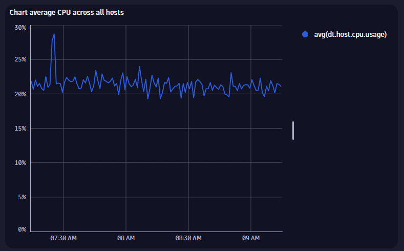
For details, see Line chart visualization.
Area chart example
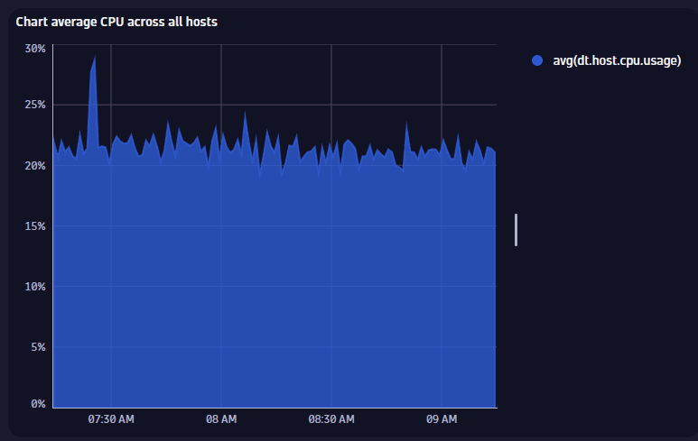
For details, see Area chart visualization.
Bar chart example
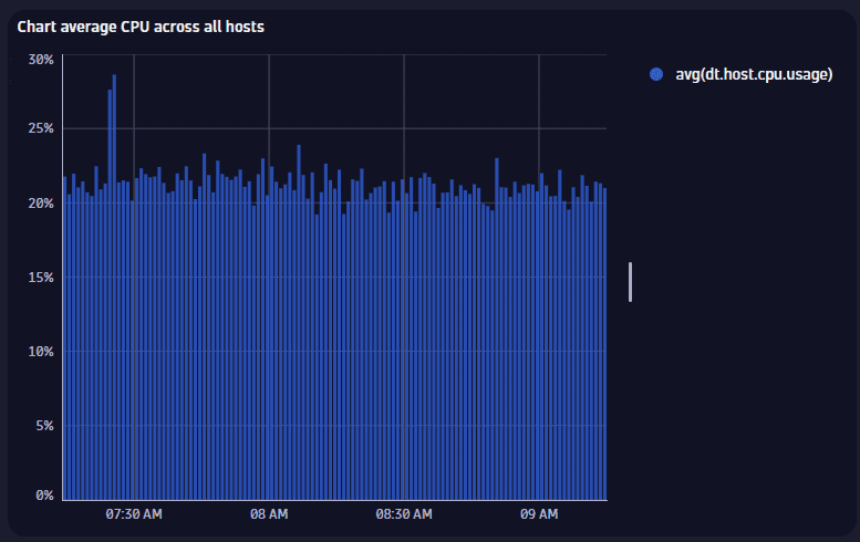
For details, see Bar chart visualization.
Table example
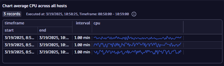
For details, see Table visualization.
Single value chart example
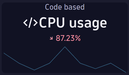
For details, see Single value visualization.
Raw example
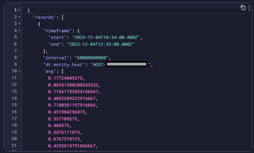
Displays the raw results of the query. Some data has been obfuscated in the example.
For details, see Raw visualization.
Record list example
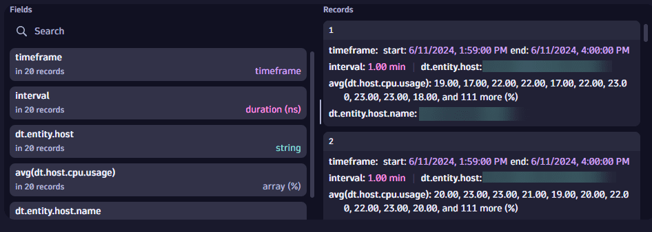
Lists the records returned from the query. Some data has been obfuscated in the example.
For details, see Record list.
Band chart example
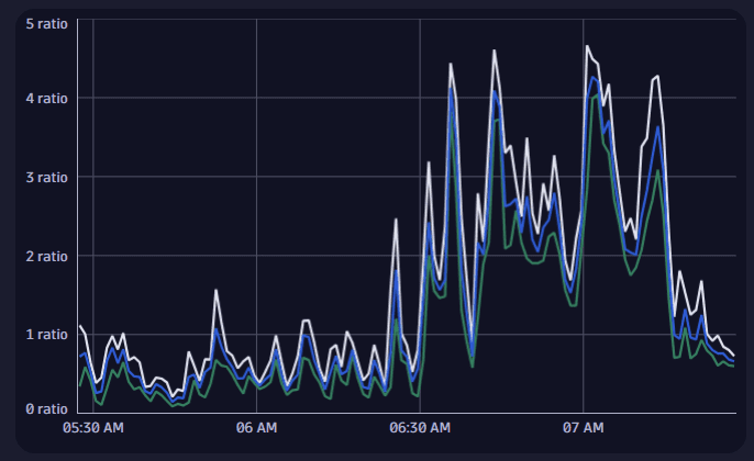
For details, see Band chart visualization.
Categorical chart example
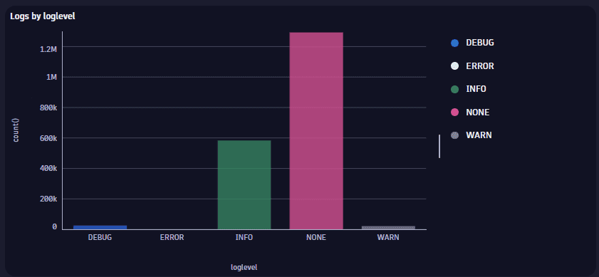
For details, see Categorical chart visualization.
Pie chart example
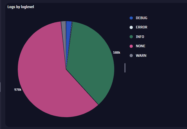
For details, see Pie visualization.
Donut chart example
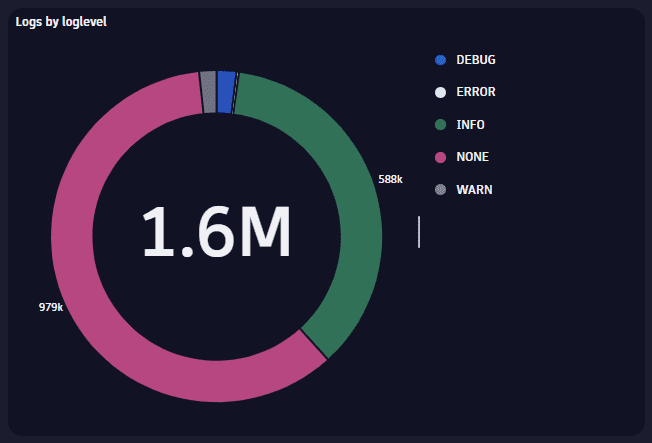
For details, see Donut visualization.
Histogram example
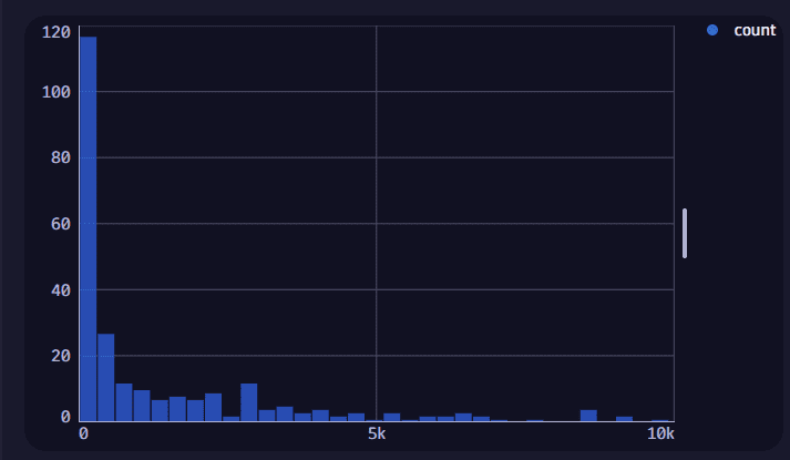
For details, see Histogram visualization.
Honeycomb example
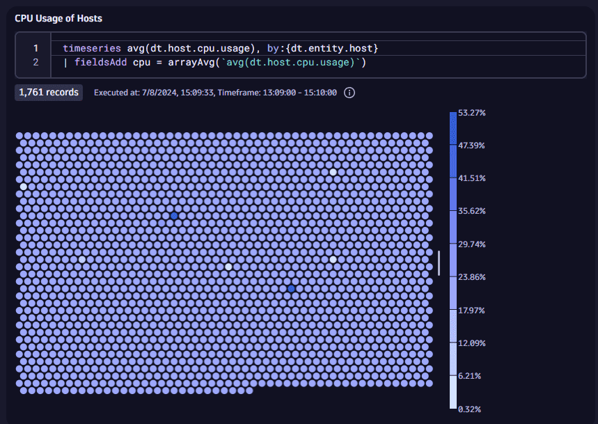
For details, see Honeycomb visualization.
Meter bar example
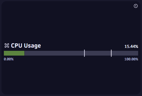
For details, see Meter bar chart.
Gauge example
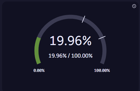
For details, see Gauge chart.
Choropleth map example

For details, see Choropleth map visualization.
Dot map example
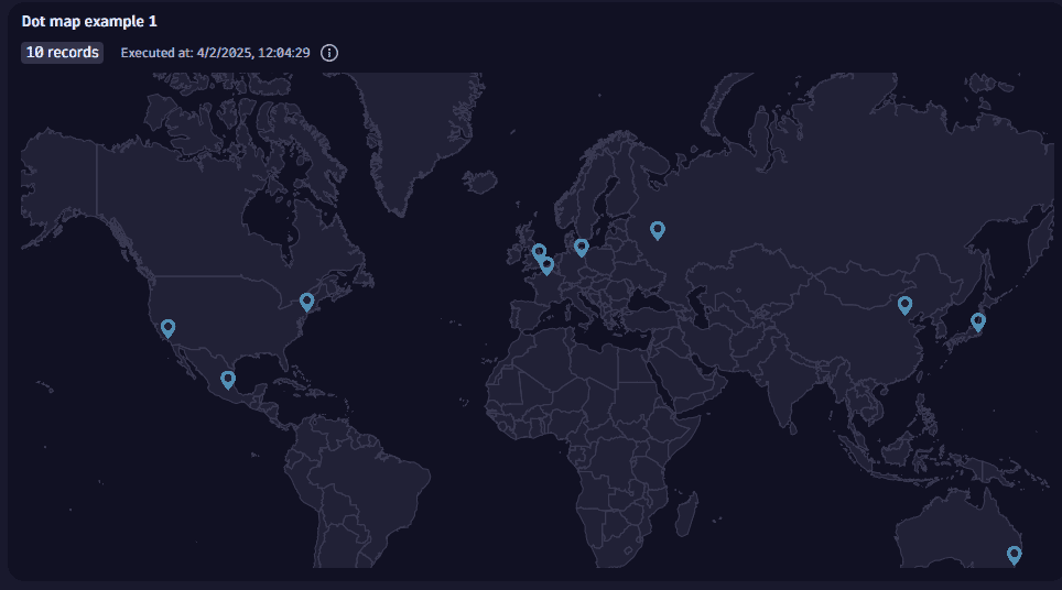
For details, see Dot map visualization.
Connection map example
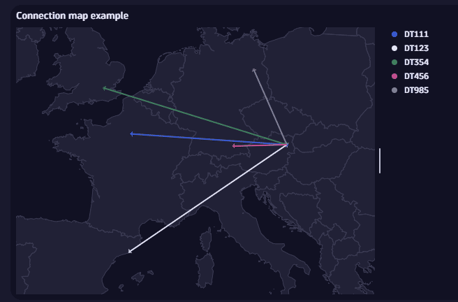
For details, see Connection map visualization.
Bubble map example
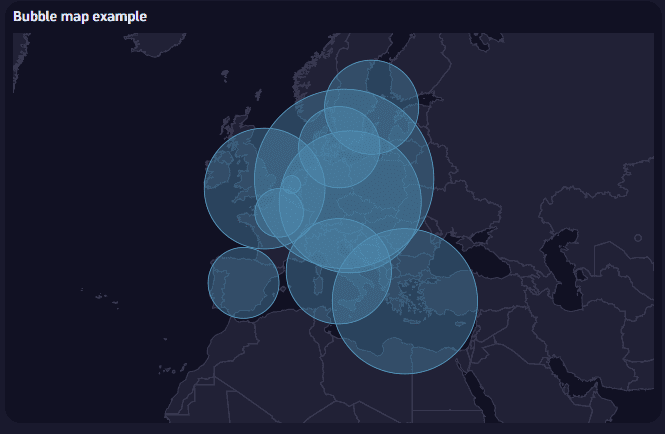
For details, see Bubble map visualization.
Heatmap example
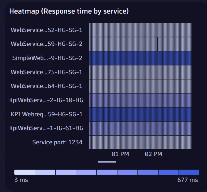
For details, see Heatmap visualization.
Scatterplot example
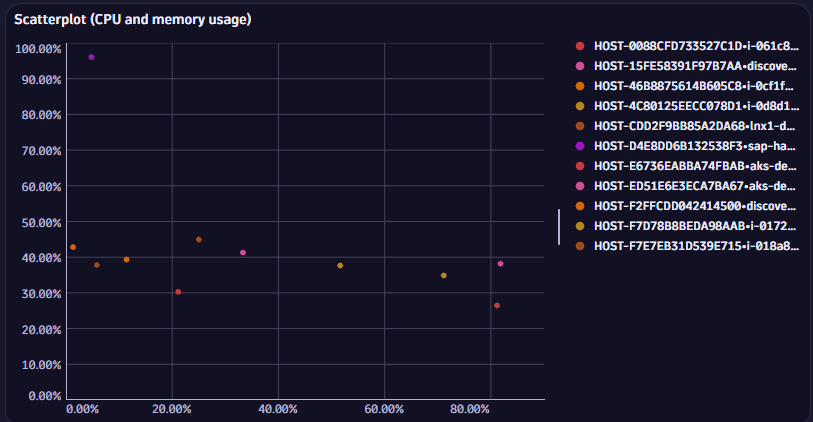
For details, see Scatterplot visualization.
Treemap example
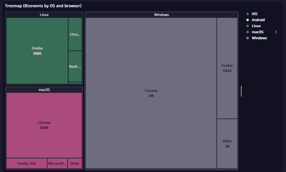
For details, see Treemap chart.