Raw visualization
- Latest Dynatrace
- How-to guide
- 1-min read
- Published Jul 08, 2022
Select the Raw visualization to see the actual data returned by the query (rather than a visualization of the data).
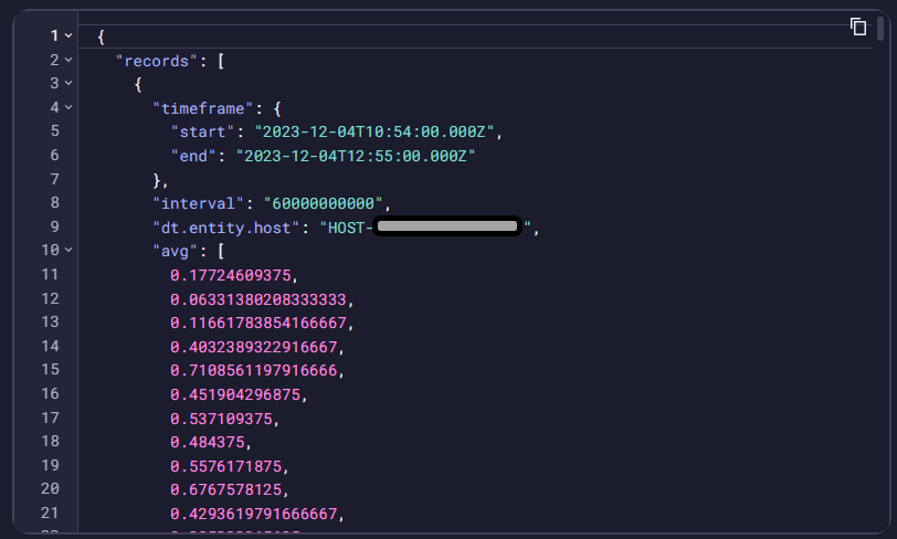
The raw data visualization above is based on the following query. Some data has been obfuscated.
timeseries avg=avg(dt.host.cpu.load),max=max(dt.host.cpu.load),min=min(dt.host.cpu.load),by:dt.entity.host| limit 1
Title
Use the title field at the top of the options panel (initially Untitled tile or Untitled section) to add a title to your dashboard tile or notebook section.
- You can use emojis such as 😃 and 🌍 and ❤️.
- You can use variables.
Example:
- Define variables called
StatusandEmojiin your dashboard. - Set the title to
Current $Emoji status is $Status. - Set
StatustoGood. - Set
Emojito🌍.
The title will be displayed as Current 🌍 status is Good.
Visualization
If you aren't sure that you chose the right visualization, use the visualization selector to try different visualizations.
Units and formats
To override the default units and formats in a dashboard or notebook visualization
-
Select to edit the visualization tile.
-
Select the Visual tab.
-
Expand Units and formats.
The Units and formats section lists all available unit settings for the document (dashboard or notebook). Some units may already be added automatically when querying metrics from their metadata.
Each row has two menus:
- The left menu displays unit settings.
- The right menu displays field mapped to that unit.
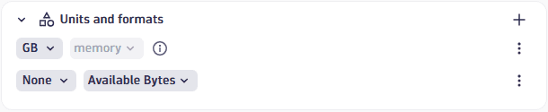 Example rows in "Units and formats" settings
 -
To edit unit settings, open the left menu and review/set the following settings:
-
Unit: The base unit in which the values were captured. It's
Noneif it was not included in the DQL result, or its automatically defined by the unit passed from the DQL result. This field doesn't lead to any conversion but modifies the suffix to correspond to the unit. -
Convert: You can turn on Convert for conversion. For example, if the DQL result defined your numeric value in the result as
Bytes, Convert now offers a suitable list of byte conversions such asKilobyteandMegabyte.Only linear and static conversions are supported. For example, you cannot convert
Degree Celsius(°C)intoDegree Fahrenheit(°F), or convertUsd(US$)intoEur(€).
The Format section determines how the unit is displayed:
- Decimals: displays the default number of decimals (degree of precision) to display. To see it in action, change the Decimals selection and observe the change in the visualization.
- Custom suffix: displays the suffix to display after the unit. To see it in action, turn on Custom suffix, enter a string, and observe the change in the visualization. When you don't find the unit you're looking for, you can use Custom suffix to display the desired unit.
- Abbreviate large numbers: displays large figures in abbreviated form. For example,
1053becomes1.1K. - Multiple units: displays more than one unit. Turn this on and select the number of units to display. For example,
90 secondsbecomes1m 30sif multiple units is enabled and 2 units are selected.
-
-
To choose a different field for a row, open the right menu in that row and select a field from the available fields.
Units and formats: Additional actions
- To add a row, select (Add) and configure it as described above.
- (Actions) opens a menu of further options:
- Duplicate creates a copy of the selected row.
- Delete removes the row.
- Reset resets the settings in the selected row to default/metadata values.
Units and formats: Examples
Chart average CPU across all hosts
This example uses a line chart, but the options apply to other visualizations.
-
In
 Dashboards, create a dashboard.
 -
Select and, in the Library section of the menu, select Chart average CPU across all hosts.
-
In the edit panel, select the Visual tab and select Line.
-
Expand Units and formats.
One row is already defined based on metadata from
avg(dt.host.cpu.usage). -
To override the unit settings for that field, open the left menu in that row to display the unit settings.
-
Define an override for the displayed metric. You can observe your changes in the Y-axis of the chart.
-
Unit displays
Percent, which is the default unit for the selected metric. -
Turn on Convert to try conversions settings. For example, change
AutotoOneto display the result as a fraction of 1. -
Decimals displays the default number of decimal points (degree of precision) to display. For example, enter
Pctand review the dashboard to seePctinstead of%displayed after the percentage value. -
Turn on Custom suffix to try different suffixes to display after the unit. For example, change the Decimals selection and review the dashboard to see the change in the number of decimal points in the percentage value.
-
To reset to defaults (discard override settings for the selected metric), open the (Actions) menu for that row and select Reset.
Links
Use the Links section to manage custom links from your dashboard or notebook.
Add a link
To add a link
- Open the Links section in the visualization tab of your selected visualization.
- Select to open Add link.
- Configure the link:
- Name: Enter a descriptive name such as "Go to Host" to display in the menu.
- Icon: Select an icon such as "Logs" to represent the link in the menu.
- URL: Use dynamic placeholders to insert data fields or variables. For example, select Insert placeholder and add the
:nameplaceholder to the your URL likehttps://myhost/host={{:name}} - Use the Preview section at the bottom to see how placeholders will be replaced with actual data and to test your link.
- Select Add link to save. The link will now appear in the visualization's tooltip menu.
Links: Additional actions
- To add a row, select and configure it as described in Add a link.
- To move a row up or down in the table, select and drag .
- opens a menu of further options:
- Edit displays link fields for editing as described in Add a link.
- Duplicate creates a copy of the selected row.
- Delete removes the row.
For details, Link from visualization via custom links
Query limits
Use the Query limits section to check and adjust the Grail query limits per notebook section or dashboard tile. These settings determine the maximum limits when fetching data. Exceeding any limit will generate a warning.
Dashboard tiles and notebook sections created in Dynatrace earlier than version 1.296 are not affected. Those existing tiles/sections will return the same results as before.
-
Read data limit (GB)
The limit in gigabytes for the amount of data that will be scanned during a read.
-
Record limit
The maximum number of result records that this query will return. Default: 1,000 records. To see more records, you need to increase the value of Record limit.
-
If your query has no
limit, such asfetch logsthe value of Record limit is applied. By default, you will see up to 1,000 records.
-
If your query also includes a
limit, such asfetch logs| limit 2000the lower of the two values (either
limitin your query, or Record limit in the web UI) is applied.In the example above, you would still see only 1,000 records unless you increased the value of Record limit.
-
-
Result size limit
The maximum number of result bytes that this query will return. For better performance with typical queries and smaller documents, the default is set to 1 MB.
-
Sampling (Logs and Spans only)
Results in the selection of a subset of Log or Span records.