Upgrade from Dashboards Classic to Dashboards
- Dynatrace Classic
- Upgrade guide
- 60-min read
This is a guide to upgrading from  Dashboards Classic to
  Dashboards.
Why upgrade?
Upgrading to Dashboards offers substantial benefits, unlocking numerous new possibilities and feature upgrades.
-
Use AI for simplified chart configuration
- Dynatrace Intelligence generative AI translates natural language questions into Dynatrace Query Language (DQL) queries, so you don't have to be a DQL master to query data and display the results in any of various visualization types.
-
Experience the improved user interface
- The new interface is designed to help you get the answers you're looking for in less time.
- You can see updates to your dashboard as you modify your queries.
-
Gain valuable insights from unified data
- Join different data types like RUM, logs, metrics, events, and traces in a single view.
- Correlate user actions to backend impact, or combine traces with logs, metrics, and Kubernetes events for a complete, contextual view of your environment.
-
Accelerate analysis with improved drilldowns
- Pass context to other Dynatrace apps to keep your analysis consistent and speed your access to relevant details.
-
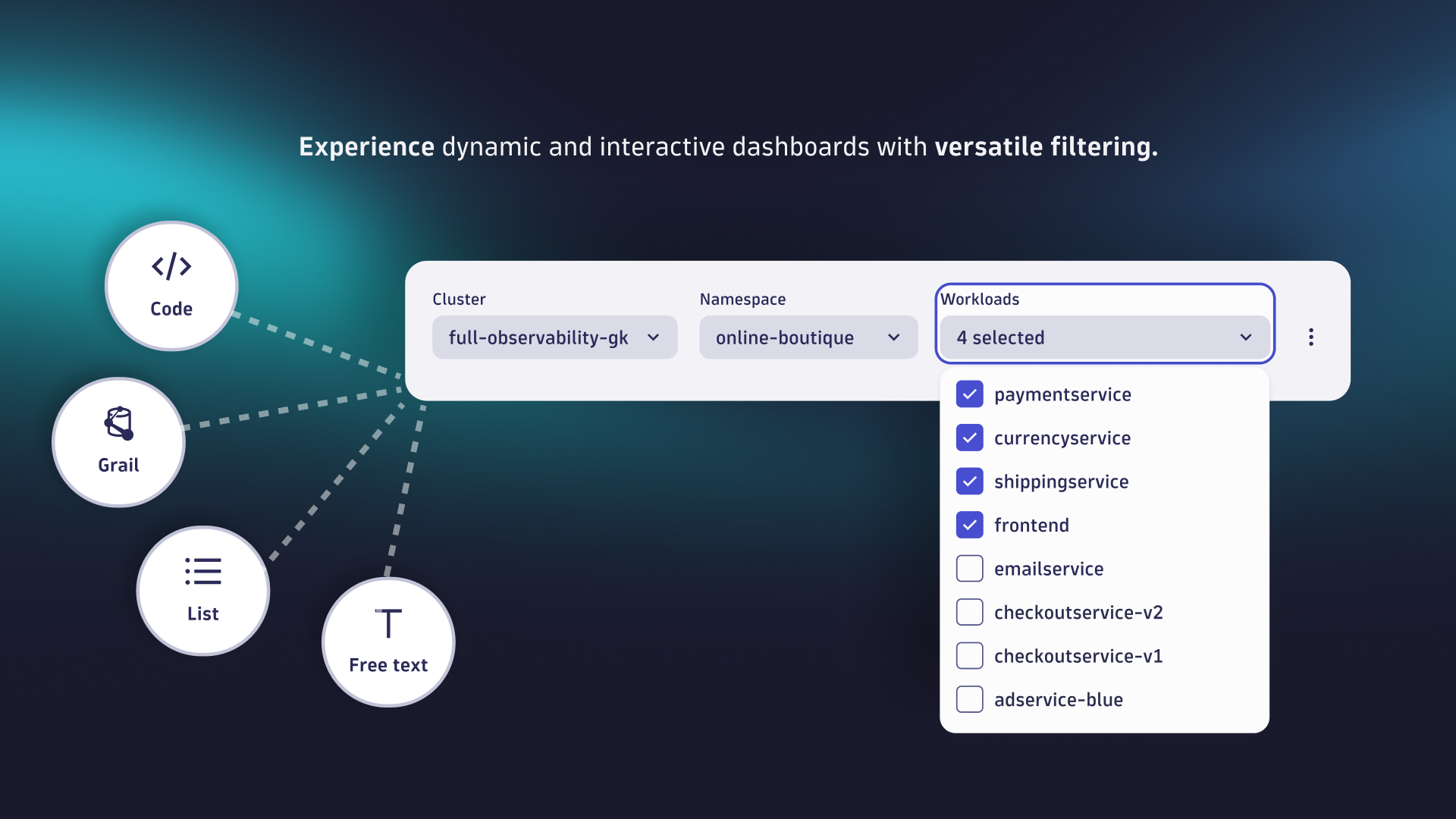
Build dynamic dashboards using variables
- Add more flexible and versatile filtering options with variables.
- Combine variables with DQL and code tiles to turn dashboards into versatile custom solutions for your business challenges.
-
Break down data silos
- Blend external data with app function-based code tiles.
- Enrich your dashboards with additional data sources for a holistic view beyond tool borders.
-
Save time on administration
- Use Dynatrace segments—reusable, shareable pre-filters—to customize views for users and teams. Segments dynamically adjust context using variables, eliminating the need for multiple static management zones.
-
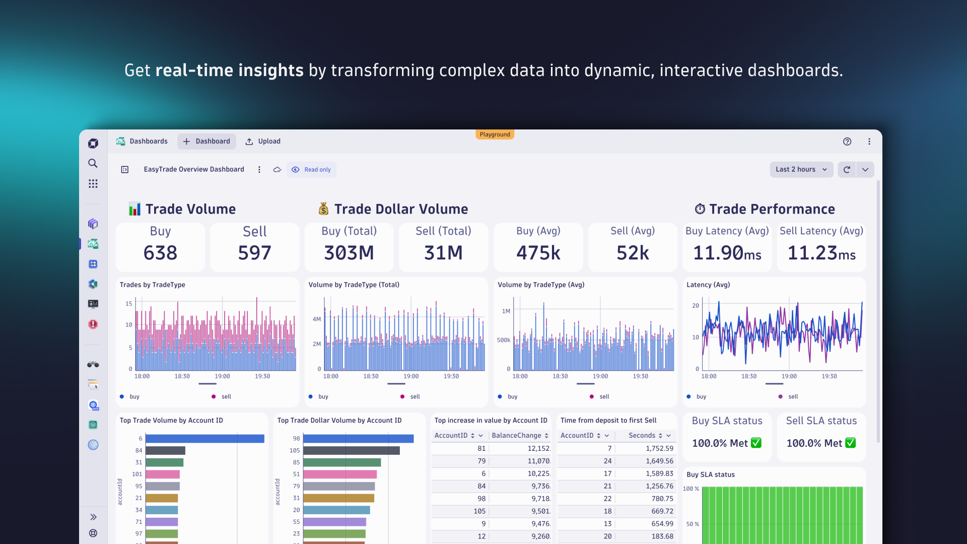
Save time on dashboard creation
- Use predefined tiles for simpler dashboard creation.
- Leverage our ready-made dashboards, curated by Dynatrace experts, that cover many different use cases.
What is new?
When you upgrade an existing, classic dashboard, we recreate it (with some exceptions as noted below) and make the newly created document available via the Dashboards app. The upgrade does not delete or change the original dashboard, which means that you can still continue to use it, and you can retry the upgrade later.
Layout
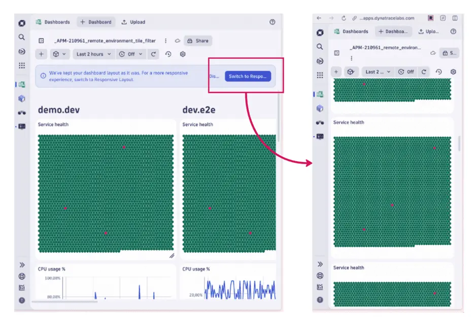
After the upgrade, the existing layout is preserved, ensuring a smooth upgrade without immediate visual changes, and also accommodating wide dashboard layouts, which otherwise could not be upgraded without breaking the layout.
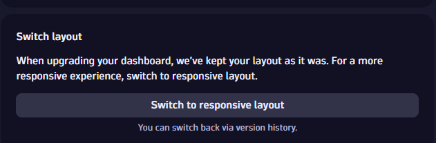
When you open the upgraded document, a message box offers you the following choices about your dashboard layout:
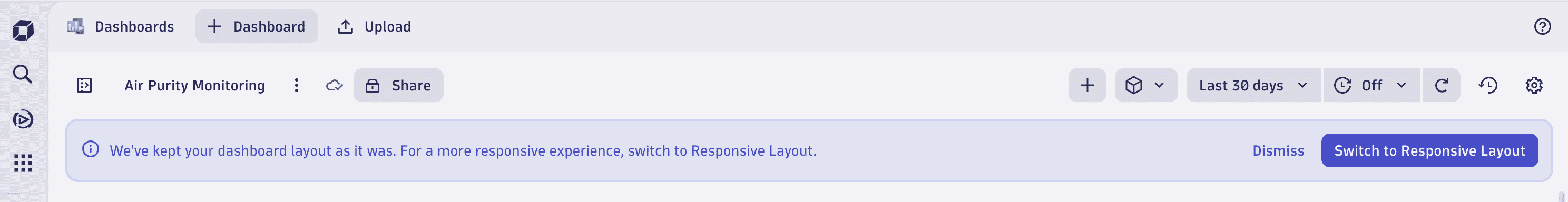
- To use the new responsive layout, select Switch to Responsive Layout
- To keep the canvas-based layout, select Dismiss
When you switch to the responsive layout, you can benefit from a reflowing layout, supporting all screen sizes, even mobile ones, enhancing usability and accessibility.
Switching back
When you switch to the responsive layout, you're notified that "Your dashboard has been successfully switched to Responsive Layout."
If the conversion to the new layout causes any issues, you can select Revert changes in the message box to display the previous version of the dashboard. From there, select Restore to revert to the previous version (with the canvas layout).
Apply responsive layout in a later stage
If you choose to keep the canvas-based layout, you can still switch to the responsive layout later from your dashboard settings.
- In Dashboards, display the dashboard.
- In the upper-right corner of the dashboard, select Settings to display the dashboard settings.
- Select Switch to responsive layout.
Tiles
The upgrade supports a limited set of tile types from Dashboards Classic for recreation in the new Dashboards app. Supported tile types are:
-
Data Explorer (custom tiles that you created in Data Explorer)
-
Health (Host health, Service health, Application health, Synthetic monitor health, Database health).
Note:
- Synthetic filter
WEBCHECK_TYPE(4001)(availability vs click path) is deprecated and won't be migrated. - Synthetic filters
WEBCHECK_CREDENTIALS(4006)andWEBCHECK_CREDENTIALS_OWNER(4007)need theUSES_CREDENTIALSattribute, which has not been exported to Grail. - Application status filter (Monitored/Unmonitored)
APPLICATION_STATUS(3000)has not been migrated.
- Synthetic filter
-
Markdown
-
Header
-
Logs & Events Classic (custom tiles you created in the Logs & Events app).
Note:
- Custom tile refresh rates are not supported in Dashboards, so this isn't supported in the upgrade. You can set a refresh rate in the upgraded dashboard manually. By default, dashboard refresh in Dashboards is off.
- Columns that were hidden in the classic tile are not hidden in the upgraded tile. You can manually modify (hide/show) columns in the upgraded tile in Dashboards.
- Custom tile refresh rates are not supported in
-
Custom chart
-
Browser monitor
-
Third-party monitor
-
HTTP monitor
Metrics
Because Grail provides better scale and cardinality for metrics, we didn't replicate metrics one-to-one. Instead, we created new metrics that are either extended or a merged version of multiple previous metrics.
See Built-in Metrics on Grail for a full list of metrics available on Grail, with a mapping from their Dashboards Classic counterparts, so you can select the best metrics whenever the upgrade can't automatically map them.
Settings
The following settings are upgraded. These mainly apply to Data Explorer tiles.
-
Metric configuration
- Metric
- Aggregation
- Split by
- Filter
- Limit
- Rate
- Default
- Timeshift
-
Visual settings
- Resolution
- Unit
- Format
- Thresholds
- Fold
- Show legend
- Show trend (Single value)
- Show sparkline (Single value)
- Columns (Table)
- Dual axis (Graph)
What is not changing?
Tiles
The upgrade process does not support all tiles available in Dashboards Classic. Built-in tiles (for example, USQL, Service, or Database) not described in Supported tile types. If a tile does not convert, in new dashboard (in Dashboards), Dynatrace replaces the built-in tile with a Markdown tile explaining that the built-in tile type can't be converted automatically and that you need to recreate it manually in Dashboards.
Built-in tiles that are not upgraded:
- Network metrics
- Network status
- Docker
- VMware
- AWS
- Service or request
- Top web applications
- User behavior
- User breakdown
- World map
- Key user action overview
- Bounce rate
- Top conversion goals
- Conversion goal
- JavaScript errors
- Resources
- Most used 3rd parties
- Mobile app
- Custom application
- Live user activity
- Web application
- Key user action
- User Sessions Query
- Service-level objective
- Database performance
- Data center service health
- Problems
- Smartscape
Settings
The following visualization settings are not supported for dashboard upgrade. These mainly apply to Data Explorer tiles.
- Three or more axes (Graph)
- Different geometries for metrics. For example, a line and a bar in a single visualization (Graph).
But you can configure this manually in the new dashboards with the Custom geometry chart settings in Dynatrace version 1.299+.
The following dashboard settings are not supported for dashboard upgrade. These mainly apply to Data Explorer tiles.
- Default management zone doesn't exist in the new dashboards.
- Dynamic filters need to be recreated as variables.
- Title font size doesn't exist in the new dashboards.
- Permissions need to be reassigned via document sharing.
- Preset enablement doesn't exist in the new dashboards, but you can get essentially the same effect with read-only sharing.
- Anonymous links don't exist in new Dashboards
- Report subscriptions don't exist in new Dashboards
Automatic licensing model conversions
If you upgrade Kubernetes-based dashboards, the new Kubernetes metrics are available only for DPS-enabled customers, so you might not see data, even though the upgrade was successful.
-
For more about the new Kubernetes metrics, see Built-in Metrics on Grail.
-
For details on becoming a DPS-enabled customer, see License Dynatrace.
Data types
Not all data types are available on Grail:
- RUM on Grail is currently in preview. Please reach out to your CSM to learn more about availability of RUM data.
- Not all metrics are currently supported. For information on which metrics are available on Grail, see Built-in Metrics on Grail.
Be aware that some data types, as well as some metrics, are only available when using DPS. For example, if you upgrade Kubernetes-based dashboards, the new Kubernetes metrics are available only for DPS-enabled customers, so you might not see data, even though the upgrade itself was successful.
Features
The following features are not supported for dashboard upgrade:
-
Cross-tenant / multi environment dashboards
- Dashboards Classic offers multi-environment dashboards that are currently not supported by Dashboards.
- As a workaround, in Dashboards you can access remote data via code tiles.
-
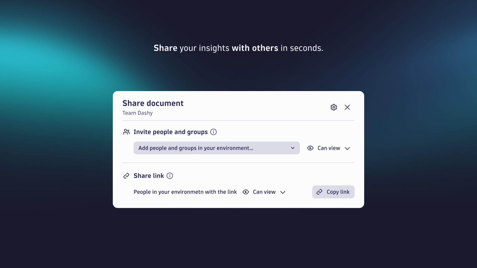
Public sharing
- Dashboards Classic allows you to share a dashboard with specific users or groups, with any user via a share link or even turn on anonymous access.
- The Dashboards app currently offers sharing only with users and groups within your Dynatrace environment.
What will you do?
In most cases, the process to upgrade a dashboard from Dashboards Classic to Dashboards is to select the classic dashboard you want to upgrade, select the Upgrade option, and review the results. Full details are described below.
Before you begin
Prerequisites
Be sure to review these prerequisites before you start upgrading your classic dashboards to Dashboards.
Data availability
Be aware that not every data point is available on the latest Dynatrace. Before starting to upgrade, ensure that all relevant data types that you need are available for and stored in Grail.
Grail currently supports the following data types:
- Metrics: check the metrics available on Grail
- Logs: do you already ingest your log data into Grail?
- Problems
- Events
- Security events: only available on Grail
- Software development lifecycle events: only available on Grail
- Davis events
- Synthetic events
- Traces / Spans
- Real User Monitoring (RUM) data (currently in preview)
- User events
- User sessions
- Synthetic Monitoring
- Synthetic events
- System events
- Business events: only available on Grail
Data capture
If you rely on RUM data (see above), and are part of the current preview, ensure that you have enabled the new RUM agent. You can enable it in the settings of a frontend application: Enablement and cost control > Enable new Real User Monitoring Experience.
Dynatrace Platform Subscription (DPS)
You can only use the full scope of the latest Dynatrace if your license agreement includes Dynatrace Platform Subscription (DPS).
- Is your account running on DPS?
- Have you opted in to all individual rate cards for all of the capabilities that you want to use?
Plan your upgrade
We assume you have already taken your first steps, including setting up data partitioning, data access, and data segmentation based on your individual requirements.
To upgrade your dashboards
-
Identify the top 50 classic dashboards within your environment based on the popularity score in the web UI. Your Dynatrace contact can help you to create the list.
Why migrate only 50 dashboards?- Today, you might have hundreds of different dashboards. After you upgrade your dashboards—thanks to newly introduced dynamic concepts such as variables or segments, and more flexibility in defining access to data—you will need far fewer dashboards to serve the same needs.
- In our experience, only 10-15% of all created dashboards are regularly used. Get rid of orphaned documents and start with those dashboards that provide that most value for a significant user base.
- Some of your existing dashboards will be replaced by a broader range of use-case specific apps or ready-made dashboards that provide immediate value.
Use the following information from the web UI and API to decide which classic dashboards to upgrade.
Web UI API Meaning Popularity
popularityHow often the dashboard is used.
Created at
createdWhen the dashboard was created.
Modified at
lastModifiedWhen the dashboard was last modified.
Last viewed
lastViewedWhen the dashboard was last viewed.
For example, go to
Dashboards Classic and select the Popularity column header to sort your classic dashboards by popularity, or select the Last viewed column header to sort by when the dashboard was last viewed. -
Upgrade the top 50 dashboards manually as described in the Upgrade your dashboards section.
-
Apply segments to the upgraded dashboards.
-
Add and define variables in the upgraded dashboards.
-
Set up improved alerting utilizing anomaly detection, simple workflows, and third-party integrations for common tools such as Jira, PagerDuty, ServiceNow, Slack, and Microsoft Teams.
-
Remove access to
Dashboards Classic for your users. -
Provide your users with a process for requesting specific dashboards that have not been upgraded so far. Manually upgrade the requested dashboards as needed.
Plan to handle historical data
You can use Dashboards Classic and the Dashboards app side by side.
-
Use
Dashboards, querying data stored in Grail, for day-to-day operations, benefiting from added value of exploratory analytics and latest Dynatrace platform. -
Keep your
Dashboards Classic classic dashboards for historical analysis of metric data.Keep data retention periods in mind.
In the previous Dynatrace
- RUM data is only stored for 30 days
- Traces are stored for a maximum of 90 days
Once you have made the upgrade to the latest Dynatrace, you benefit from increased retention periods for up to 10 years (maximum retention for log and trace data) in Grail.
When to upgrade
Do you use Dynatrace to monitor a hyperscaler such as AWS using CloudWatch metrics, Azure, or GCP, or a container platform such as Kubernetes? Then we recommend talking to your Dynatrace contact to learn more about native integration for data ingest into Grail.
New concepts
The latest Dynatrace is introducing a couple of new concepts and capabilities that are vital to understand before upgrading from Dashboards Classic to the Dashboards app.
Accessing data
Dashboards Classic allows tiles with a limited set of predetermined data sources, such as metric-based tiles on Data Explorer, health states for applications and services, digital experience signals like Apdex on a world map, and other built-in tiles.
With the new Dashboards app, you can visualize all data stored in Grail and external data.
-
Data stored in Grail
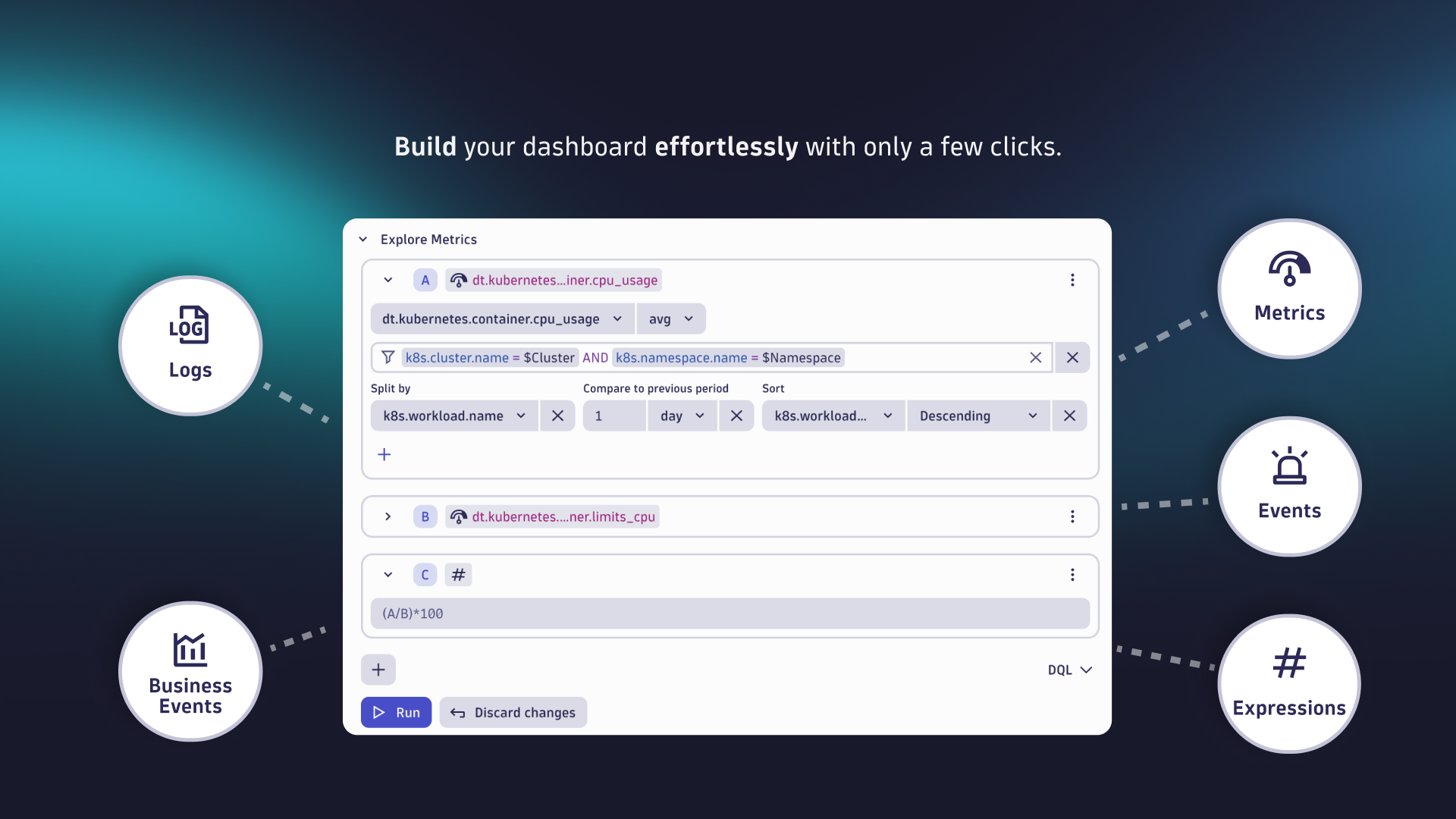
Grail stores all data in buckets and tables, allowing you to join data types, perform versatile aggregations and filtering, and utilize schema on read. Data can be queried using the Explore interface or by leveraging Dynatrace Intelligence generative AI, which allows you to formulate your queries in natural language, or by using one of the predefined tiles.
Under the hood, Grail uses DQL, which you can use for powerful, advanced analytics.
-
External data
You can fetch data from any external API and display it on your dashboard. Use a code tile to embed external data.
Filtering data
With latest Dynatrace we have implemented new concepts for filtering data—segments and variables—to help reduce visual clutter and make it easier find relevant data. Previously, you had to define many static management zones to achieve the same results.
Segments
Segments logically structure and filter observability data across apps on the Dynatrace platform. Use cases include filtering your data based on logical structure.
- They are dynamic and multidimensional, supporting the scalability requirements for enterprise environments.
- You can define them in line with your business applications or org units and the relevant responsibilities and ownerships.
Unlike management zones, segments aren’t selected globally. However, when you set segments for one app, they are carried over to other apps when via Open with.
For instance, if you filter a notebook’s data by segments and then use Open with > Dashboards to create a new dashboard, the selected segments are automatically applied to the corresponding tile.
Variables
Variables allow you to filter your data across dashboard tiles but in a more versatile way. Variables let you fully control:
- Where the filter values come from, including fetching them from external sources via Code/ad-hoc functions.
- How filters are dependent on each other.
- How they apply to your tiles.
- Whether your filters are single or multi-select based.
- What their initial state is.
- And much more.
Variables go far beyond just being filters on top of your dashboard. They are increasingly used to optimize performance and costs for repeating parts of queries, as well as to increase efficiency and maintainability.
For instance, you can also add variables to your markdown, tile title, or tile descriptions to make your dashboards and tiles more dynamic. In the future, variables will also be increasingly used in visualization settings.
Dashboard layout
There are two types of dashboard layouts available in Dynatrace:
- The static canvas-based layout used in Dashboards Classic
- The responsive layout featured in the new Dashboards
The canvas-based layout led to issues in day-to-day work, such as screen size mismatches causing partial visibility or unused whitespace on different screens, and required scrolling on smaller devices, making tiles difficult to interact with.
The new responsive layout offers much more flexibility, and ensures dashboards are fully visible and easier to navigate on smaller devices through dynamic reflow, while also making tile swapping and repositioning easier, enhancing user experience and flexibility.
Alerting
With the latest Dynatrace, we have introduced new ways to define alerts and get notified.
Upgrade your dashboards
There are multiple ways to upgrade classic dashboards to Dashboards.
From Dashboards page
To upgrade a dashboard from the Dashboards page
-
Go to
Dashboards Classic in the latest Dynatrace. -
On the Dashboards page, find a classic dashboard that you want to upgrade.
-
In that dashboard's row, select > Upgrade.
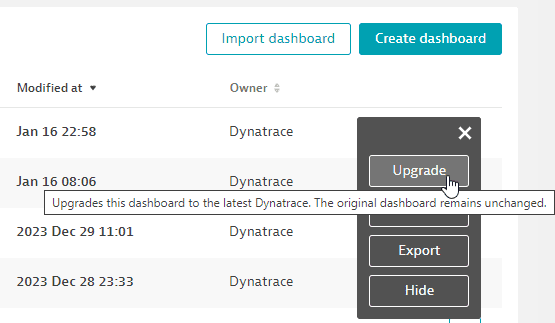 Upgrade a dashboard from the Dashboards table
 -
After the upgrade is completed, the recreated dashboard is displayed in the
Dashboards app.
From displayed dashboard
To upgrade a dashboard from within the displayed dashboard
-
Go to
Dashboards Classic in the latest Dynatrace. -
On the Dashboards page, find the dashboard that you want to upgrade and select its name to display that classic dashboard.
-
In the upper-right corner of the dashboard, select > Upgrade.
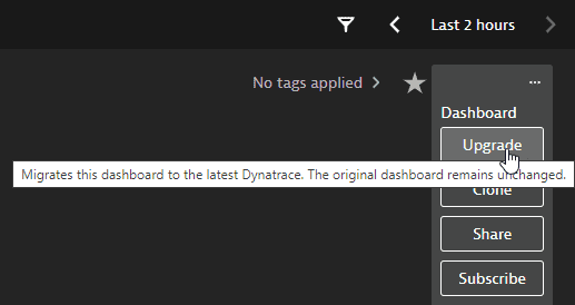 Upgrade a dashboard from the currently displayed dashboard
 -
After the upgrade is completed, the recreated dashboard is displayed in the
Dashboards app.
From Data Explorer (single visualization)
To upgrade a single Data Explorer–based visualization
-
On a dashboard, select a Data Explorer–based tile and select Configure in data explorer to open the selected tile's visualization in Data Explorer.
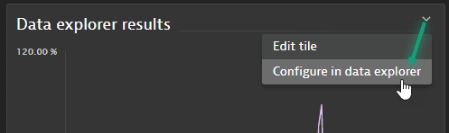 Configure in data explorer
Or you can start from Data Explorer and configure a new visualization there.
-
Once your visualization is finished, select Open with in the upper-right corner of the Result section of Data Explorer.
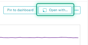 Data Explorer: Open with: enabledIf "Open with" is disabled
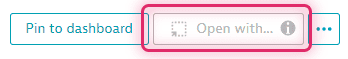 Data Explorer: Open with: disabled
Open with is disabled if the selected metric couldn't be mapped or converted to a metric available in Grail. Hover over the information icon on the button to see why.
-
In Open with, select the destination app:
Dashboards or  Notebooks.
 -
In Select destination, select the destination document.
- To add your Data Explorer visualization to an existing Dashboards or Notebooks document, select the document from the list and then select Confirm.
- To create a new document for your visualization, select New notebook or New dashboard (depending on the destination app you selected previously).
-
The document is displayed with your Data Explorer visualization added as a new notebook section or dashboard tile.
After you upgrade
After you upgrade a dashboard, review it in the Dashboards app and open a second browser window with the Dashboards Classic dashboard to compare them side by side.
What to look for:
- Tiles that didn't upgrade at all, which are indicated as markdown tiles showing warnings.
- Tiles that were upgraded but without preserving the original visualizations: edit them manually to select different visualizations.
- Migrated health tiles, where the filter could not be upgraded, as indicated by a “Could not migrate filter” message: manually update the query addressing the exception detailed in the message.
Upgrade dynamic filters to variables
In Dashboards Classic, Dynamic filters allow you to filter your data across dashboard tiles based on entities, tags, or custom metric dimensions. You can add multiple dynamic filters to a dashboard—for example, to filter infrastructure metrics by operating system—and only apply them once a filter value is entered. However, how these filters are applied to tiles is fully pre-determined by Dynatrace.
Basic filters (for example, when you filter a service metric by a service name or tag) can be recreated as a variable.
Relationship filters, however, should not be replicated immediately, because, in a subsequent step, you have to edit every tile referencing the newly created variable. In our experience, these referencing efforts are greater than rethinking your filtering using variables. For example, for Kubernetes metrics, unlike in Dashboards Classic, where using relationships were often times required to filter by related fields—like pods, namespaces, and clusters—are now automatically enriched on most metrics. This means you can rely on these enriched fields directly, instead of needing to define and use relationships in your filter statements manually. However, as mentioned earlier, this requires adding the filter per tile manually.
Rethink data segmentation
In Dashboards Classic, you could use management zones to filter individual tiles or dashboards. Management zones no longer exist in the latest Dynatrace, however, so there is no automatic upgrade available.
Instead of management zones, use segments in the latest Dynatrace for data segmentation. Once your segments are defined, you can set them as individual filters on a tile or use them as dashboard-wide filters, similar to what you know from Dashboards Classic.
Familiarize yourself with new possibilities
With Dashboards, we have introduced a lot of new capabilities, providing deeper insights and adding new concepts and use cases.
-
Explore data with the Dynatrace Intelligence generative AI-powered natural language interface, using Explore data or the predefined tiles.
-
Use
Notebooks to create powerful, data-driven documents for custom analytics. -
Dive into data with our apps for Application Observability, Infrastructure Observability, and Business Observability.
-
Investigate security-related use cases with apps such as
 Threats & Exploits,
  Vulnerabilities, and
  Security Posture Management.
Visualize data in new ways
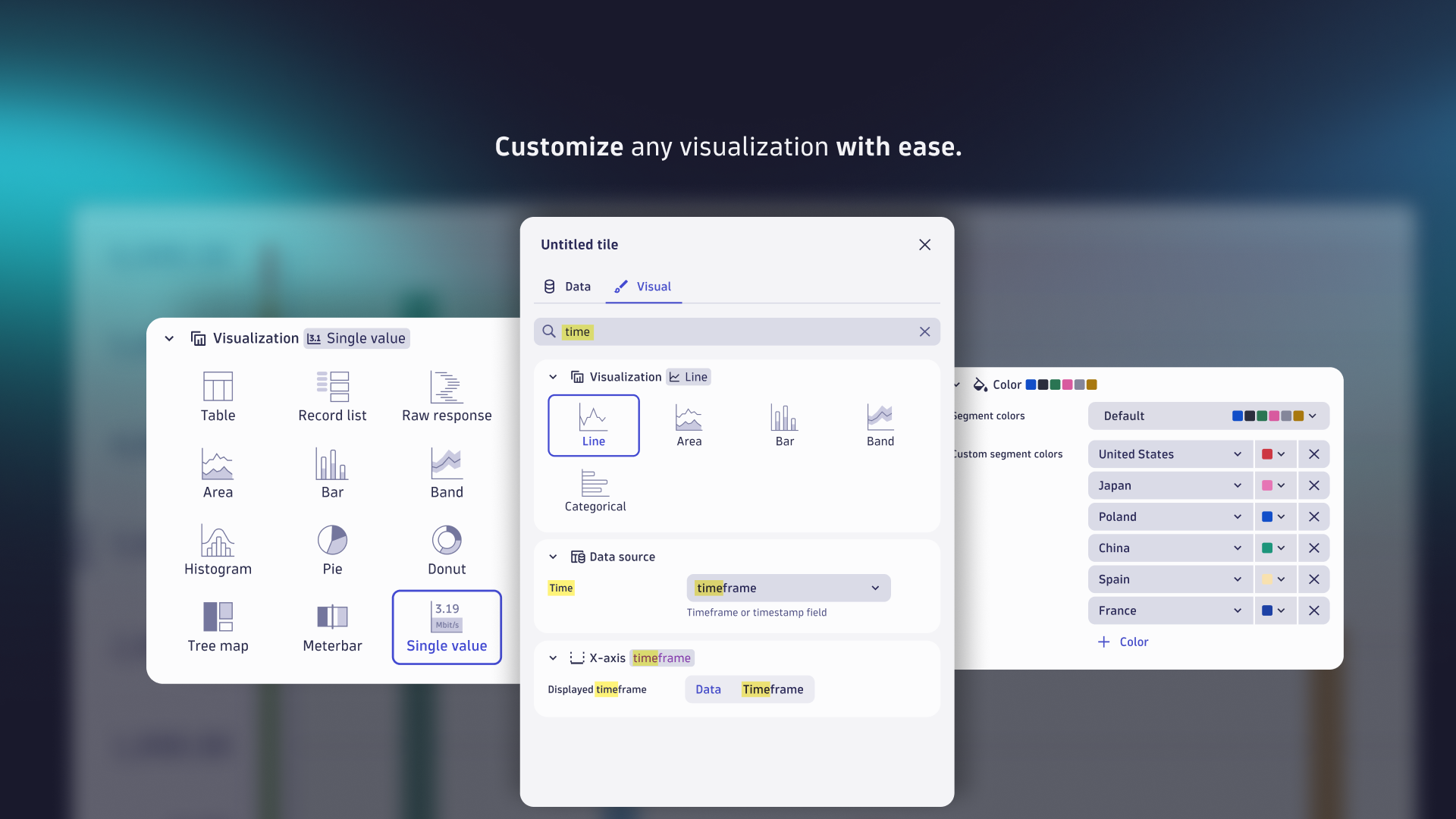
Review the available visualizations to see if there are better ways to visualize your data.
Apply AI
Use the power of Dynatrace Intelligence by giving your dashboards analyzers for forecast analysis and anomaly detection (thresholds or seasonal baselining).
Use external data
Use code tiles to
- Fetch external data via APIs
- Combine external data with your query results
- Map code results to your visualizations
Drill down to other applications
Use Open with from your dashboard to drill down into other applications to gain further insights or start workflows.
FAQ
What if a tile cannot be upgraded?
In cases where a tile couldn't be upgraded, you can recreate it manually if all of the following conditions are met:
- Data: The data is available in Grail (for example, metrics or problems).
- Visualization type: The visualization type exists in Dashboards.
- Visual settings: The visual settings offer you all the necessary options. For example, the line geometry settings for a line chart would already allow you to plot a bar chart for one series and overlay it with a line chart for another series.
Let's look at an example where the upgrade doesn't automatically upgrade your tile, but where the above conditions are met and you can manually recreate them.
Example: Problem tile
- Data:
dt.davis.problems, since it's based on Problems.
 - Visualization type: Single value, which is available in Dashboards.
- Visualization settings: Conditional coloring, to show whether there are active (previously called open) problems.
To recreate the tile
-
In the upper-right of the dashboard, select Add > DQL.
Dashboards will display an empty Query Grail tile and a tile edit panel open to the Data tab. -
On the Data tab
-
In the DQL edit box, paste the following DQL query:
fetch dt.davis.problems| filter event.status == "ACTIVE"| summarize `Active problems`=count()or, if you want to filter for a certain entity, use this variation (and adjust the entity value):
fetch dt.davis.problems| filter event.status == "ACTIVE"| expand entity.id=affected_entity_ids| filter entity.id=="HOST-1234234324"| summarize `Active problems`=count()or, if you want to filter for a certain tag, use this variation (and adjust the tag value):
fetch dt.davis.problems| filter event.status == "ACTIVE"| filter matchesPhrase(entity_tags, "myTagKey:MyTagvalue")| summarize count() -
Optional: If you want all closed problems you can use
event.status == "CLOSED"instead. -
Select Run to run the query.
-
-
Switch to the Visual tab. There are expandable sections for visualization settings.
-
In the Visualization section (expanded by default), select Single value as the visualization type.
-
Expand the Data mapping section and make sure Single value is set to
Active problems. -
Expand the Thresholds section to color the tile based on whether there are active problems.
Under Thresholds, select Threshold and set the following:
- Green,
<,1(the tile is green if there are no active problems) - Red,
>=,1(the tile is red if there are any active problems) - You can delete the extra row.
- Green,
-
Expand the Single value section and select
Backgroundfor Apply threshold color to.
-
-
Close the tile edit panel.
The resulting tile should be similar to the following, with a green background for no active problems and a red background for one or more active problems.
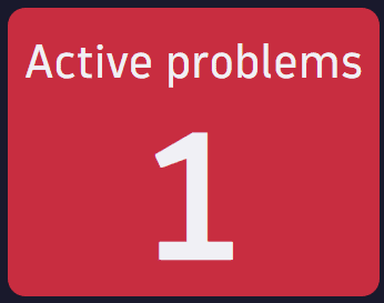 Manually upgraded "Active problems" tile example
Which tile types can be upgraded?
The upgrade supports a limited set of tile types from Dashboards Classic for recreation in the new Dashboards.
Supported tile types are:
- All Data Explorer tiles (custom tiles that you created in Data Explorer)
- All visualizations
- Markdown tiles and headers
Do you offer support services for upgrading dashboards?
Please reach out to your Dynatrace contact if you need further information about upgrading dashboards.