Explore data
- Latest Dynatrace
- How-to guide
- 15-min read
Dynatrace  Dashboards and
  Notebooks offer the following options for exploring your data:
- Use Dynatrace Intelligence agentic and generative AI and natural language to access data stored in Grail.
- Get started with our Explore interface for data types such as logs, metrics, and business events.
- Advance with DQL to leverage the full power of Grail.
Get started
To explore data such as logs, metrics, or business events with our point-and-click interface
-
In your document, open the Add menu and select an option, depending on what you want to explore.
For this example, select Logs, but there are other options.
List options
We walk you through the following options below:
- Prompt—Enter a plain-text query to get AI-powered insights from Grail.
- Logs—Explore logs via the UI. We use this option in the example that follows.
- Metrics—Explore metrics via the UI.
- Business Events—Explore business events via the UI.
After you try those options, you'll be ready to explore the following additional options with little or no additional explanation.
- Events
- Problems
- Traces
- User sessions
- Security events
- User events
The layouts differ slightly between
Dashboards and Notebooks to suit the different contexts, but the functionality is the same. -
Use the displayed elements to define your exploration.
In this example, we focus on Logs. By default, the filter field and a default limit of 20 is added.
-
Click into the filter field and, for example, select content as a field from the list of suggested fields.
-
Add an operator and a search string right after.
- Only operators relevant to the data type are suggested.
- Read more on how the filter field works in the dedicated documentation.
Operator Description ~Use a tilde to get one of two effects:
To match on a specific field
-
In the filter bar
- Select the field name
- Select the tilde (
~) as the operator - Enter the term you want to match
-
Select Run.
For example, when exploring log data,
content~errorlists log entries that have "error" in the "content" field.In DQL, this translates to matchesPhrase, such as:
fetch logs| filter matchesPhrase(content, "error")| limit 20
To search all data
-
In the filter bar
- Enter an asterisk (
*) - Select the tilde (
~) as the operator - Enter the term you want to search for
Alternative: Click in the filter bar, scroll down to the bottom of the list of suggestions, select
Search a phrase in all data, and enter the search term between the quotation marks. (This bar is hidden when there is no splitting set, or when there is more than one building block with a metric selected.) - Enter an asterisk (
-
Select Run.
For example, when exploring log data,
*~errorlists log entries that have "error".In DQL, this translates to search, such as:
fetch logs| search "error"| limit 20
=equals
!=doesn't equal
<less than
<=less than or equal to
>greater than
>=greater than or equal to
= *is any value
!= *isn't any value
inmatches one or more values in a list of values
not indoesn’t match any value in a list of values
Note: Combining
=with a wildcard in before*, after, or both, before your search term will resolve to a starts with, ends with, or contains filter respectively. -
The on the bottom of the definition opens a menu of additional commands you can add.
-
Select any
 in the definition to remove the element that comes before the . If you remove an element and then change your mind, you can use to select it from the menu and add it back to your definition.
-
-
Select Run to test it and see your results.
When you need to cover more complex use cases, you can create a DQL query from it.
The result of this step is equivalent to opening the menu, selecting DQL, and writing a DQL query without this web UI assistance. Then you can edit the DQL directly as needed, and you're free to delete the exploration version if you no longer need it.
- In Dashboards, open the menu and select Create DQL tile
- In Notebooks, open the menu and select Create DQL section
Transition to Smartscape fields
As part of ongoing improvements to the Dynatrace platform, the dt.entity.* fields are now deprecated. To ensure consistency and accuracy in your queries and data exploration, we recommend transitioning to the equivalent dt.smartscape.* fields.
What this means for you
Dynatrace automatically uses the new Smartscape notation whenever possible to enhance your experience.
If you encounter the following message:
"The dt.entity.* fields are deprecated. Please use dt.smartscape.* fields instead."
this indicates that the dt.entity.* fields will eventually be removed.
What you should do
- Update your queries to replace
dt.entity.*fields with the correspondingdt.smartscape.*fields. - Review your dashboards and notebooks to ensure compatibility with the new Smartscape fields.
Learn more
For more information about the benefits of Smartscape nodes and how they work, see Smartscape on Grail.
Prompt
You can create a notebook section or dashboard tile using Dynatrace Intelligence agentic and generative AI to translate your natural language questions into DQL queries.
Generative AI in your dashboard
To create a dashboard tile using Dynatrace Intelligence agentic and generative AI
-
Go to
Dashboards and open or create a dashboard you can edit. -
Open the Add menu and select Prompt.
- A new Dynatrace Intelligence generative AI dashboard tile is created
- A panel on the right displays:
- An empty tile title field you can customize
- A prompt box followed by some examples you can select to try
- A Run button
-
Optional At the top of the prompt definition panel, enter a tile title.
-
In the prompt box, type a prompt. Try
average cpu usage percentage by hostor see the examples displayed in the web UI for inspiration. -
Optional If your prompt doesn't specify a timeframe, you can still specify it for the dashboard in your dashboard header (default is Last 2 hours) or the Custom timeframe settings (for a tile-specific timeframe).
-
Select Run. Generative AI creates and runs the query for you.
-
Review the results.
- To review the query, expand DQL under the prompt box.
- Optional You can't edit the query directly in Dynatrace Intelligence generative AI, but you have two options for reusing it:
- Copy the query and paste it elsewhere manually.
- Open the menu in the tile header and select Create DQL tile to create a DQL tile from this query.
- You can edit your original prompt and run it to update the query and results.
If you refresh your dashboard, the Dashboards app will first check if any prompts have been edited.- If a prompt has been edited, the DQL will first be regenerated and then run.
- If no prompts have been edited, the existing generated DQL will simply be run.
-
Optional Select the Visual tab to change the visualization (refer to the visualization-specific documentation for more information).
Generative AI in your notebook
To create a notebook section using Dynatrace Intelligence agentic and generative AI
-
Go to
Notebooks and open or create a notebook you can edit. -
Open the Add menu and select Prompt. A new Generative AI notebook section is created with an empty prompt box.
-
In the prompt box, type a prompt. Try
average cpu usage percentage by hostor see the examples displayed in the web UI for inspiration. -
Optional If your prompt doesn't specify the timeframe, you can still specify it in your section header. The default is Last 2 hours.
-
Select Run. Generative AI creates and runs the query for you.
Optional If you want to see the generated query before running it, open the menu next to the Run button and select Generate DQL only.
-
Review the results.
- You can review the query by expanding DQL on the right.
- Optional You can't edit the query directly in Dynatrace Intelligence generative AI, but you have two options for reusing it:
- Copy the query and paste it elsewhere manually.
- Open the menu in the section header and select Create DQL section to create a DQL section from this query.
- You can edit your original prompt, regenerate the query, and run it to update the results.
If you select Rerun sections, the Notebooks app will first check if any prompts have been edited.- If a prompt has been edited, the DQL will first be regenerated and then run.
- If no prompts have been edited, the existing generated DQL will simply be run.
-
Optional Select the Options in the section header to change the visualization (refer to the visualization-specific documentation for more information).
Automatically select visualization
To have Dynatrace automatically select a visualization for your query, turn on Auto select in the upper-right corner of your visualization settings pane.
- If you manually select a different visualization, the Auto select switch will turn off.
- To have Dynatrace once again automatically select a visualization, turn Auto select back on.
Logs
This exploration functionality is the same in Dashboards and Notebooks. We use Notebooks in this example.
-
Open
Notebooks and select Notebook in the app header to create a new document. -
In the empty document, open the Add menu and select Logs.
-
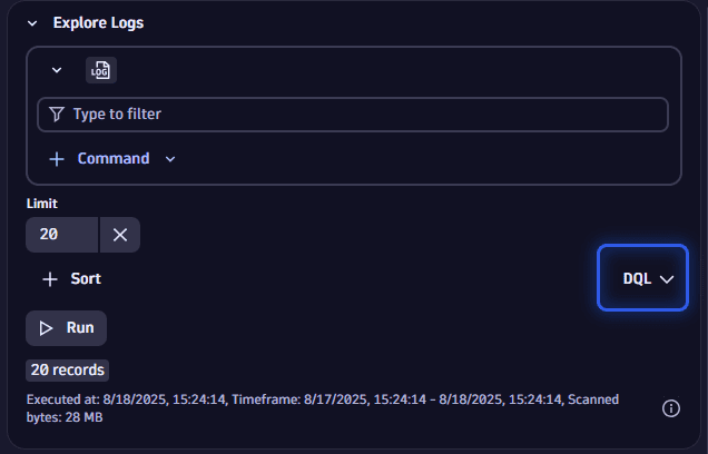
Inspect the results (initially, results are automatically fetched).
Done. You have fetched the first 20 log lines with just a few clicks.
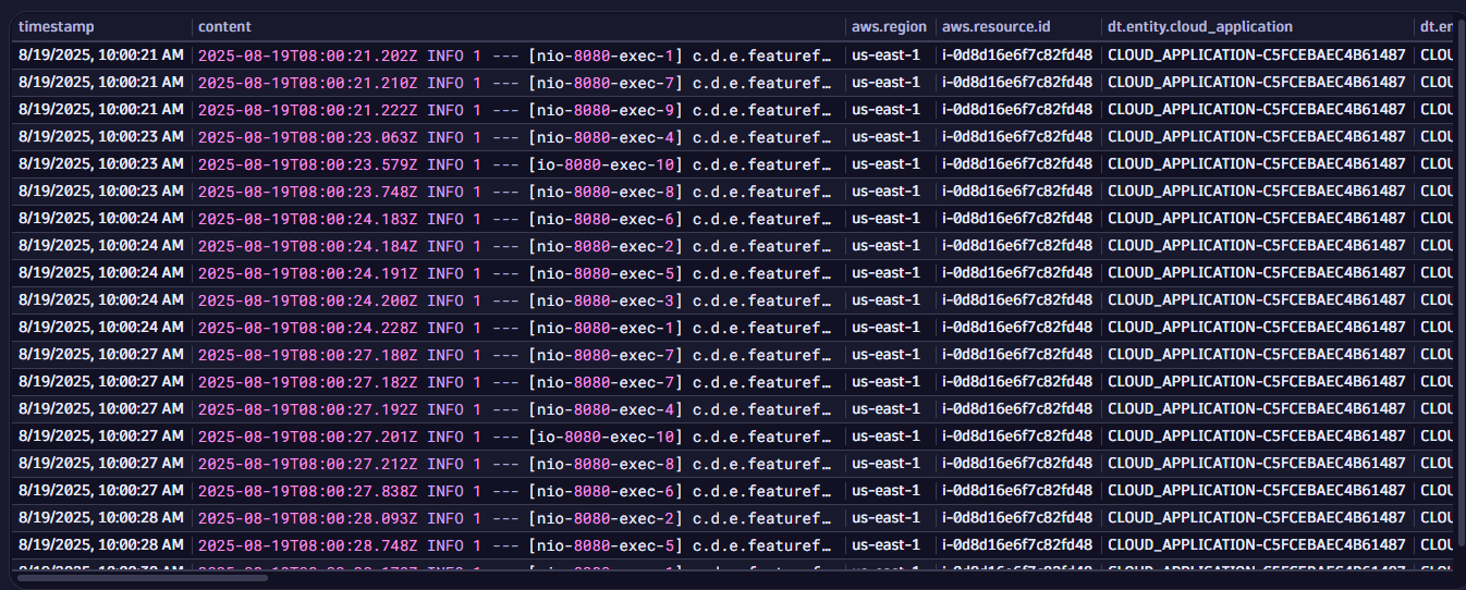 Explore logs example: default results
To make it more useful, now click in the box to get filter suggestions.
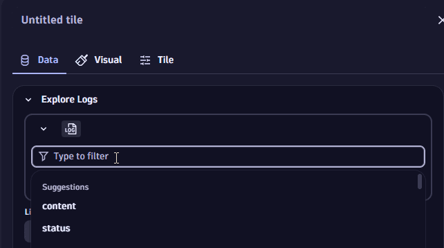 Explore logs example: select filter
Filter suggestions are available for any field apart from content.
Filter by log.source
Starting from the previous example, let's add a log.source filter to return only those logs where the log.source field contains a certain string.
To do this, we need to specify
- A field, in this case log.source, in the filter
- A desired operator, such as
= - A filter value (a string that needs to occur somewhere in the log.source field)
-
Insert your cursor in the filter field and start typing log.source, or search for it via the search at the top of the suggestions, and select it.
-
Add
=as an operator by either selecting it from the suggestions from the auto complete or by typing it. -
Enter the string you want to search for.
For this example, enter
oneagentto get all logs where the log.source field containsoneagent. -
Add
*a wildcard before and after your filter term such that the results are restricted to logs where the log.source field containsoneagentinstead of only considering exact matches. -
Select Run and inspect the results.
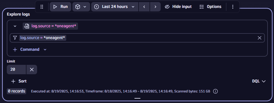 Explore logs example: filter by log.source = oneagent
Filter by content
Starting from the previous example, let's add a content filter to focus on logs where the content contains the string crash (and, because we are starting from the previous settings, where the log.source field contains oneagent).
-
Insert your cursor in the filter field immediately after the previously added log.source filter and either select content from the suggested fields or type it in.
-
Add
=as an operator by either selecting it from the suggestions from the auto complete or by typing it. -
Enter the string you want to search for.
If you are using
Dashboards, you can also reference existing variables by entering a $sign and selecting the desired variable. In this example, we are looking for logs that contain the stringcrashsomewhere in the content, so entercrash. -
Add
*a wildcard before and after your filter term such that the results are restricted to logs where the content field containscrashinstead of only considering exact matches. -
Select Run and inspect the results.
Now the results are restricted to logs where the log.source field contains
oneagentand the content contains the stringcrash. If you want to search for all occurrences where either one or the other filter applies, add anORbetween the two filters.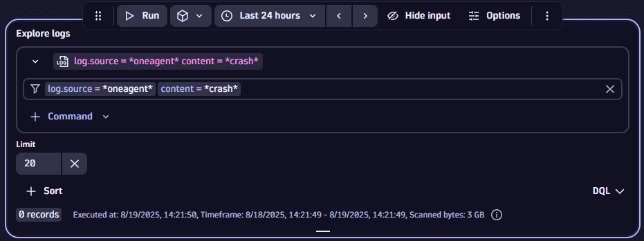 Explore logs example: filter by log.source = oneagent, content = crash
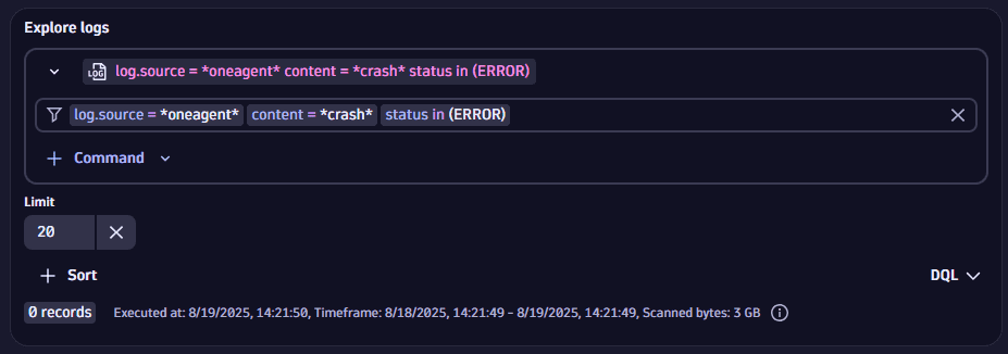
Filter by status
Starting from the previous example, let's add a status filter to focus on logs that contain status strings (and, because we're building on the previous settings, where the log.source field contains oneagent and the content contains the string crash).
- Insert your cursor in the filter field immediately after the previously added content filter and either select
statusfrom the suggested fields or type it in. - Add
inas an operator by either selecting it from the suggestions or by typing it. - Enter all statuses you want to filter by. Either use the value suggestions provided or type them in, separated by commas.
- Select Run and inspect the results.
Summarize
To summarize your results
-
Open the Command menu and select Summarize.
-
Specify how you want to summarize the results.
You can choose between aggregation options and you can select the field by which the results are aggregated.
Convert to time series
You can convert log-based events to a time series format appropriate to be visualized with graph visualizations. This is done by counting occurrences of fields specified for each timeslot.
To convert log-based events to a time series format
- Open the Command menu and select Convert to time series.
- After you select Convert to time series, use the dropdown menu to select the field you want to count the occurences of the logs by. The time slots are automatically adjusted to the timeframe selected on top of the dashboard or for the respective section in a notebook.
Bucketize
The bucketize command is used to group metric data into fixed-size ranges (buckets) for histogram visualizations. It defines the bucket size, which directly influences the granularity and scale of the x-axis in the chart.
- Open the Command menu and select Bucketize.
- Select the field for which you want to create the buckets.
- Set the Bucketize value.
Sort
To sort your results
-
Select Sort.
-
After you select Sort, use the Sort by menu to select the field you want to sort by, and to choose whether you want the results in ascending or descending order.
value.Ais selected by default- Sort applies to all metrics included in the query
Limit
To change the limit of your results, change the value of Limit to the maximum number of records you want to return.
If the Limit setting is not displayed, Limit and then set the value.
Metrics
Add
This exploration functionality is the same in Dashboards and Notebooks. We use Notebooks in these examples.
-
Open
Notebooks and select Notebook in the app header to create a new notebook. -
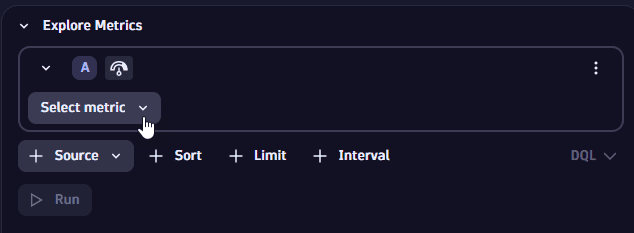
In the empty notebook, open the Add menu and select Metrics.
-
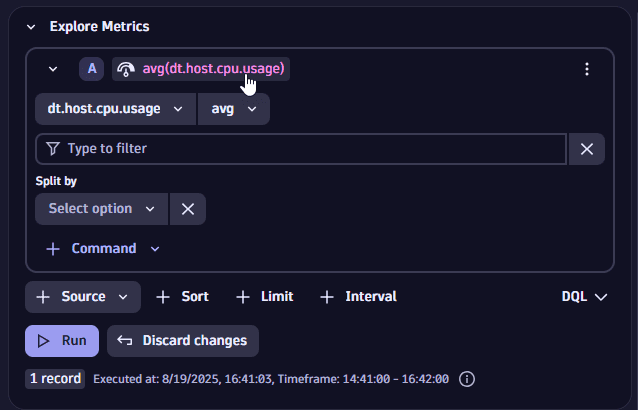
Use the metric selector to select the metric you want to explore.
 Explore metrics example: select metric
For example, if you want to explore a metric for Kubernetes workloads, you can search for the string or use the menu to find what you want.
How to search for a string and select a matching metric
In this example, we searched for
cpu usageand selected the best match.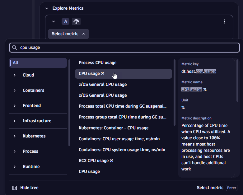 Explore metrics example: search for metric
In this example, we used the menu to find All > Infrastructure > CPU and then selected the best match.
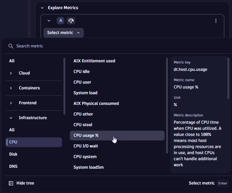 Explore metrics example: browse for metric
Additional options are displayed after you select a metric.
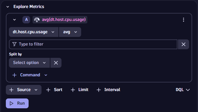 Explore metrics example: additional options after you select a metric
 -
Select Run to see what we have so far.
Without making any additional settings, we get this line chart of the metric average over time.
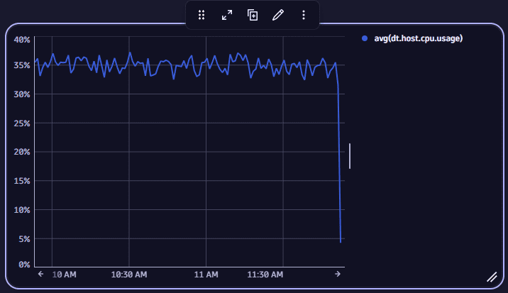 Explore metrics example: default chart after selecting metric
Additional metric-specific options
To see additional options for a metric, use the metric-specific menus.
Metric-specific commands:
Global commands:
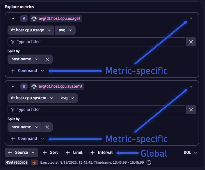
Add another metric or expression
- To add another metric, select the global menu and then Metric.
- To add an expression, select the global menu and then Expression.
Hide or show
If you still aren't finished and you want to keep configurations for potential latter adjustments, you can hide or show selected metrics or expressions.
- To hide a metric or expression from the result, select the menu for that metric or expression and then select Hide. This removes the metric from the underlying DQL query.
- To show it again, select the menu for that metric or expression and then select Show.
Duplicate
To make a copy of a metric or expression that you have already added, select the menu for that metric or expression and then select Duplicate. Edit the copy as needed.
Delete
To remove a metric or expression from your query, select the menu for that metric or expression and then select Delete.
Filter
Starting from the previous example, let's add a host.name filter to focus on specific hosts, where the host.name field contains a certain host name.
-
Select the metric-specific menu and then select Filters.
-
Insert your cursor in the filter field and either select host.name from the suggested fields or type it in.
-
Add
=as an operator by either selecting it from the auto-complete suggestions or by typing it in. -
Enter a host name you want to filter by or use one of the value suggestions provided.
-
Select Run and inspect the results.
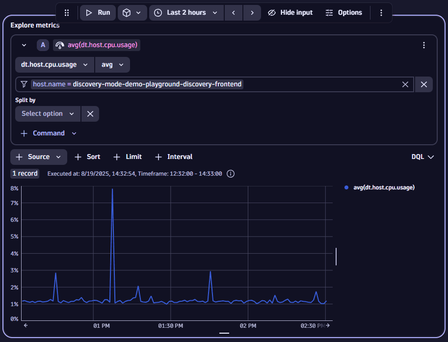 Explore metrics example: Filter by host
Note: As an alternative to using auto-enriched fields such as host.name or k8s.pod.name, names and tags are automatically offered as additional filter values for each entity contained in your data. For example, if your data contains the entity dt.entity.host, the two additional fields dt.entity.host.name and dt.entity.host.tags are offered in the field suggestions for you to use as a filter.
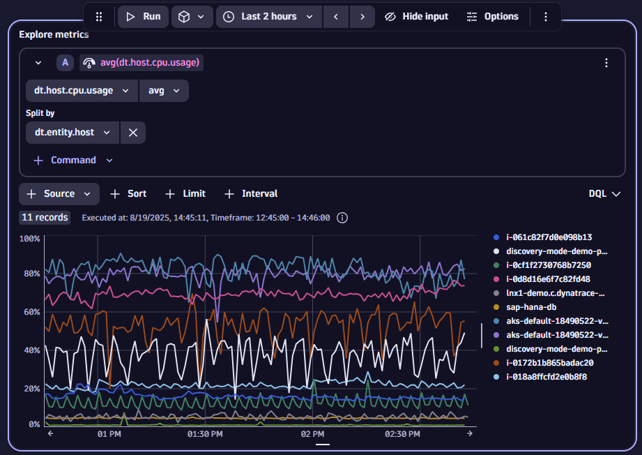
Split by (Aggregate)
If Split by isn't displayed
- Open the Command menu for the metric and then select Split by.
- Use the Split by menu to make your aggregation selection.
To see the same metric by host, we can aggregate on (Split by) dt.entity.host and then select Run again.
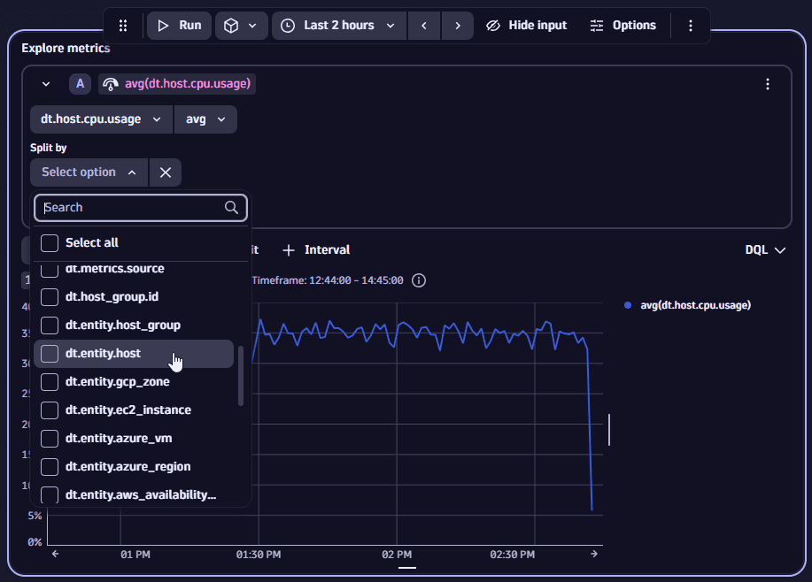
Now we get a separate line per host.
Compare to previous period
To shift the metric to a previous period and add it for comparison
- Select the metric-specific menu and then select Compare to previous period.
- Under Compare to previous period, enter the number and select the unit (seconds, minutes, hours, or days) for the relative time shift.
Default value
To replace null values in your time series data with a default value
- Select the metric-specific menu and then select Default value.
- Under Default value, enter a positive or negative numerical integer value that is used to replace null values.
Rate
To visualize the rate at which a metric is changing
- Select the metric-specific menu and then select Rate.
- Use the Rate menu to select a rate: Per Second, Per Minute, Per Hour, or Per Day.
Reduce to single value
To make your results suitable for certain visualizations such as Single value, Table, or Categorical bar chart
- Select the metric-specific menu and then select Reduce to single value.
- Use the Reduce to single value menu to select the value.
This reduces the time series data to a single scalar value over the selected timeframe and adds this as a new column called value that can then be used to properly map the results to your visualization.
Alias
You might want to rename (add an alias to) a metric to make it more readable.
- Adding an alias gives the metric a more convenient alternate name for you to use in the current dashboard tile or notebook section. Instead of the raw metric name, the alias is displayed in your query definition and in the resulting dashboard tile or notebook section.
- Adding an alias doesn't affect the actual name or value of the metric, and it doesn't change how others see the metric. It doesn't even change the metric name in other dashboard tiles or notebook sections in the current document.
To add an alias for metric
-
Select the metric in your query definition. This makes the name of the metric editable.
 Explore metrics example: select metric to add alias
 -
Type an alias and press Enter.
In this example, we added the metric
avg(dt.host.cpu.usage)to our query, and now we want to give it a simpler alternative name, such asAverage host CPU usage, to display instead ofavg(dt.host.cpu.usage)in your notebook section or dashboard tile.Technical detailsExpand DQL in your query definition to see how your alias is handled in DQL.
Bucketize
The bucketize command is used to group metric data into fixed-size ranges (buckets) for histogram visualizations. It defines the bucket size, which directly influences the granularity and scale of the x-axis in the chart.
- Open the Command menu for the metric and select Bucketize.
- Set the Bucketize value.
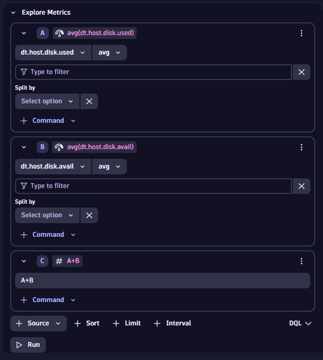
Expressions
Add expressions to apply arithmetic based on your selected metrics.
-
Add the metrics you want to base your expression on.
For example, to calculate the total capacity of all your disks, we can select:
- dt.host.disk.used as our first metric,
A - dt.host.disk.avail as our second metric,
B.
- dt.host.disk.used as our first metric,
-
Select the global Source menu and then select Expression.
-
Define your expression by combining references from
- Defined metrics such as
A,B, andC - Supported mathematical and logical operators such as
+,-,/,*,(, and)
For example, to calculate the total disk capacity, we simply add both metrics together using
A+B - Defined metrics such as
-
Select Run and inspect the results.
Sort
To sort your results
-
Select Sort.
-
After you select Sort, use the Sort by menu to select the field you want to sort by, and to choose whether you want the results in ascending or descending order.
value.Ais selected by default- Sort applies to all metrics included in the query
Limit
To focus our exploration, we can set a limit on the results returned. If you add multiple metrics to your query, the limit applies to all of them.
-
Select Limit to add a Limit.
-
Set Limit to the maximum number of records we want to return. In this case, we set the limit to 5, and then we ran it again to see the following results.
Interval
The interval defines the time granularity for metrics, determining how data is grouped and aggregated over time. It is expressed as a duration of each time slot (for example, 1h, 5m) for aggregating data points.
If you add multiple metrics to your query, the interval applies to all of them, ensuring consistency in data granularity across all metrics.
- Select Interval to add an Interval selector to your query.
- Select an interval.
For details on how an interval is used in DQL, see timeseries.
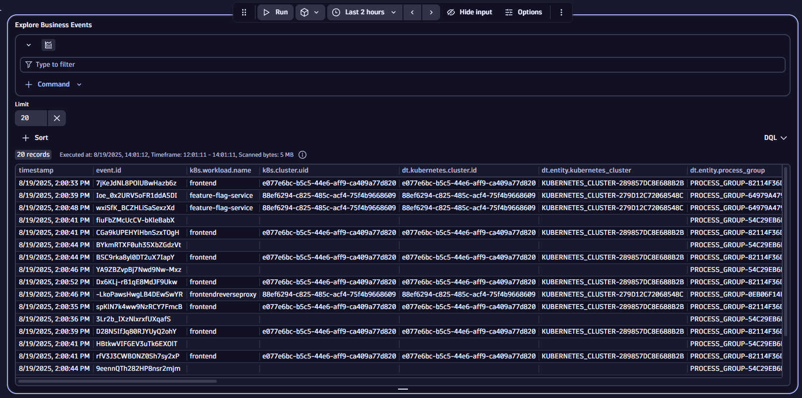
Business events
This exploration functionality is the same as described for logs.
To start exploring business events
- Open Dashboards or Notebooks and select in an empty notebook or the document header of a dashboard.
- Select Business Events to add a section or tile based on it.
- Inspect the results (if no results are initially displayed, select Run).
Done. You have fetched the first 20 business events with just a few clicks.
To make it more useful, now click in the box to get filter suggestions.
Filter suggestions are available for any field apart from content.
Filter by event.provider
Let's add an event.provider filter to return only those business events where the event.provider field contains a certain string.
To do this, we need to specify
- The field you want to filter by
- The operator that decides how the filter is applied
- The filter value (a string that needs to occur somewhere in the event.provider field)
- Insert your cursor in the filter field and either select event.provider from the suggested fields or type it in.
- Add
=as an operator by either selecting it from the suggestions or by typing it in. - Enter an event provider you want to filter by.
- Select Run and inspect the results.
Now the results are restricted to logs where the event.provider field contains our filter value.
Filter by event.type
Now let's further refine exploration by specifying an event type.
- Insert your cursor in the filter field immediately after our previously added event.provider filter and either select event.type from the suggested fields or type it in.
- Add
=as an operator by either selecting it from the suggestions or by typing it in. - Enter the event type you want to filter by.
- Select Run and inspect the results.
Now the results are restricted to business events where the event.provider and event.type match our filter values.
Summarize
To summarize your results
-
Open the Command menu and select Summarize.
-
Specify how you want to summarize the results.
You can choose between aggregation options and you can select the field by which the results are aggregated.
Convert to time series
You can convert log-based events to a time series format appropriate to be visualized with graph visualizations. This is done by counting occurrences of fields specified for each timeslot.
To convert log-based events to a time series format
- Open the Command menu and select Convert to time series.
- After you select Convert to time series, use the dropdown menu to select the field you want to count the occurences of the logs by. The time slots are automatically adjusted to the timeframe selected on top of the dashboard or for the respective section in a notebook.
Bucketize
The bucketize command is used to group metric data into fixed-size ranges (buckets) for histogram visualizations. It defines the bucket size, which directly influences the granularity and scale of the x-axis in the chart.
- Open the Command menu and select Bucketize.
- Select the field for which you want to create the buckets.
- Set the Bucketize value.
Sort
To sort your results
-
Select Sort.
-
After you select Sort, use the Sort by menu to select the field you want to sort by, and to choose whether you want the results in ascending or descending order.
value.Ais selected by default- Sort applies to all metrics included in the query
Limit
To change the limit of your results, change the value of Limit to the maximum number of records you want to return.
If the Limit setting is not displayed, Limit and then set the value.
Explore other areas
In the previous sections, we have shown how to use the Prompt for AI-based exploration, and how to explore Metrics, Logs, and Business Events through our point-and-click UI.
You can also explore the following areas in similar fashion:
- Events
- Problems
- Traces
- User sessions
- Security events
- User events
In all cases, the functionality is similar.
- Go to Notebooks or Dashboards.
- Create a new notebook or dashboard.
- Select and choose one of the above options (for example, Events) to add a corresponding notebook section or dashboard tile.
- Inspect the results. If no results are initially displayed, select Run.
From that point, you can apply what you've learned from the previous examples to focus your exploration.
Query Grail
When you're exploring data, you're automatically creating a DQL query that you can view, copy, and use as the basis of more complex queries.
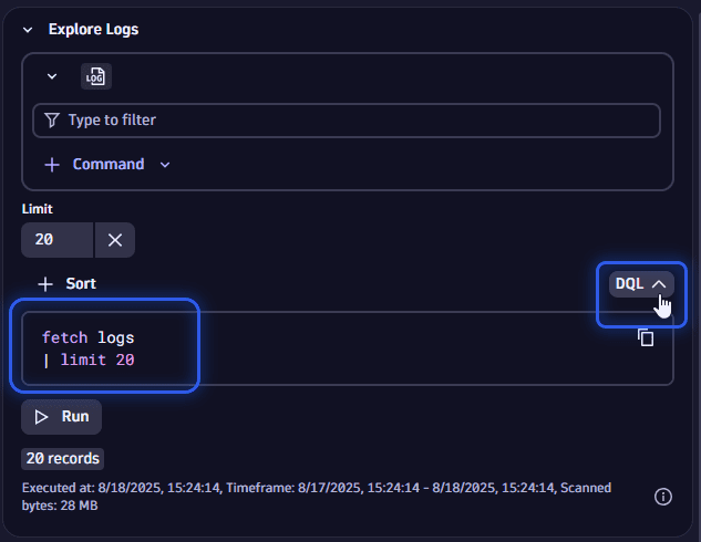
Show DQL
To see the DQL that is created automatically during your exploration with the point-and-click interface, select DQL. This shows you the DQL that you can copy and use elsewhere.
Create a DQL query
When you're satisfied with the results but want to advance with more complex DQL commands, you can easily create a standard notebook section or dashboard tile based on it.
-
Open the menu and select Create DQL section or Create DQL tile
-
Edit the resulting query section or tile as needed.
-
If you no longer need the UI-constructed version, you can delete it and just use the duplicate notebook section or dashboard tile with the DQL query.
The result of this step is equivalent to
- Open the menu and select DQL.
- Write a DQL query (without UI assistance) to do everything you did in the previous examples.
That's what makes this a great tool for beginners and experts.