User behavior analysis
- Dynatrace Classic
- How-to guide
- 5-min read
- Published Jul 11, 2019
The User behavior analysis section displays a number of key performance metrics regarding user behavior, like bounces, top landing and exit pages, conversions and many more. Just expand the User behavior analysis section of the infographic on the application overview page to view the user behavior analysis options.
The infographic
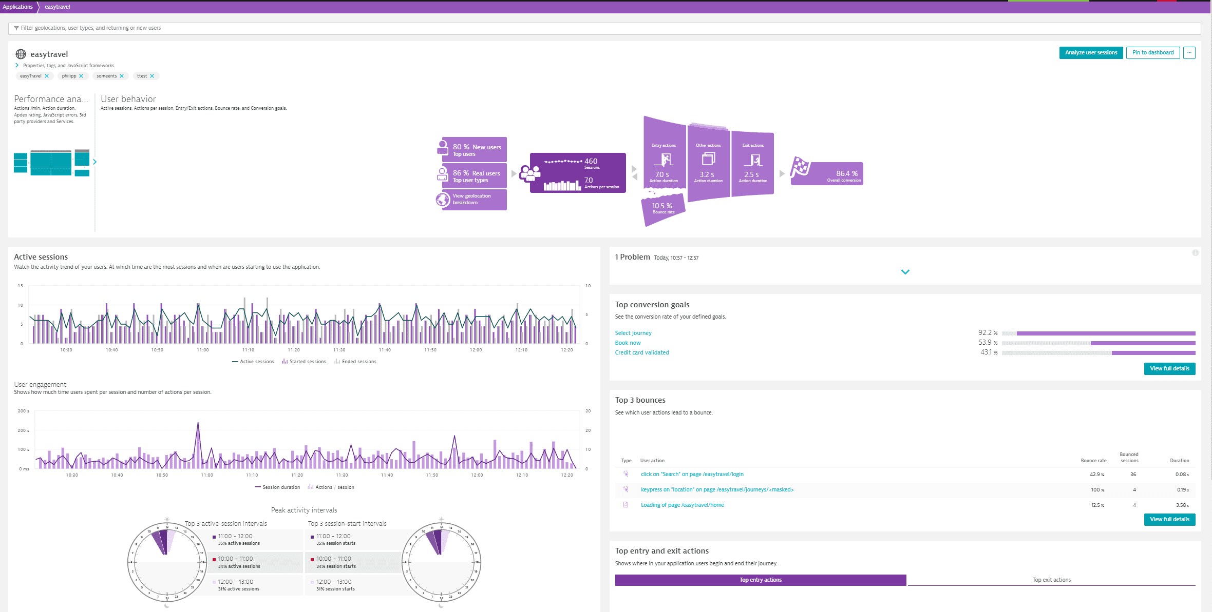
Each area of the infographic appearing at the top is clickable, offering access to deeper detail regarding each metric. Whenever you select a part of the infographic, the left section right below the infographic shows different data that reflect the selected part. The discrete infographic parts are briefly described below.
Top users
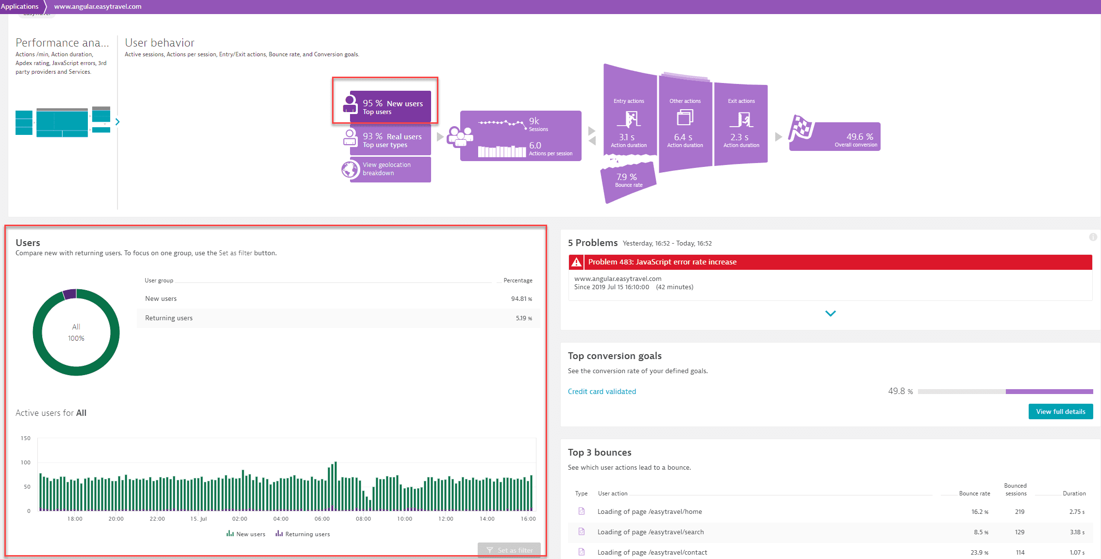
If you select the Top users tile of the Infographic, you will get the Users section in the left part under the infographic, where you compare new with returning users. To focus on one group, select Set as filter.
A returning visitor is determined via a cookie that is persisted in the end user's browser. The cookie is valid for 2 years. Should a user come back to your web application after 2 years, they will be considered a new user. This allows you to understand and drive the caching strategy for your web application. The more returning users you have, the more effective your caching strategy can be. Should the graph not contain any returning users, have a look at the data privacy settings of your application. Ensure that the switch that allows placement of this cookie is enabled.
Top user types
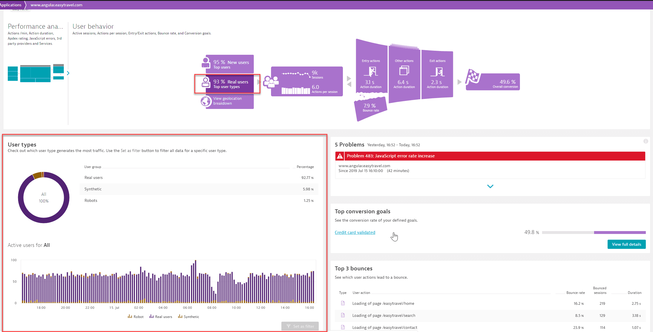
In the Top user types section, you can check out which user type—Real users, Synthetic, or Robots like Googlebot—generates the most traffic. Select Set as filter to filter all data for a specific user type.
Geolocation breakdown
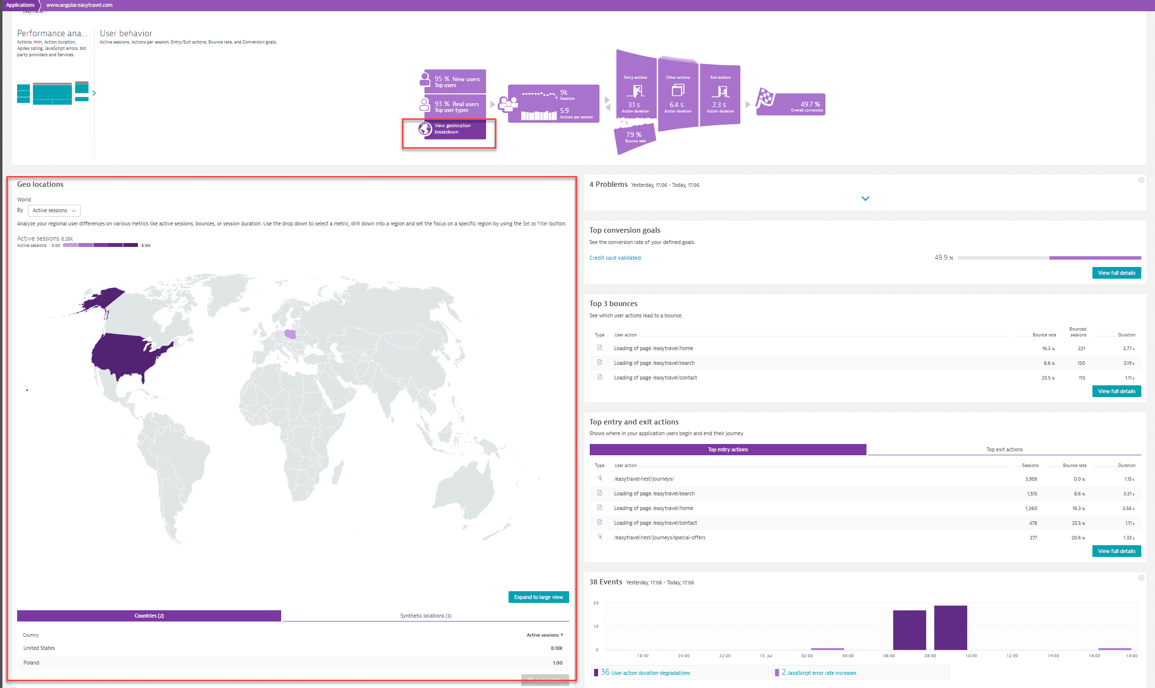
By selecting Geolocation breakdown you can analyze your regional user differences across various metrics like active sessions, bounces, or session duration. Use the dropdown list to select a metric, drill down into a region and set the focus on a specific region by selecting Set as filter. The world map can also be enlarged.
Sessions
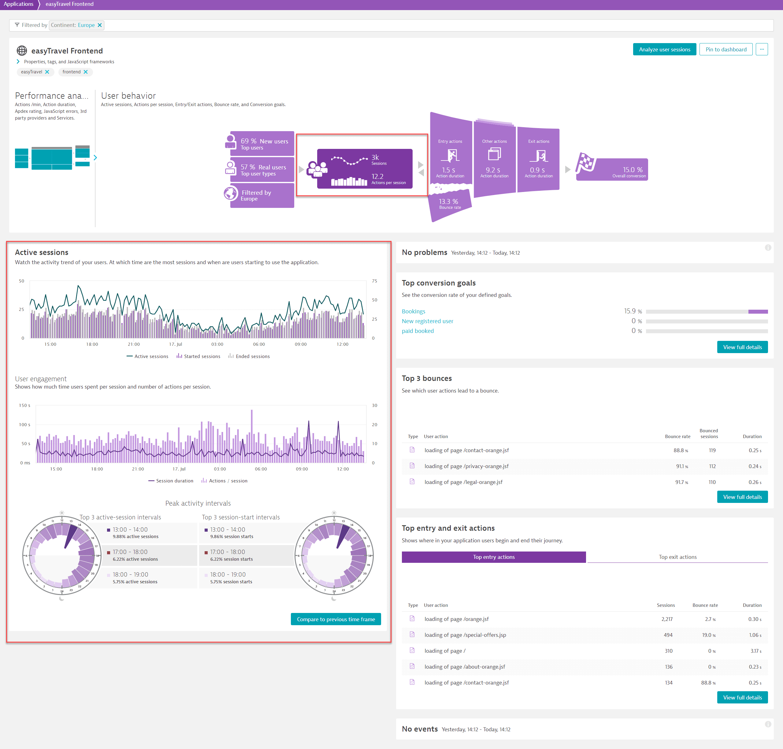
If you select the Sessions section in the middle of the infographic, you can view the Active sessions section in the section on the left, under the infographic. This section shows you at which time the most sessions occur and when users are using your application. In the lower part of the section, you can view the 3 intervals that have the highest number of active sessions (Top 3 active-session intervals) as well as the 3 intervals that have the highest number of session starts (Top 3 session-start intervals).
Entry actions
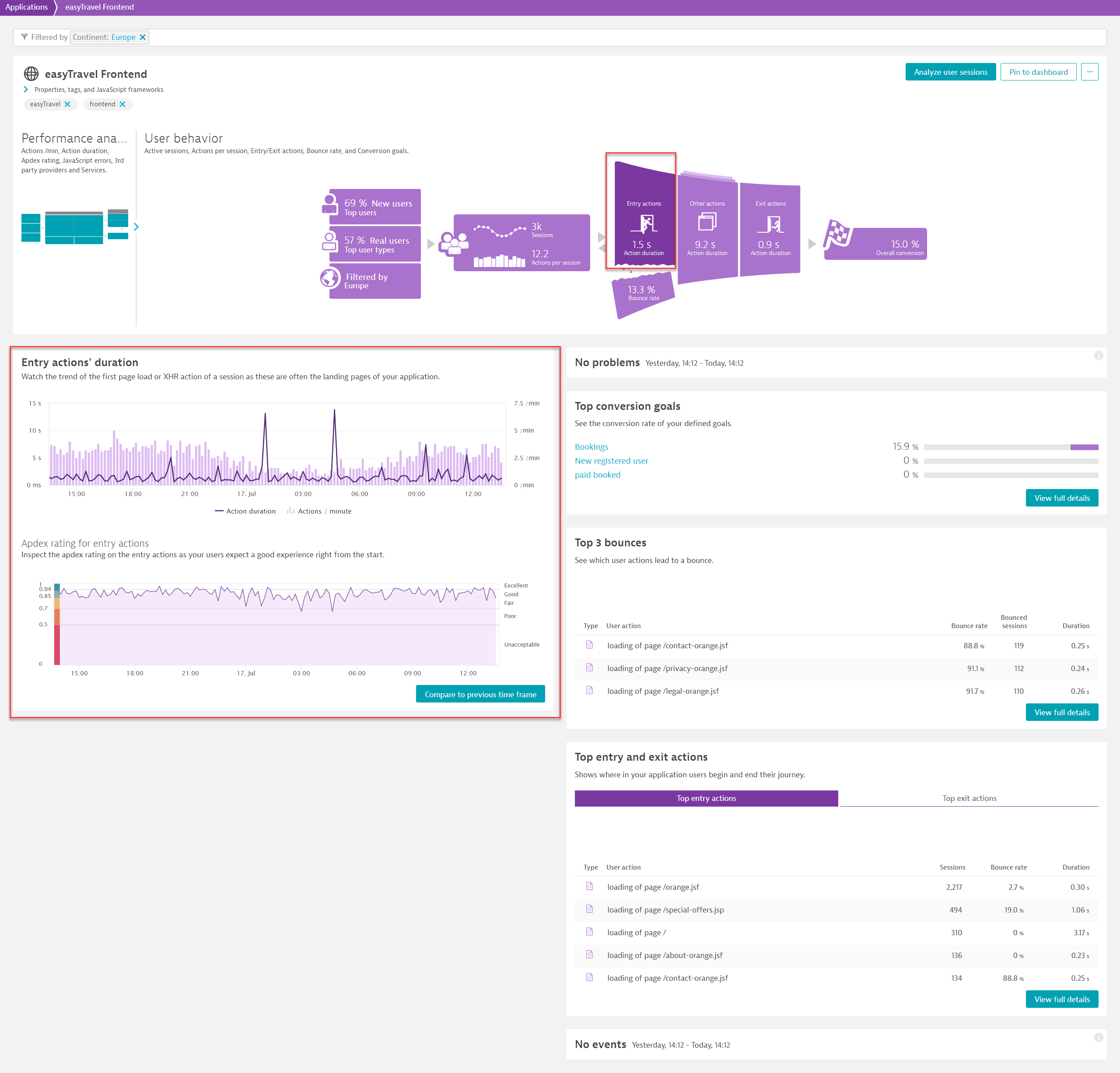
By selecting Entry actions, you can analyze the Entry actions' duration. It's important to watch the trend of the first page load or XHR action of a session as these are often the landing pages of your application. You can also inspect the Apdex rating on the entry actions as your users expect a good experience with your application right from the start.
Exit actions
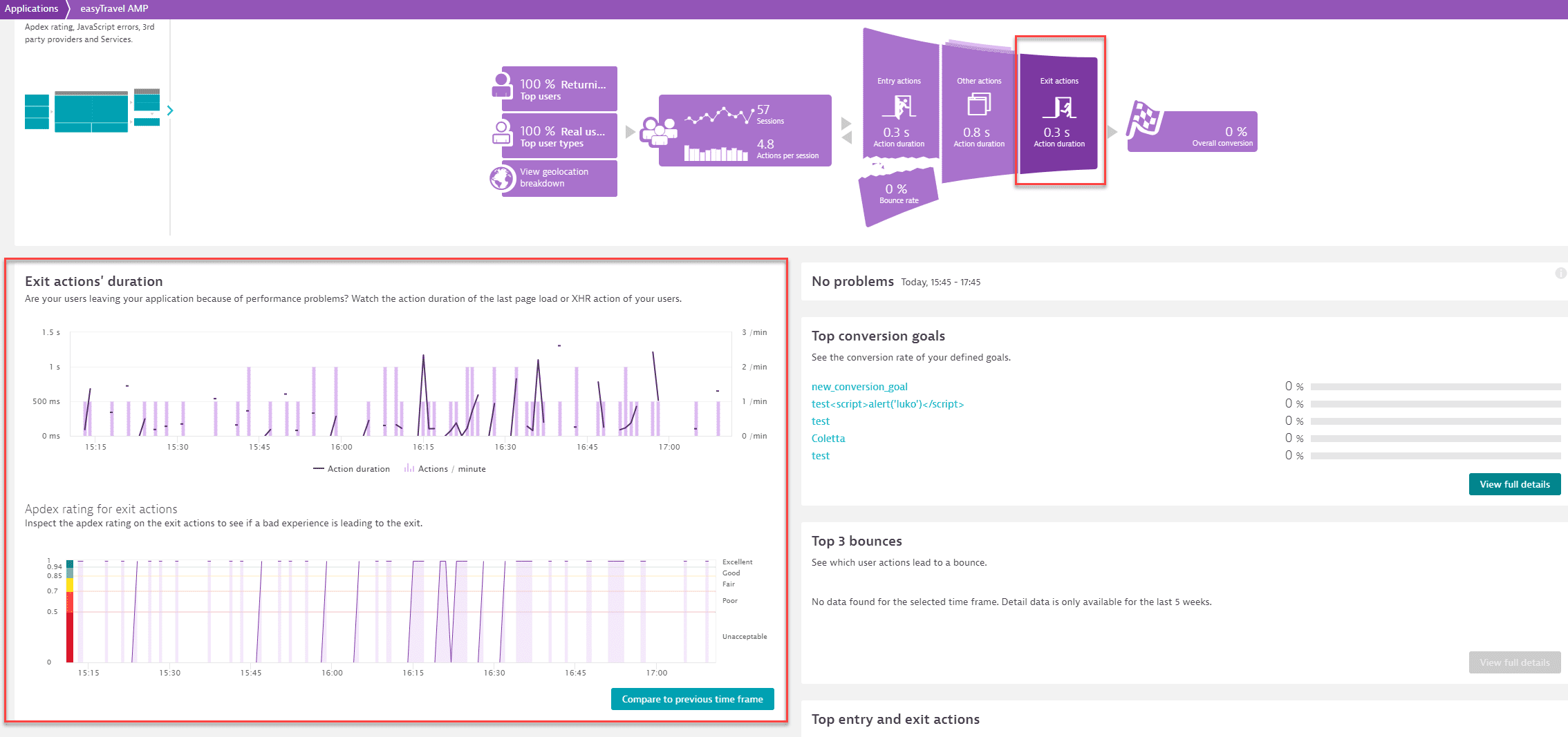
By selecting Exit actions, you can analyze the Exit actions' duration. Watch the action duration of the last page load or XHR action of your users so that you can identify whether your users leave your application because of performance problems. You can also inspect the Apdex rating on the exit actions to see if a bad experience is leading users to exit.
Other actions
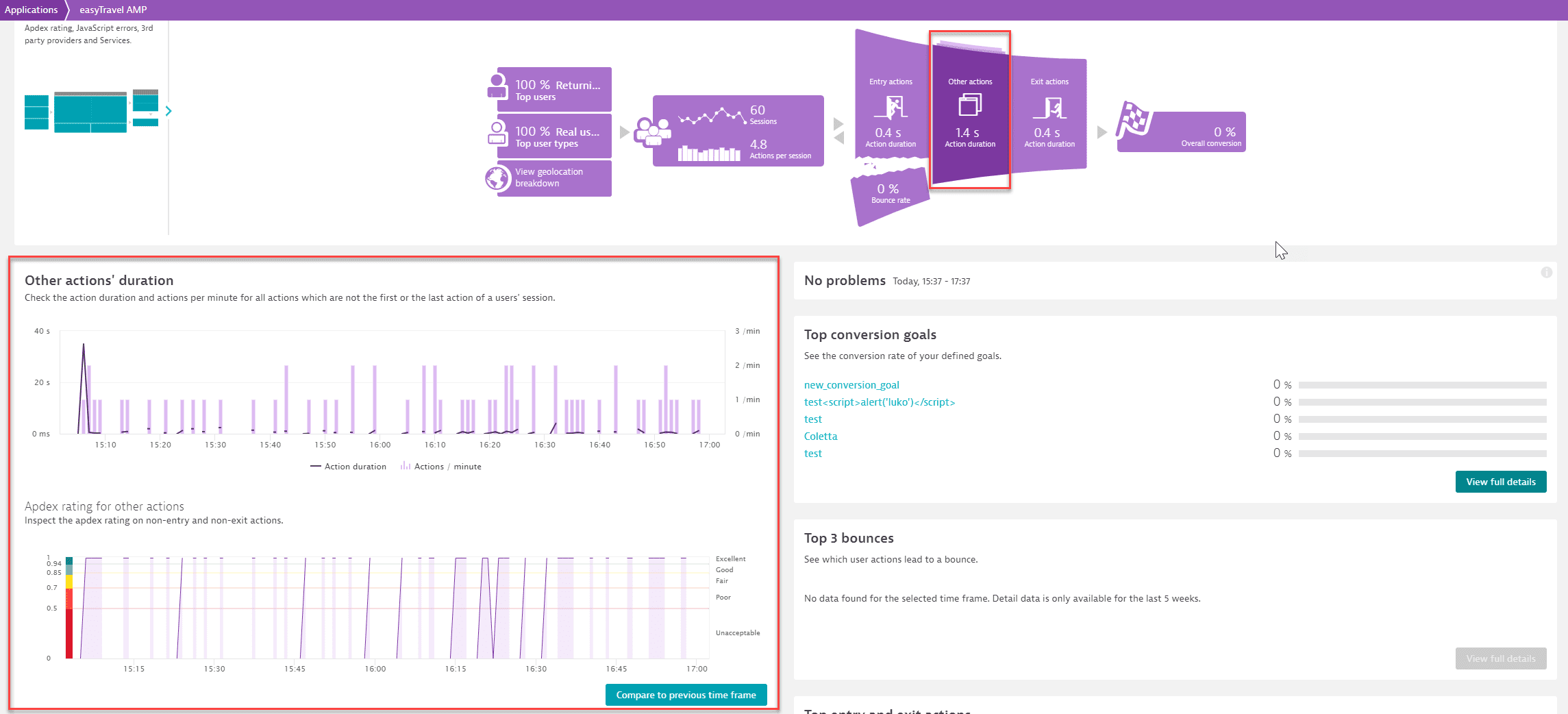
By selecting Other actions, you can analyze the Other actions' duration, which is the duration of all actions that aren't the first or the last action of a users' session. You can also inspect the Apdex rating of these actions.
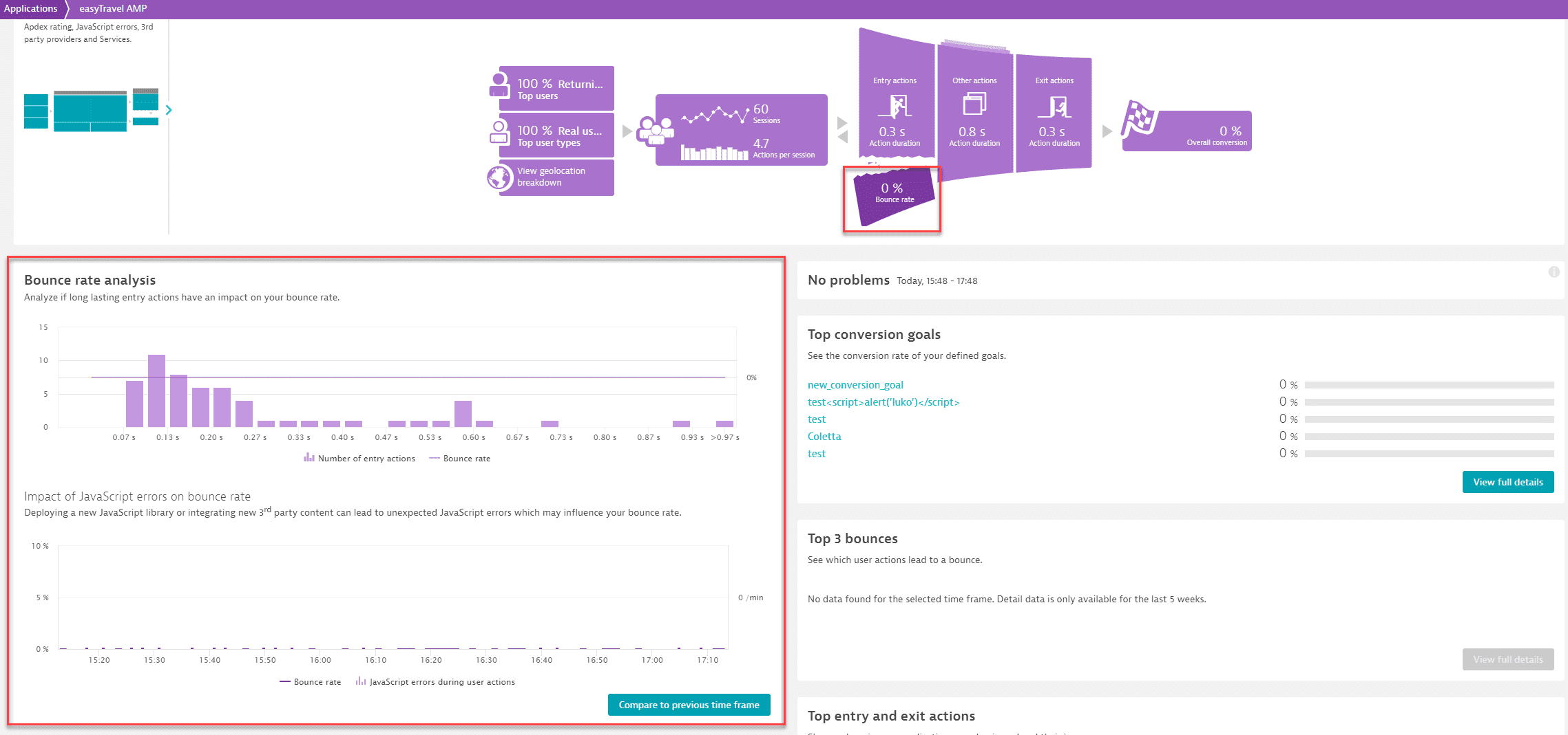
Bounce rate
Select the Bounce rate portion of the infographic, to view Bounce rate analysis. In this analysis, you can check whether long lasting entry actions have an impact on your bounce rate and also you can examine the impact of JavaScript errors on the bounce rate.
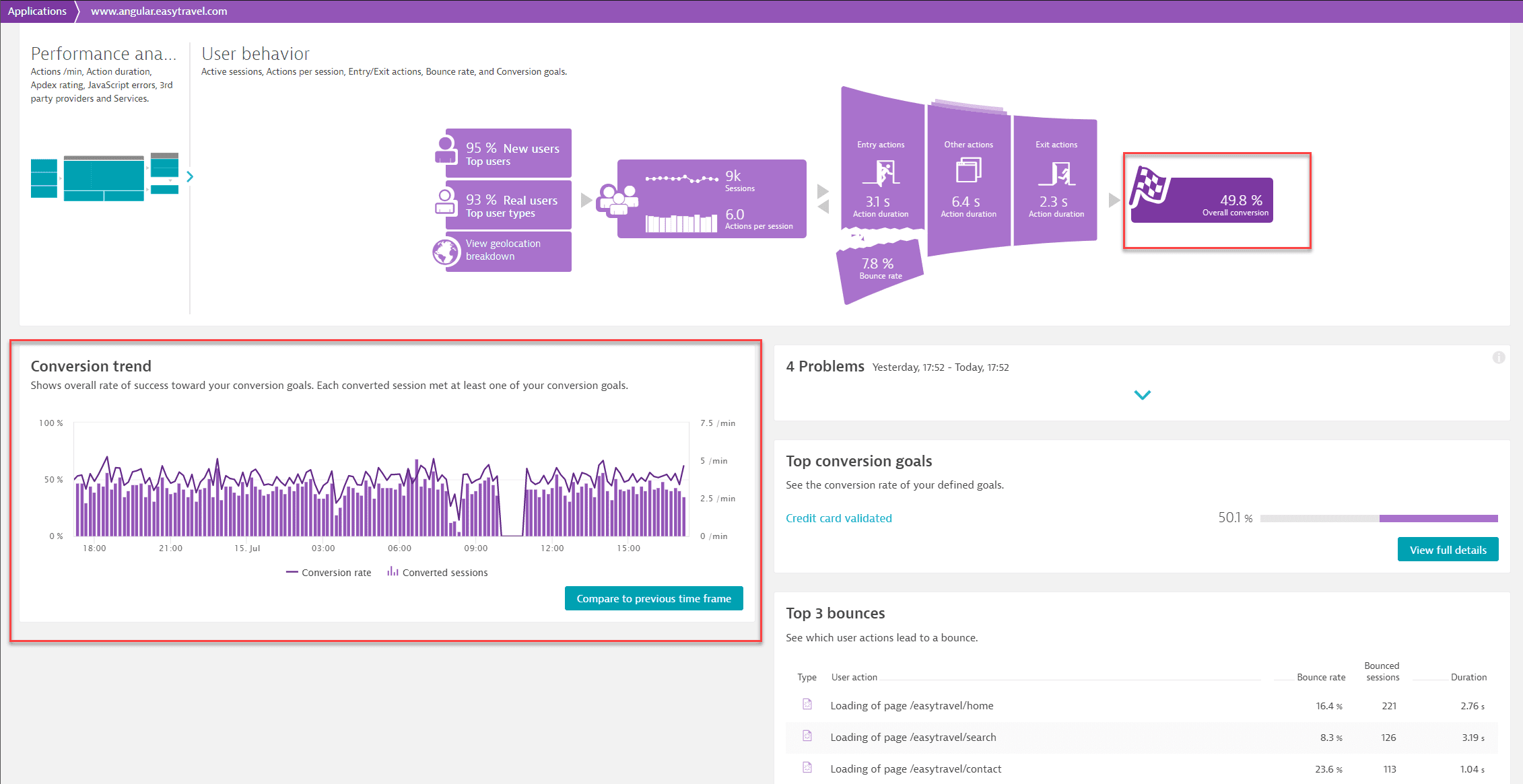
Overall conversion
Select the Overall conversion section of the infographic to view the overall rate of success against your conversion goals. Each converted session met at least one of your conversion goals.
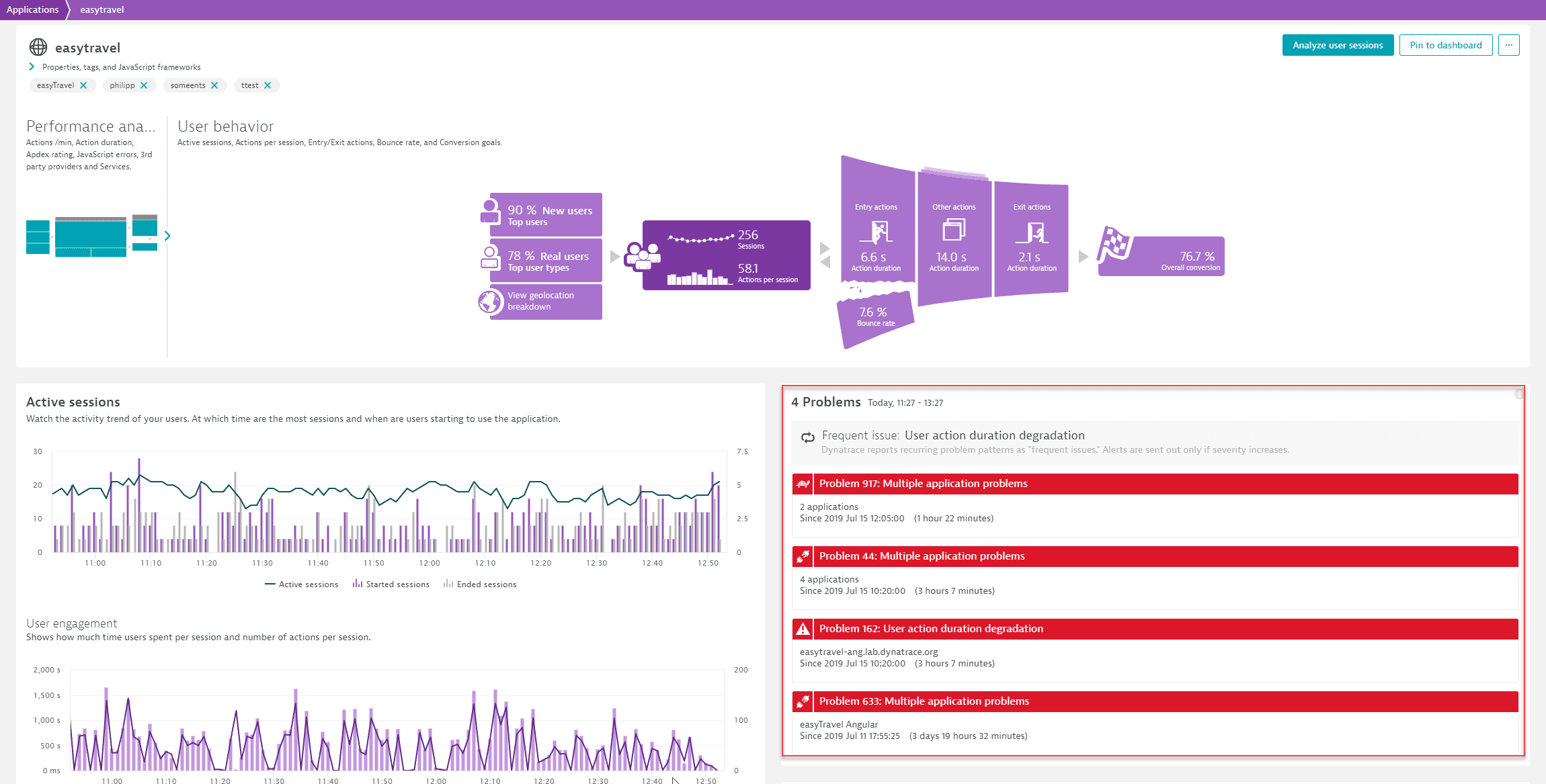
Problems
The Problems section indicates problems that have been automatically detected by Davis, the Dynatrace AI-driven root-causation engine. Just select a problem to learn further details.
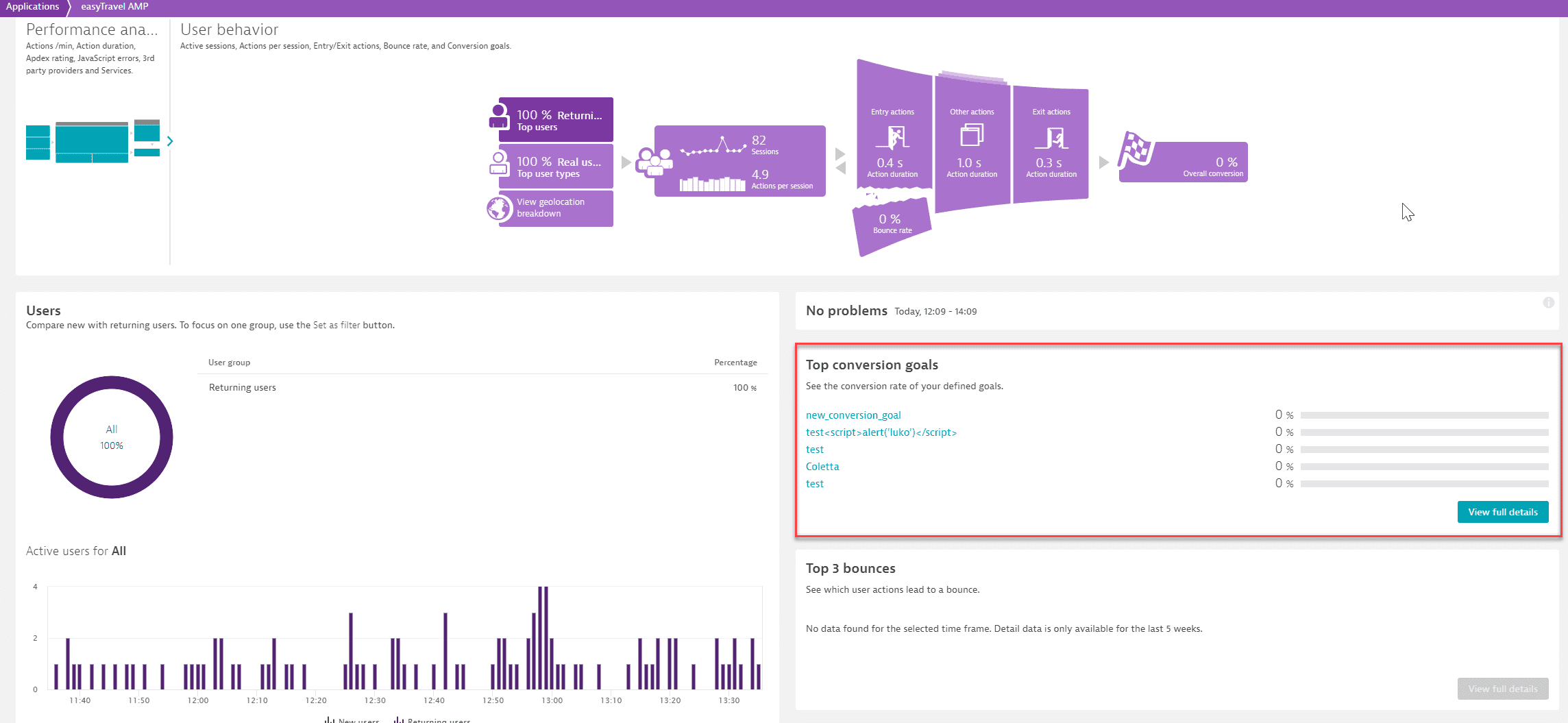
Top conversion goals
The Top conversion goals section shows the conversion rate of your defined goals. Select View full details at the bottom right corner of this section to review overall metrics related to your conversion goals or to analyze progress toward specific goals. Alternatively, you can access the conversion analysis page, if you select a specific conversion goal.
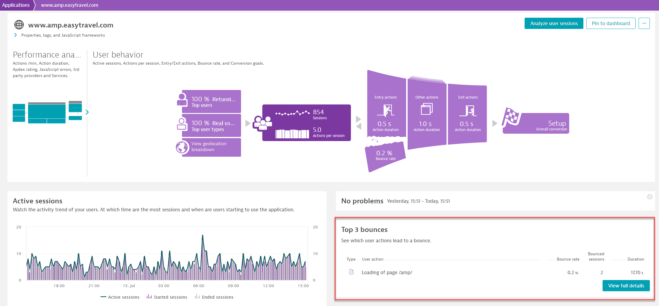
Top 3 bounces
In the Top 3 bounces section, you can see which user actions have the most bounces and compare the duration of bounced actions with the same user actions in sessions where those same actions didn't bounce.
Select View full details to view the full list and associated metrics for each bounce. Here you can compare the durations and JavaScript errors of bounced actions with the same action in other sessions in which the actions didn't bounce.
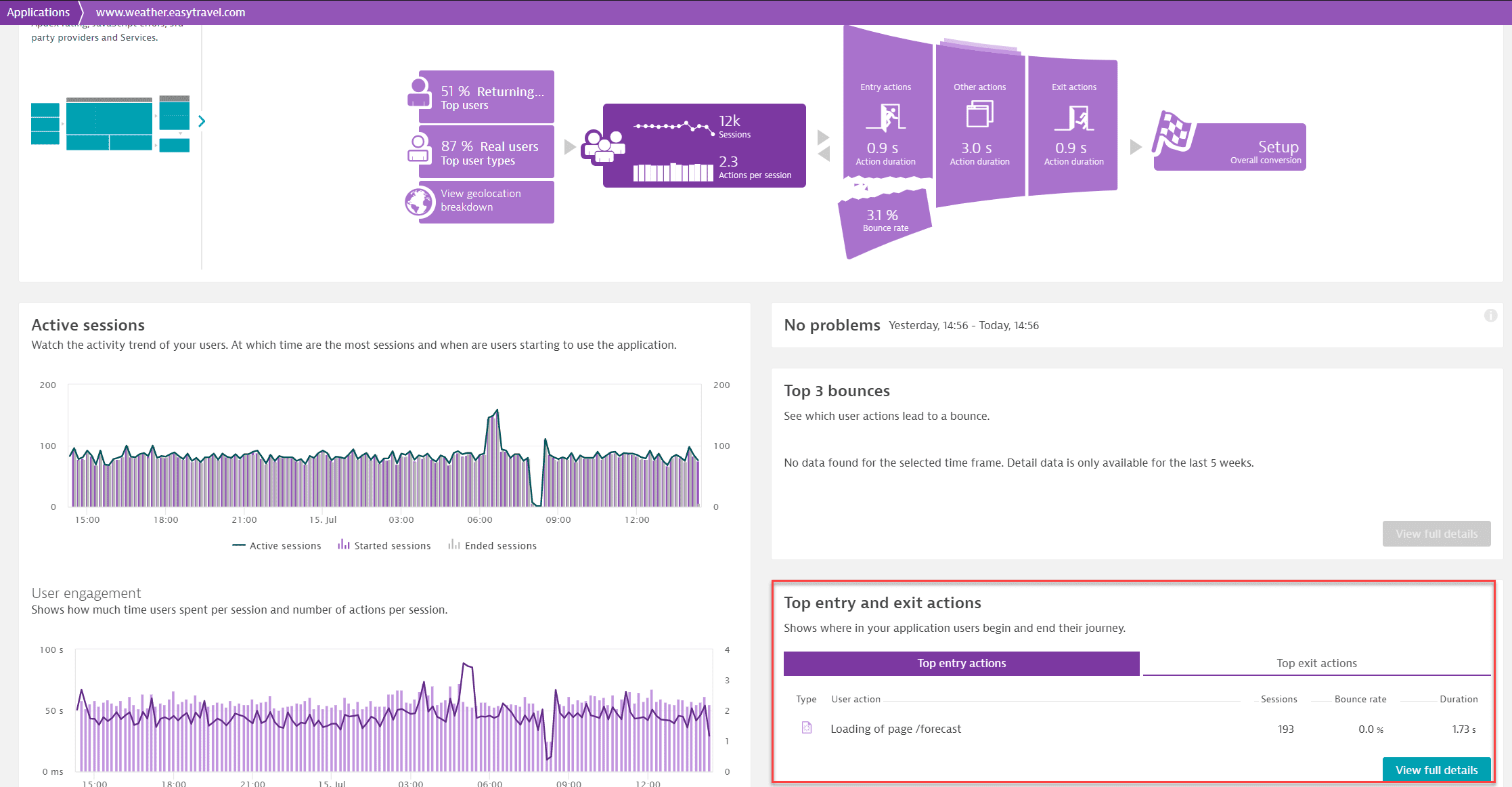
Top entry and exit actions
Ever wondered which of your application's entry and exit actions are the slowest or most popular? Not necessarily the special landing pages that you've set up, but the pages that your users actually use to enter and exit your application?
At the bottom of the application overview page you'll find the Top entry and exit actions section. Select a specific action here or select View full details. You'll find historical trends for all entry and exit actions here.
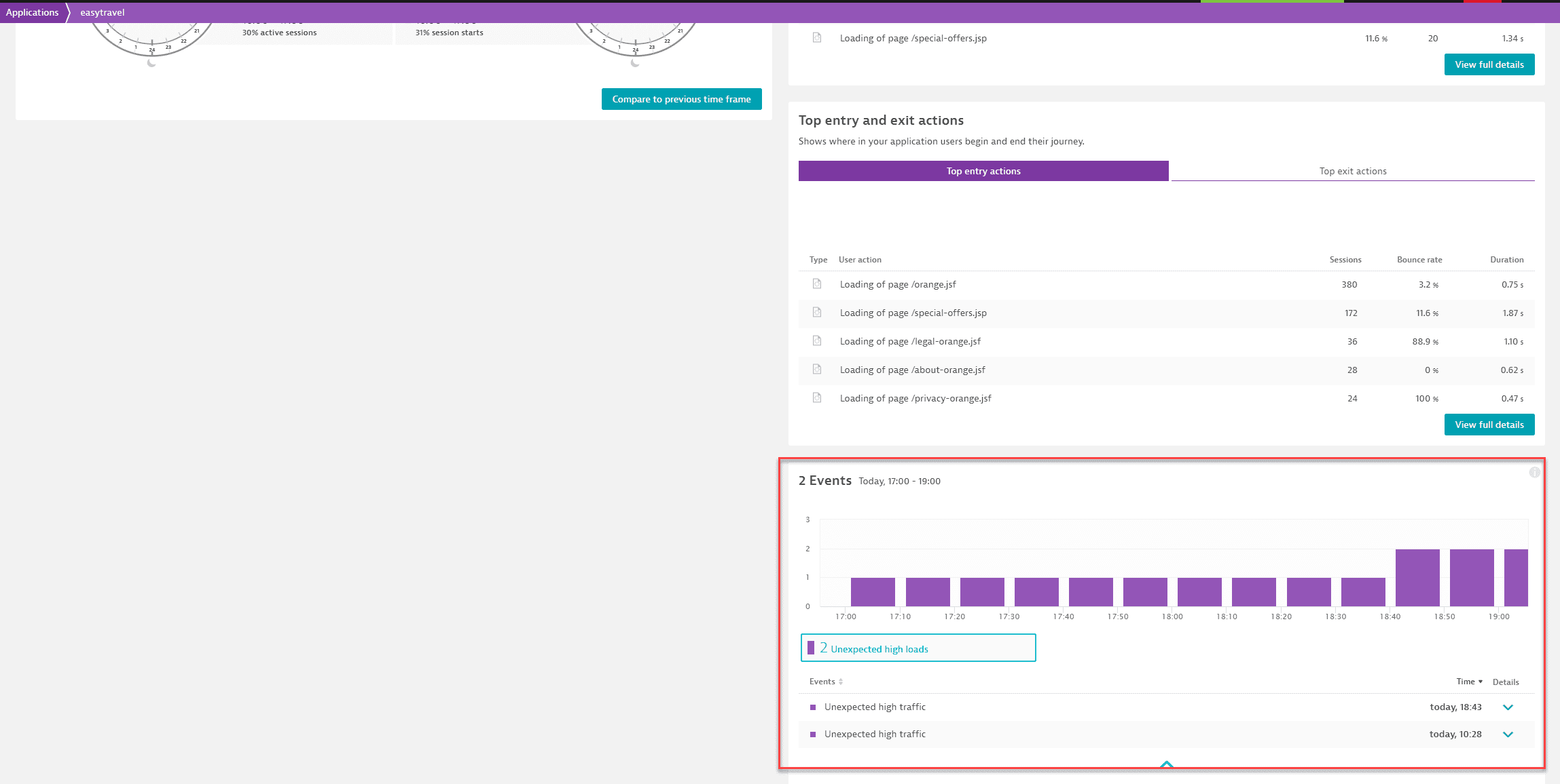
Events
Events represent system incidents that may be of interest to you. Such events include, for example, errors, new version deployments of your application, configuration changes, and more.
