Time series charts
- Latest Dynatrace
- 6-min read
- Published Apr 21, 2023
Time series charts show a series of numeric values collected over time at consistent intervals, such as every minute, hour, or day. The data can be either timestamps (showing only the start time) or timeframes (showing both the start and end times of each data point).
In these charts, both the X-axis and Y-axis are numerical. The X-axis represents the independent variable, while the Y-axis represents the dependent variable. In dual-axis charts, a third variable can be included, which results in a second Y-axis.
Timestamp data
Timestamp data includes only one timestamp (start) per data point.
{start: new Date ("2022-10-01 06:00:00")value: 1500,}
Timeframe data
Timeframe data includes two timestamps (start and end) per data point to represent a duration.
{start: new Date ("2022-10-01 06:00:00"),end: new Date ("2022-10-01 08:00:00"),value: 1500,}
Gaps in time series data
Data gaps appear when data is missing between data points. In time series charts, these gaps appear as empty spaces along a line. To fill these gaps, linear interpolation can be used. This is a configuration option on the chart determined by the app creator.
- In datasets consisting only of timestamps, there is no continuity, resulting in gaps between data points. This occurs regardless of the dataset's resolution.
- In timeframe datasets, gaps are only considered when the end timestamp of one data point overlaps with the start timestamp of the next data point.

//example timeframe data without gaps{start: new Date ("2022-10-01 06:00:00"),end: new Date ("2022-10-01 08:00:00"),value: 1500,},{start: new Date ("2022-10-01 08:00:00"),end: new Date ("2022-10-01 10:00:00"),value: 1250,}//example timeframe data with gaps{start: new Date ("2022-10-01 10:00:00"),end: new Date ("2022-10-01 12:00:00"),value: 1150,},{start: new Date ("2022-10-01 14:00:00"),end: new Date ("2022-10-01 16:00:00"),value: 950,}
Time series chart variants
Dynatrace visualizations provides four different time series chart types:
- Line chart
- Area chart
- Bar chart
- Band chart
Time series line chart
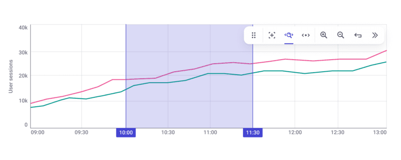
Line charts are commonly used to show changes in variables over time. Linear interpolation connects each consecutive data point with a straight line.

Time series area chart
A stacked area chart is similar to a line chart, but with a filled area beneath the line. Like line charts, area charts are used to illustrate changes over time, and to highlight the total value during that period.

Time series bar chart
Like time series area and line charts, a time series bar chart shows changes over time. Grouping is not supported, but can be achieved by using a categorical bar chart.
The width of the bar is determined by the underlying data.
- In a chart with timeframe data, the width of a bar is equivalent to the duration of the data point.
- In a chart with timestamp data, the bar takes a minimum width, since there is no duration to be plotted to the X-axis.

Time series band chart
A time series band chart visually represents the range of values for a variable over time. The band indicates the minimum and maximum value, making it possible to observe how the range fluctuates over time. Band charts enable the identification of patterns or trends in the data that may not be obvious when focusing solely on the median.

Interactions on time series charts

The chart toolbar and its controls (and additional shortcuts) provide an important mechanism to interact with the data in your chart.
This table summarizes the various tools available on the toolbar. Note that the availability of tools might differ per app/dataset.
| Button | Name | Shortcut | Action |
|---|---|---|---|
 | Move | Reposition the toolbar within the chart area. | |
 | Inspect | I | Inspect datapoints with a tooltip. |
 | X-axis zoom | Z | Zoom in along the X-axis. |
 | Pan | P Middle mouse button Select-and-drag in the X-axis | Pan the chart left and right. |
 | Zoom in | Ctrl/⌘ + ↑ Ctrl/⌘ + scroll up | Zoom into the chart by a predefined amount. |
 | Zoom out | Ctrl/⌘ + ↓ Ctrl/⌘ + scroll down | Zoom out of the chart by a predefined amount. |
 | Reset | R | Reset the chart’s zoom level to the original view. |
 | Collapse | Collapse the chart’s toolbar. |
Move 
To reposition the chart toolbar to another location within the chart, select and drag the move icon 
Inspect (mode) 
Inspect chart mode 
X-axis zoom (mode) 

With the X-axis zoom mode, you can zoom in on your data along the X-axis (time series). To perform an X-axis zoom, select 
Whether a zoom action fetches additional data with a higher resolution from the data source depends on the app and usage scenario.
Pan (mode) 

Use this mode to pan your chart along the X-axis (time axis). To perform a pan action, select 
Pan actions aren't possible until a zoom action has been executed. In some circumstances, panning your chart requires additional data to be fetched.
Zoom in/out 

To immediately zoom the chart in or out, select the zoom in 

Zoom in and out factors are based on a predetermined increment. Steps can be increased by pressing the Shift key.
Whether a zoom action retrieves higher resolution data from the data source depends on the app and usage.
Reset 
To reset a chart's zoom level to its original/default level, select reset 
Collapse 

- To decrease the toolbar to its minimal size, select collapse
on the toolbar.
- To increase the toolbar size, select collapse again.
Dual Y-axes

To show relationships between two variables, use a dual axis chart for the same or different units.