Upgrade from Dashboards Classic to Dashboards
If you have classic dashboards created in the previous Dynatrace, you can automatically re-create them in the  Dashboards app in the latest Dynatrace.
Why upgrade?
Upgrade your existing dashboards to the new Dashboards app to
- Experience a drastically faster and simpler user experience with the latest user interface
- Fetch all Dynatrace data from one place with Grail
- Blend in external data with app function-based code tiles
- Add more flexible and versatile filtering with variables
- Take context seamlessly with you with intents
Use this upgrade procedure and try your dashboards with the enhanced functionality of the new Dashboards app.
What's upgraded
When you upgrade a dashboard
- Dynatrace re-creates your Dashboards Classic dashboard (with some exceptions as noted below) in the Dashboards app running under the latest Dynatrace.
- You can continue to use the original dashboard in Dashboards Classic. This upgrade does not delete or change the original dashboard.
Layout
Classic dashboards use a canvas-based layout that allows for scrolling, while the new Dashboards app offers a responsive, grid-based layout that reflows content.
When you upgrade your classic dashboard, the existing layout of your dashboard is preserved with a canvas-based layout. This ensures a smooth transition without immediate changes to your dashboard's layout.
You'll see a message like this in your upgraded dashboard.
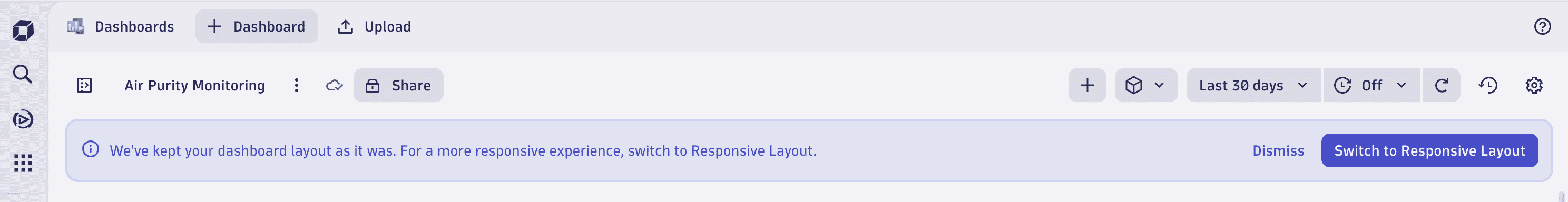
The message box offers you two options:
- To use the new responsive layout, select Switch to Responsive Layout.
- To keep the canvas-based layout, select Dismiss.
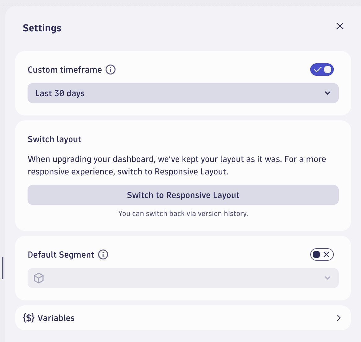
If you choose to keep the canvas-based layout, you can still switch to the responsive layout later from your dashboard settings.
- In the upper-right corner of the dashboard, select Settings to displays the dashboard settings.
- Select Switch to Responsive Layout.
When you switch to the responsive layout, you're notified that the layout has been switched. If the conversion to the new layout causes any issues, the notification will offer a link to the previous version of the dashboard, which allows you to revert back to the canvas layout with a single click on restore.
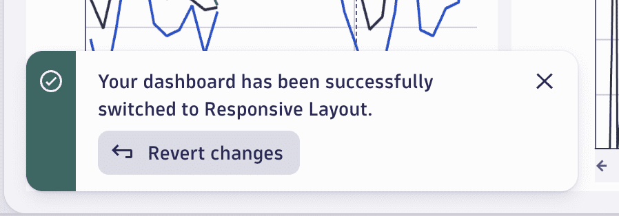
To learn more about managing dashboard versions, Manage document versions.
Supported tile types
The upgrade mechanism supports a limited set of tile types from Dashboards Classic for re-creation in the new Dashboards app. Supported tile types are:
- All Data Explorer tiles (custom tiles that you created in Data Explorer)
- All visualizations except Heatmap (see below for details)
- Markdown tiles and headers
Supported metrics
Because Grail provides better scale and cardinality for metrics, we didn't replicate metrics one-to-one. Instead, we created new metrics that are either extended or a merged version of multiple previous metrics.
See Built-in Metrics on Grail for a full list of metrics available on Grail, with a mapping from their Dashboards Classic counterparts, so you can select the best metrics whenever the upgrade mechanism can't automatically map them.
Supported settings
-
Metric configuration
- Metric
- Aggregation
- Split by
- Filter
- Limit
- Rate
- Default
- Timeshift
-
Visual settings
- Resolution
- Unit
- Format
- Thresholds
- Fold
- Show legend
- Show trend (Single value)
- Show sparkline (Single value)
- Columns (Table)
- Dual axis (Graph)
What's not upgraded
-
Built-in tiles (other than Markdown and Header tiles)
In the new dashboard (in the
Dashboards app), Dynatrace replaces the built-in tile with a Markdown tile explaining that the built-in tile type can't be converted automatically and that you need to re-create it manually in the Dashboards app.- Image
- Host health
- Network metrics
- Network status
- Docker
- VMware
- AWS
- Service health
- Service or request
- Top web applications
- Application health
- User behavior
- User breakdown
- World map
- Key user action overview
- Bounce rate
- Top conversion goals
- Conversion goal
- JavaScript errors
- Resources
- Most used 3rd parties
- Mobile app
- Custom application
- Live user activity
- Web application
- Key user action
- User Sessions Query
- Service-level objective
- Browser monitor
- Synthetic monitor health
- Third-party monitor
- HTTP monitor
- Database health
- Database performance
- Data center service health
- Problems
- Smartscape
- Log query table
-
Heatmap visualizations
Heatmap visualizations are not yet supported in the Dynatrace app. Any tiles using Heatmap visualizations in the original dashboard are upgraded (added to the new dashboard) but with an automatically selected default visualization. You can change the visualization to another supported visualization type after the upgrade.
-
Visualization settings
- Three or more axes (Graph)
- Different geometries for metrics. For example, a line and a bar in a single visualization (Graph).
But you can configure this manually in the new dashboards with the Custom geometry chart settings in Dynatrace version 1.299+.
-
Dashboard settings
- Default management zone doesn't exist in the new dashboards.
- Dynamic filters need to be re-created as variables.
- Title font size doesn't exist in the new dashboards.
- Permissions need to be reassigned via document sharing.
- Preset enablement doesn't exist in the new dashboards, but you can get essentially the same effect with read-only sharing.
- Anonymous links don't exist in new Dashboards
- Report subscriptions don't exist in new Dashboards
-
Automatic licensing model conversions
If you upgrade Kubernetes-based dashboards, the new Kubernetes metrics are available only for DPS-enabled customers, so you might not see data, even though the upgrade was successful.
- For more about the new Kubernetes metrics, see Built-in Metrics on Grail.
- For details on becoming a DPS-enabled customer, see Dynatrace Platform Subscription (DPS).
How to upgrade
You can upgrade a dashboard from the Dashboards page or from within the displayed dashboard.
After you upgrade a dashboard
- The Dashboards app opens with the new dashboard displayed.
- The original dashboard remains unchanged.
From the Dashboards page
To upgrade a dashboard from the Dashboards page
-
Go to Dashboards Classic in the latest Dynatrace.
-
On the Dashboards page, find a classic dashboard that you want to upgrade.
-
In that dashboard's row, select > Upgrade.
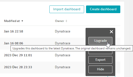
-
After the upgrade is completed, the re-created dashboard is displayed in the
Dashboards app.
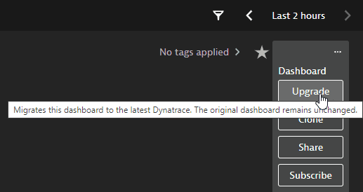
From the currently displayed dashboard
To upgrade a dashboard from within the displayed dashboard
-
Go to Dashboards Classic in the latest Dynatrace.
-
On the Dashboards page, find the dashboard that you want to upgrade and select its name to display that classic dashboard.
-
In the upper-right corner of the dashboard, select > Upgrade.
-
After the upgrade is completed, the re-created dashboard is displayed in the
Dashboards app.
From Data Explorer for a single visualization
To upgrade a single Data Explorer–based visualization
-
On a dashboard, select a Data Explorer–based tile and select Configure in data explorer to open the selected tile's visualization in Data Explorer.
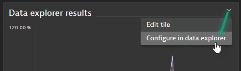
Or you can start from Data Explorer and configure a new visualization there.
-
Once your visualization is finished, select Open with in the upper-right corner of the Result section of Data Explorer.
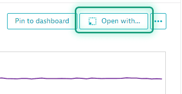 If "Open with" is disabled
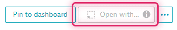
Open with is disabled if the selected metric couldn't be mapped or converted to a metric available in Grail. Hover over the information icon on the button to see why.
-
In Open with, select the destination app: Dashboards or Notebooks.
-
In Select destination, select the destination document.
- To add your Data Explorer visualization to an existing Dashboards or Notebooks document, select the document from the list and then select Confirm.
- To create a new document for your visualization, select New notebook or New dashboard (depending on the destination app you selected previously).
-
The document is displayed with your Data Explorer visualization added as a new notebook section or dashboard tile.
What to do after the upgrade
In the Dashboards app, review the new dashboard.
You can open the original and new dashboards in two different browser windows to compare them side by side, one with the old dashboard displayed in the Dashboards Classic app, and the other with the new dashboard displayed in the Dashboards app.
- Look for tiles that didn't upgrade at all. In the new dashboard, a tile that wasn't upgraded is replaced with a message in a Markdown tile.
- Look for tiles that were upgraded but without the original visualizations. You can edit them to select different visualizations.
For details on what to expect, review the above sections:
What if a tile couldn't be upgraded?
In cases where a tile couldn't be upgraded, you can re-create it manually if all of the following conditions are met:
- Data: The data is available in Grail (for example, metrics or problems).
- Visualization type: The visualization type exists in the new Dashboards app.
- Visual settings: The visual settings offer you all the necessary options. For example, the line geometry settings for a line chart would already allow you to plot a bar chart for one series and overlay it with a line chart for another series.
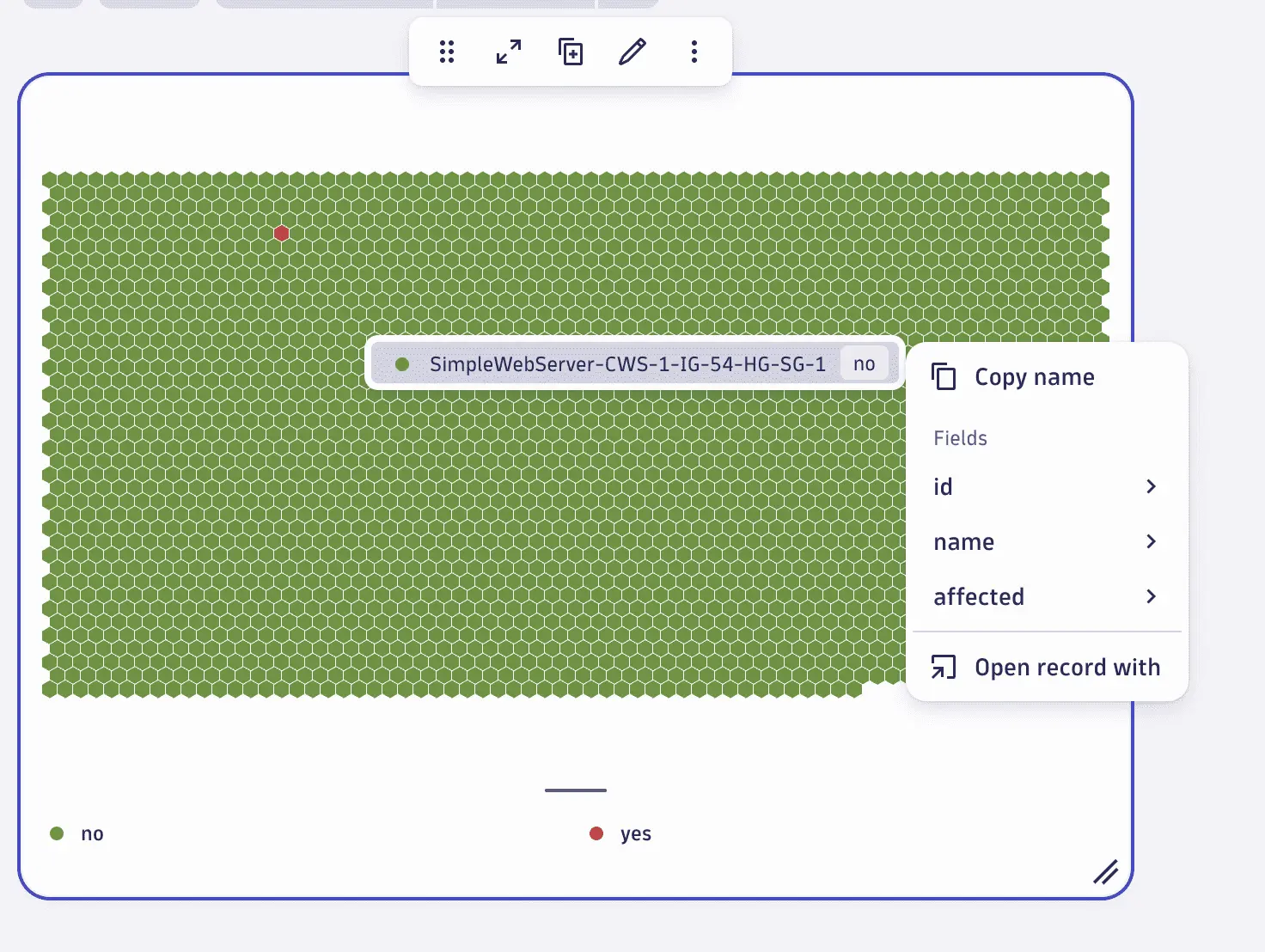
Let's look at an example where the upgrade mechanism doesn't yet automatically upgrade your tile, but where the above conditions are met and you can manually re-create them.
Example: Service health
- Data:
dt.davis.problems, since it is based on Davis problems - Visualization type: Honeycomb, which is already available
- Visualization settings: Conditional coloring, to show and express the red or green state of a service.
To re-create the tile
-
In the upper-right of the dashboard, select Add > DQL.
The
Dashboards app will display an empty Query Grail tile and a tile edit panel open to the Data tab. -
On the Data tab
-
In the DQL edit box, paste the following DQL query:
fetch dt.entity.service| filter serviceType != "DATABASE_SERVICE"| lookup [fetch dt.davis.problems| filter event.status == "ACTIVE"| expand affected_entity_ids], sourceField:id, lookupField:affected_entity_ids| fieldsAdd affected = if(isNotNull(lookup.affected_entity_ids), "yes", else: "no")| fields id, name=entity.name, event.id=lookup.event.id, event.kind=lookup.event.kind, affected -
Expand Query limits and increase Record limit if your total number of services exceeds the default limit of 1,000.
-
Select Run to run the query.
-
-
Switch to the Visual tab.
-
In the Visualization section, select Honeycomb as the visualization type.
-
In the Data mapping section, set Value to
affectedto express the state of the respective service. -
In the Legend and tooltip section, set Displayed fields to just
nameto ensure the name is used and shown for the individual service when hovering over a honeycomb cell. -
In the Color section, set the Color mode to
Custom colors. -
Under Custom colors, define the following rules to express whether a service has an open problem or not.
- Define the color green =
noto express when the service has no open problem. - Define the color red =
yesto express when the service has been affected.
- Define the color green =
-
-
Close the tile edit panel.
The resulting tile should be similar to the following: