Data Explorer query reference
- Reference
- 12-min read
Use this reference to look up the components of a Data Explorer metric query, the commands of the query editor, and the limits that apply to query results.
Metric query components
Every metric query is composed of multiple optional components. For example, this query:

has the following components:
- Metric name:
CPU usage %(builtin:host.cpu.usage) - Aggregation:
Average(avg) - Split by:
Host(dt.entity.host) - Filter by:
Host:OS type:Linux
See below for descriptions of these and other possible query components.
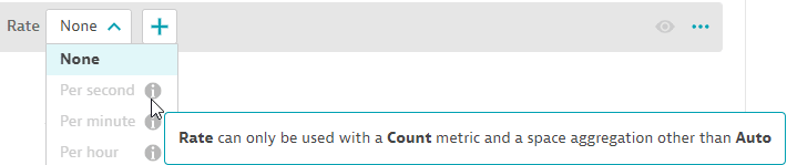
The query editor helps you select query settings that are compatible with the query you configure.
In the example below, if you hover over the i (information) icon in the selection list for Rate, the editor explains why the setting is unavailable for the current query.
Metric name
In the query editor, select the metric name from the list displayed in the Select metric… box. This can be a built-in metric or a metric ingested from a channel such as StatsD, Prometheus, or Telegraf through the Dynatrace metrics API.
To select the metric
-
You can type or paste a metric name directly into the box to find all matching metrics. In this example, there are multiple matches. Select the metric in the Host category to add it to your query.
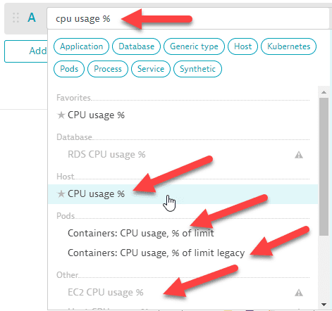 Data Explorer: metric selector: type and select
 -
If you have favorited any metrics in the Metrics browser, those metrics are displayed at the top of the list in the metric selector.
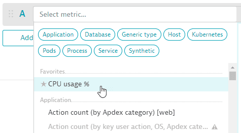 Data Explorer: metric selector: favorites
 -
You can select a metric category to focus the list of metrics.
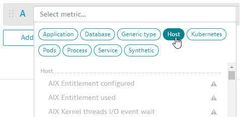 Data Explorer: metric selector: categories
 -
When you hover over any metric in the list, a side panel displays details about that metric.
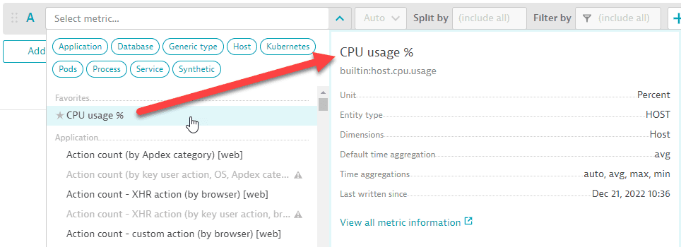 Data Explorer: metric selector: metric details
To see more information about that metric, select View all metric information. This opens the Metrics browser in a new tab (so you don't lose your work in Data Explorer) with lots of useful details about the selected metric.
Space aggregation
The space aggregation enables you to specify how the resulting data points of a metric query are supposed to be aggregated across dimensions.
The query will always provide the statistically most accurate results for a given query, even if certain metrics provide different statistics, which depends on the nature of each metric.
To change this aggregation, select one from the list immediately following the metric name in the query editor:

Every metric provides the same possible space aggregations: Auto, Average, Count, Maximum, Minimum, Sum, Median, Percentile 10th, Percentile 75th, and Percentile 90th.
Split by
By default, a query doesn't split by any dimensions using the metric's aggregation. When splitting by a dimension such as host, the aggregation is used for each host.
To split by a dimension
- If Split by isn't already displayed in the query editor, select and then select
Split byfrom the list. - Set Split by to the dimension by which you want to split the query.
Example
If the row's metric is CPU usage %, Host is the only available dimension. In Split by, select Host.
Sort by
By default, results are sorted in descending order based on the aggregation chosen.
To set the sort order
- If Sort by isn't already displayed in the query editor, select and then select
Sort byfrom the list. - Set Sort by to the dimension by which you want to sort.
- Select the sort order:
ASC(ascending) orDESC(descending).
Rate
To set the rate
- If Rate isn't already displayed in the query editor, select and then select
Ratefrom the list. - Set Rate to
None,Per second,Per minute, orPer hour.
Filter by
The scope is determined by any filter you set. By default, the scope is (include all).
To filter your query (change the scope)
- If Filter by isn't already displayed in the query editor, select and then select
Filter byfrom the list. - In Filter by:
- Select an available dimension
- Specify an attribute
- Specify an attribute value
You can add multiple filters.
Example
If the metric is Action count (by Apdex category) [web] (builtin:apps.web.actionCount.category) and you want to filter for a specific web application named My web application
- If Filter by isn't already displayed, display it.
- In Filter by, select
Web application, then selectName, and then selectMy web application
See also Auto-extended filtering.
Limit
By default, the number of metrics you see if they're split by a dimension is 20.
To set an explicit limit
- If Limit isn't already displayed in the query editor, select and then select
Limitfrom the list. - Set Limit to
1,10,20, or100.
For Honeycomb and Table visualizations, you can work around this limitation by using Limit > Maximum or turning on Advanced mode and removing :limit(100) from the query.
Global limit
The global limit aligns records across multiple metrics with the same dimensionality (Split by transformation). If the Global limit is set for a metric, only records that match the dimensions of that metric are included in the result.
The Global limit is automatically displayed if all of the following conditions are met:
- Table visualization is selected.
- At least two metrics are added to the table.
- At least two metrics have the same Split by transformation.
Only one metric can be marked as the Global limit. The metric marked as Global limit overrides the Limit transformation of all other metrics with the same Split by transformation. In this case, the Limit for these metrics will appear disabled.
In the Advanced mode, the Global limit is always visible regardless of the conditions.
Default
To set the default value
- If Default isn't already displayed in the query editor, select and then select
Defaultfrom the list. - Set Default to the desired default value.
Timeshift
To set a timeshift value
- If Timeshift isn't already displayed in the query editor, select and then select
Timeshiftfrom the list. - Set Timeshift to a number (positive or negative).
- Select a unit (second, minute, hour, day, week) from the adjacent list.
Example
To shift back two minutes:
- Set Timeshift to
-2 - Set the unit to
minute
Query editor commands
Use these commands in the query editor to build and run a query. The menu is next to each metric row.

| Command | Effect |
|---|---|
Visualization list | Selects how results are displayed; the default is a graph. For the available types, see Visualization types. |
Adds or removes transformations for a metric row: Default, Filter by, Limit, Rate, Sort by, Split by, and Timeshift. All shows every available field. | |
Add metric | Adds an empty metric row to the query. |
> Duplicate | Copies a metric row so you can edit the copy. |
> Add metric event | Creates a metric event from the query. See Add a metric event. |
Drag a metric row | Reorders the metrics. The order sets the rendering order (the last metric is drawn on top), the column order in a table, and the order of the Settings panel. Rerun the query to see the change. |
Metric letter or | Turns a metric on or off in the query. |
> Delete | Removes a metric row. |
Run query | Runs the query and displays the results. The text next to the button shows the status of the latest run. |
Advanced mode | Shows the underlying Metrics API v2 query for editing. For details, see Write queries in advanced mode. |
To select a visualization, use the list in the upper-left corner of the query definition.

To turn a metric on or off, select its letter or .

After you run a query, the status of the latest run appears next to Run query.

To edit the underlying query, turn on Advanced mode.
Add a metric event
To continue observing something you see in a Data Explorer chart, create a metric event from the query.
-
In the query editor, select > Add metric event.
Settings > Anomaly detection > Metric events opens in a new browser window, so you keep your work in Data Explorer. Add metric event is selected, and the metric fields are filled in from your query where possible.
-
Complete the metric event definition and save your changes.
-
Close that browser window and return to Data Explorer.
For details on metric events, see Metric events for alerting.
To work with baselines, correlated metrics, and focus on a graph, see Use Data Explorer results.
Auto-extended filtering
Auto-extended filters use the Dynatrace topology (entity model) to offer additional filter dimensions not available in the original metric. They work on both the tile level and the dashboard level.
- On a tile level, select them when you set Filter by in Data Explorer by selecting the original dimension of a metric that has the relationship assigned. For example, a metric that captures the performance for Synthetic events has a relationship to a Synthetic monitor. Using the topology, you can first select the related Synthetic event in the filter and then, besides the name, tag, id, or health state, you also get an additional option to pick the related monitor.
- On a dashboard level, while you can't pick desired relationships, Dynatrace automatically extends the metrics where possible, so that, when you pass a dynamic filter, it can apply to a tile with that metric.
Extend a Synthetic step metric by Synthetic monitor
Some performance metrics for Synthetic events lack the ability to filter them by monitor. However, the same event could happen in multiple monitors, and to look at a single monitor's performance you need the ability to filter for them.
With automatically extended filters, you can now filter on the Synthetic test step.
- Select the metric (for example,
Action duration - load action (by event) [browser monitor]). It has entity typeSYNTHETIC_TEST_STEP.
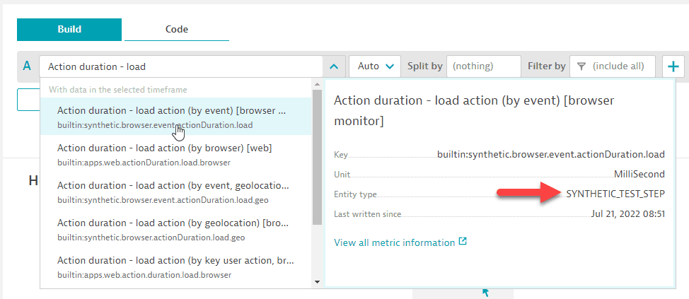
- Add the filter.
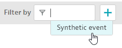
- Select auto-extended dimension.
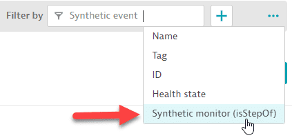
- Resulting filter.

Moreover, you can now use auto-extended filters on your dashboard, so there's no need to configure multiple tiles to see the same metric for different monitors or different hosts.
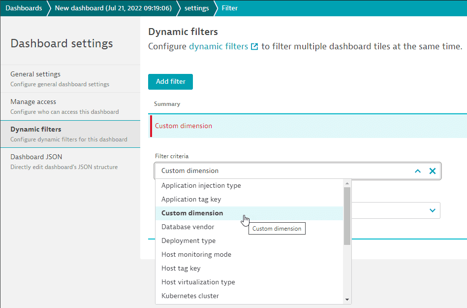
- On the Dynamic filters tab of your dashboard's Dashboard settings page, add a filter for
Custom dimension.
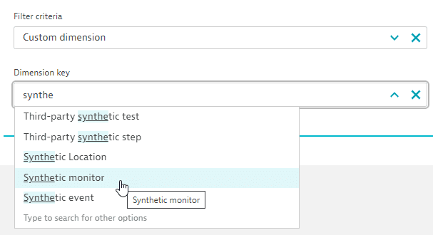
- Select
Synthetic monitor.
- Save your changes and display the dashboard. Now you can filter all tiles on the dashboard by Synthetic monitor. The dashboard will automatically, for each tile, check whether any such relationship exists. So every tile (without filters set on a tile level) that has a Synthetic event metric will be filtered the moment a relationship exists between the step in the tile and the monitor you picked.

Extend a host metric by EC2 instance or host group
In this example, the host metric is extended by EC2 instance.
-
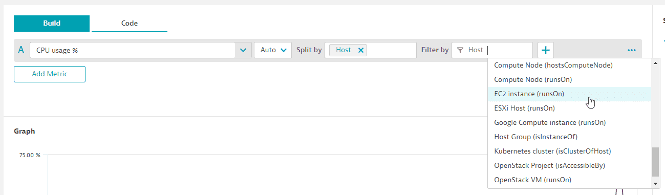
Create a host-related tile with a host metric (for example,
CPU usage %-builtin:host.cpu.usage). -
Apply a related filter such as
EC2 instance (runsOn).Now the tile with all hosts is filtered to only the hosts running on that EC2 instance. This is possible even though the dimension
EC2 instancedoesn't exist on the original host metric. Because the filter uses the topology (entity model), the hosts can be filtered based on that relationship.
In this variation, the host metric is extended by host group.
-
Set a filter for
Host.Host Group (isInstanceOf)and pin the tile to your dashboard.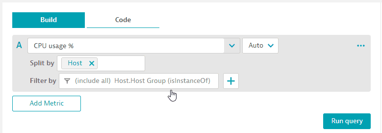 Host metric is extended by host group.
 -
You can now filter the dashboard tiles by host group.
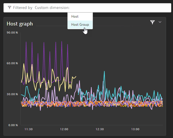 Filter the dashboard tiles by host group.
Examples
Table with two metrics (split)
This example selects the metrics CPU usage % and Memory used %, splits both by host, and displays them as a table so that the rows are hosts and the columns show the metric values per host.
- A:
CPU usage %(builtin:host.cpu.usage),Average, Split byHost - B:
Memory used %(builtin:host.mem.usage),Average, Split byHost - Visualization:
Table
You can use the Global limit to align records across these two metrics. For example, if the Global limit is set for metric A, only records that match the dimensions of metric A are included in the result.
The complete query should look like this:
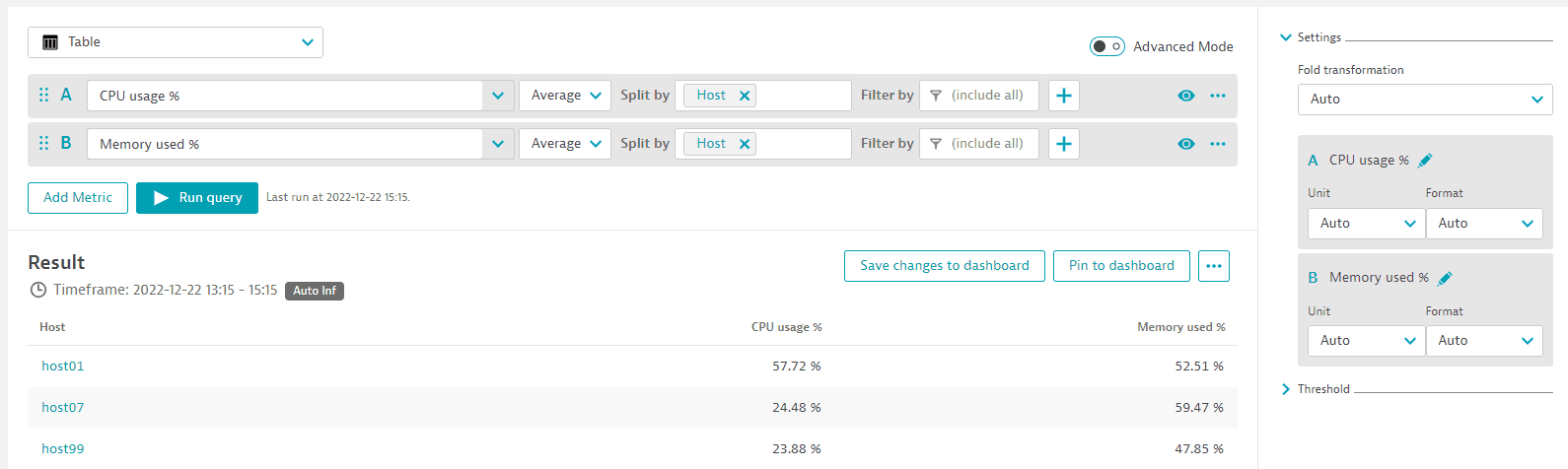
Example tile:
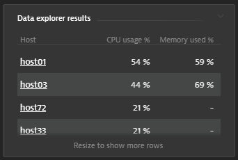
Graph with two metrics
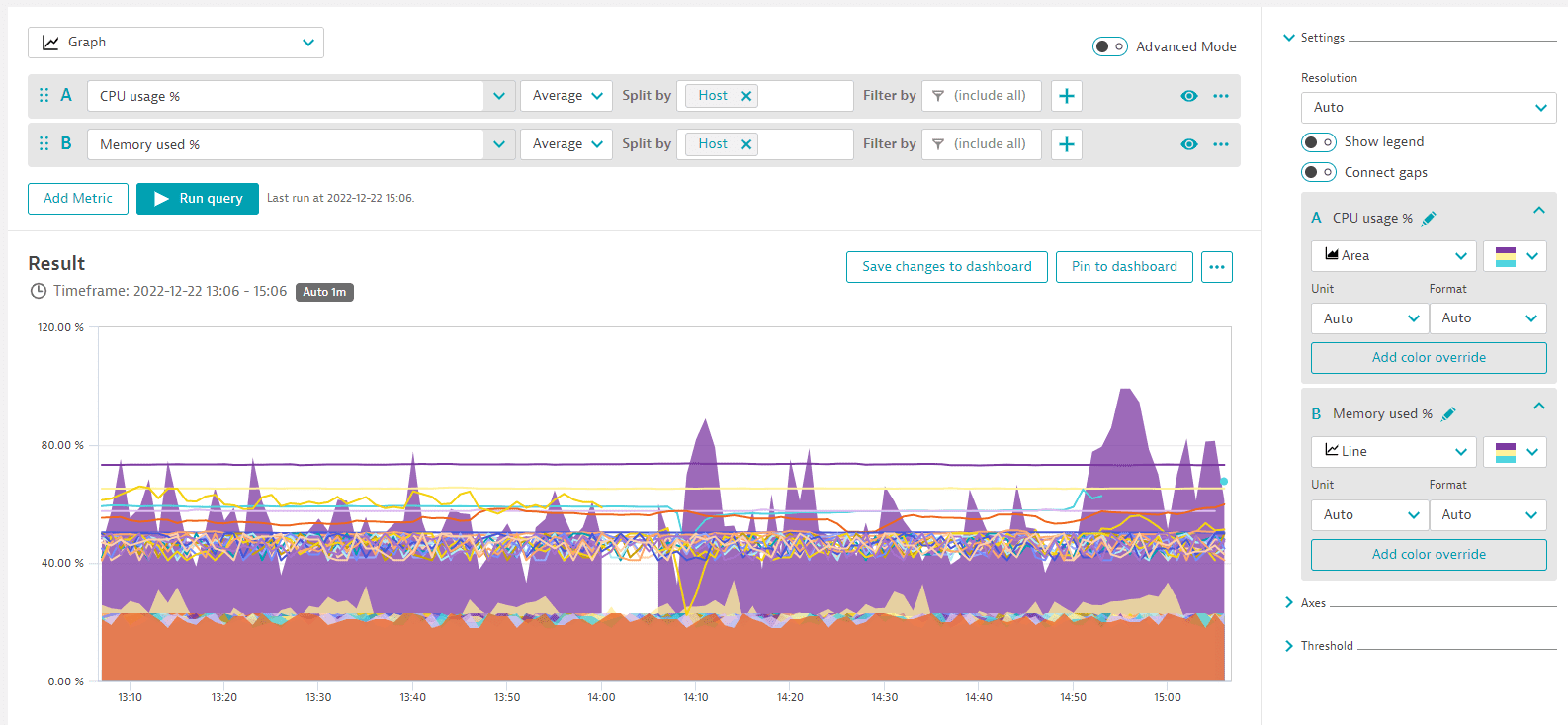
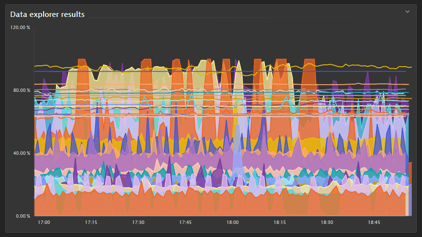
This example selects the same metrics and displays them as a graph.
When you set Visualization to Graph, the Settings are displayed, where you can select how to graph each metric. In this case, CPU usage % is an area chart (the area between 0 and the value of the metric is filled in) and Memory used % is a line chart (a single line representing the value of the metric over time).
- A:
CPU usage %(builtin:host.cpu.usage),Average, Split byHost - B:
Memory used %(builtin:host.mem.usage),Average, Split byHost - Visualization:
Graph - Visual settings:
- A =
Area - B =
Line
- A =
You can use the Global limit to align records across these two metrics. For example, if the Global limit is set for metric A, only records that match the dimensions of metric A are included in the result.
The complete query should look like this:
Example tile:
Notes and limitations
-
A visualization shows up to 10 metrics.
-
A metric shows up to 100 series.
For Honeycomb and Table visualizations, you can work around this limit by using Limit > Maximum, or by turning on Advanced mode and removing
:limit(100)from the query. -
Data Explorer uses long-term metric data, not trace and request data, so its values can differ from the values in multidimensional analysis.
-
A query on a dashboard tile created with Data Explorer returns at most 4,000 data points. When the timeframe and resolution would exceed that, Dynatrace switches to a coarser resolution. This limit doesn't apply to visualizations in Data Explorer itself.
-
Large values use order-of-magnitude notation, such as
7.5Mfor about 7.5 million. For details, see Order-of-magnitude notation.