Use Data Explorer results
- How-to guide
- 12-min read
After you run a Data Explorer query, use the result visualization to investigate its data, save it to a dashboard, or share and export the query results.
Result
The Result section displays the selected visualization of your query results.
Interact with visualization
You can hover over and select visualization elements to view details, drill down to relevant Dynatrace pages, and alter the visualization to help you identify problems.
In this example, a Graph visualization shows a line chart of the CPU usage % metric for hosts. One host behaves erratically, so selecting it opens a popup with details about the host.
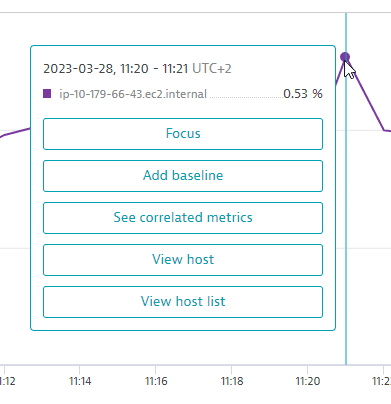
In this example, you have the following options:
- Select Focus to temporarily focus your graph on a single metric.
- Select Add baseline to add a baseline for the selected metric.
- Select See correlated metrics to list correlated metrics and optionally add a selection of them to your query.
- Select View host to drill down directly to the details page for that host.
- Select View host list to go to the Hosts page.
The options available in the popup depend on the query and visualization you configured.
Focus on a metric series
To temporarily remove potential clutter from your graph and focus on a single metric, you can hide everything but a selected metric series.
- Focus applies only to the
Graphvisualization. - Focus doesn't change your query and doesn't affect the dashboard tile when you pin a chart to a dashboard.
Set focus
-
On a line graph, select the line for the metric you want to focus on.
-
In the popup, select Focus.
The graph is redrawn with only the selected metric displayed.
Remove focus
-
On the graph, select the line for the metric you have focused on.
-
In the popup, select Remove focus.
The graph is redrawn to display all metrics.
Add a baseline
To help you identify anomalies, you can use baselining to add a confidence band to a metric's line on the chart. Then you can see when the value goes outside the confidence band. The baseline calculation is based on the Seasonal baseline model which is used to create metric events for anomaly detection.
-
Baselines apply only to the
Graphvisualization. -
Baselines aren't added to the dashboard tile when you pin a chart to a dashboard.
-
The timeframe used to infer the baseline is determined by the currently selected resolution:
Resolution range Resolution examples Baseline timeframe resolution < 5 minutes
- 1 minute
previous 14 days
5 minutes ≥ resolution < 1 hour
- 5 minutes
- 10 minutes
- 30 minutes
previous 28 days
1 hour ≥ resolution < 1 day
- 1 hour
- 6 hours
- 12 hours
400 days
resolution ≥ 1 day
- 1 day
- 1 week
- 1 month
5 years
Show a baseline
- On the graph, select the line for the metric you want to baseline.
- In the popup, select Add baseline.
- Wait a moment while the baseline is calculated (
Loading). The graph is then redrawn with the baseline displayed for the metric you selected.
Hide or show a baseline
Baselines are listed separately in the chart legend. For example, if you add a baseline to the CPU usage % metric in a Graph visualization, the legend lists CPU usage % and CPU usage % - baseline. Select the legend entries to toggle their display on or off.
Remove a baseline
- On the graph, select the line for the metric from which you want to remove the baseline.
- In the popup, select Remove baseline. The graph is redrawn with the baseline removed.
Compared to metric event baselines
You may notice differences between baselines in Data Explorer and metric events. These features offer different approaches to suit their different contexts. In general, the Data Explorer configuration is fixed, while the metric events configuration is configurable.
| Data Explorer | Metric events | |
|---|---|---|
Samples |
| Configurable |
Violating samples |
| Configurable |
Dealerting samples |
| Configurable |
Alert on no data |
| Configurable |
Tolerance (affects width of confidence band) |
| Configurable (range: |
Resolution (affects granularity) | Configurable |
|
Training time | Instantaneous | Daily |
For details on seasonal baselining, see Seasonal baseline.
Baselines FAQ
How is the baseline calculated?
The baseline calculation is based on the seasonal baseline model used to create metric events for anomaly detection. For details on the inner workings of the model, see Seasonal baseline.
Why is the baseline different from the seasonal baseline model preview?
Although the baseline model is based on the seasonal baseline model, there are several reasons why the resulting baselines can differ:
- Resolution: The baseline in Data Explorer is derived from the data depending on the currently selected resolution as described above. A seasonal baseline model of a metric event configuration always learns the behavior from 1-minute resolution data. If the resolutions are different, the resulting baseline differs as the metric values are also different.
- Baseline timeframe: The timeframe used to infer the baseline is determined by the currently selected resolution as described above. As metric event configurations always use 1-minute resolution data, the training timeframe can differ, which also can lead to different baselines.
- Model parameters: The baseline in Data Explorer uses fixed default parameters to train a baseline model:
- Tolerance = 4
- Alert condition = 'Alert if metric is outside'
- No alert on missing data If the parameters are different in the metric event configuration, the resulting baseline can be different.
Add correlated metrics
Dynatrace Davis® takes domain-specific knowledge and topology into account when computing connected observability signals. Davis ranks the most relevant signals on top, and the Davis score for each detected signal indicates how closely the signal matches the reference signal's behavior during the selected timeframe. More about Davis® AI.
Find and add correlated metrics
Note that this option is available only if you Split by a dimension in the query.
-
Go to Data Explorer (standard or advanced mode), create a query of a metric series split by a related dimension, and display it in the
Graphvisualization.Correlated metrics are available only if you:
- Select the
Graphvisualization - Specify a query that's Split by a dimension related to the selected data series
Try this example:
 Correlated metrics: query: standard mode
That's this in Advanced mode:
 Correlated metrics: query: advanced modebuiltin:host.cpu.usage:splitBy("dt.entity.host"):sort(value(auto,descending)):limit(20)
 - Select the
-
Select Run query to graph the query.
-
Select a line on the graph to display a popup of related options.
-
In the popup, select See correlated metrics.
The Davis for Correlation analysis side panel lists metrics that, based on Davis AI correlation analysis, are correlated to the selected series. This correlation is determined by the shape of the series, not the values.
What does the analyzer display?-
Reference signal represents the data series you selected on the graph. Other shapes of other metric series are compared to the shape of this series.
-
Connected signals are other metric series that have a similar shape, sorted by most similar to least similar. The more similar the shape, the closer the correlation.
For each correlated metric, the analyzer displays:
- Metric name
- Dimension
- ID of the entity
Correlations are sometimes grouped.
-
-
In the side panel, select any listed metric to automatically add it to your current query.
- You can add multiple correlated metrics to your query
- You can add the same metric multiple times and then edit the query
-
After you add correlated metrics, select Run query to update the graph.
Correlated metrics FAQ
What does "correlation" mean in this context?
To determine correlation, the analyzer checks the shape of the data series, not the values. Two series with very similar shapes are correlated.
Possible reasons why you see no "See correlated metrics" option include:
- You didn't select the
Graphvisualization - You didn't Split by a dimension in your query
- You didn't run the query to draw a graph
- You didn't select a line in the graph
What does "No connected signals found" mean?
If No connected signals found is displayed, possibilities include:
- Too little variance in the sample (for example, a metric that's a straight line)
- Too few data points in the sample (for example, in a very short timeframe)
Pin to dashboard
To save the visualization as a dashboard tile, select Pin to dashboard. For details, see Pin tiles to your dashboard.
Share your results
If you find results that you want to share with authenticated users or revisit with a later timeframe:
- Go to Data Explorer and, in the Result section, select > Share link.
- Determine the timeframe to associate with the link:
- To share the link with the current timeframe, turn on Use the current timeframe.
- Otherwise, the shared query link will specify the current query and settings except the timeframe.
- Select Copy to copy the link to your clipboard.
- Share the link with any other authenticated Dynatrace user or keep a copy for your own use.
Export to CSV file
To export to a comma-separated values (CSV) file
-
Go to Data Explorer and, in the Result section, select > Export CSV.
- CSV export is available for all visualizations except honeycomb and single value
- Values exported to a CSV file reflect the formatting specified with the Unit and Format settings in the Settings section.
-
A CSV file of the results is saved to your local machine.
The filename indicates the metrics, date, and timeframe.
For example:
CPU usage % (May 24, 2022, 11_41 - 13_41).csv—contains results from metricCPU usage %, run on May 24, 2022, for a two-hour timeframe of 11:41 AM to 1:41 PM.CPU usage % +1 (May 24, 2022, 13_19 - 13_49).csv—contains results from metricCPU usage %and one more metric, run on May 24, 2022, for a half-hour timeframe of 1:19 PM to 1:49 PM.
Use in API
After you run a query, you have the option to copy the request for use in an API request.
- Go to Data Explorer and, in the Result section, select > Copy request.
- Select whether to use the timeframe of the result.
- Select a response format: JSON or CSV.
- Select Copy to copy the request to your clipboard, or select and copy only the portions of the request that you want to use.
- Optional Select Get a token to go to the Generate access token page and get a token for the request.
Troubleshoot results
Not all series of a metric are shown
A metric shows 20 series by default and 100 at most, even after you remove the limit transformation in advanced mode. To see the series you need, add more specific filters, such as a management zone or an entity name. If a metric expression returns no series, see Why is the result of my metric expression empty?.
Table cells are empty
Each metric returns its own top series. For example, if you query builtin:host.cpu.usage and builtin:host.cpu.idle split by dt.entity.host, each metric returns its own top 100 hosts. Hosts that appear in only one result leave empty cells. To align the records, set a global limit.
Totals differ after adding a metric
The Fold transformation setting affects the resolution.
-
If Fold transformation is set to
Autofor visualizationTable,Single value,Top list, orHoneycomb, theInf(infinity) resolution is used to maintain backward compatibility. If the chosen metric selector doesn't support theInfresolution, thefoldtransformation is automatically added to the end of the query. -
If Fold transformation is set to a value other than
Auto,foldis used.
Because all metric selectors are queried using the same total value mechanism (either fold or Inf), adding a new selector that requires fold might change the result of the other selectors.
To inspect the actual query used by Data Explorer, go to the Result section in Data Explorer and select > Copy request.
Availability differs from the Hosts and Processes pages
The metrics builtin:host.availability and builtin:pgi.availability are based on time-series data provided by OneAgent. Dedicated events calculate the availability values shown on the Hosts and Processes pages, so the values can differ.
In the future, the availability shown on the Hosts and Processes pages will also be based on the availability metrics.
Chart values dip at the current time
If a chart shows a misleading drop in values at the end of the current timeframe, manually subtract the last one or two time buckets from the timeframe.
To temporarily adjust the timeframe:
- Open the timeframe selector.
- Subtract one or two buckets from the end of the timeframe. For example, change
-2hto-2h-2m.
To set the adjusted timeframe as the default for a dashboard:
- Edit the dashboard.
- Under Edit dashboard, select the Settings tab.
- Turn on Default timeframe.
- Select and edit the timeframe. For example, change
-2hto-2h-2m. - Select Done.
For a discussion of this behavior, see Correction required on Dashboard Charts showing dip at current time in the Dynatrace Community.
For more information, see timeframes.