Visualization settings
- Reference
- 10-min read
Data Explorer offers nine visualization types. You select and configure a visualization here, and a visualization you pin to a dashboard keeps its settings as a dashboard tile.
Visualization types
Graph
Metric values over time as lines, columns, or areas.
Stacked column
Metric values over time as stacked columns.
Stacked area
Metric values over time as stacked areas.
Pie
One metric as a pie or doughnut chart.
Single value
One metric merged into a single aggregate value.
Table
Query results as table rows, with one metric per column.
Top list
One metric as a ranked list of results.
Heatmap
One metric as a value distribution in buckets.
Honeycomb
One cell per result, colored by threshold.
Select a visualization from the list in the upper-left corner of Data Explorer. When you switch visualizations, settings that don't apply to the new visualization are ignored, and an information icon in the list warns you. If you switch back, you might need to reconfigure them.
To choose which metrics of a multi-metric query a visualization shows, select the letter next to a metric or .
For how each visualization looks as a dashboard tile, see Visualizations in the Dashboards section.
Graph
A graph shows metric values over time as lines, columns, or areas. A graph can show any selection of metrics in the query, with up to 20 series per metric.
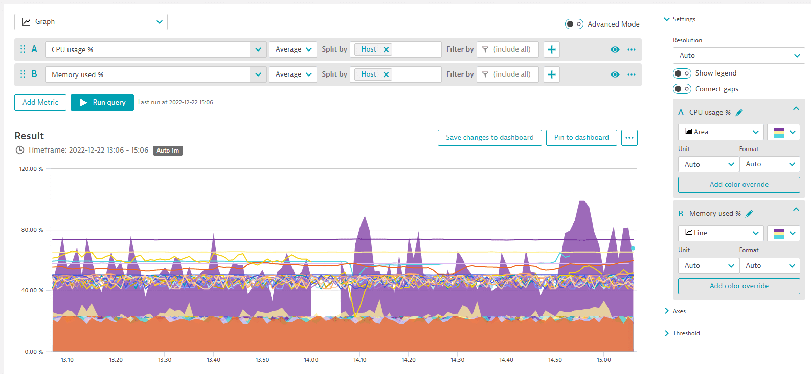
Chart mode sets each metric to Line, Column, or Area.
Baselines, correlated metrics, and focus are graph actions rather than settings. See Add a baseline, Add correlated metrics, and Focus on a metric series.
For how the tile looks, see Graph tiles.
Shared settings that apply: Unit and format, resolution, legend, connect gaps, rename, color palette, color override, axes, and thresholds. See Shared settings.
Stacked column
A stacked column chart shows metric values over time as stacked columns. Your metric selection controls which metrics are stacked, and only metrics with the same unit can be stacked.
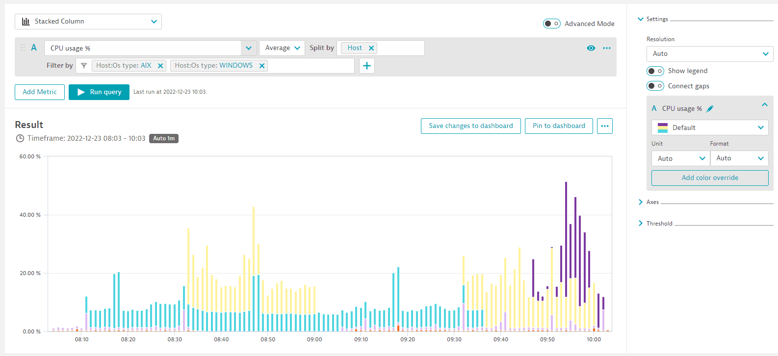
Chart mode sets each metric to Line, Column, or Area.
For how the tile looks, see Stacked column tiles.
Shared settings that apply: Unit and format, resolution, legend, connect gaps, rename, color palette, color override, axes, and thresholds. See Shared settings.
Stacked area
A stacked area chart shows metric values over time as stacked areas. Your metric selection controls which metrics are stacked, and only metrics with the same unit can be stacked.
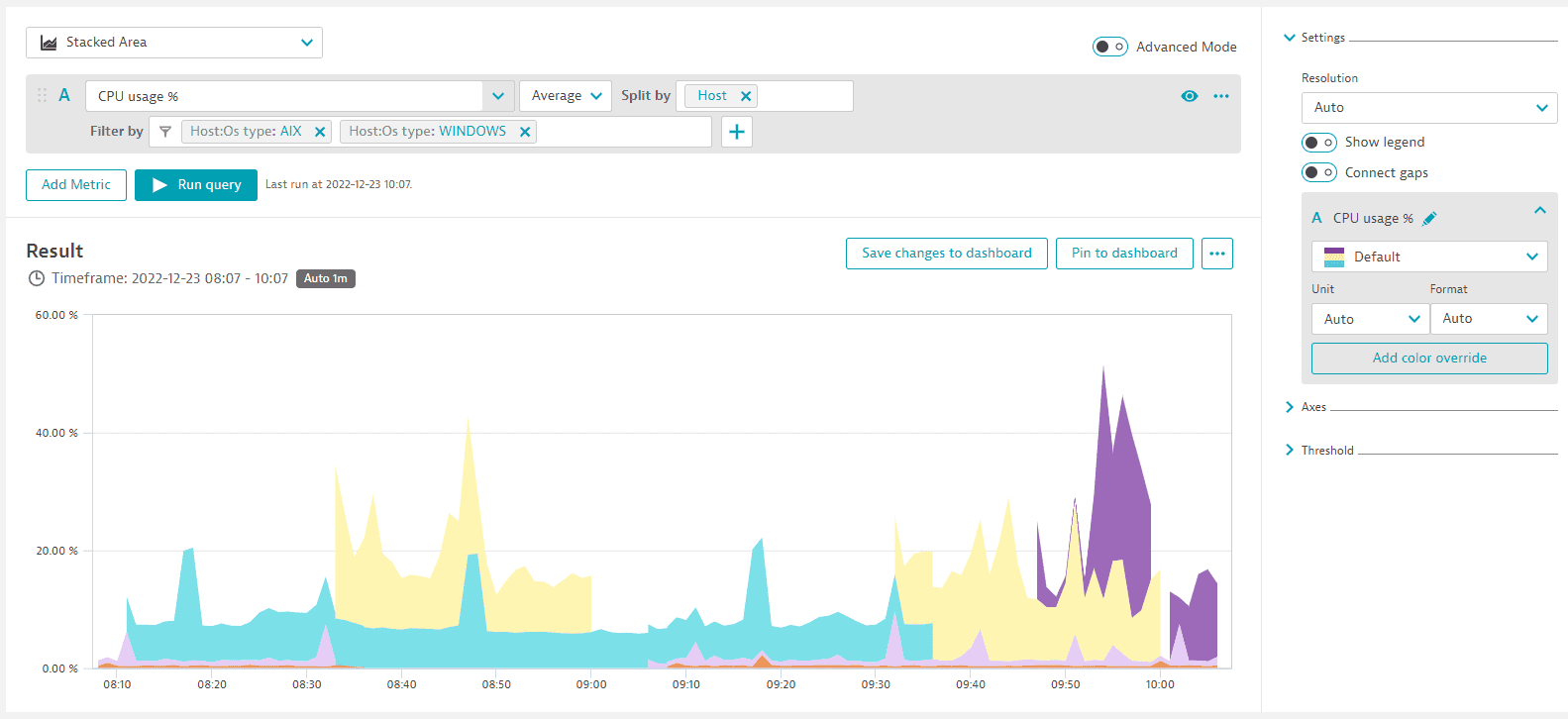
For how the tile looks, see Stacked area tiles.
Shared settings that apply: Unit and format, resolution, legend, connect gaps, rename, color palette, color override, axes, and thresholds. See Shared settings.
Pie
A pie shows query results as a pie or doughnut chart. By default, it shows the first metric of a multi-metric query. Thresholds don't apply to a pie.
For how the tile looks, see Pie tiles.
Shared settings that apply: Unit and format, legend, fold transformation, rename, color palette, and color override. See Shared settings.
Single value
A single value shows one metric and merges all its dimensions into a single aggregate.
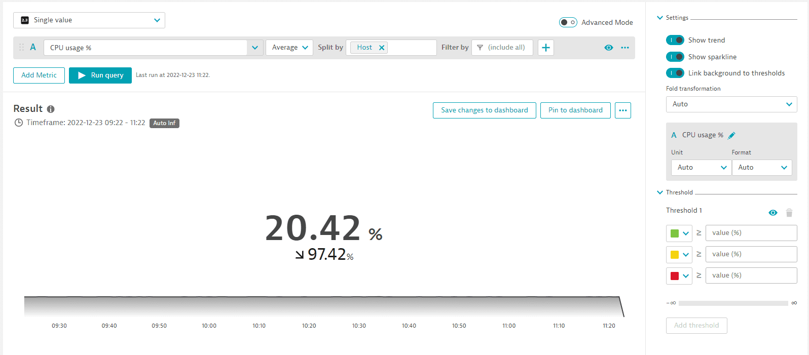
Show trend
Show trend shows the trend in the tile, based on the first and last data points of the selected timeframe.
Show sparkline
Show sparkline shows a sparkline in the tile.
Threshold background
Threshold background reflects the threshold color in the tile background when turned on.
For how the tile looks, see Single value tiles.
Shared settings that apply: Unit and format, fold transformation, rename, and thresholds. See Shared settings.
Table
A table shows query results as rows, with one metric per column. A table can show any selection of metrics in the query, and shows 100 rows by default.
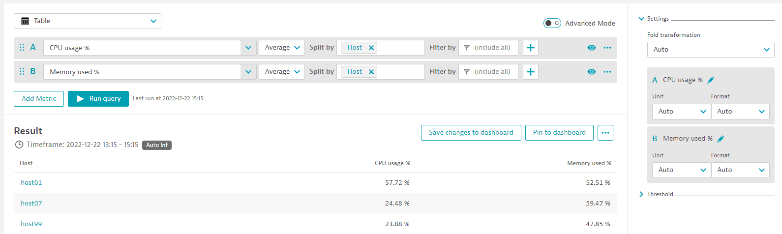
Sort
- A table is sorted by the first metric in the query, in descending order of its aggregation. To sort by another metric, move it to the top of the query definition.
- Sort by sets the dimension to sort by, with the order
ASCorDESC.
Columns
The Columns section turns individual columns on or off. The selection also applies to table tiles.
Rows
In Data Explorer, results are limited to 100 rows by default. Limit sets another value, and Limit > Maximum removes the limit, as does removing :limit(100) in advanced mode. For the row limit on a table tile, see Table tiles.
Pages
Page controls are at the bottom of the Result section, and on table tiles. For the page size of a table tile, see Table tiles.
Table thresholds
- A table can have one threshold definition per metric. Add threshold adds one for another metric, and the trash can icon deletes one.
- Link cell color to thresholds colors the background of every cell by threshold. When it's off, only the cell data is colored.
- Tile text color adjusts automatically for contrast with the threshold color.
For how the tile looks, see Table tiles.
Shared settings that apply: Unit and format, fold transformation, rename, and thresholds. See Shared settings.
Top list
A top list shows a ranked list of results. A top list doesn't show multiple metrics: only the metric selected in the query editor runs, and the first metric is selected by default.
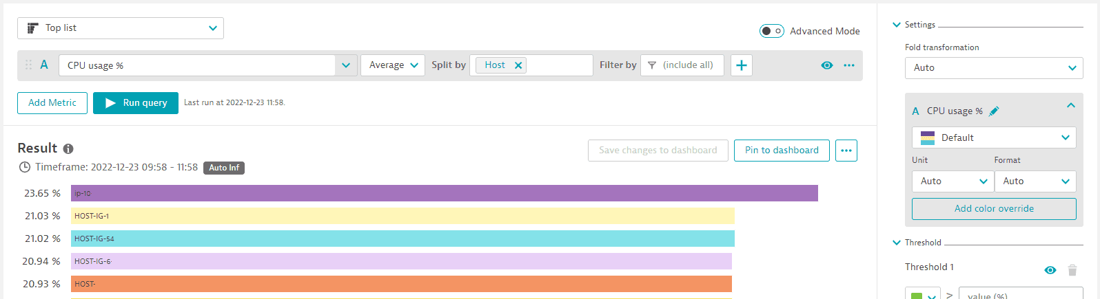
For how the tile looks, see Top list tiles.
Shared settings that apply: Unit and format, fold transformation, rename, color override, and thresholds. See Shared settings.
Heatmap
A heatmap shows the value distribution in buckets. By default, it shows the first metric of a multi-metric query.
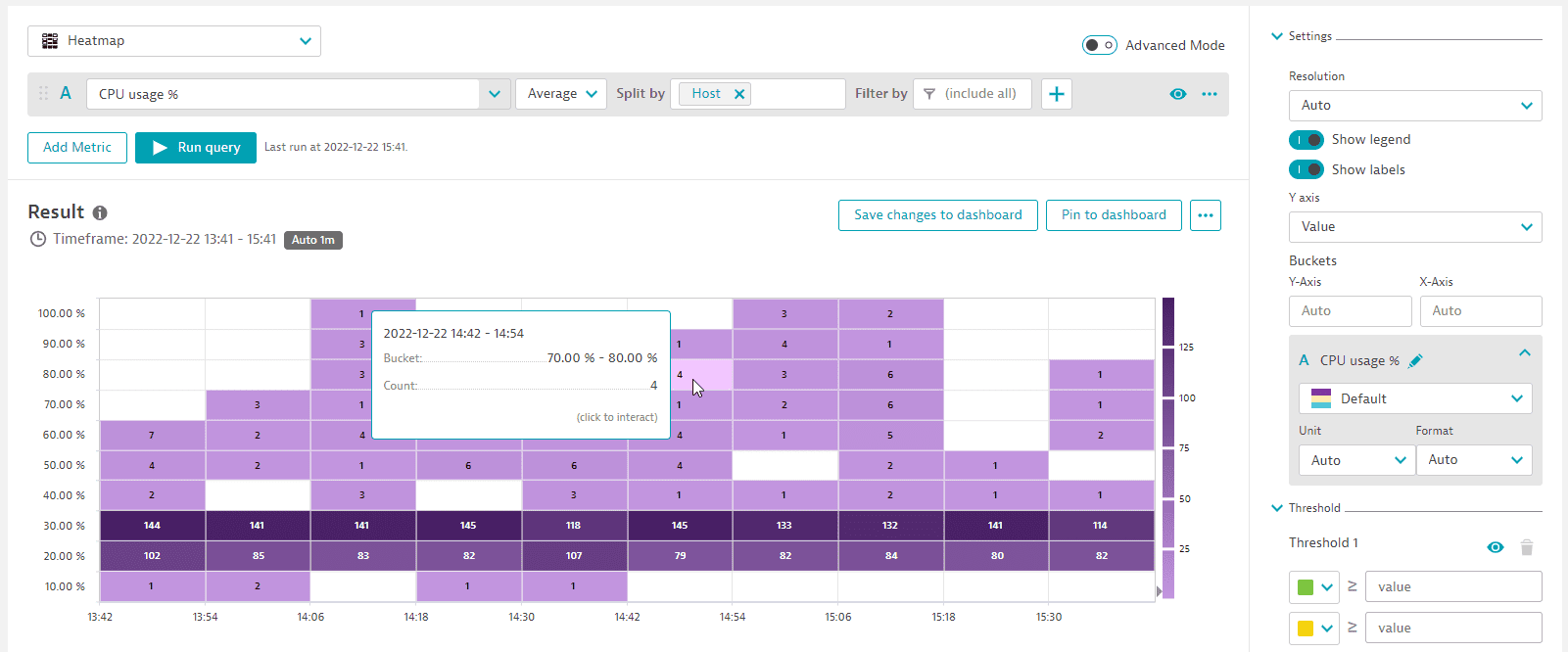
Y axis shows the Y axis by value or split by dimensions. Buckets sets the number of buckets on each axis. The default is Auto; clear a number to return to Auto.
For how the tile looks, see Heatmap tiles.
Shared settings that apply: Unit and format, resolution, legend, show labels, rename, color palette, and thresholds. See Shared settings.
Honeycomb
A honeycomb shows one cell per result, colored by threshold. By default, it shows the first metric of a multi-metric query and 100 cells. To show more, use Limit > Maximum, or remove :limit(100) from the query in advanced mode. Hover over a cell on a tile to see details, and select it for drilldown options.
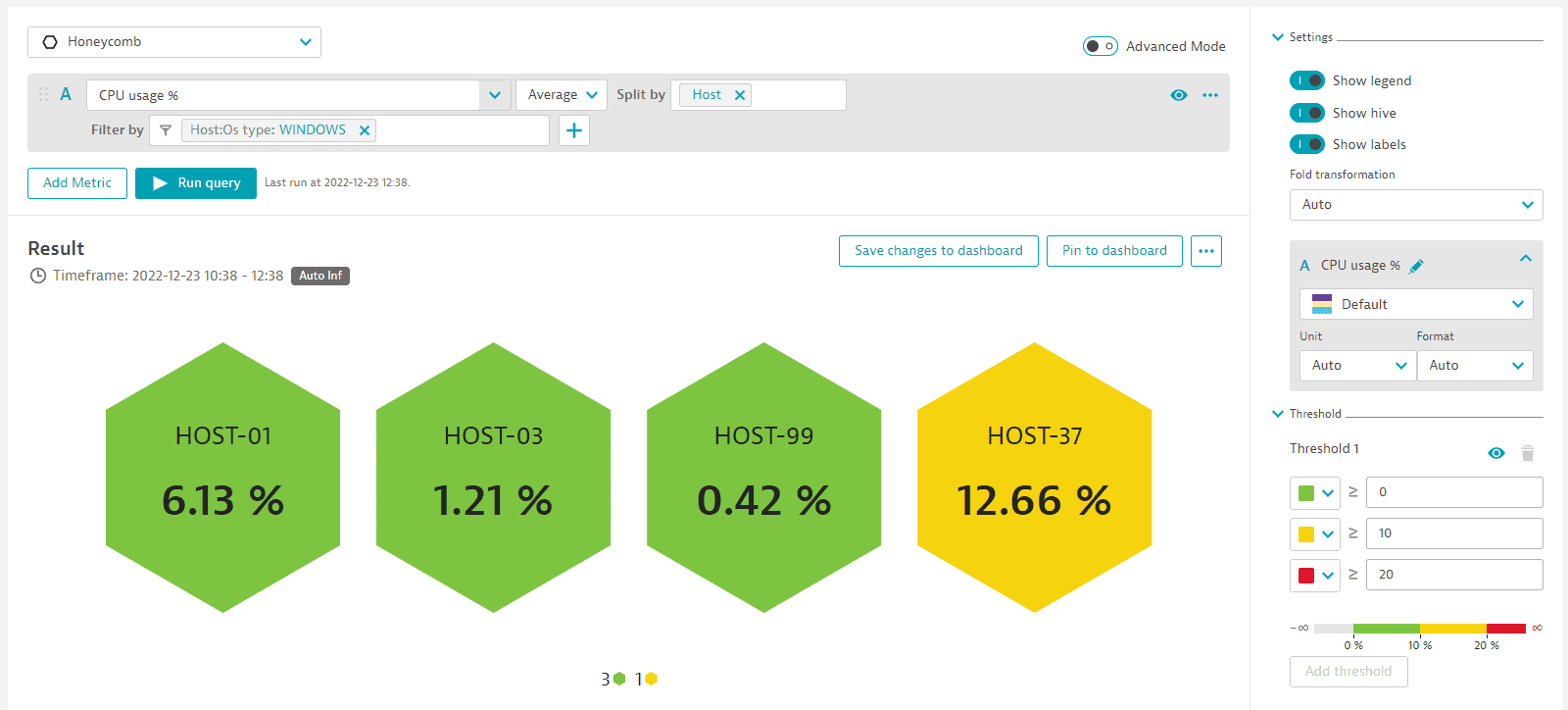
Show hive works with Show legend:
- Show hive only: the hive is the only representation of the results.
- Show legend only: the legend is the only representation of the results.
- Both: the hive is the primary visualization, with the legend under it.
For how the tile looks, see Honeycomb tiles.
Shared settings that apply: Unit and format, legend, show labels, fold transformation, rename, color palette, and thresholds. See Shared settings.
Shared settings
These options appear in the Settings section. Its contents depend on the selected visualization.
| Setting | Visualizations | Description |
|---|---|---|
Resolution | Graph, Stacked column, Stacked area, Heatmap | X axis (time) granularity; |
Show legend | Graph, Stacked column, Stacked area, Pie, Heatmap, Honeycomb | Shows a legend; in a heatmap, the legend matches colors to the value range |
Show labels | Heatmap, Honeycomb | Shows a count for each heatmap bucket, or a label and value in each honeycomb cell |
Connect gaps | Graph, Stacked column, Stacked area | Connects gaps in the chart when turned on |
Fold transformation | Pie, Single value, Table, Top list, Honeycomb | Combines a timeseries into a single data point; default |
The Settings section also lists options for each metric in the query.
| Setting | Visualizations | Description |
|---|---|---|
Rename | All | Display name on the chart and in the legend, or the column heading in a table; the query keeps the original metric name |
Chart mode | Graph, Stacked column |
|
Color palette | Graph, Stacked column, Stacked area, Pie, Heatmap, Honeycomb | Color palette for the metric |
Color override | Graph, Stacked column, Stacked area, Pie, Top list | Fixed color for one series, such as a selected host, that overrides the palette |
Resolution
Some resolutions are unavailable for some timeframes. If you select an incompatible combination, Dynatrace applies a resolution automatically and displays a message such as Auto-resolution applied. Resolution value of [6 hours] applied. Selected timeframe doesn't allow for [5 minutes] resolution. Select a different resolution to override it.
For the data point limit of a dashboard tile, see Tile behavior.
Connect gaps
Connect gaps draws a continuous line across intervals without data. It's available for Graph, Stacked column, and Stacked area.
Legend
The legend is active: select a legend entry to turn the display of that entry on or off.
Fold transformation values
Autoselects the most appropriate time aggregation for the metric.- Other values:
Last value,Average,Count,Maximum,Minimum,Sum,Median,Value,Percentile 10th,Percentile 75th,Percentile 90th. Last valueshows the last reported value instead of an aggregation.
The fold transformation affects the resolution:
- With
Autoin a table, single value, top list, or honeycomb, theInf(infinity) resolution is used for backward compatibility. If the metric selector doesn't supportInf, thefoldtransformation is added to the end of the query. - With any other value,
foldis used.
All metric selectors use the same total value mechanism, fold or Inf, so adding a selector that requires fold might change the results of the other selectors. To see the query Data Explorer sends, select > Copy request in the Result section.
Unit and format
Unit and Format set how values are displayed, and also apply to values you export to a CSV file.
| Setting | Values | Description |
|---|---|---|
Unit |
|
|
Format |
| Decimal places; |
In advanced mode, use :setUnit(<unit>) to select from a wider range of units.
Dynatrace uses this order-of-magnitude notation:
| Notation | Factor | Meaning |
|---|---|---|
|
| Kilo, thousand |
|
| Mega, million |
|
| Giga, billion |
|
| Tera, trillion |
Examples:
- Bytes:
Autoselects a readable unit such asGiB, orGBfor a decimal base, which is used when the metric defines no base. SelectB,KiB,MiB, orGiBfor a fixed unit, orNonefor raw bytes. - Dollars and cents:
Autowith Format0.00shows exact amounts;k (thousand),M (million), orG (billion)with Format0shows large amounts without cents. - Counts:
Autowith FormatNoneshows an exact count;k,M,G, orTwith Format0.0,0.00, or0.000shows a rough count.
Axes
The Axes section is available for Graph, Stacked column, and Stacked area. The section lists the X axis and each Y axis.
| Setting | Values | Description |
|---|---|---|
Name | Text | Axis name, shown vertically next to a Y axis and horizontally under the X axis; the X axis has no name by default |
Visibility | Hides or shows the axis | |
Position |
| Side of the chart for a Y axis; default |
Min, Max |
| Range of the axis; default |
Add Y axis | Metric | Adds a Y axis for a metric; only the first two metrics get a Y axis automatically |
Thresholds
The Threshold section sets threshold values and colors for every visualization except Pie, and the colors also apply to dashboard tiles.
- Set Unit before the thresholds. Threshold values then match the selected unit, so you enter
MiBvalues without the unit. If you change Unit later, the thresholds aren't adjusted. With UnitAuto, enter thresholds in the base unit, such as bytes. - Threshold colors are optional, and hides or shows them without deleting the values.
Result problems
For missing series and empty table cells, see Troubleshoot results.