Visualizations
- Reference
- 3-min read
A visualization you create in Data Explorer becomes a dashboard tile when you pin it, and you configure it in Visualization settings in the Data Explorer section.
Visualization types
Graph
Metric values over time as lines, columns, or areas.
Stacked column
Metric values over time as stacked columns.
Stacked area
Metric values over time as stacked areas.
Pie
One metric as a pie or doughnut chart.
Single value
One metric merged into a single aggregate value.
Table
Query results as table rows, with one metric per column.
Top list
One metric as a ranked list of results.
Heatmap
One metric as a value distribution in buckets.
Honeycomb
One cell per result, colored by threshold.
Graph
A graph tile shows metric values over time as lines, columns, or areas, with up to 20 series per metric.
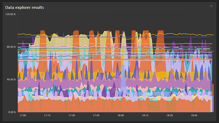
For settings, see Graph settings.
Stacked column
A stacked column tile shows metric values over time as stacked columns. You can stack only metrics with the same unit.
For settings, see Stacked column settings.
Stacked area
A stacked area tile shows metric values over time as stacked areas. You can stack only metrics with the same unit.
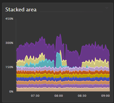
For settings, see Stacked area settings.
Pie
A pie tile shows query results as a pie or doughnut chart. By default, it shows the first metric of a multi-metric query.
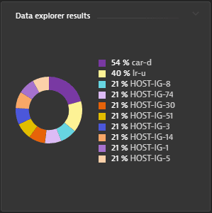
For settings, see Pie settings.
Single value
A single value tile shows one metric, with all its dimensions merged into a single aggregate.
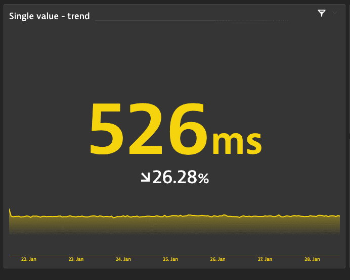
The tile can also show a trend, a sparkline, and a threshold background:
-
Trend, based on the first and last data points of the timeframe:
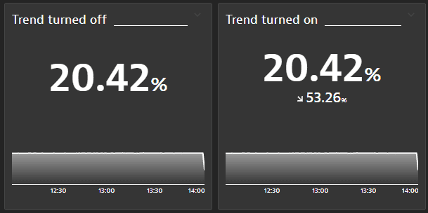 Two identical single value tiles, with the trend turned off on the left and turned on on the right
 -
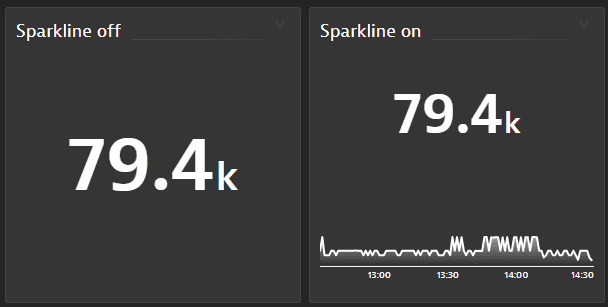 Two identical single value tiles, with the sparkline turned off on the left and turned on on the right
 -
Threshold background, the threshold color in the tile background:
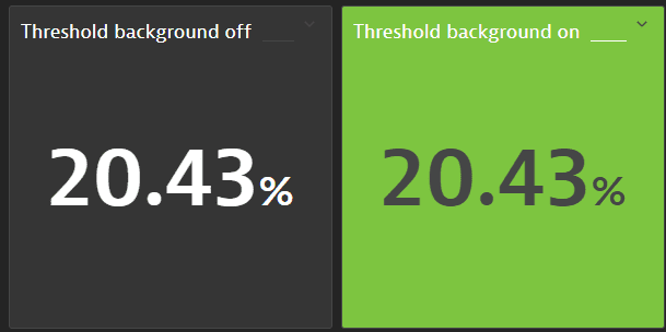 Two identical single value tiles, with the threshold background turned off on the left and turned on on the right
For settings, see Single value settings.
Table
A table tile shows query results as rows, with one metric per column.
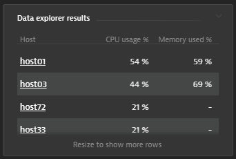
- The query limit sets the maximum number of rows, shown in pages.
- Page controls are on the tile.
- The page size adjusts to the tile size.
- Columns you turn off in the Data Explorer Columns section are also hidden on the table tile.
For settings, see Table settings.
Top list
A top list tile shows a ranked list of results for one metric. By default, it shows the first metric of a multi-metric query.
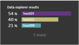
For settings, see Top list settings.
Heatmap
A heatmap tile shows the value distribution of one metric in buckets. By default, it shows the first metric of a multi-metric query.
For settings, see Heatmap settings.
Honeycomb
A honeycomb tile shows one cell per result, colored by threshold, for example green, yellow, and red. Hover over a cell to see details, and select it for drilldown options.
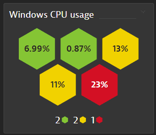
For settings, see Honeycomb settings.
Tile behavior
- A tile created with Data Explorer shows at most 4,000 data points per query. Beyond that, Dynatrace switches to a coarser resolution. The limit doesn't apply in Data Explorer.
- The legend is active: select a legend entry to show or hide it.
- Threshold colors, units, and formats carry over to tiles.