Create specialized unified analysis pages
- Dynatrace Classic
- How-to guide
- 8-min read
- Published May 19, 2022
Dynatrace unified analysis pages bring all observability data and relevant analytical tools for effective analysis and troubleshooting into context. When exploring metrics, events, logs, and metadata for a problematic, domain-specific entity, you will find every observability signal related to this entity on one page.
- The host overview page is an example of a unified analysis page available in most environments.
- See the unified analysis step in the WMI extension tutorial to learn more about creating unified analysis pages.
- See this video to learn how you can build your own unified analysis page from start to finish.
Introduction to Dynatrace Unified Analysis: Going beyond Dashboards
Unified analysis pages come in two types:
- List screen
- Browse all instances of an entity type
- Details screen
- View all observability signals attached to a particular entity instance in the context
List screen
The list screen lets you browse all instances of a specific entity type. In most environments, you can list your hosts using the unified analysis list screen (for example, https://abc1234.live.dynatrace.com/ui/entity/list/host).
If your extension defines a custom topology (entity types and relations), the default unified analysis list screen is created automatically. Use the following URL to access it: <your-environment-url>/ui/entity/list/<entity-type-name> (for example, https://abc1234.live.dynatrace.com/ui/entity/list/syn:diskmanager).
The unified analysis screen definition starts with the top-level screens node in your extension YAML file. Refer to the extension schema for a full list of available options.
In the example below, we use the unified analysis page definition from the Synology DiskStation topology extraction extension.
screens:- entityType: syn:diskmanagerlistSettings:staticContent:showGlobalFilter: trueheader:title: "Synology Diskmanagers"description: "This pages shows all monitored Synology Diskmanagers"icon: serverlayout:autoGenerate: true
The static content section activates the pre-built list screen UI widgets such as navigation breadcrumbs, header, and smart filter bars.
Header
In the header section, you can define the page title, page description, and the icon displayed in the upper-left corner. Select a Dynatrace Barista icon.
Breadcrumbs
You can define breadcrumbs leading to your unified analysis page.
Screen layout
You can choose between automatic page layout (autoGenerate: true) or customize the layout of list screen components such as chart groups or entity lists.
Filter
Defines whether the filter bar is displayed at the top of the list screen.
Details screen
The entity details screens bring all observability signals attached to an entity into context. Like the list screen, a details screen is automatically generated for every entity in your environment. To access the details screen, drill down from the list screen, or use the following URL: <your-environment-url>/ui/entity/<entity-id>. Without any configuration, the details screen contains cards with the properties and tags attributed to the entity, a problems card, and basic charts for all the metrics collected for the entity.
To customize the details screen, start with the detailsSettings child node of screens. In the example below from the Synology DiskStation topology extraction extension, we enable all default pre-built web UI widgets available for a details screen, disable automatic layout, and reference two cards: a charts card and an entities list card.
detailsSettings:staticContent:showProblems: trueshowProperties: trueshowTags: trueshowGlobalFilter: trueshowAddTag: truelayout:autoGenerate: falsecards:- key: cpu_memtype: CHART_GROUP- key: diskstype: ENTITIES_LIST
The cards are referenced by their key in the layout section and defined later in the extension YAML file using the charts cards.
Charts cards
The charts cards enable you to visualize the specified metrics in dedicated charts.
- The
metricSelectorexpression specifies the metrics your chart is based on. For more information, see Metrics API - Metric selector. The examples below use simple metric selector expressions referring directly to the metric keys. - The
visualizationTypedefines the type for your chart: a graph chartGRAPH_CHART, a pie chartPIE_CHART, or a single valueSINGLE_VALUE. If you don't specify the visualization type, the graph chart is rendered by default. For more information, see Visualization types
Entities list card
The entities list card displays other entities that are related to the focused entity. The YAML file below lists all Synology disks mapped to an instance of DiskStation Manager on which the details screen focuses.
- The
entitySelectorTemplateexpression specifies the entities to list on the card. For more information, see Environment API v2 - Entity selector. - The expression
type(syn:disk),fromRelationships.runsOn($(entityConditions))lists the entities of typesyn:diskthat have a relationship offromdirection andrunsOntype to thesyn:diskmanagerrepresented via the$(entityConditions)placeholder that stands for a focused entity.
entitiesListCards:- key: disksdisplayName: Synology diskspageSize: 10displayCharts: falseentitySelectorTemplate: "type(syn:disk),fromRelationships.runsOn($(entityConditions))"displayIcons: trueenableDetailsExpandability: truenumberOfVisibleCharts: 2
The relation between syn:disk and syn:diskmanager is defined in the topology section of the extension YAML file:
relationships:- fromType: "syn:disk"typeOfRelation: "RUNS_ON"toType: "syn:diskmanager"sources:- sourceType: "Metrics"condition: "$prefix(telegraf.hrStorageTable)"
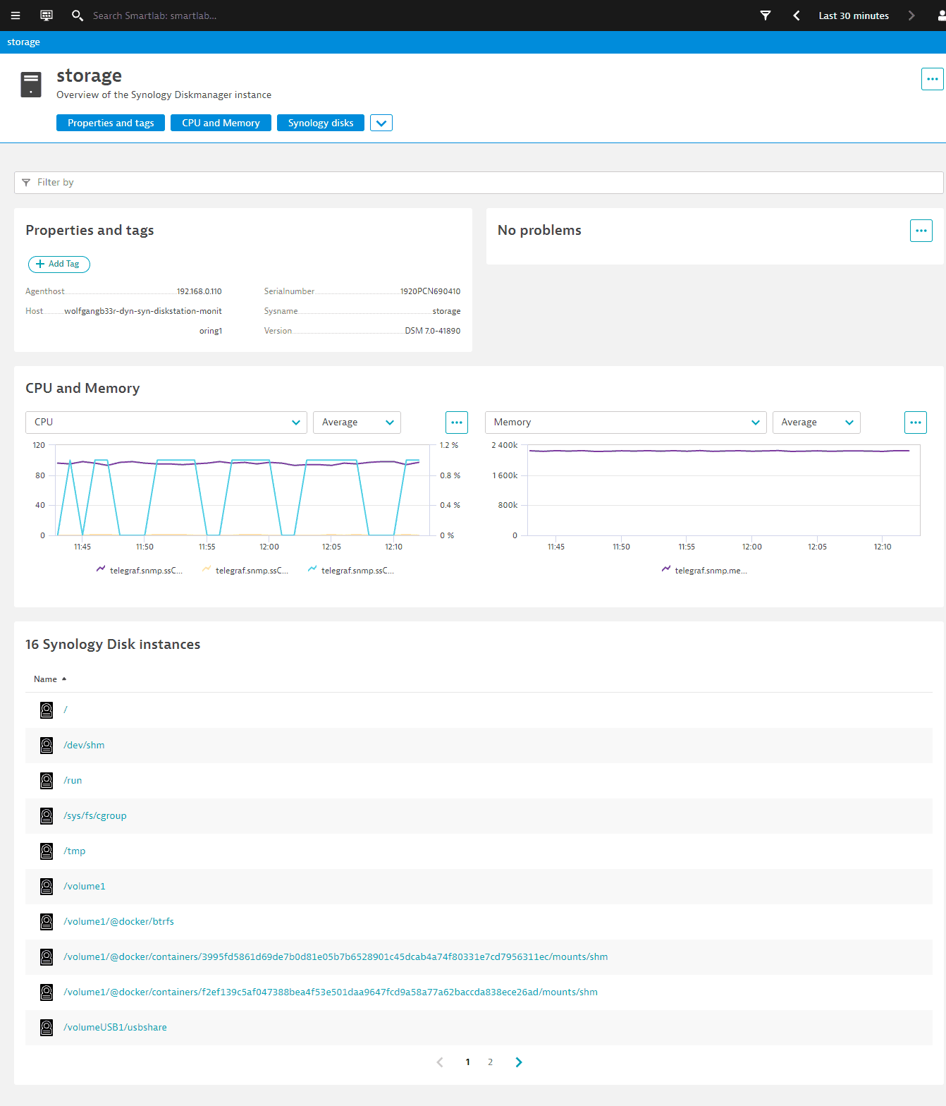
The above unified analysis page definition for the Synology DiskStation extension results in the following details screen.

Visualization types
The visualizationType defines the type for your chart:
- graph chart:
GRAPH_CHART - pie chart:
PIE_CHART - single value:
SINGLE_VALUE
If you don't specify the visualization type, the graph chart is rendered by default.
Graph chart
The graph chart type renders the graph visualization in your unified analysis page.
For graph charts, you can configure:
- display name
- color scheme:
DEFAULT,BLUE,ROYALBLUE,PURPLE,YELLOW,TURQUOISE,ORANGE,GREEN, orRED - series type:
COLUMN,LINE, orAREA
Refer to the extension schema for a full list of available options.
In this example, we specify two charts:
- CPU displays three CPU-related metrics
- Memory displays the available memory.
chartsCards:- key: cpu_memdisplayName: "CPU and Memory"numberOfVisibleCharts: 2charts:- displayName: CPUvisualizationType: GRAPH_CHARTgraphChartConfig:visualization:themeColor: DEFAULTseriesType: LINEmetrics:- metricSelector: telegraf.snmp.ssCpuIdle- metricSelector: telegraf.snmp.ssCpuSystem- metricSelector: telegraf.snmp.ssCpuUser- displayName: MemoryvisualizationType: GRAPH_CHARTgraphChartConfig:visualization:themeColor: DEFAULTseriesType: LINEmetrics:- metricSelector: telegraf.snmp.memTotalFree
The configuration above results in the following visualization on a page:

Display multiple metrics in one chart
You can add multiple metrics to the chart as a metrics array. For example:
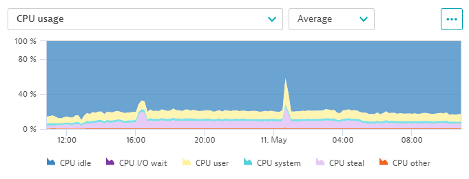
displayName: CPU usageconditions: []visualizationType: GRAPH_CHARTgraphChartConfig:visualization:themeColor: DEFAULTseriesType: AREAstacked: trueyAxes:- key: percentposition: LEFTvisible: truemin: '0'max: '100.00001'defaultAggregation: AVGmetrics:- metricSelector: builtin:host.cpu.idlevisualization:themeColor: BLUEyAxisKey: percent- metricSelector: builtin:host.cpu.iowaitvisualization: {}yAxisKey: percent- metricSelector: builtin:host.cpu.uservisualization: {}yAxisKey: percent- metricSelector: builtin:host.cpu.systemvisualization: {}yAxisKey: percent- metricSelector: builtin:host.cpu.stealvisualization: {}yAxisKey: percent- metricSelector: builtin:host.cpu.othervisualization: {}yAxisKey: percent
The configuration above results in the following visualization on a page:

Pie chart
The pie chart type renders the pie visualization in your unified analysis page.
When you define the metric selector for the pie chart, note that it shows only the first enabled metric from the query and that you also need to explicitly define various fold transformations.
For pie charts, you can configure
- display name
- color scheme:
DEFAULT,BLUE,ROYALBLUE,PURPLE,YELLOW,TURQUOISE,ORANGE,GREEN, orRED - whether the chart legend is shown
Refer to the extension schema for a full list of available options.
chartsCards:- key: cpu_memdisplayName: "My pie chart"charts:- displayName: Pie chart examplevisualizationType: PIE_CHARTpieChartConfig:metric:metricSelector: metric-keydefaultAggregation: AVGshowLegend: truethemeColor: ORANGE
Single-value
The single-value chart type renders the single-value visualization in your unified analysis page: it shows one metric as a single-value chart or tile, and merges all dimensions to a single aggregate.
For a single-value visualization, you can configure:
Refer to the extension schema for a full list of available options.
chartsCards:- key: cpu_memdisplayName: "My single value"charts:- displayName: Single value examplevisualizationType: SINGLE_VALUEsingleValueConfig:metric:metricSelector: metric-keydisplayName: Single value exampledefaultAggregation: COUNTshowSparkline: trueshowTrend: true
Filtering
You can enable filtering to the entity lists of screens created from Extensions 2.0 YAML.
For example, to filter your list by interface name:
filtering:entityFilters:- displayName: Interfacefilters:- type: entityNamedisplayName: NamefreeText: truemodifier: containsdefaultSearch: truedistinct: falseentityTypes:- my:interface
filtering—The block that defines the filtering capability.entityFilters—The blocks that define the groups of filters.filters—The actual filters that are part of this group:type—Should reference an attribute of the entity you are filtering. Every entity hasentityNameas an indexed attribute.displayName—How this filter is labeled within the web UI.freeText—If true, you can type any value instead of just selecting from a list of suggestions. Only indexed attributes such asentityNamecan offer a list of suggestions.modifier—WhenfreeTextis true,modifierdefines how the text should be matched against the attribute. Otherwise, this parameter should be omitted. All non-default attributes should match as equals regardless of this option.defaultSearch—If true, the filter is selected by default when you start typing. Only one filter within the filtering block can have this enabled.distinct—If true, only one instance of this filter can be applied. Otherwise, you will see only those entities that match all instances you have applied to the filter.entityTypes—The list of entity types to which this filter applies. If you omit this, your filtering bar will show a spinning wheel because of the incomplete definition.