Unified analysis pages
- Dynatrace Classic
- Overview
- 4-min read
- Published Mar 09, 2023
Dynatrace unified analysis pages bring all observability data and relevant analytical tools for effective analysis and troubleshooting into context. When exploring metrics, events, logs, and metadata for a problematic, domain-specific entity, you can find every observability signal related to this entity on one page.
The host overview page is an example of a unified analysis page available in most environments.
Page types
There are two types of unified analysis pages:
- List page
The list page is automatically generated and enables you to browse all instances of a specific entity type. You can find the available customizations in List settings. - Details page
The entity details page brings all observability signals attached to an entity into context. Like the list page, a details page is automatically generated for every entity in your environment. You can find the available customizations in Details settings.
Cards
On the entity page, you can define various types of cards.
Chart group
Use the chart group component to group configured charts in a grid. For configuration details, see Chart group cards.
Chart type
You can use the following chart types (controlled by the visualizationType field).
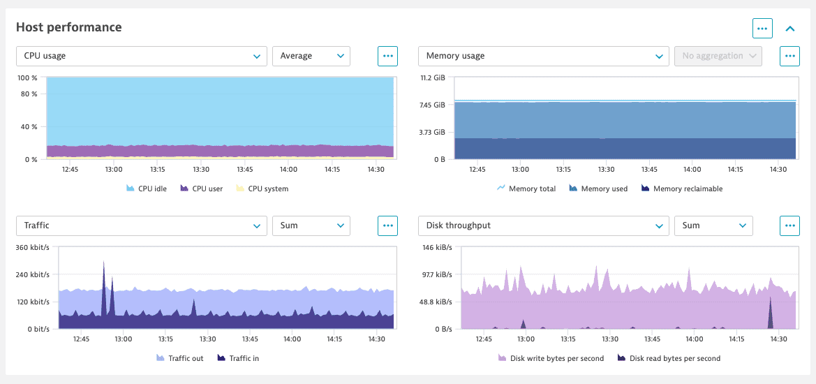
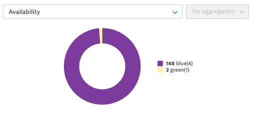
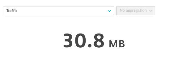
Entity list
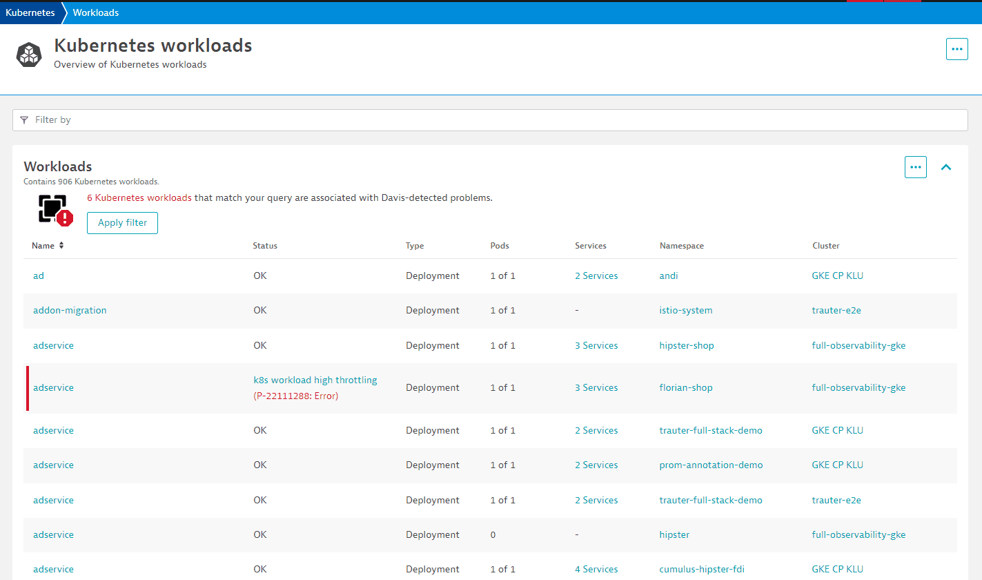
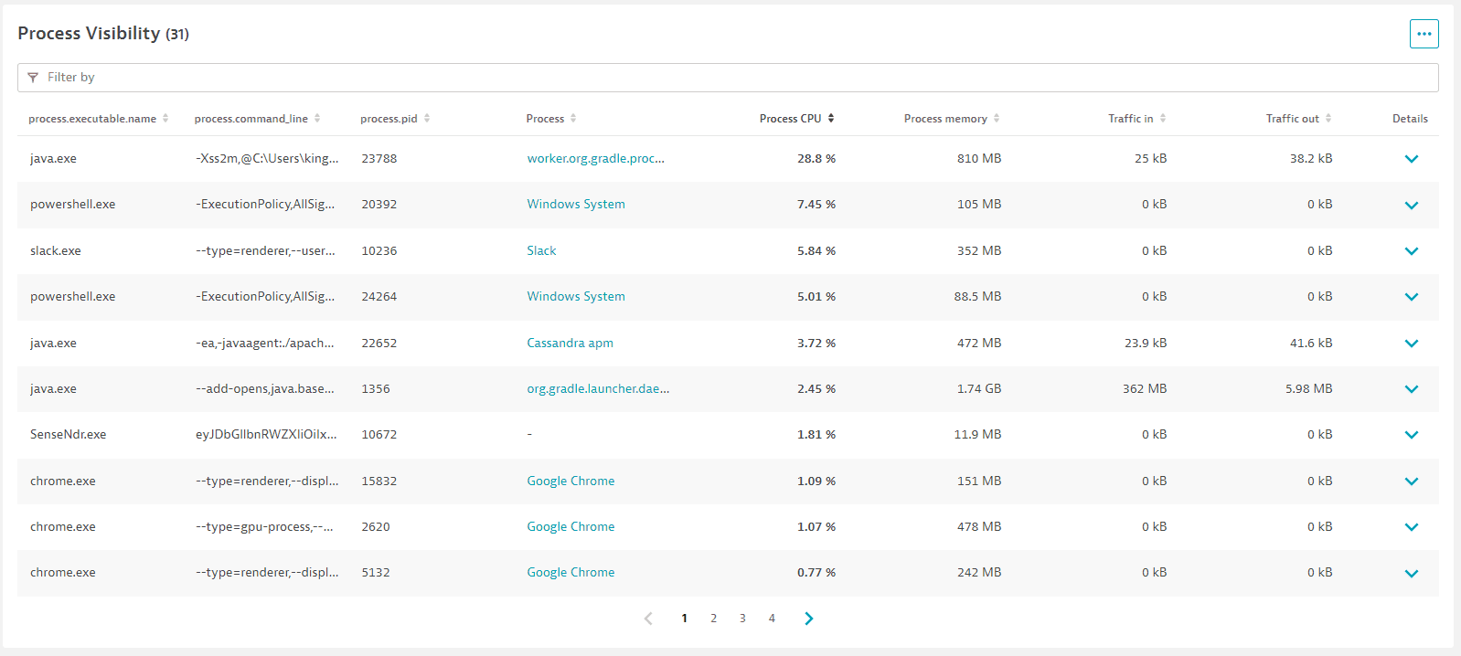
Use the entity list card to show entities of the same type, their attributes, and related entities in one table.
For configuration details, see Entities list cards.
Metric table
Use the metric table card to show multiple metric data in one table.
For configuration details, see Metric table cards.
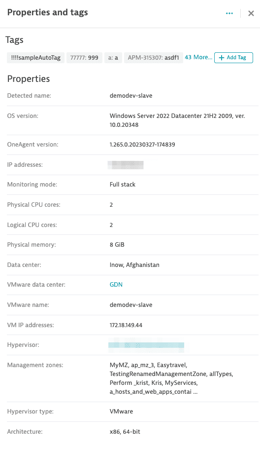
Properties
Use the properties card to show attributes and tags. By default, it displays all attributes coming from the Monitored entities API. For more information, see Notifications bar.
For configuration details, see Properties cards.
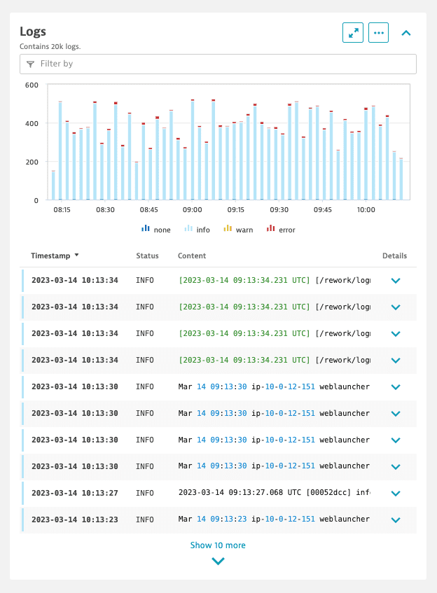
Logs
Use the logs card (which has the same functionality as the Log viewer) to display a bar chart representing different log occurrences within the selected timeframe and a detailed table where each log is an entry with additional properties such as timestamp, status, and content.
For configuration details, see Logs cards.
Messages
Use the message card to show information when a certain condition is satisfied. For configuration details, see Message cards. There are two types of message card visualization:
- Message: A card that displays text information.
- Card: A card with a title, description, and available actions.
For example, display the message card if OneAgent is not deployed:

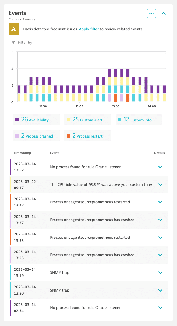
Events
Use the events card to display events related to the specified entities.
For configuration details, see Events cards.
Health
Use the health card to display specific metrics in a visual format. By default, it provides a quick overview of up to six distinct tiles, each representing a unique metric or data point.
Each tile reacts to certain events on connected metrics and may take different colors:
| Color | State |
|---|---|
Green | Data on at least one connected metric |
Red | Open problem on at least one connected metric |
Gray | Closed problem on at least one connected metric |
White | No data for this tile in the current timeframe |
For configuration details, see Health cards.

Concepts
Actions
Actions define what happens after selecting one of the available options from the More (…) menu in the upper-right corner of every card.
For configuration details, see Actions.
Filtering
Unified analysis supports filtering entities by indexed entity attributes. You can enable filtering for the list page and in the context of specific cards. Entity filtering can be configured at two levels:
- At the page level, where filtering affects all cards on the page. There are separate configurations for the details page and list page.
- At the entity list level, where filtering affects only a single list.
Injections
If you want to display the cards on the page without modifying their layout, see Extend built-in unified analysis pages.
Exploratory analysis
Exploratory analysis covers only the metrics from the graph charts that are in the chart groups, entity lists, and metric tables. For more information, see Dynatrace Intelligence causal correlation analysis.
Next step: Unified analysis tutorial