DQL table
- Latest Dynatrace
- Reference
- 8-min read
- Published Jul 13, 2026
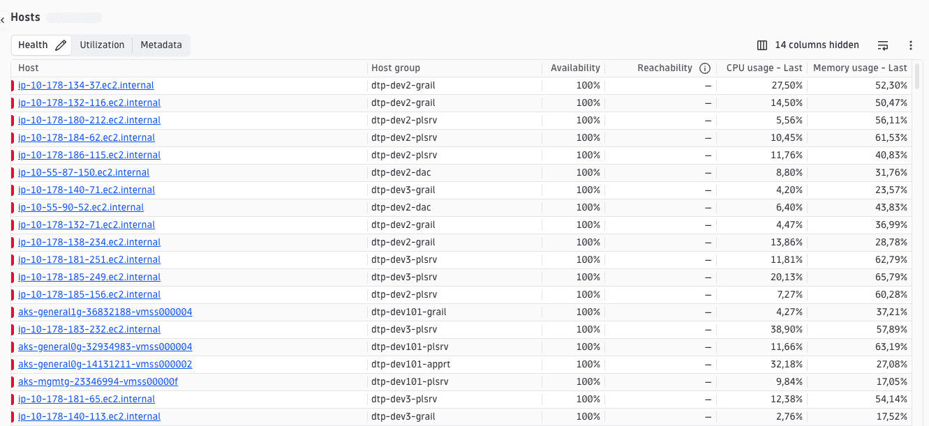
A data table driven by a DQL query, with columns, filtering, grouping, and perspectives. Usually the main component of an explorer view.
Fields
In addition to the shared CoreElement fields (see Elements overview):
| Property | Type | Description |
|---|---|---|
|
| The DQL query powering the table. Defines the data source, joins, and the field that uniquely identifies each row ( |
|
| Column definitions. Mix custom columns with built-in references. |
|
| Named column sets that you can switch between. Each perspective selects a subset of columns and optional default sorting. When omitted, no perspective switcher is shown. |
|
| Name of the perspective to activate on first load. Must match a |
|
| Health indicator config. See Health indicators. |
|
| Row-grouping configuration. |
|
| Rules for highlighting or marking rows based on field values. |
|
| Controls row highlighting and entity-detail linking. Pass the row field name that uniquely identifies the entity to enable detail-panel navigation, or |
|
| Layout rendered inside an expanded row. |
|
| When true, selecting a row toggles its expandable content instead of navigating. |
|
| Height reserved for expanded row content. |
|
| Toolbar action buttons above the table. Accepts built-in action names (for example, |
|
| Context-menu actions per cell. Accepts an |
|
| Action buttons at the trailing edge of each row. Accepts built-in or custom |
|
| Show a search box in the toolbar/header. |
|
| Enable row selection. |
|
| Fields always fetched from Grail, even when not visible as columns. |
|
| Controls DQL generation details such as limits and lookup ordering. default: |
|
| Overall table density/mode. |
|
|
|
|
|
|
|
| Card title displayed in the card header. |
|
| Card description displayed below the card title. |
|
| The semantic HTML heading element for the card title. Decouples visual level from document structure. |
DqlTableQuery
Describes the data that populates the table. It is composed of:
- A main query (
query) that produces the primary set of rows, and - Optional lookups and
additionalCommandsthat append extra data used by columns.
Every field referenced by a column must be provided by one of these queries. If a field is not found among the lookups or additionalCommands outputs, it is assumed to come from the main query.
| Property | Type | Description |
|---|---|---|
|
| Field that uniquely identifies each row. Required to merge lazily-fetched columns back into rows. |
|
| The base DQL query that provides the main set of rows. |
|
| Lookup queries joined onto the base query to append fields. |
|
| Extra query fragments that compute derived fields. |
DqlTableLookup
| Property | Type | Description |
|---|---|---|
|
| The lookup query. |
|
| Field in the base query to join on. |
|
| Field in the lookup query to join on. |
|
| Fields pulled from the lookup result. |
AlertLookup (built-in lookup)
A built-in alternative to DqlTableLookup, identified by builtInLookup: 'ALERTS_LOOKUP'. Resolved at runtime to a health-indicators lookup.
| Property | Type | Description |
|---|---|---|
|
| Discriminant. |
|
| Entity ID field the lookup matches against. |
|
| Filter expression distinguishing main-entity events from relation events. |
|
| See Health indicators. |
|
| Fields to expand. |
|
| Extra event fields to include. |
|
| Pre-filter expressions (without the leading |
When nodeType is set in InvExTypeDefinition.metadata, ALERTS_LOOKUP auto-generates the filter iAny(smartscape.affected_entities[][type] == "<nodeType>") so only events for the correct entity type are returned. Without it, the lookup returns events for all Smartscape node types. See Document types and Health indicators.
DqlTableAdditionalCommand
| Property | Type | Description |
|---|---|---|
|
| Fields this command needs resolved first. |
|
| Fields this command produces. |
|
| The DQL command fragment (for example, |
|
| Experimental — appends the command after filters but before the limit clause. |
DqlTableColumn
| Property | Type | Description |
|---|---|---|
|
| Unique column ID. |
|
| Field accessor; must correspond to a field produced by the query. |
|
| Column header label. |
|
| Column type; affects alignment and default sort behavior. default: |
|
| Overrides the default alignment derived from |
|
| Built-in cell renderer configuration. See the CellRenderer section. |
|
| Width sizing strategy. |
|
| Width value paired with |
|
| Minimum width in pixels. default: |
|
| Whether the column can be sorted. |
|
| The first selection sorts descending instead of ascending. default: |
|
| Overrides for how the column is sorted. |
|
| Default columns can't be hidden via column visibility settings. |
|
| Perspective names in which this column is visible. Columns with |
|
| Pairs with another column of the same |
|
| Loads cell data only when the cell scrolls into view. |
|
| Excludes the column from downloads even if visible. |
|
| Adds a line-wrap toggle to the column header. |
|
| Tooltip text for a header info button. |
|
| When |
|
|
BuiltInColumn
A reference to a pre-configured runtime column, usable in columns alongside custom DqlTableColumn entries. The available built-in columns are health columns and they surface health indicator data alongside your table rows without requiring manual column configuration:
{ "builtInColumn": "HEALTH_ALERTS_COLUMN" }
| Literal | Description |
|---|---|
| Health column that shows Davis health alert indicators for each row's entity. |
| Health column that shows alerts not mapped to health alert indicators configuration. |
An optional overrides object (displayName, perspectives, defaultColumn, widthType, widthValue) customizes the built-in column without fully replacing it.
CellRenderer
A discriminated union on type. Set cellRenderer: { "type": "<name>", ...params } on a column to activate a built-in renderer. Renderers with no configuration fields accept a plain { "type": "..." } object.
type | Description | Expected cell data |
|---|---|---|
| Renders an array of values. |
|
| Renders a problem count badge. |
|
| Renders a vulnerability count badge. |
|
| Renders an alert count badge. |
|
| Renders Davis health alert indicator chips. | Health indicator payload |
| Renders custom alert indicator chips. | Custom alert payload |
| Overlays warning/critical health icons on top of another renderer. | Value accepted by the inner |
| Renders an SLO breach count. |
|
| Renders the formatted duration between two timestamps. |
|
| Renders and formats CPU millicores. |
|
| Converts bytes to human-readable units (KiB, MiB, …). |
|
| Formats a 0–1 fraction as a percentage. |
|
| Renders a 0–1 fraction as a progress bar with label. |
|
| Renders a 0–1 fraction as a meter bar. |
|
| Renders a count with a rate unit suffix (for example, |
|
| Renders a number with a Strato unit (for example, |
|
| Formats a timestamp as date and time. |
|
| Formats a numeric duration with the appropriate time unit. |
|
| Renders a sparkline alongside a scalar value (v2). |
|
| Renders a list of owner chips. |
|
| Renders a clickable entity name; supports details, intent, or text modes. | Entity object ( |
| Renders "Just now" for recent timestamps, exact time otherwise. |
|
| Extracts and renders the value matching a tag key from a tag array. |
|
entity parameters
| Parameter | Type | Description |
|---|---|---|
|
| How the entity name navigates on click. |
|
| Minutes after |
|
| Stack entity name and extra info vertically. |
|
| Pathname for opening entity details in a new tab. |
|
| Search param key for the entity ID (for example, |
healthValue parameters
| Parameter | Type | Description |
|---|---|---|
|
| Renderer applied to the value itself. |
|
| Row field containing health indicator data. |
|
| Alert group to match against. |
|
| Display name for the alert. |
duration parameters
| Parameter | Type | Description |
|---|---|---|
|
| Round to seconds instead of milliseconds. |
meterBar parameters
| Parameter | Type | Description |
|---|---|---|
|
| Tooltip label shown on hover. |
countPerUnit parameters
| Parameter | Type | Description |
|---|---|---|
|
| Unit string appended as a rate suffix. |
unitRenderer / unit parameters
| Parameter | Type | Description |
|---|---|---|
|
| Strato unit identifier (for example, |
|
| Abbreviate the unit label. |
|
| Maximum decimal places. |
|
| Minimum decimal places. |
|
| Additional suffix appended after the unit. |
microChartV2 parameters
| Parameter | Type | Description |
|---|---|---|
|
| Sparkline style. |
|
| Hex color or Strato design token. |
|
| Show or hide the sparkline. |
|
| Formatter for the scalar value. |
|
| CSS width of the value area. |
|
| Y-axis bounds. |
time parameters
| Parameter | Type | Description |
|---|---|---|
|
| Input time unit. |
lastSeen / lastUpdated parameters
| Parameter | Type | Description |
|---|---|---|
|
| Minutes before switching from "Just now" to an exact timestamp. |
tag parameters
| Parameter | Type | Description |
|---|---|---|
|
| Tag key whose value to extract and display. |
DqlTableGroupingConfig
| Property | Type | Description |
|---|---|---|
|
| Fields grouped by default. |
|
| Fields you can group by, optionally organized into named groups. |
|
| Aggregation function per numeric field, keyed by field name. |
|
| Whether grouped rows can be expanded to show underlying records. |
|
| Enables expansion of grouping rows (requires expandable rows to be configured). |
|
| Hides the group-by selector even when grouping is configured. Use with controlled grouping state. |
DqlTablePerspective
| Property | Type | Description |
|---|---|---|
|
| Unique perspective name. |
|
| Label shown to you. Defaults to the value of |
|
| Description text. |
|
| Sort applied when the perspective is selected. |
RowThreshold
Serializable row-highlighting rules. A threshold is a single rule or a combined set of rules sharing one display variant: 'pill' (with a color) or 'highlight' (with backgroundColor/color). Each rule compares a field value with a comparator, optionally through an accessor.
Action unions
Action arrays accept both BuiltInAction<T> references ({ "builtInAction": "..." }) and full IntentAction objects. See Elements overview.
Providing an action array in the document overrides the default rendering for that slot. The defaults are not merged in. If you want to keep the default actions, every default action must be listed explicitly alongside your custom ones.
| Type | Used in | Built-in literals |
|---|---|---|
|
|
|
|
|
|
|
| none — intent actions only |
| per-column actions | none — intent actions only |
|
| none — intent actions only |
Examples
Minimal
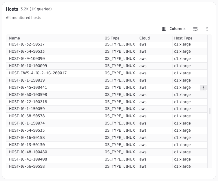
Minimal DQL table configuration. Includes the required query and columns, plus explicit card metadata and interactiveRows: false to demonstrate a non-interactive table. idField remains the unique row identifier and only drives highlighting or detail-panel navigation when interactiveRows enables that behavior.
{"type": "dql-table","id": "example-minimal","cardTitle": "Hosts","cardDescription": "All monitored hosts","interactiveRows": false,"dqlQuery": {"query": "smartscapeNodes \"HOST\" | fields id, name, os.type, cloud.provider, hypervisor.type, host.type, aws.availability_zone","idField": "id"},"columns": [{ "id": "name", "field": "name", "displayName": "Name", "type": "text", "sortable": true },{ "id": "os-type", "field": "os.type", "displayName": "OS Type", "type": "text", "sortable": true },{ "id": "cloud-provider", "field": "cloud.provider", "displayName": "Cloud", "type": "text", "sortable": true },{ "id": "host-type", "field": "host.type", "displayName": "Host Type", "type": "text", "sortable": true }]}
Perspectives
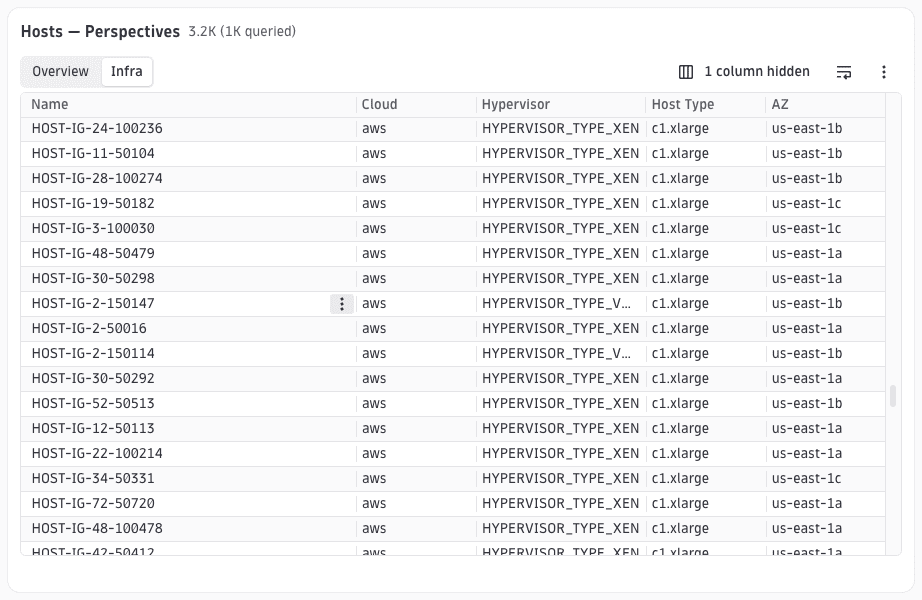
Perspectives are named column sets you can switch between via tabs. Each column declares which perspectives it belongs to via the perspectives array. defaultPerspective selects the active perspective on first load. The column set changes but the underlying DQL query stays the same.
{"type": "dql-table","id": "example-perspectives","cardTitle": "Hosts — Perspectives","interactiveRows": false,"dqlQuery": {"query": "smartscapeNodes \"HOST\" | fields id, name, os.type, cloud.provider, hypervisor.type, host.type, aws.availability_zone","idField": "id"},"perspectives": [{ "name": "overview", "displayName": "Overview" },{ "name": "infra", "displayName": "Infra" }],"defaultPerspective": "overview","columns": [{ "id": "name", "field": "name", "displayName": "Name", "type": "text", "sortable": true, "perspectives": ["overview", "infra"] },{ "id": "os-type", "field": "os.type", "displayName": "OS Type", "type": "text", "sortable": true, "perspectives": ["overview"] },{ "id": "cloud-provider", "field": "cloud.provider", "displayName": "Cloud", "type": "text", "sortable": true, "perspectives": ["overview", "infra"] },{ "id": "hypervisor", "field": "hypervisor.type", "displayName": "Hypervisor", "type": "text", "sortable": true, "perspectives": ["infra"] },{ "id": "host-type", "field": "host.type", "displayName": "Host Type", "type": "text", "sortable": true, "perspectives": ["infra"] },{ "id": "availability-zone", "field": "aws.availability_zone", "displayName": "AZ", "type": "text", "sortable": true, "perspectives": ["infra"] }]}
Grouping
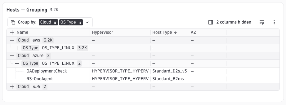
variant: 'with-row-records' groups rows while still allowing you to expand each group to see the individual host records. The first grouping level is OS type; the second level is cloud provider. rowsAreExpandable: true is required to enable row-level expansion within groups.
{"type": "dql-table","id": "example-grouping","cardTitle": "Hosts — Grouping","interactiveRows": false,"dqlQuery": {"query": "smartscapeNodes \"HOST\" | fields id, name, os.type, cloud.provider, hypervisor.type, host.type, aws.availability_zone","idField": "id"},"columns": [{ "id": "name", "field": "name", "displayName": "Name", "type": "text", "sortable": true },{ "id": "os-type", "field": "os.type", "displayName": "OS Type", "type": "text", "sortable": true },{ "id": "cloud-provider", "field": "cloud.provider", "displayName": "Cloud", "type": "text", "sortable": true },{ "id": "hypervisor", "field": "hypervisor.type", "displayName": "Hypervisor", "type": "text", "sortable": true },{ "id": "host-type", "field": "host.type", "displayName": "Host Type", "type": "text", "sortable": true },{ "id": "availability-zone", "field": "aws.availability_zone", "displayName": "AZ", "type": "text", "sortable": true }],"grouping": {"variant": "with-row-records","defaultFields": ["os.type", "cloud.provider"],"availableFields": ["os.type", "cloud.provider"],"rowsAreExpandable": true}}
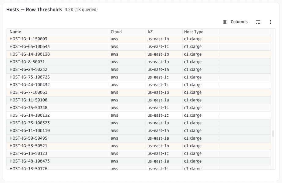
Row thresholds
Each threshold entry specifies a comparator, a string or numeric value, an accessor (the row field to compare), and a display style (highlight or pill). Rules are evaluated in order; the first match wins. Rows matching no rule are unstyled.
String accessors with dots (for example, aws.availability_zone) are automatically converted to literal-key lookups at runtime. Dot notation does not mean nested access.
{"type": "dql-table","id": "example-row-thresholds","cardTitle": "Hosts — Row Thresholds","interactiveRows": false,"dqlQuery": {"query": "smartscapeNodes \"HOST\" | fields id, name, os.type, cloud.provider, hypervisor.type, host.type, aws.availability_zone","idField": "id"},"columns": [{ "id": "name", "field": "name", "displayName": "Name", "type": "text", "sortable": true },{ "id": "cloud-provider", "field": "cloud.provider", "displayName": "Cloud", "type": "text", "sortable": true },{ "id": "availability-zone", "field": "aws.availability_zone", "displayName": "AZ", "type": "text", "sortable": true },{ "id": "host-type", "field": "host.type", "displayName": "Host Type", "type": "text", "sortable": true }],"rowThresholds": [{"comparator": "equal-to","value": "us-east-1a","accessor": "aws.availability_zone","type": "highlight","backgroundColor": "var(--dt-colors-background-container-success-default, #f1f3f3)"},{"comparator": "equal-to","value": "us-east-1b","accessor": "aws.availability_zone","type": "highlight","backgroundColor": "var(--dt-colors-background-container-warning-default, #f9f6f3)"}]}
Toolbar actions
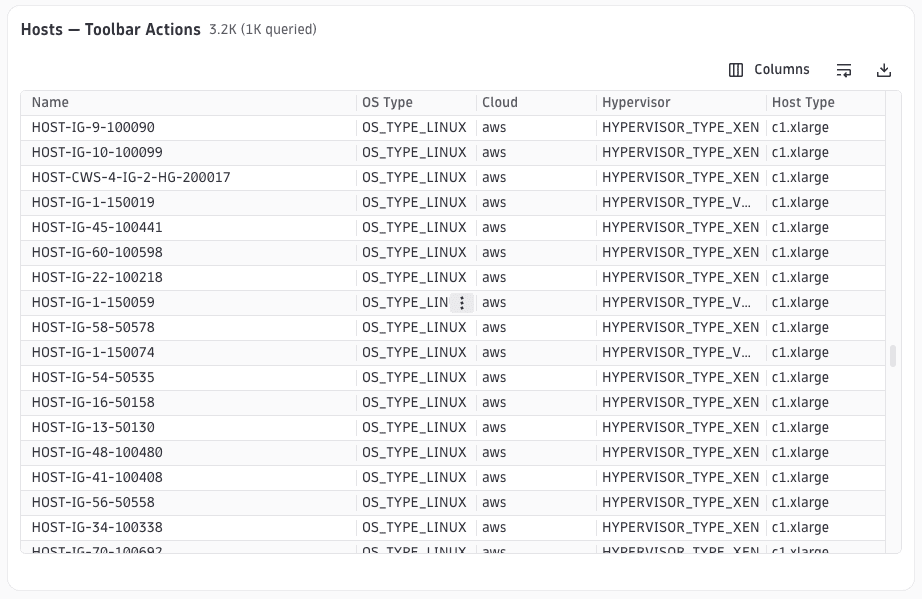
Lists which standard toolbar buttons appear above the table. Omitting toolbarItems disables the toolbar entirely. Each builtInAction value maps to a pre-configured DataTable.Toolbar element at runtime, requiring no custom render function.
{"type": "dql-table","id": "example-toolbar","cardTitle": "Hosts — Toolbar Actions","interactiveRows": false,"dqlQuery": {"query": "smartscapeNodes \"HOST\" | fields id, name, os.type, cloud.provider, hypervisor.type, host.type, aws.availability_zone","idField": "id"},"columns": [{ "id": "name", "field": "name", "displayName": "Name", "type": "text", "sortable": true },{ "id": "os-type", "field": "os.type", "displayName": "OS Type", "type": "text", "sortable": true },{ "id": "cloud-provider", "field": "cloud.provider", "displayName": "Cloud", "type": "text", "sortable": true },{ "id": "hypervisor", "field": "hypervisor.type", "displayName": "Hypervisor", "type": "text", "sortable": true },{ "id": "host-type", "field": "host.type", "displayName": "Host Type", "type": "text", "sortable": true }],"toolbarItems": [{ "builtInAction": "COLUMN_VISIBILITY" },{ "builtInAction": "LINE_WRAP" },{ "builtInAction": "DOWNLOAD_ALL" }]}
Interactive rows
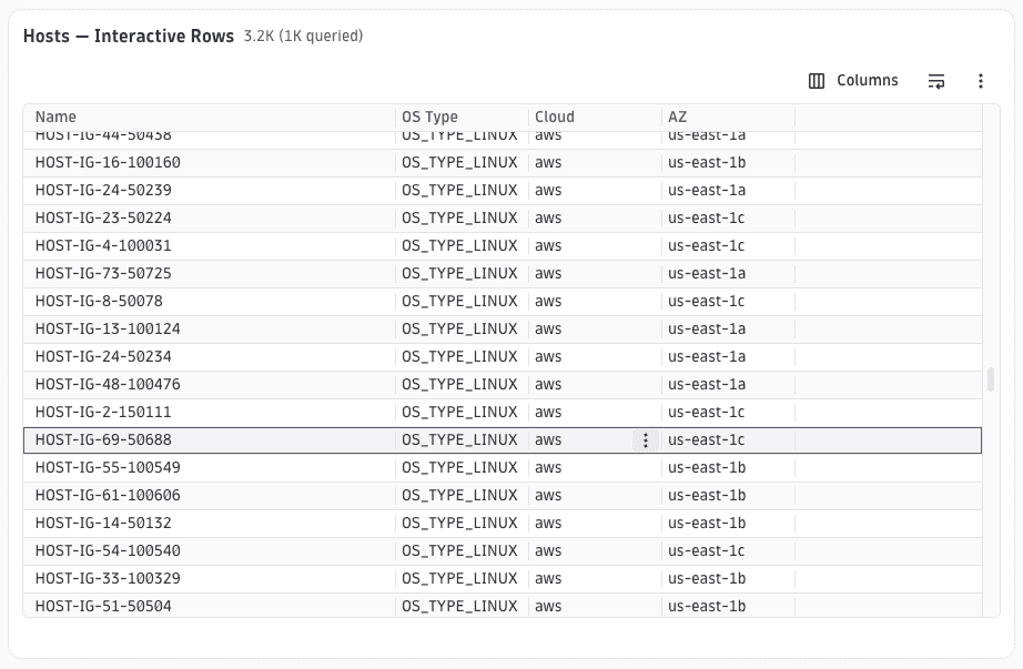
Setting interactiveRows to the row field that identifies the entity (same as dqlQuery.idField) enables the row-selection handler that highlights the selected row and updates the detailsId URL param. A companion detail panel (for example, UAEntityDetails) reads that param and renders the entity view. Without a detail panel in the same layout, selecting a row only changes the URL.
{"type": "dql-table","id": "example-interactive","cardTitle": "Hosts — Interactive Rows","interactiveRows": "id","dqlQuery": {"query": "smartscapeNodes \"HOST\" | fields id, name, os.type, cloud.provider, hypervisor.type, host.type, aws.availability_zone","idField": "id"},"columns": [{ "id": "name", "field": "name", "displayName": "Name", "type": "text", "sortable": true },{ "id": "os-type", "field": "os.type", "displayName": "OS Type", "type": "text", "sortable": true },{ "id": "cloud-provider", "field": "cloud.provider", "displayName": "Cloud", "type": "text", "sortable": true },{ "id": "availability-zone", "field": "aws.availability_zone", "displayName": "AZ", "type": "text", "sortable": true }]}
Selectable rows
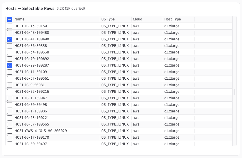
selectableRows: true renders a leading checkbox column. Multi-selection is enabled by default. Pair with toolbarItems that include DOWNLOAD_SELECTED to act on the selection.
{"type": "dql-table","id": "example-selectable","cardTitle": "Hosts — Selectable Rows","interactiveRows": false,"dqlQuery": {"query": "smartscapeNodes \"HOST\" | fields id, name, os.type, cloud.provider, hypervisor.type, host.type, aws.availability_zone","idField": "id"},"columns": [{ "id": "name", "field": "name", "displayName": "Name", "type": "text", "sortable": true },{ "id": "os-type", "field": "os.type", "displayName": "OS Type", "type": "text", "sortable": true },{ "id": "cloud-provider", "field": "cloud.provider", "displayName": "Cloud", "type": "text", "sortable": true },{ "id": "host-type", "field": "host.type", "displayName": "Host Type", "type": "text", "sortable": true }],"selectableRows": true,"toolbarItems": [{ "builtInAction": "DOWNLOAD_SELECTED" }]}
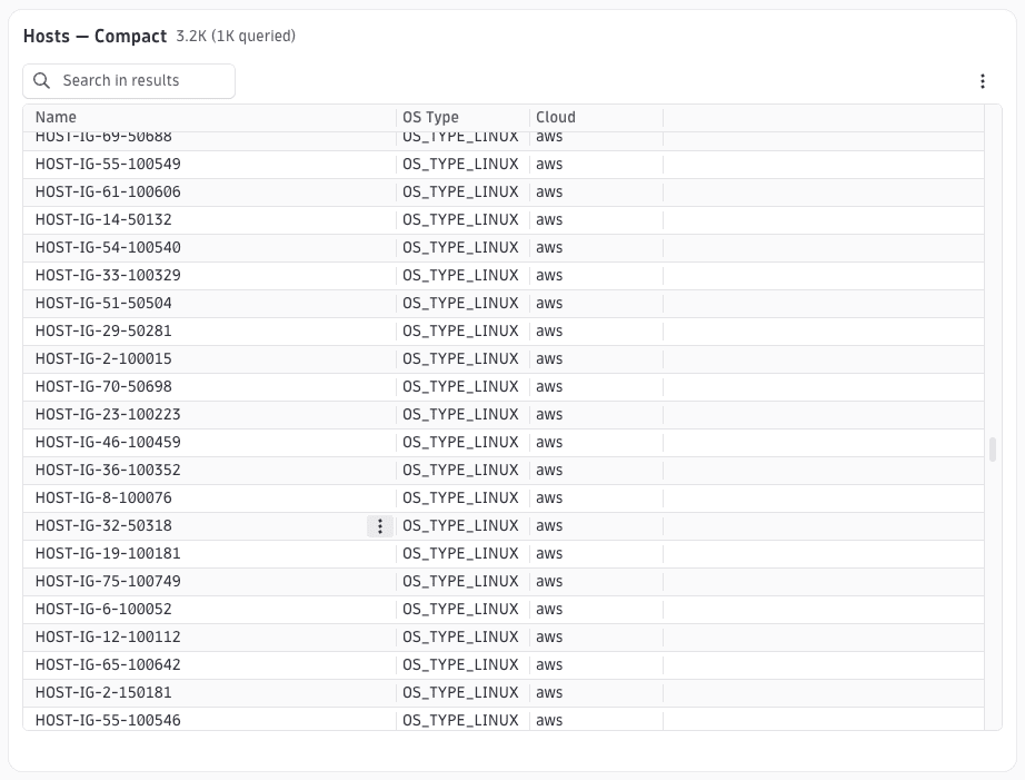
Compact mode with search
tableMode: 'compact' renders a simplified header without the full toolbar. displaySearch: true moves the search field into the compact header. Use compact mode inside entity detail panels or any space-constrained context.
{"type": "dql-table","id": "example-compact-search","cardTitle": "Hosts — Compact","tableMode": "compact","displaySearch": true,"interactiveRows": false,"dqlQuery": {"query": "smartscapeNodes \"HOST\" | fields id, name, os.type, cloud.provider, hypervisor.type, host.type, aws.availability_zone","idField": "id"},"columns": [{ "id": "name", "field": "name", "displayName": "Name", "type": "text", "sortable": true },{ "id": "os-type", "field": "os.type", "displayName": "OS Type", "type": "text", "sortable": true },{ "id": "cloud-provider", "field": "cloud.provider", "displayName": "Cloud", "type": "text", "sortable": true }]}
Cell renderers
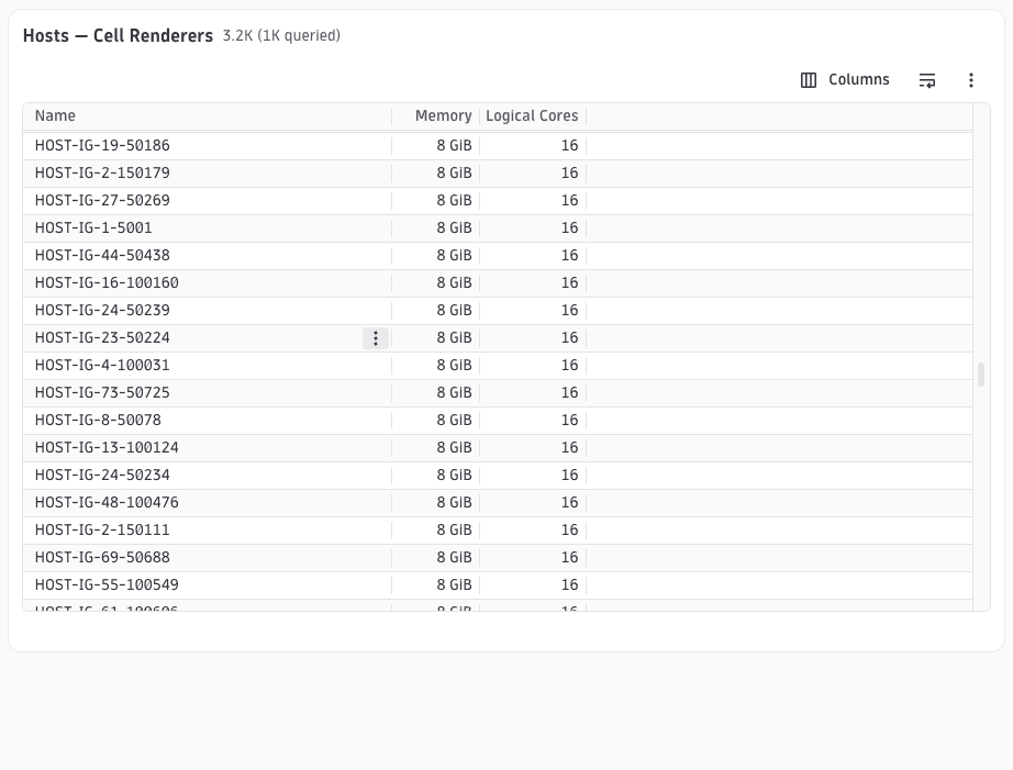
cellRenderer on a column controls how its raw value is displayed. The renderer type is a discriminated union; each variant has its own optional config fields. Common variants are
byte: Formats a number as a byte sizeduration: Formats nanoseconds as a human-readable durationpercent: Appends a%suffixentity: Renders an entity name as a selectable link
The type: 'number' column type enables numeric sorting.
{"type": "dql-table","id": "example-cell-renderers","cardTitle": "Hosts — Cell Renderers","interactiveRows": false,"dqlQuery": {"query": "smartscapeNodes \"HOST\" | fields id, name, memory, logical_cores","idField": "id"},"columns": [{ "id": "name", "field": "name", "displayName": "Name", "type": "text", "sortable": true },{ "id": "memory", "field": "memory", "displayName": "Memory", "type": "number", "sortable": true, "cellRenderer": { "type": "byte" } },{ "id": "logical-cores", "field": "logical_cores", "displayName": "Logical Cores", "type": "number", "sortable": true }]}
Row actions
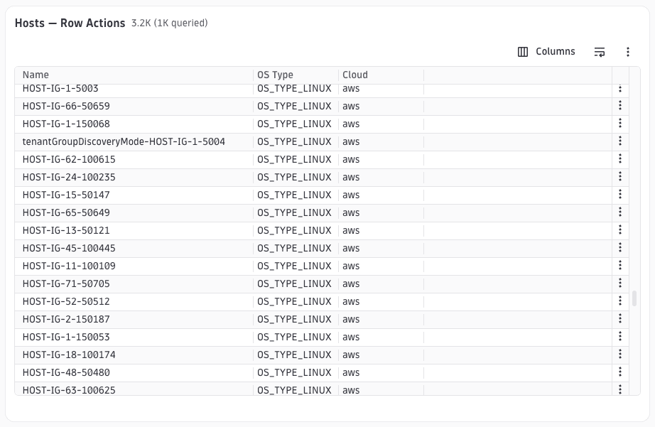
rowActions renders one or more action buttons inline at the end of each table row. Each entry is an IntentAction that opens a target app with an optional payload. Use rowActions when you want a visible per-row CTA without making the entire row interactive (cf. interactiveRows).
{"type": "dql-table","id": "example-row-actions","cardTitle": "Hosts — Row Actions","interactiveRows": false,"dqlQuery": {"query": "smartscapeNodes \"HOST\" | fields id, name, os.type, cloud.provider, hypervisor.type, host.type, aws.availability_zone","idField": "id"},"columns": [{ "id": "name", "field": "name", "displayName": "Name", "type": "text", "sortable": true },{ "id": "os-type", "field": "os.type", "displayName": "OS Type", "type": "text", "sortable": true },{ "id": "cloud-provider", "field": "cloud.provider", "displayName": "Cloud", "type": "text", "sortable": true }],"rowActions": [{ "displayName": "Open details", "appId": "dynatrace.entity.generic", "intentId": "open-entity" }]}
Lookups
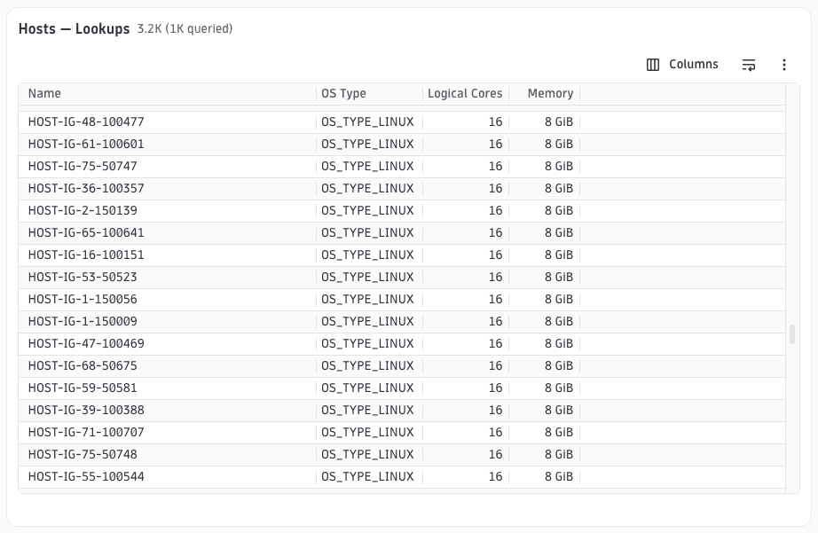
dqlQuery.lookups runs additional DQL queries and joins their results onto each main-query row. The join is performed by matching sourceField (a field on the main row) against lookupField (a field in the lookup result). Only the fields listed in fields are merged into the row; they can then be referenced by column field values as if they were part of the original query.
{"type": "dql-table","id": "example-lookups","cardTitle": "Hosts — Lookups","interactiveRows": false,"dqlQuery": {"query": "smartscapeNodes \"HOST\" | fields id, name, os.type","idField": "id","lookups": [{"query": "smartscapeNodes \"HOST\" | fields id, logical_cores, memory","sourceField": "id","lookupField": "id","fields": ["logical_cores", "memory"]}]},"columns": [{ "id": "name", "field": "name", "displayName": "Name", "type": "text", "sortable": true },{ "id": "os-type", "field": "os.type", "displayName": "OS Type", "type": "text", "sortable": true },{ "id": "logical-cores", "field": "logical_cores", "displayName": "Logical Cores", "type": "number", "sortable": true },{ "id": "memory", "field": "memory", "displayName": "Memory", "type": "number", "sortable": true, "cellRenderer": { "type": "byte" } }]}
Alert groups
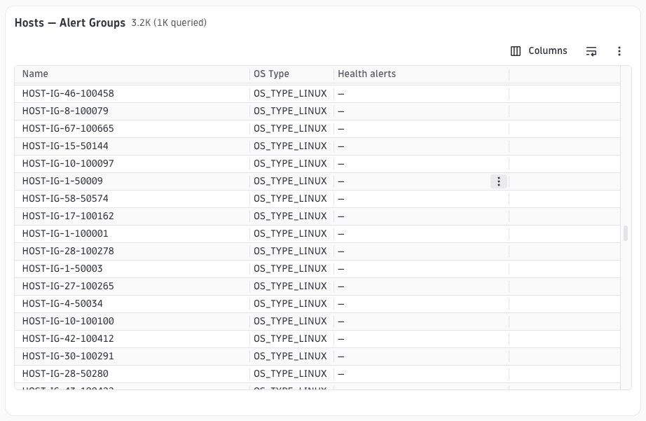
Pairing alertGroups with builtInLookup: 'ALERTS_LOOKUP' in dqlQuery.lookups wires health indicators into the table. At runtime the mapper resolves ALERTS_LOOKUP into a DQL join that fetches event snapshots for each row's entity and merges health data into the result. The HEALTH_ALERTS_COLUMN built-in column renders the aggregated alert chips. Each alertGroups entry is a named chip group. alerts within a group define which events to match via matchConditions (field: allowed values).
{"type": "dql-table","id": "example-alert-groups","cardTitle": "Hosts — Alert Groups","interactiveRows": false,"dqlQuery": {"query": "smartscapeNodes \"HOST\" | fields id, name, os.type","idField": "id","lookups": [{ "builtInLookup": "ALERTS_LOOKUP" }]},"alertGroups": [{"groupName": "Availability","alerts": [{ "displayName": "Host unavailable", "matchConditions": { "event.category": ["AVAILABILITY"] } }]},{"groupName": "Performance","alerts": [{ "displayName": "Performance degraded", "matchConditions": { "event.category": ["PERFORMANCE"] } }]}],"columns": [{ "id": "name", "field": "name", "displayName": "Name", "type": "text", "sortable": true },{ "id": "os-type", "field": "os.type", "displayName": "OS Type", "type": "text", "sortable": true },{ "builtInColumn": "HEALTH_ALERTS_COLUMN" }]}
Conditional columns
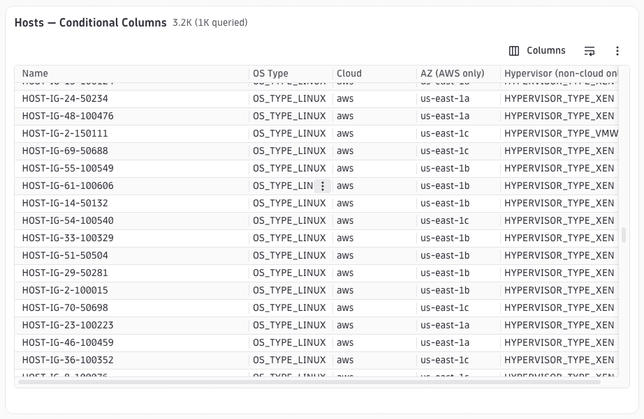
Each column can carry a conditions array. Conditions reference variables resolved by a conditionContext DQL query declared at the wrapping document root. A column is only rendered when all its conditions evaluate to true (AND semantics).
{"type": "dql-table","id": "example-conditional-columns","cardTitle": "Hosts — Conditional Columns","interactiveRows": false,"dqlQuery": {"query": "smartscapeNodes \"HOST\" | fields id, name, os.type, cloud.provider, hypervisor.type, host.type, aws.availability_zone","idField": "id"},"columns": [{ "id": "name", "field": "name", "displayName": "Name", "type": "text", "sortable": true },{ "id": "os-type", "field": "os.type", "displayName": "OS Type", "type": "text", "sortable": true },{ "id": "cloud-provider", "field": "cloud.provider", "displayName": "Cloud", "type": "text", "sortable": true },{"id": "availability-zone","field": "aws.availability_zone","displayName": "AZ (AWS only)","type": "text","sortable": true,"conditions": [{ "type": "dql-variable", "variable": "cloud.provider", "value": "aws" }]},{"id": "hypervisor","field": "hypervisor.type","displayName": "Hypervisor (non-cloud only)","type": "text","sortable": true,"conditions": [{ "type": "dql-variable", "variable": "cloud.provider", "value": ["", "CLOUD_PROVIDER_UNKNOWN"] }]}]}
See also
 ExtensionsInfrastructure Observability