Categorical chart visualization
- Latest Dynatrace
- How-to guide
- 2-min read
Use a categorical bar chart:
- When you want to group your data according to defined categories and compare their aggregated values rather than see them over time. It's particularly useful when you have more than five distinct categories, where a pie or donut visualization becomes insufficient to compare the different proportions.
- When you have frequency or count data for distinct categories. For example, requests by response code, errors by error type, or log lines by status.
Example
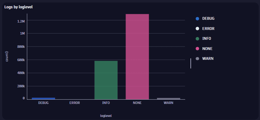
The above categorical bar chart is based on the following query.
fetch logs| summarize count(), by:{loglevel}
In the Categorical bar chart options section, Category axis label is set to loglevel to show the label on the X-axis.
This categorical bar chart shows the values on the vertical axis and the categories along the horizontal axis.
Chart interactions
Selection interactions
- Hover to display a tooltip showing details.
- Select to pin the displayed tooltip open; you can then hover over the tooltip to display a menu of selection-specific options.
Available menu options vary according to your data and the selected visualization.
-
Copy name—copy the name of the selected host.
-
Fields—a section with a submenu for each query field. A field submenu offers field-specific options such as:
- Copy value—copy the value of the field.
- Explain value—use AI to explain the field.
- Add command to query—a section of field-specific commands that you can automatically add to your query.
- Up to three recommended apps may be listed per field.
-
Visual options—opens the edit panel so you can change visualization options for the selected item.
-
Set color—opens the edit panel so you can change the color of the selected item.
-
Add link—for details, see Links.
-
Open with lets you select a different target app. For details, see Open with.
Title
Use the title field at the top of the options panel (initially Untitled tile or Untitled section) to add a title to your dashboard tile or notebook section.
- You can use emojis such as 😃 and 🌍 and ❤️.
- You can use variables.
Example:
- Define variables called
StatusandEmojiin your dashboard. - Set the title to
Current $Emoji status is $Status. - Set
StatustoGood. - Set
Emojito🌍.
The title will be displayed as Current 🌍 status is Good.
Visualization
If you aren't sure that you chose the right visualization, use the visualization selector to try different visualizations.
Data mapping
The data mapping section shows how a column of your result is mapped to the visualization.
Expand for general rules on data mapping settings
Expand the Data mapping section of your visualization settings to see how data in your result is mapped to your visualization, and to adjust those settings if needed.
-
Mandatory fields are marked with an asterisk (
*). Example: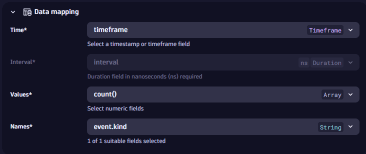 Example data mapping: line chart
 -
Data types are displayed next to field names in dropdowns and mapped fields.
-
Units are displayed when there’s only one assigned.
-
Result fields are grouped into Suitable and Unsuitable. Fields are marked as unsuitable if they cannot be used to display data in the visualization. Example:
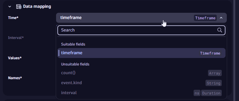 Example data mapping: line chart, Time dropdown
 -
Automatic application of data mapping default settings:
Dynatrace version 1.319+
- Already existing tiles and sections are considered to be user-defined. Their data mapping configurations aren't updated automatically.
- Newly created tiles and sections apply a data mapping setting by default. If you don't modify these settings manually, these settings might change if a new execution of the tile/section modifies the results and there are fields missing or new fields that better suit the data mapping.
Visualization-specific data mapping settings
For a categorical bar chart, the data mapping section includes:
-
Values: the value (numerical) to display. If multiple values are listed, you can select more than one at a time.
-
Categories: the column of your result that is displayed as the category.
Categorical chart options
To learn about options quickly and decide what works best for you, turn options on and off and see the effect immediately on your chart. For example, does it look best with a label or without? Turn that option on and off and see for yourself.
Axes
- Category axis label
- Value axis label
- Min and Max
- Relative values
General
- Color mode—select multi-color or single-color mode.
- Color palettes—select a color palette from the list.
- Legend position—select where to display the visualization legend:
- Automatic—Dynatrace chooses an appropriate location
- Hidden—no legend is displayed
- Bottom—the legend is displayed along the bottom of the visualization
- Right—the legend is displayed on the right side of the visualization
- Vertical layout—Determines the orientation of the chart:
- Horizontal—the bars are oriented horizontally, from left to right
- Vertical—the bars are oriented vertically, from bottom to top
- Category tick label layout—specifies the orientation of the category tick labels:
- Horizontal—the category tick labels are oriented horizontally, from left to right
- Vertical—the category tick labels are oriented vertically, from bottom to top
Overrides
- Category colors—to override a category color, select from the list.
Time axis
Selects the X-axis.
Left axis
Sets the scale of the left axis:
- Logarithmic
- Linear
Legend and tooltip
-
Show legend: To display a legend, turn on Show legend and select the legend Position.
-
Position: Determines where to display the legend.
- Auto: Selects an appropriate location based on the visualization size and the available space.
- Bottom: Displays a legend under the visualization.
- Right: Displays a legend to the right of the visualization.
-
Text truncation: Determines how to truncate text when the full text can't be displayed.
- A…: Trim from the right end of the text (when the right end is less important)
- A…B: Trim from the middle of the text (when the middle is less important)
- …B: Trim from the left end of the text (when the left end is less important)
-
Tooltip variant
- Grouped displays points from the closest data
- Shared shows all points for this timestamp
-
Tooltip series mode: Defines if the tooltip shows a datapoint's properties in one or multiple lines.
- Single line
- Multi line
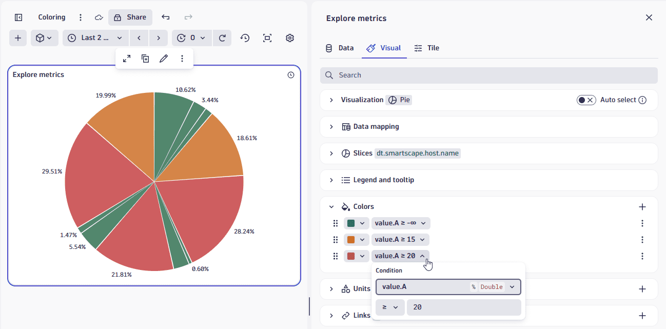
Colors
The color settings for a visualization are displayed in rows.
Each row associates a color scheme with a condition/value related to a selected field displayed in the visualization.
To adjust the settings for a row, there are two menus of settings that will be used in combination to determine which color is displayed:
- The first menu in a row displays the selected color or color palette. Open this menu to display three tabs of color options:
- Palettes: select a color palette to use for this row.
Palette exceptions for certain visualization types
- Heatmap and honeycomb: the palette only applies the first color (unless color rules match the data mapping values or Name is used), and the palette is not reflected in the legend.
- Categorical: the nth color in the palette is applied to the nth item in the series.
- Categorical for multiple subcategories: palettes are by bin but are not reflected in the legend.
- Table: palettes are not applicable to tables.
- Colors: select a color to apply uniformly when this rule matches.
- Custom: specify a precise hex color code (for example,
#134FC9) or use the color picker to select a color visually.
- Palettes: select a color palette to use for this row.
- The second menu in a row displays the condition under which this row's color will be displayed. Select the current setting to change the field, operator, and value as needed to evaluate the condition.
- The fields available for evaluation depend on the raw data.
- Name is a special property constructed via the Data mapping setting Names.
- Value is a special property constructed via the Data mapping setting Values (heatmap visualization only).
- The available operators change to suit the conditon being evaluated.
- The fields available for evaluation depend on the raw data.
Colors: additional actions
- To add a row, select and configure it as described above.
- To move a row up or down in the table, select and drag .
- opens a menu of further options:
-
Move up and Move down move the row up or down one row. These are alternatives to .
Remember that colors are applied in the order in which they are listed in the Colors section, from top to bottom, so changing the order may give you different results.
-
Duplicate creates a copy of the selected row.
-
Delete section removes the row. You can delete all color rules for table and single value visualizations; all other visualizations need at least one color rule.
-
Colors: Examples:
Pie
In this pie visualization example, we have applied:
- Green to slices with values below 15.
- Yellow to slices with values at or above 15.
- Red to slices with values at or above 20.
If you changed the order of the rows in the Colors section, you would see different colors. For example, if you swapped rows 2 and 3 above, all slices with values at or above 20 would be colored red, but then all slices with values at or above 15, including all the red slices, would be colored yellow.
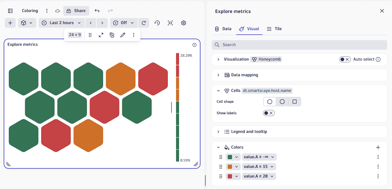
Honeycomb
In this honeycomb visualization example, we have applied:
- Green to all
value.Avalues. - Yellow as a row marker (on the left) for
value.Avalues at or above 15. - Red to the entire row for
value.Avalues at or above 20,
The result is a fully thresholded honeycomb chart. You can use other honeycomb visualization settings to adjust the labels, tooltip, legend, and so on.
Thresholds
Each row in the thresholds settings associates a color with a value or range of values in the visualization. For example, you can specify that everything between two values is shaded green in the chart. Note: the line, area, column, scatterplot, and heatmap visualizations only allow thresholds for numeric fields.
To configure a threshold in a dashboard or notebook visualization
-
Select to edit the visualization tile.
-
Expand the Thresholds section.
Not all visualization types have thresholds settings
Only the following visualizations have Thresholds settings:
- Area
- Categorical
- Line
- Bar
- Band
- Histogram
- Scatterplot
For other visualization types, use the Colors section to get similar effects by applying value-dependent colors to visualization elements such as table rows, honeycomb cells, and pie slices.
-
To add a row, select .
-
Define the threshold.
For each row, there are two menus of settings that are used in combination to determine which color is displayed if the threshold conditions are met:
-
Open the first menu to select a standard or custom color to display for the selected threshold.
- Use the Colors tab to select from standard colors. Values are dynamic and vary based on the selected theme (light or dark).
- Use the Custom tab if you would rather specify a precise hex color code (for example,
#134FC9) or use the color picker to select a color visually.
-
Open the second menu to define the threshold conditions for this color. This can be a range or a single value:
-
Use the Range tab if you want to define a threshold range (two values) between which the selected color should be applied.
- Filled: When this is turned off, the range is indicated only on the Y-axis by a range indicator in the selected color. When this is turned on, everything within the range is also colored.
- Min: the minimum value of the range.
- Max: the maximum value of the range.
- Label: the label to display (with the range) when you hover over the Y-axis range indicator.
-
Use the Line tab if you want to define a single threshold Value and Label. This draws a line of the selected color at the value you set here.
-
-
Thresholds: Additional actions
- To add a row, select and configure it as described above.
- To move a row up or down in the table, select and drag . The order of these rows matters: if two settings match, the last match is the one applied to the chart.
- opens a menu of further options:
- Move up and Move down move the row up or down one row.
These are alternatives to . - Duplicate creates a copy of the selected row.
- Delete section removes the row.
- Move up and Move down move the row up or down one row.
Thresholds: Examples
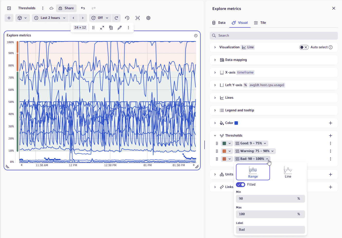
Line
In this table visualization example, we have applied:
- Green from 0% to 75%.
- Yellow from 75% to 90%.
- Red from 90% to 100%.
Units and formats
To override the default units and formats in a dashboard or notebook visualization
-
Select to edit the visualization tile.
-
Select the Visual tab.
-
Expand Units and formats.
The Units and formats section lists all available unit settings for the document (dashboard or notebook). Some units may already be added automatically when querying metrics from their metadata.
Each row has two menus:
- The left menu displays unit settings.
- The right menu displays field mapped to that unit.
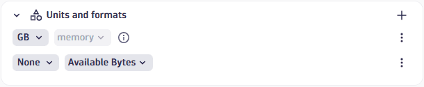 Example rows in "Units and formats" settings
 -
To edit unit settings, open the left menu and review/set the following settings:
-
Unit: The base unit in which the values were captured. It's
Noneif it was not included in the DQL result, or its automatically defined by the unit passed from the DQL result. This field doesn't lead to any conversion but modifies the suffix to correspond to the unit. -
Convert: You can turn on Convert for conversion. For example, if the DQL result defined your numeric value in the result as
Bytes, Convert now offers a suitable list of byte conversions such asKilobyteandMegabyte.Only linear and static conversions are supported. For example, you cannot convert
Degree Celsius(°C)intoDegree Fahrenheit(°F), or convertUsd(US$)intoEur(€).
The Format section determines how the unit is displayed:
- Decimals: displays the default number of decimals (degree of precision) to display. To see it in action, change the Decimals selection and observe the change in the visualization.
- Custom suffix: displays the suffix to display after the unit. To see it in action, turn on Custom suffix, enter a string, and observe the change in the visualization. When you don't find the unit you're looking for, you can use Custom suffix to display the desired unit.
- Abbreviate large numbers: displays large figures in abbreviated form. For example,
1053becomes1.1K. - Multiple units: displays more than one unit. Turn this on and select the number of units to display. For example,
90 secondsbecomes1m 30sif multiple units is enabled and 2 units are selected.
-
-
To choose a different field for a row, open the right menu in that row and select a field from the available fields.
Units and formats: Additional actions
- To add a row, select (Add) and configure it as described above.
- (Actions) opens a menu of further options:
- Duplicate creates a copy of the selected row.
- Delete removes the row.
- Reset resets the settings in the selected row to default/metadata values.
Units and formats: Examples
Chart average CPU across all hosts
This example uses a line chart, but the options apply to other visualizations.
-
In
 Dashboards, create a dashboard.
 -
Select and, in the Library section of the menu, select Chart average CPU across all hosts.
-
In the edit panel, select the Visual tab and select Line.
-
Expand Units and formats.
One row is already defined based on metadata from
avg(dt.host.cpu.usage). -
To override the unit settings for that field, open the left menu in that row to display the unit settings.
-
Define an override for the displayed metric. You can observe your changes in the Y-axis of the chart.
-
Unit displays
Percent, which is the default unit for the selected metric. -
Turn on Convert to try conversions settings. For example, change
AutotoOneto display the result as a fraction of 1. -
Decimals displays the default number of decimal points (degree of precision) to display. For example, enter
Pctand review the dashboard to seePctinstead of%displayed after the percentage value. -
Turn on Custom suffix to try different suffixes to display after the unit. For example, change the Decimals selection and review the dashboard to see the change in the number of decimal points in the percentage value.
-
To reset to defaults (discard override settings for the selected metric), open the (Actions) menu for that row and select Reset.
Links
Use the Links section to manage custom links from your dashboard or notebook.
Add a link
To add a link
- Open the Links section in the visualization tab of your selected visualization.
- Select to open Add link.
- Configure the link:
- Name: Enter a descriptive name such as "Go to Host" to display in the menu.
- Icon: Select an icon such as "Logs" to represent the link in the menu.
- URL: Use dynamic placeholders to insert data fields or variables. For example, select Insert placeholder and add the
:nameplaceholder to the your URL likehttps://myhost/host={{:name}} - Use the Preview section at the bottom to see how placeholders will be replaced with actual data and to test your link.
- Select Add link to save. The link will now appear in the visualization's tooltip menu.
Links: Additional actions
- To add a row, select and configure it as described in Add a link.
- To move a row up or down in the table, select and drag .
- opens a menu of further options:
- Edit displays link fields for editing as described in Add a link.
- Duplicate creates a copy of the selected row.
- Delete removes the row.
For details, Link from visualization via custom links
Query limits
Use the Query limits section to check and adjust the Grail query limits per notebook section or dashboard tile. These settings determine the maximum limits when fetching data. Exceeding any limit will generate a warning.
Dashboard tiles and notebook sections created in Dynatrace earlier than version 1.296 are not affected. Those existing tiles/sections will return the same results as before.
-
Read data limit (GB)
The limit in gigabytes for the amount of data that will be scanned during a read.
-
Record limit
The maximum number of result records that this query will return. Default: 1,000 records. To see more records, you need to increase the value of Record limit.
-
If your query has no
limit, such asfetch logsthe value of Record limit is applied. By default, you will see up to 1,000 records.
-
If your query also includes a
limit, such asfetch logs| limit 2000the lower of the two values (either
limitin your query, or Record limit in the web UI) is applied.In the example above, you would still see only 1,000 records unless you increased the value of Record limit.
-
-
Result size limit
The maximum number of result bytes that this query will return. For better performance with typical queries and smaller documents, the default is set to 1 MB.
-
Sampling (Logs and Spans only)
Results in the selection of a subset of Log or Span records.