HTTP monitors reporting results
- Latest Dynatrace
- Reference
- 15-min read
The HTTP monitors reporting results page provides an overview panel of monitor execution results, result visualizations, and monitor properties. The details panel shows you at-a-glance information and graphs, with ready links and filters to drill right down to problem details and edit monitor settings.
To access the HTTP monitors reporting results page,
- Go to
 Synthetic.
 - Optional Select HTTP on the left to filter the list for HTTP monitors.
- From the list of HTTP monitors, select the monitor you want to examine.
- Select View details from the preview panel to access the details page.
Metric visualizations
The top panel shows overall monitor availability and performance infographics for the selected timeframe.
Use the filter bar at the top of the page to filter all HTTP details by one or more locations.
In the upper-right corner of the page, you can access Analyze executions, On-demand execution, and more HTTP monitor settings:
- Edit
- for more options ( Disable and Delete)
Analyze executions
DPS License
If you're a non-DPS user, see HTTP monitors reporting results in Classic.
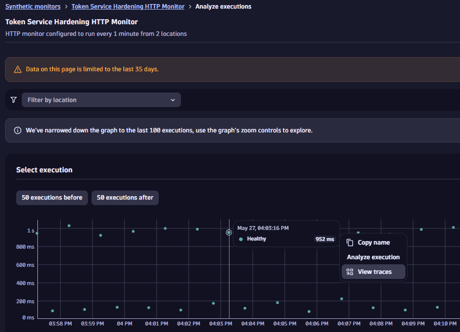
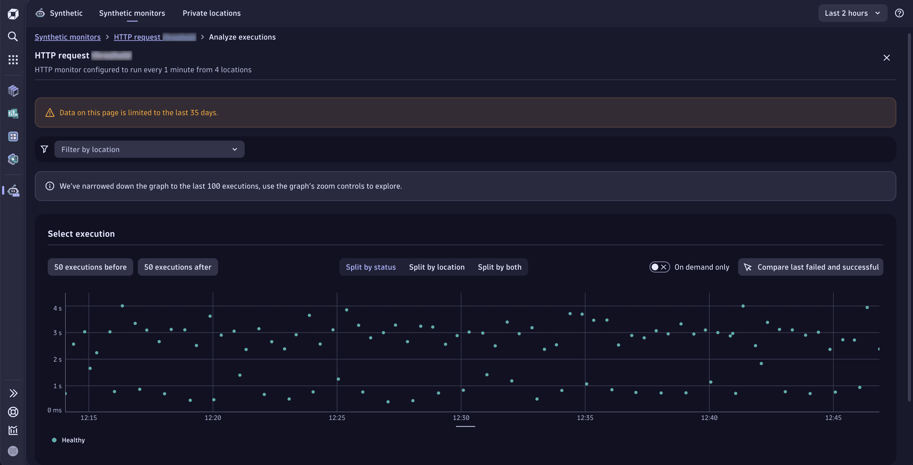
When you access Analyze executions functionality, you're presented with the Select execution section with the scatter plot chart on which you can move the view window to the next or previous 50 executions. For readability, the whole chart is limited to 100 points. The content of the scatter plot chart might be divided into results (success/failure), locations, or all of those dimensions. Therefore, you can analyze your executions in three ways:
-
Split by status—the default view shows Healthy and Failed executions separately. Below the graph, there's a legend where you can select any status to focus the graph on it. Select icon for more options.
-
Split by location—shows executions performed from different locations. Below the graph, there's a legend where you can select a given location to focus the graph on it. Select icon for more options.
-
Split by both—combines the Split by status and Split by location views.
Note that if there's more than one execution status for the location, the legend below the graph presents the location more than once. For example,
Las Vegas (Healthy)andLas Vegas (Failed).
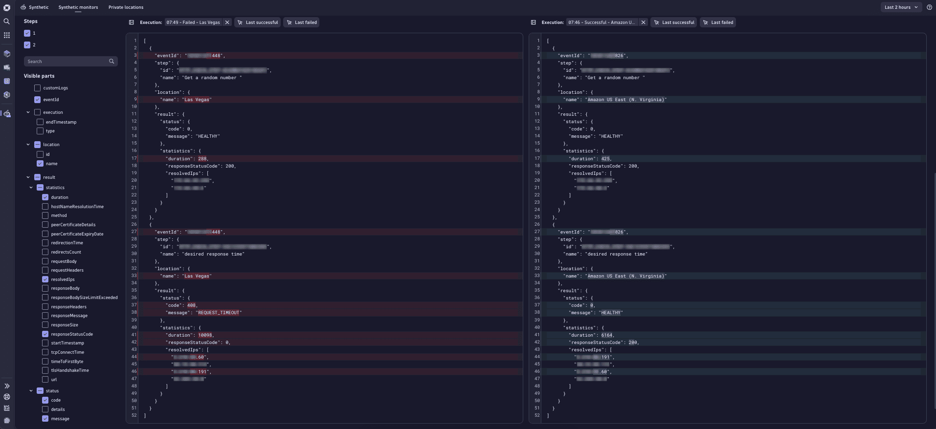
Not only can you see the details of the last failed or successful execution, but also the details of all executions within the retention period.
-
Each dot represents a separate execution. You can select any dot, hover over the data, and select Analyze execution to display the execution's details in the panel below.
-
You can narrow down the displayed details to a needed set of elements using filters visible on the left in the Visible parts section.
-
You can also select two executions for comparison. To do that
- Select an execution and hover over their data visible in the tooltip. Then, select Analyze execution.
- Select the second execution you want to compare the first with. Hover over their data visible in the tooltip and select Compare execution.
You'll see the following comparison:
 Synthetic HTTP compare execution
You can trigger an execution on-demand. For details, see On-demand monitor executions.
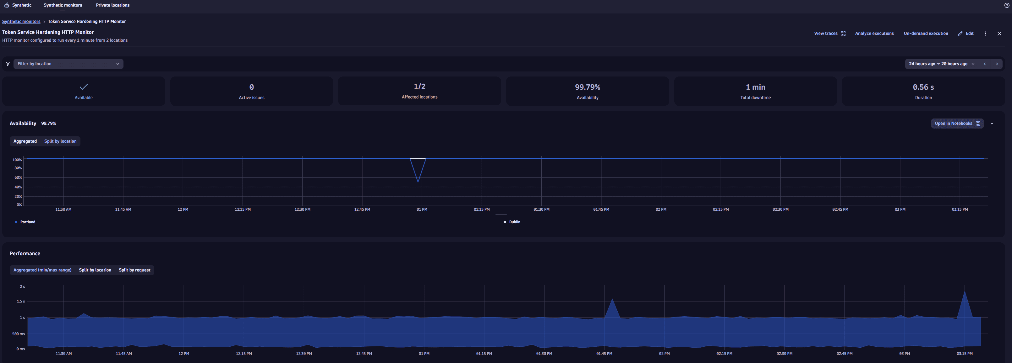
Availability
The Availability section displays the monitor's availability for the selected timeframe, with details of downtime and affected locations, if any. The panel contains information about all problems related to the given monitor. Outage (downtime) duration and affected locations infographics are displayed if the monitor is down (unavailable) at one or more locations.
Also, the panel shows reasons for discarded tests. The bar above the time frame indicates when a downtime occurred. Hover over the bar to see why the tests were discarded. The possible reasons can be:
-
Maintenance window - the monitor execution was deliberately made inactive due to maintenance. For details, see the maintenance window.
How to see the maintenance window, and what happens if the monitor execution is on/offTo see the maintenance window:
-
Select the bar to pin the Maintenance window tooltip.
-
Hover over the Maintenance window tooltip.
-
Select View maintenance window settings.
-
Select Settings Classic.
- When the Disable synthetic monitor execution option is on in the maintenance window, the tests are suppressed during the maintenance period so there are no tests results for this period.
- When the Disable synthetic monitor execution option is on in the maintenance window, the scheduled automatic tests are suppressed during the maintenance period, but the on-demand tests are not suppressed.
- When the Disable synthetic monitor execution option is off in the maintenance window, the tests are executed during the maintenance period, but, due to maintenance, the test results may differ from those observed under the normal conditions.
-
-
No result - the execution started but the results were not delivered. Reach out to the Dynatrace support team.
-
No capability - you're trying to execute monitors that aren't supported by a location (for example, NAM ICMP monitors - from a location with inactive ICMP).
-
Discarded, not executed - the probable cause is the overloaded private location. Check the capacity metrics. If there are no issues with the metrics, contact the Dynatrace support team.
-
Http monitor local outage - the outage happened in one or more locations from which the monitor executed the tests.
-
Http monitor global outage - the outage happened in all locations from which the monitor executed the tests.
Local and global outage - view problem detailsTo see the details of the problem that's causing the local or global outage:
- Select the bar with the icon to pin the Http monitor local outage or Http monitor global outage tooltip.
- Hover over the tooltip.
- Select View problem details.
- Select one of the available options:
- Problems Classic
- Problems in the problems app
- Problems in the current app to view problem details.
A monitor can be down at one or all locations even if no outage thresholds (global or local) have been set up. The outage duration is the sum of all downtimes in the selected timeframe, not counting overlapping downtimes.
The Availability card shows overall availability across all monitor locations, with annotations for global/local outages and global/local missing data (as when the monitor is inactive).
-
For details on how availability is calculated, see Availability in Synthetic calculations.
-
For details on how total downtime is calculated, see Total downtime in Synthetic calculations.
Open in Notebooks
DPS License
Through the Availability section, you can also access Notebooks  with three predefined DQL queries which are executed to get data from Synthetic events in Grail.
Note that queries for synthetic events from outside the Synthetic application, such as those from Notebooks , Dashboards  , and SRG
  , are not charged.
The predefined queries are examples of how to deal with synthetic monitor execution details using our Dynatrace Query Language. You can use those queries as patterns and adjust them to your needs.
- Query number 1—returns an executions list of the selected monitors within the selected time range. For each execution, the query returns a timestamp, basic information about the result, and an ID.
- Query number 2—by default contains the filter applied to the last execution from the list mentioned above and returns details of each executed step of the monitor.
- Query number 3—returns full details of an HTTP monitor execution, including the whole request and response.
Performance
The performance section displays the HTTP monitor's performance—response time for the sum of all requests across all locations for the selected timeframe. We don't do sum operation for executions from different locations.
Additional metrics are captured per request and are shown in the requests card.
Performance card shows trend lines for response time for the execution time for the whole monitor with the shaded area representing the difference between the two values at any given time. Note that if your monitor runs from a single location, the minimum and maximum trend lines coincide.
Optional You can view trend lines for the HTTP monitor's performance.
Display problems in Performance section
- Red bar above the chart indicates an ongoing problem.
- Grey bar above the chart indicates a closed problem.
Availability and other problems are not marked in this section.
If the monitor violates a performance threshold, whether for the sum of all requests or an individual request, a solid red line appears above the performance graph for the problem duration. Select the solid red bar to display a link to the problem overview page.
- Hover over the problem bar to see an ongoing/closed problem details in the form of a tooltip.
- Select the problem bar and hover over the tooltip to display more options.
- Select View problem details to open the problem details in Problems
 .
.
Problems
The Problems card shows performance (threshold violation) and availability (local or global outage) problems when you enable the respective thresholds in monitor settings.
See Create and configure an HTTP monitor for information on defining performance and thresholds availability outage rules. See the Synthetic alerting overview for alerting workflow and concepts, including setting up notification profiles and templates.
There are three main problem types for HTTP monitors:
- Global outage (availability)
- Local outage (availability)
- Performance threshold violation (performance problem for sum of all requests or individual requests)
Performance problems may combine threshold violations at the monitor as well as request levels.
The problems section lists all problems in the selected time frame, both open and closed. On top of that, you can:
- See the details of a problem in the form of a table with a start date and duration.
- Expand each problem to see affected entities and alerting profiles.
Problems, along with their constituent events and any corresponding status codes give you a full picture of the number and scope of your monitor's issues.
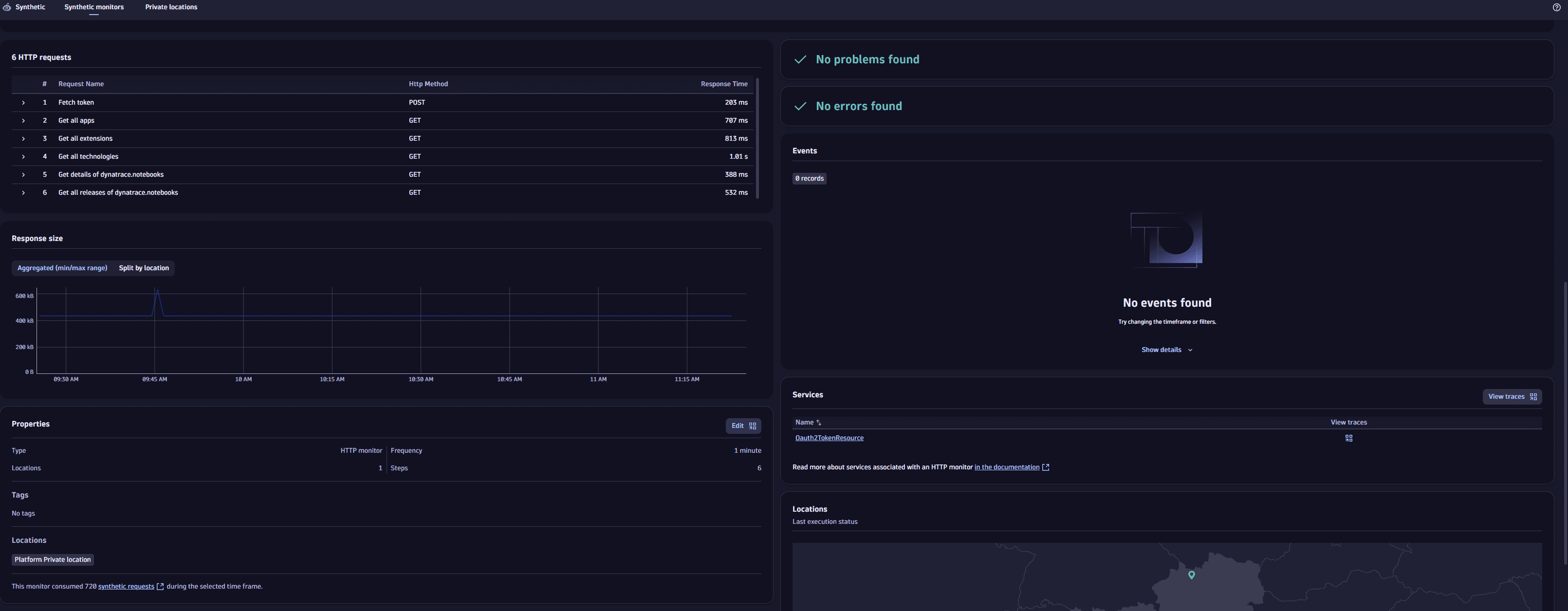
HTTP requests
An HTTP monitor can consist of one or multiple HTTP requests. The HTTP requests card overviews all executed requests, their order, name, request URL, and the HTTP method used. For each request, the HTTP requests card splits performance (Response time) by the following metrics (see more in HTTP monitor metrics):
- DNS lookup time
- TCP connect time
- TLS handshake time
- Waiting
- Download
Response time is the summation of these different metrics.
Expand a request from the list to view all performance metrics in one chart. Select a metric in the legend to remove/add it to the performance chart. Select Edit request to go to monitor settings from this card.
The Status codes tab shows the timeline of returned HTTP status codes for a particular request. (The HTTP status codes card shows the returned HTTP status codes for your HTTP monitor as a whole.)
When a request violates its event-specific performance threshold, it is highlighted in red. Expand the request to see the performance timings and the threshold violated. A solid red line for the problem duration appears above the stacked graph; the request threshold appears as a dotted red line. Select the solid red bar to display a link to the problem overview page.
Response size
The Response size card shows trend lines for minimum and maximum response size for the sum of all requests, with any shaded area representing the difference between the two values at any given time. The trend lines might coincide, as when your monitor runs from a single location. However, response size might vary, for example, when different responses are sent based on location.
To track such differences, you can Show response size breakdown per location. Note that if you filter the entire details page by any locations, the toggle is no longer available.
Events
The Events card shows all events that compose problems. Events for active as well as resolved problems show up in the list and timeline.
Hover over a time slot in the event timeline to see the type and number of events generated at that interval. Select a time slot to view a tooltip with the events that took place in it.
Select an event type, for example, HTTP monitor location slowdown, to see the list of events. One slowdown event is always created per location where your monitor violates request- or monitor-level performance thresholds. Select an individual event to see details.
The api.fail() method can be used to define a custom Failure message that appears in the Events card in case of failure. Custom log messages also appear in the customLogs attribute in HTTP monitor execution details.
Changes
The Changes card shows the history log that displays:
- When the monitor was created and who created it.
- Who changed the monitor properties, when the change was made, and which properties were changed in the selected timeframe.
Errors
The Errors card displays errors found in the selected timeframe.
On the card, you can:
- See the details of an error in the form of a table with the step and number of occurrences.
- Select Analyze errors .
Frontends
The Frontends card displays the frontends to which the monitor is assigned.
Locations
The Locations card shows the status of the last monitor execution for each location. The status is displayed with colors:
- Green—the location was available during the last monitor execution.
- Red—an outage was detected during the last monitor execution.
- Gray—there is no data about executions for this location.
Properties and tags
This informational card shows the number of steps, the number and list of locations, frequency of monitor execution, and any applied tags.
Select Edit to edit or apply additional tags.
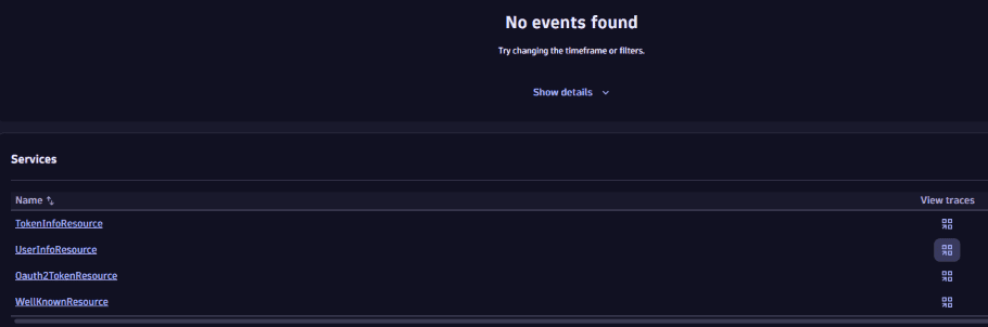
Services
The Services card displays any monitored services automatically associated with the HTTP monitor. This card appears when the monitored HTTP endpoint is hosted on a OneAgent-monitored host, and the endpoint URL is handled by one of the discovered services. The association between the HTTP monitor and the service is made based on data provided by OneAgent. Therefore, at least one monitor execution needs to be completed before a service can be associated with the monitor.
Select the link for a displayed service to view the service overview page, filtered by the HTTP monitor.
View traces
In HTTP monitors that have associated services, you can see:
- A full list of traces for an entire monitor within a specific period of time
- A full list of traces for a specific service within a specific period of time
- Traces for specific synthetic executions
Traces for an entire monitor
To see a full list of traces for an entire monitor, select View traces in either of these locations:
- The top of the monitor's details page
- The Services card header
Traces for a specific service
To see a full list of traces for a specific service
- In the Services card, find a service you want to investigate.
- Select the icon in the View traces column.
Traces for a specific execution
To see backed traces for a specific execution
-
Select Analyze executions at the top of the monitor's details page.
-
On the graph, select an execution to pin its tooltip.
-
Hover over the tooltip and select View traces.