Chart group
- Latest Dynatrace
- Reference
- 10-min read
- Published Jul 13, 2026
A card consisting of charts aligned in a grid driven by DQL queries, optionally organized into collapsible sections.
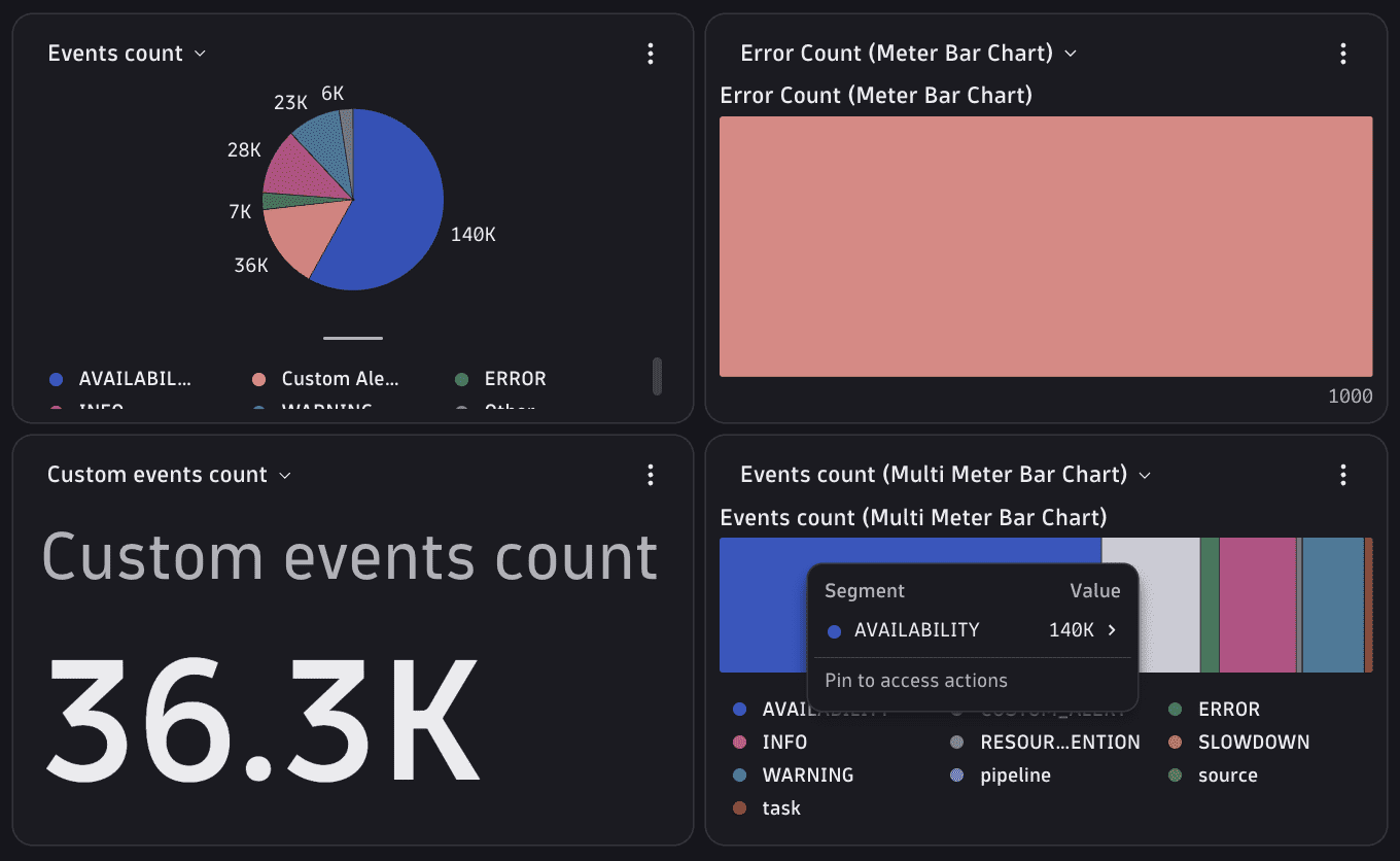
Placement: A chart group is a leaf card, valid inside an Entity details tab and any layout that accepts a card. See Elements overview.
DQL for chart cards: timeseries and metrics queries reference the entity with $(meId) (classic entity ID, for example, HOST-abc123). smartscapeNodes queries use $(nodeId) paired with toSmartscapeId($(nodeId)) to build the Smartscape ID filter. See DQL variables for the full placeholder list.
Fields
In addition to the shared CoreElement fields (see Elements overview):
| Property | Type | Description |
|---|---|---|
|
| All chart definitions. Each chart optionally declares a |
|
| Ordered accordion sections. When omitted, all charts render in a flat grid. |
|
|
|
|
| Adds a search field above the sections to filter charts by display name. |
|
| Controlled list of expanded section IDs. When set, |
|
| Number of charts shown before a "Show more" control appears. When omitted, all charts are visible. |
|
| When |
|
| Whether the "Show more" button is rendered when hidden charts remain. When |
|
| The semantic HTML heading element for the card title, decoupling visual level from document structure. |
|
| Card title displayed in the card header. |
|
| Card description displayed below the card title. |
|
| Default color palette for all charts. Individual charts can override this via |
|
| Health indicator configuration. See Health indicators. |
When defaultVisibleChartsNumber is set and swapChartsEnabled is true, charts beyond the visible slot count appear in a swap dropdown in each visible chart header rather than being hidden. Section-level overrides of both properties can mix these behaviors within the same card.
ChartGroupSection
| Property | Type | Description |
|---|---|---|
|
| Unique section ID, referenced by a chart's |
|
| Accordion header title. |
|
| Whether the section starts expanded. Defaults to |
|
| Section-level override of the chart group's |
|
| Section-level override of the chart group's |
|
| Whether the "Show more" button is rendered for this section. |
|
| Section-level palette override. |
|
|
Chart
| Property | Type | Description |
|---|---|---|
|
| Unique chart ID within the chart group. Referenced by |
|
| Label shown in the chart header and the charts swap dropdown. |
|
| Section ID(s) this chart belongs to. An array places the same chart in multiple sections. |
|
| DQL query that fetches chart data. For timeseries charts, typically starts with |
|
| Alternative DQL query used when navigating to this chart via an intent. Defaults to |
|
| Visualization type and its configuration. For details, see Chart visualization types. |
|
| Tooltip text shown via an info badge in the chart header. |
|
| When |
|
| Per-chart header actions. |
|
| Custom content shown when the query returns no data. |
|
| Custom content shown when the query fails. |
|
| An array of conditions that must be fulfilled to display the chart. If not provided, the chart is always visible. See Conditional rendering. |
ChartEmptyState: header: string, body: string. Used by Chart.emptyState and Chart.errorState.
Chart visualization types
visualization is a discriminated union on type. Each variant is documented in its own section below.
type value | Visualization | Description |
|---|---|---|
|
| Time-series line/area/bar chart. |
|
| Single metric value with optional sparkline/trend. |
|
| Categorical bar chart. |
|
| Pie chart. |
|
| Donut chart. |
|
| Single meter bar. |
|
| Multi-series meter bar. |
Shared visualization types
DQL output → series/slices: For pie, donut, multi-meter-bar, and categorical charts, each returned field (multi-field queries like { used = ..., free = ... }) or each distinct by:{} dimension value becomes one series/slice. The series identifier (which seriesOverrides[].name and CustomColorPalette object keys must match) is the field alias (for example, 'used') for multi-field queries, or the dimension value (for example, 'Linux') for by:{os.type} queries.
ChartGlobalProperties: Visualization-wide settings, available on every chart type via globalProperties:
| Property | Type | Description |
|---|---|---|
|
| Hides the chart legend. Defaults to |
|
| Palette for this chart, overriding the section- and chart-group-level defaults. |
ChartAxes: Used by ChartTimeseriesChartVisualization.axesSettings:
| Property | Type | Description |
|---|---|---|
|
| X-axis configuration. Only |
|
| Y-axis definitions. Each entry configures one axis (label, position, optional min/max). A single entry configures the left axis for all metrics. Add a second entry with |
ChartSeriesOverride: Per-series/dimension styling override, used by timeseries metrics, categorical, pie, donut, and multi-meter-bar visualizations:
| Property | Type | Description |
|---|---|---|
|
| Dimension/series value to match against. |
|
| Display name override for the matched series. |
|
| Color override: a Strato color token path, resolved CSS variable, or hex/rgb value. |
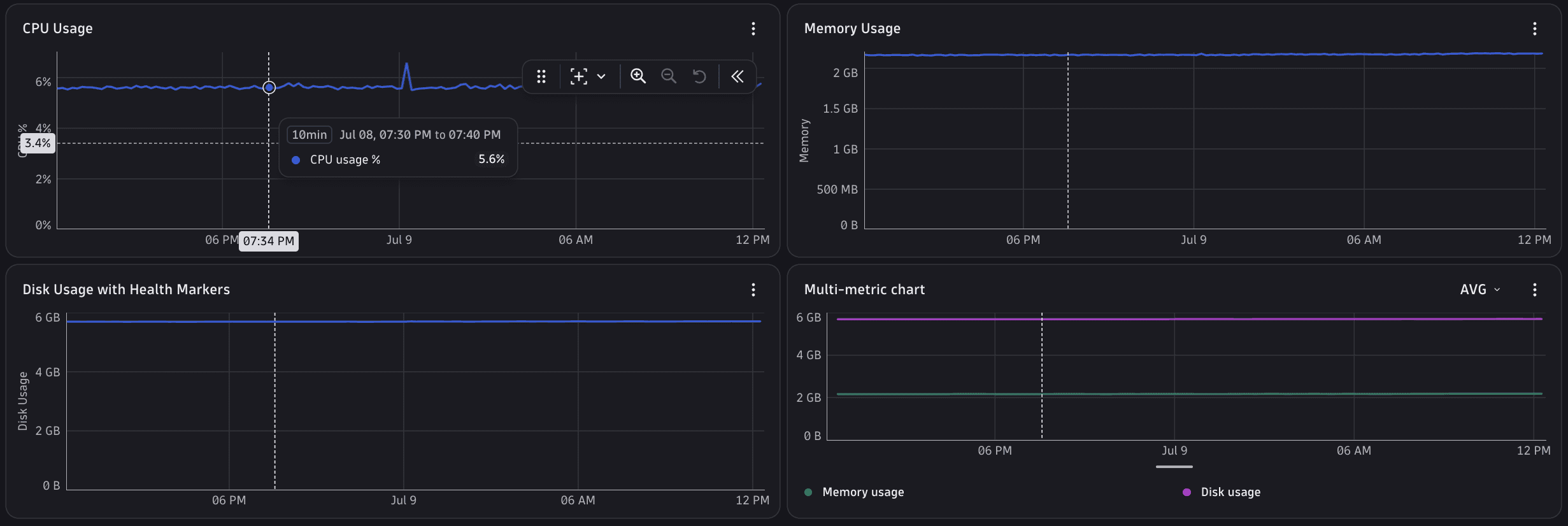

ChartTimeseriesChartVisualization ('TIMESERIES_CHART')
| Property | Type | Description |
|---|---|---|
|
| Chart rendering variant. |
|
| Axis labels and Y-axis definitions. |
|
| Per-metric settings, keyed by the DQL response field/alias (for example, |
|
| Shows only dimension values in the legend, hiding metric names. |
|
| See Shared visualization types above. |
|
| Aggregation options shown in a header dropdown, for use with a |
| one of the values above (optional) | Aggregation selected by default; ignored when |
| object (optional) | Additional props forwarded to the underlying Strato |
ChartTimeseriesMetricVisualization (one entry per key in metrics):
| Property | Type | Description |
|---|---|---|
|
| Overrides the chart-level |
|
| Per-dimension styling for this metric's series. |
|
| Davis AI forecast configuration for this metric. When |
|
| When |
|
| Custom Y-axis min/max applied when all data points for this metric are |
|
| Forces a specific display unit regardless of auto-detection. Unit tokens follow the path pattern |
|
| Display alias for this metric in legend/tooltip. |
|
| Default color for all of this metric's series. |
ChartForecastSettings:
| Property | Type | Description |
|---|---|---|
|
| Enables the Davis AI forecast band. |
|
| Forecast analyzer to use. |
|
| Number of datapoints to forecast into the future. |
ChartFlatLineMinMaxSettings:
| Property | Type | Description |
|---|---|---|
|
| Disables the custom min/max override for all-zero data. |
|
| Y-axis min applied when all data points are |
|
| Y-axis max applied when all data points are |
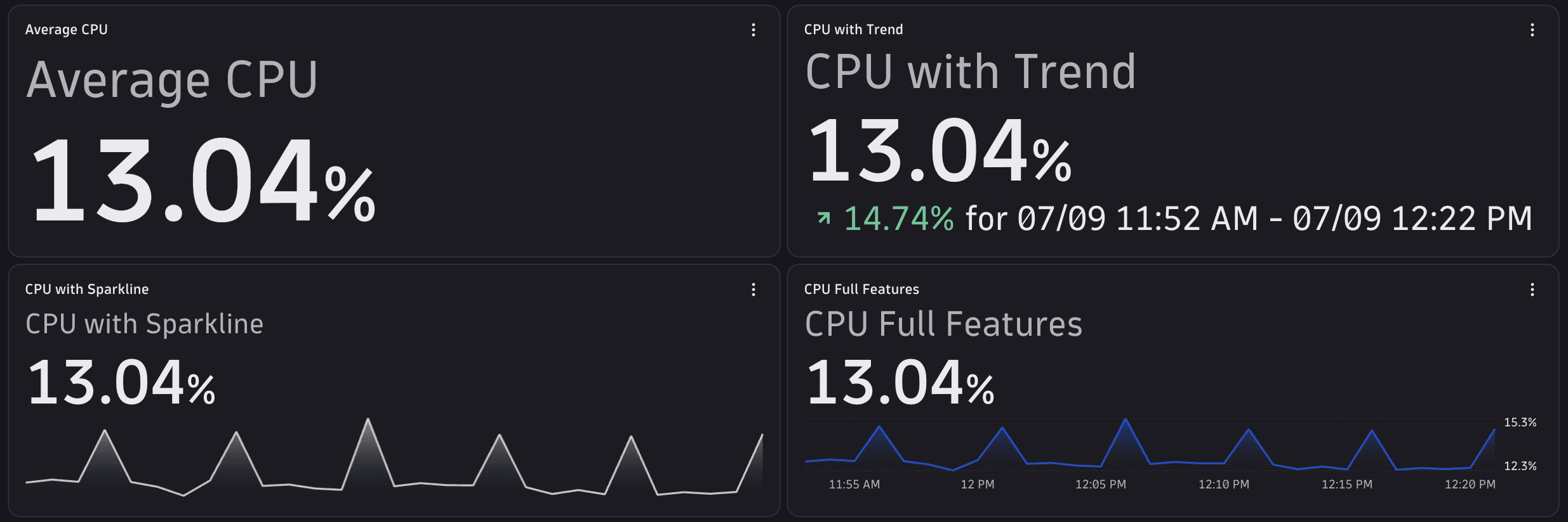
ChartSingleValueVisualization ('SINGLE_VALUE')
| Property | Type | Description |
|---|---|---|
|
| DQL response field name to visualize. Optional when the query returns a single value field; required when the query returns multiple value fields. |
|
| Visualization settings for the selected metric. |
|
| See Shared visualization types above. |
| array (optional) | Same shape as |
| value (optional) | Same shape as |
ChartSingleValueMetricVisualization:
| Property | Type | Description |
|---|---|---|
|
| Sparkline/trend/value display configuration. |
|
| How a multi-datapoint series is folded into the single displayed value. |
|
| Forces a specific display unit regardless of auto-detection. Unit tokens follow the path pattern |
|
| Display alias. |
|
| Default color. |
ChartSingleValueSettings:
| Property | Type | Description |
|---|---|---|
|
| Shows a sparkline alongside the value. |
|
| Shows a trend indicator. |
|
| Shows ticks on the sparkline. |
|
| Value color. |
|
| Sparkline color. |
|
| Precision of the displayed value. |
|
| Advanced props forwarded to the Strato |
|
| Advanced props forwarded to the Strato |
|
| Advanced props forwarded to the Strato |
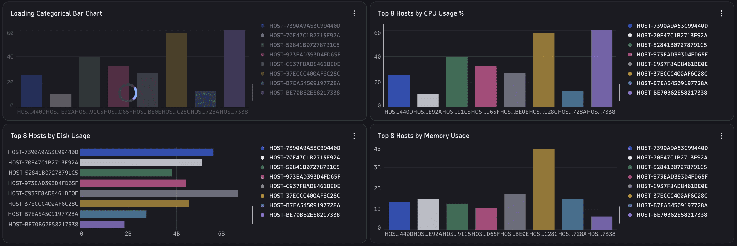

ChartCategoricalChartVisualization ('CATEGORICAL_CHART')
| Property | Type | Description |
|---|---|---|
|
| Layout, grouping, legend, and tooltip configuration. |
|
| Per-bar/category styling. |
|
| Forces a specific display unit regardless of auto-detection. Unit tokens follow the path pattern |
|
| See Shared visualization types above. |
ChartCategoricalBarChartSettings:
| Property | Type | Description |
|---|---|---|
|
| Bar orientation. |
|
| Whether bars per category are stacked or shown side by side. Has no effect with a single value per category. |
|
| Show raw values, or each dimension's proportion of its category's total. |
|
| Legend configuration. |
|
| Show all categories in the tooltip, or only the hovered one. |
|
| How overly long labels are truncated. |
|
| Shows a CSV download button. |
|
| Displays the chart in a loading state. |
|
| Palette override. |
ChartCategoricalBarChartLegendSettings:
| Property | Type | Description |
|---|---|---|
|
| Hides the legend. Shown by default. |
|
| Legend placement. |
|
| Percentage of chart space the legend occupies. |
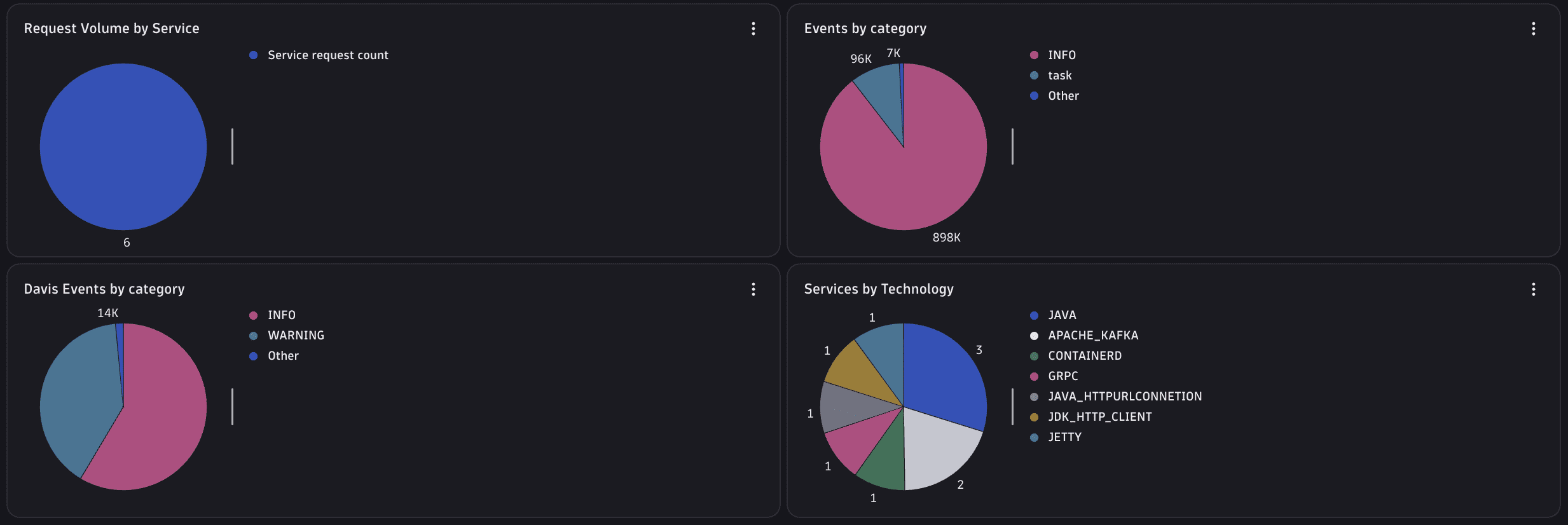
ChartPieChartVisualization ('PIE_CHART')
| Property | Type | Description |
|---|---|---|
|
| Pie-chart and legend prop overrides. |
|
| Per-slice styling. |
|
| Forces a specific display unit regardless of auto-detection. Unit tokens follow the path pattern |
|
| See Shared visualization types above. |
ChartPieChartSettings:
| Property | Type | Description |
|---|---|---|
| object (optional) | Additional props forwarded to the underlying Strato |
|
| Legend placement. |
|
| Percentage of space the legend occupies. |
|
| Whether slice labels show a relative share or an absolute value. |
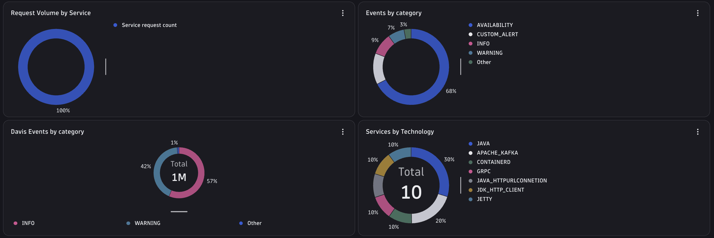
ChartDonutChartVisualization ('DONUT_CHART')
| Property | Type | Description |
|---|---|---|
|
| Donut-chart overrides and inner-content configuration. |
|
| Per-slice styling. |
|
| Forces a specific display unit regardless of auto-detection. Unit tokens follow the path pattern |
|
| See Shared visualization types above. |
ChartDonutChartSettings:
| Property | Type | Description |
|---|---|---|
| object (optional) | Additional props forwarded to the underlying Strato |
|
| Shows the aggregate total in the donut's inner content. |
|
| Label shown alongside the total value. |
|
| Legend placement. |
|
| Percentage of space the legend occupies (width when right, height when bottom). |
|
| Whether slice labels show a relative share or an absolute value. |
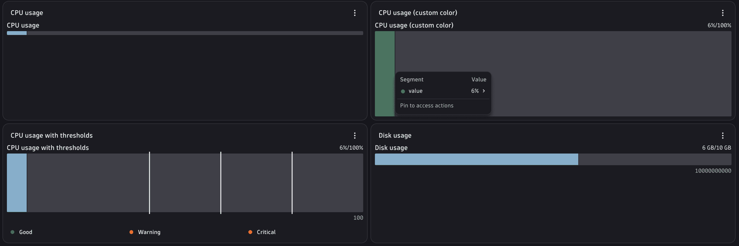
ChartMeterBarChartVisualization ('METER_BAR_CHART')
| Property | Type | Description |
|---|---|---|
|
| DQL response field name to visualize. Optional when the query returns a single value field. |
|
| Visualization settings for the selected metric. |
|
| Thresholds, sizing, and display configuration. |
|
| See Shared visualization types above. |
| array (optional) | Same shape as |
| value (optional) | Same shape as |
ChartMeterBarMetricVisualization:
| Property | Type | Description |
|---|---|---|
| value (optional) | Same options as |
|
| Forces a specific display unit regardless of auto-detection. Unit tokens follow the path pattern |
|
| Display alias. |
|
| Default color. |
ChartMeterBarChartSettings:
| Property | Type | Description |
|---|---|---|
|
| Threshold markers. |
|
| Shows a legend listing all thresholds. |
|
| Shows a tooltip on hover. |
|
| Overrides all other color and theme settings. |
|
| Meter bar scale bounds. |
|
|
|
|
| Bar height. Defaults to |
|
| Shows the chart's |
|
| Palette override. |
ChartMeterBarChartThreshold:
| Property | Type | Description |
|---|---|---|
|
| Threshold label (for example, |
|
| Threshold value. |
|
| Shows a marker at this threshold. |
|
| Bar color once this threshold is reached. |

ChartMultiMeterBarChartVisualization ('MULTI_METER_BAR_CHART')
| Property | Type | Description |
|---|---|---|
|
| Legend, tooltip, sizing, and display configuration. |
|
| Per-segment styling. |
|
| Forces a specific display unit regardless of auto-detection. Unit tokens follow the path pattern |
|
| See Shared visualization types above. |
ChartMultiMeterBarChartSettings:
| Property | Type | Description |
|---|---|---|
|
| Shows a legend for the segments. |
|
|
|
|
| Meter bar scale bounds. |
|
|
|
|
| Bar height. Default: |
|
| Shows the chart's |
|
| Palette override. |
Color palettes
ColorPalette: String literal naming a built-in palette. There are 70+ values; a representative selection: 'categorical', 'categorical-inverted', 'purple-rain', 'rainbow', 'threshold', 'threshold-inverted', 'status', 'status-inverted', 'apdex', 'log-level', 'blue', 'fireplace', 'swamps', 'red-green', 'red-blue', 'orange-blue'.
CustomColorPalette: Record<string, string> | string[], in two forms:
- Object: maps series names (field aliases or
by:{}dimension values) to colors:{ "used": "#ff5733", "free": "#33ff57" }. - Array: maps by position (first color → first series, second → second, following the order series appear in the DQL result):
["#ff5733", "#33ff57"].
For color values (color fields throughout), prefer Strato design token CSS variables over raw hex. Use the full CSS var() expression, for example, 'var(--dt-colors-charts-categorical-1-default,)' (note the trailing comma, which is required). Token names follow the --dt-colors-* convention and are available in the @dynatrace/strato-design-tokens package.
Action unions
Action arrays accept both BuiltInAction<T> references and full IntentAction objects.
| Type | Used in | Built-in literals |
|---|---|---|
|
|
|
Built-in ChartActions literals: 'EXPAND' (opens the chart full-screen), 'EDIT_IN_NOTEBOOK' (opens the chart's DQL query in a Notebook), 'PIN_TO_DASHBOARD' (pins the chart to a dashboard), 'CREATE_ALERT' (opens alert creation pre-filled with the chart's metric), 'OPEN_WITH' (opens the chart via a recommended intent).
Example
The example below includes one chart per visualization type. The sectionId field organizes them into collapsible accordion sections.
{"type": "chart-group","id": "host-performance","cardTitle": "Performance","sections": [{ "id": "overview", "title": "Overview", "defaultExpanded": true },{ "id": "trends", "title": "Performance trends", "defaultExpanded": true },{ "id": "resources", "title": "Resources", "defaultExpanded": false }],"charts": [{"id": "cpu-single-value","displayName": "CPU usage","sectionId": "overview","dqlQuery": "timeseries cpu = avg(dt.host.cpu.usage), by:{dt.entity.host} | filter dt.entity.host == $(entityId)","visualization": {"type": "SINGLE_VALUE","metric": {"singleValueSettings": { "showSparkLine": true, "showTrend": true },"foldTransformation": "AVG","overrideUnit": "units.percent.percent","alias": "CPU"}}},{"id": "mem-meter-bar","displayName": "Memory used","sectionId": "overview","dqlQuery": "timeseries mem = avg(dt.host.mem.used.percent), by:{dt.entity.host} | filter dt.entity.host == $(entityId)","visualization": {"type": "METER_BAR_CHART","settings": {"min": 0,"max": 100,"displayValue": true,"thresholds": [{ "name": "Warning", "value": 70, "showIndicator": true, "color": "warning" },{ "name": "Critical", "value": 90, "showIndicator": true, "color": "critical" }],"showThresholdLegend": true}}},{"id": "cpu-timeseries","displayName": "CPU over time","sectionId": "trends","dqlQuery": "timeseries cpu = $(aggregation)(dt.host.cpu.usage), by:{dt.entity.host} | filter dt.entity.host == $(entityId)","visualization": {"type": "TIMESERIES_CHART","variant": "area","metrics": {"cpu": {"alias": "CPU usage","overrideUnit": "units.percent.percent"}},"aggregationTypes": ["AVG", "MAX", "MIN"],"defaultAggregationType": "AVG"},"actions": [{ "builtInAction": "EXPAND" },{ "builtInAction": "PIN_TO_DASHBOARD" },{ "builtInAction": "CREATE_ALERT" }]},{"id": "net-multi-meter-bar","displayName": "Network I/O","sectionId": "trends","dqlQuery": "timeseries { rx = avg(dt.host.net.nic.bytes_rx), tx = avg(dt.host.net.nic.bytes_tx) }, by:{dt.entity.host} | filter dt.entity.host == $(entityId)","visualization": {"type": "MULTI_METER_BAR_CHART","settings": {"showLegend": true,"tooltip": "shared","min": 0}}},{"id": "process-categorical","displayName": "Processes by technology","sectionId": "resources","dqlQuery": "smartscapeNodes \"PROCESS\" | filter dt.smartscape.host == toSmartscapeId($(nodeId)) | summarize count(), by:{process.technology} | sort count() desc | limit 10","visualization": {"type": "CATEGORICAL_CHART","settings": {"layout": "horizontal","groupMode": "stacked"}}},{"id": "disk-pie","displayName": "Disk usage","sectionId": "resources","dqlQuery": "smartscapeNodes \"HOST\" | filter id == toSmartscapeId($(nodeId)) | fieldsAdd used = disk.usedBytes, free = disk.usableBytes | fields used, free","visualization": {"type": "PIE_CHART","seriesOverrides": [{ "name": "used", "displayName": "Used" },{ "name": "free", "displayName": "Free" }]}},{"id": "net-donut","displayName": "Network traffic mix","sectionId": "resources","dqlQuery": "timeseries { inbound = avg(dt.host.net.nic.bytes_rx), outbound = avg(dt.host.net.nic.bytes_tx) }, by:{dt.entity.host} | filter dt.entity.host == $(entityId)","visualization": {"type": "DONUT_CHART","settings": {"showTotalValue": true,"labelTotalValue": "Total","position": "right","valueType": "relative"}}}]}
See also
- DQL variables: Includes
$(aggregation),$(aggregation_gauge), and$(rollup)placeholders used withaggregationTypes - Health indicators
- Conditional rendering
- Elements overview
 ExtensionsInfrastructure Observability