Add annotations to a dashboard
- Latest Dynatrace
- How-to guide
- 10-min read
Annotations allow you to indicate significant events such as deployments, incidents, or configuration changes on a timeseries chart. This helps you correlate metric behavior with what happened in your environment when troubleshooting or reviewing trends.
Annotations are data-driven, so they stay current as your data changes. You can create an annotation in two ways:
- DQL query that returns timestamps and associated metadata.
- Code snippet that returns annotation records.
When you apply an annotation to a chart, the result of the DQL or code are mapped to the chart so you can see what happened and when it happened.
List annotations
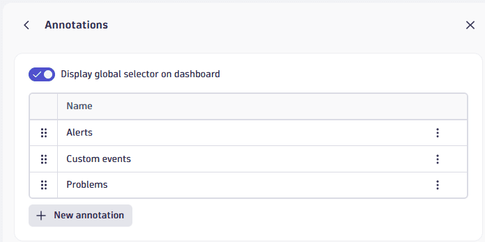
The Annotations panel is your starting point for all annotations-related activities on a dashboard.
To list all annotations
-
Select (Settings) in the upper-right corner of a dashboard to display the dashboard Settings panel.
-
Select Annotations.
Optional: Turn on Display global selector on dashboard to display the Annotations controls on your dashboard.
Use annotations
When annotations are defined for your dashboard, you can use them to look for correlations between metric behavior on your timeseries charts and significant events such as deployments, incidents, or configuration changes.
Use the global selector for interactive control of your annotations. This can be useful when, for example, you're troubleshooting an issue and you want to see only problem annotations on your charts. In this case, you could select your problems annotation and hide your other annotations.
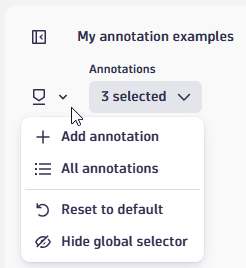
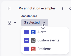
Global selector
The global selector is a section of controls labeled Annotations that you can display in the upper-left corner of the dashboard, directly under the dashboard name.
The global selector has two menus:
The menu gives you quick access to common annotation actions.
- Add annotation—to create an annotation.
- All annotations—to display the Annotations panel.
- Reset to default—to restore annotation settings to their defaults: all annotations applied to the tiles selected in the References setting.
- Hide global selector—to hide the Annotations section on your dashboard. To display the global selector again, turn on Display global selector on dashboard on the Annotations panel.
This menu shows you how many annotations are currently applied to the dashboard. Open the menu to see exactly which annotations are currently applied to your dashboard.
- When you define an annotation for a dashboard, you use the References setting to specify which tiles to apply the annotation to by default.
- When you select or clear annotations in the global selector, you temporarily override those defaults. This can be useful when, for example, you are troubleshooting an issue and you want to see only problem annotations on your charts, and hide any other annotations.
Add an annotation
To add an annotation to a dashboard
-
Go to the Annotations panel.
-
Select Create annotation.
-
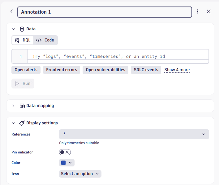
Define the annotation:
- Data: select the annotation type you want to create: DQL or Code
- Data mapping: map fields.
- Display settings: configure display settings/references.
 Annotations: create annotation: initial edit panel
See below for details on each part.
1. Configure Data
In the Data section, choose whether to use DQL or code for your annotation.
-
Select DQL or Code.
-
Enter a DQL query or code snippet.
To get you started, you can use any of the buttons under the edit box (such as Open alerts for DQL, or Sample code for code) to automatically add example DQL or code here.
-
Select Run to fetch preview data.
-
If the query or code is valid and the returned results include at least one timestamp and one string field (for label or description), fields are automatically mapped and are populated in the Data mapping section.
-
If automatic data mapping fails, error and validation messages will guide you.
-
If the query or code is not valid, you get error messages as for tiles or variables. Correct your query or code and retry.
-
If the query or code result doesn’t contain a timestamp, you get an error message in the Data mapping section. Select an appropriate field to map a timestamp to your annotation.
 Annotations: create annotation: after entering DQL and selecting Run
-
-
2. Configure Data mapping
The Data mapping section maps the annotation data, specifying what you want to see and where you want to see it.
This mapping is created automatically in the previous step, but you can adjust it manually as needed.
| Field | Required? | Description | Preferred DQL field | Expected type |
|---|---|---|---|---|
| Required | The text shown on the chart (or the primary label for the annotation). |
|
|
| Optional | The text shown in the tooltip when hovering the annotation. |
|
|
| Required | The timestamp used for the annotation start/anchor. |
|
|
| Optional | An optional timestamp to create a time range (bar or area) instead of a single instant. |
|
|
The automatic mapping is based on the following steps:
- Normalization: The field type map normalizes unsupported types (
binary,geo_point,smartscape_id) toany, and assignsanywhen a field has multiple types across type mappings. - Preferred mapping: Check if the query result contains the exact preferred fields (
event.name,event.description,event.start,event.end) with matching types. Any match is used directly. - Fallback population: If the mapping is still incomplete after the preferred pass, it iterates over all fields in the query result and assigns the first unused field that fits the expected type:
- First unmatched
stringfield is mapped toname - First unmatched
timestampfield is mapped tostart - Second unmatched
stringfield is mapped todescription - Second unmatched
timestampfield is mapped toendFields already assigned in the preferred pass are skipped.
- First unmatched
3. Configure Display settings
The Display settings section determines how the annotations appear on the chart.
- References: choose which tiles on the dashboard should display this annotation.
- An asterisk (
*) displays the annotation on all tiles with a supported visualization type. - Annotations are shown only on tile types with a timeframe.
- An asterisk (
- Pin indicator: when this is selected, the line and areas in the chart itself (below the markers) persistently indicate the point in time or area where the annotation on top is highlighting the event.
Edit an annotation
To edit an annotation
-
Go to the Annotations panel.
-
Select the annotation you want to edit.
Alternative: open the menu for the annotation you want to edit and select Edit.
-
Edit the annotation as needed. Configuration options are described in the Add an annotation section. For instance, edit the name displayed at the top of the annotation details panel.
Duplicate an annotation
To duplicate an annotation
-
Go to the Annotations panel.
-
Open the menu for the annotation you want to duplicate and select Duplicate.
Alternative: select the annotation to display the annotation details, open the menu next to the annotation name, and then select Duplicate.
-
Edit the duplicate annotation as needed. Configuration options are described in the Add an annotation section.
Delete an annotation
To delete an annotation
-
Go to the Annotations panel.
-
Open the menu for the annotation you want to delete and select Delete.
Alternative: select the annotation to display the annotation details, open the menu next to the annotation name, and then select Delete.
Change annotation order
The order of annotations on the list defines which goes first (higher means also visually higher on the same track).
To change the order of annotations on your dashboard
-
Go to the Annotations panel.
-
Drag the annotations into the order you want.
Alternative: open the menu for the annotation you want to move and select Move up or Move down.
Examples
Example 1: Alerts
To create annotations for alerts
-
Start with a dashboard that has at least one timeseries chart.
Example
- Create a dashboard.
- Select DQL.
- Paste the following DQL to chart CPU usage:
timeseries avg(dt.host.cpu.usage), by: { dt.smartscape.host }| fieldsAdd dt.smartscape.host.name = getNodeName(dt.smartscape.host)| limit 10
- Select Run.
- On the Visual tab, select the Line visualization.
- Close the edit panel. You should now have a dashboard with a line chart showing CPU usage over time.
-
Select (Settings) in the upper-right corner of a dashboard to display the dashboard Settings panel, and then select Annotations.
-
Select New annotation.
-
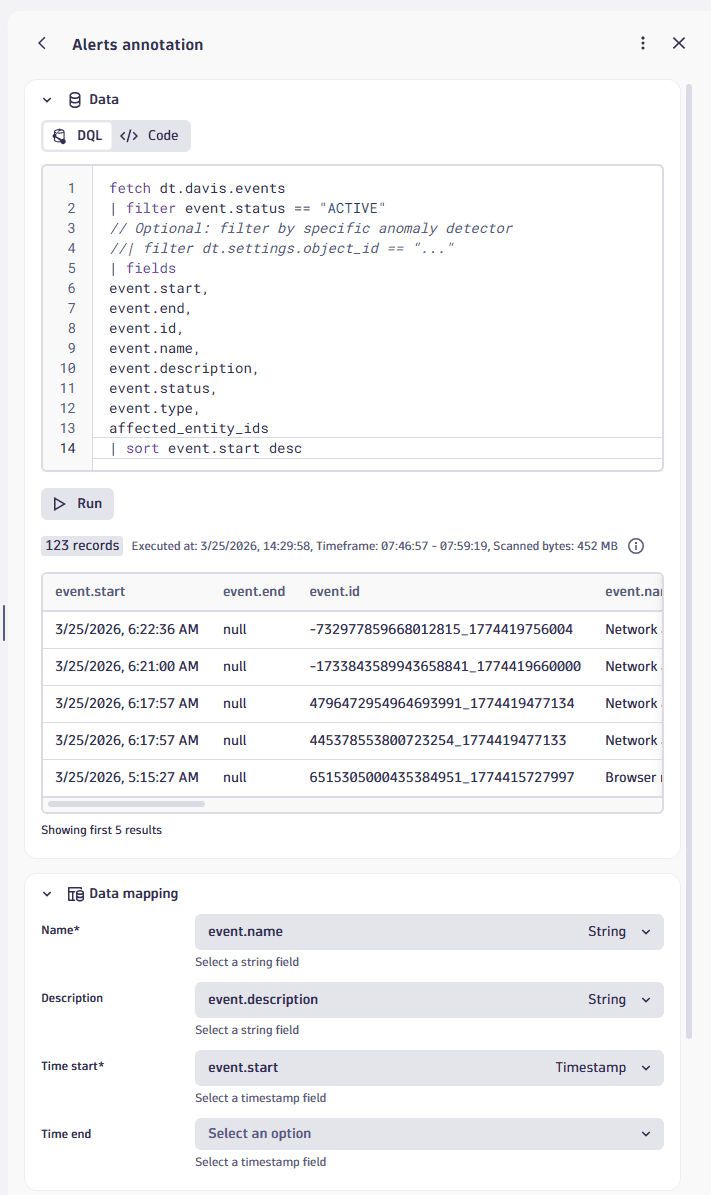
At the top of the annotation edit panel, name the annotation (for example,
Alerts). -
In the Data section, select DQL.
-
In the DQL edit box, paste the following DQL query to fetch active alerts.
fetch dt.davis.events| filter event.status == "ACTIVE"// Optional: filter by specific anomaly detector//| filter dt.settings.object_id == "..."| fieldsevent.start,event.end,event.id,event.name,event.description,event.status,event.type,affected_entity_ids| sort event.start desc -
Select Run to fetch preview data. Fields are automatically mapped as displayed in the Data mapping section. In this example, you should get:
- Name:
event.name(String) - Description:
event.description(String) - Time start:
event.start(Timestamp) - Time end: not mapped
- Name:
-
In the Display settings section, adjust display settings as needed.
- References: For this example, leave it as an asterisk to apply the annotation to all applicable charts.
- Pin indicator: For this example, turn it on to show alert indicators directly on the charts.
-
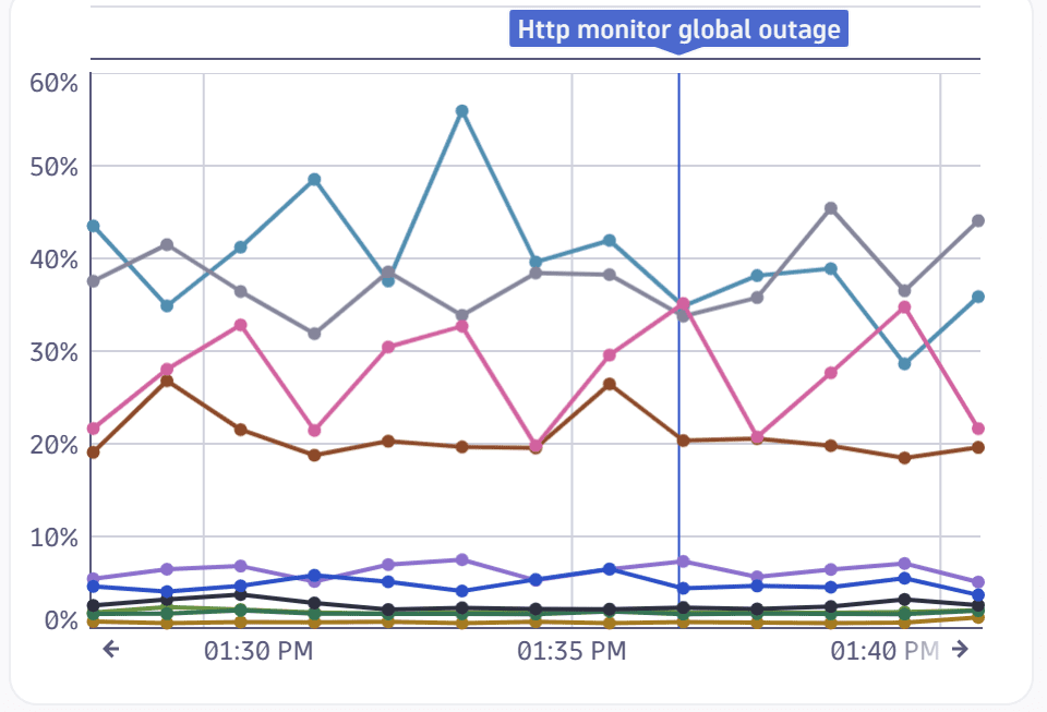
Review the results on your charts.
- By default, the Annotations global selector is displayed on the dashboard under the dashboard name. You can use it, for example, to display or hide annotations.
- Alerts that occurred during the selected timeframe are indicated above the timeseries charts. Hover over an indicator to see details in a tooltip.
- Because we selected Pin indicator, the alerts are also displayed as a line on the charts.
- Tip: If the alert annotations are clustered closely together, zoom in on the chart to separate annotations visually.
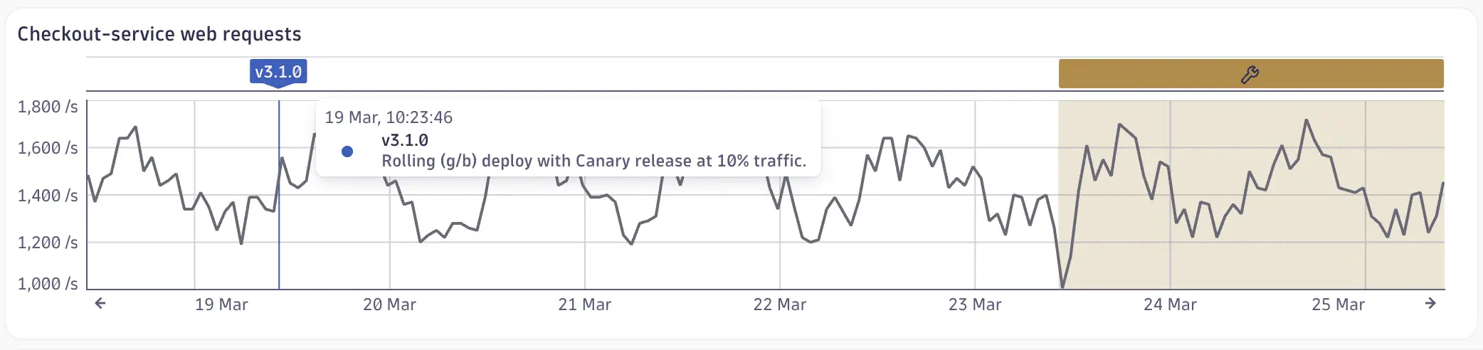
In this example, an annotation is pinned above our line chart at 1:37 PM to indicate that an alert (HTTP monitor global outage) was issued at that time. For details, hover over the annotation above the chart. The annotation line drawn on the chart is controlled by the Pin indicator setting.
Example 2: Custom events
To create annotations for custom events
-
Start with a dashboard that has at least one timeseries chart.
Example
- Create a dashboard.
- Select DQL.
- Paste the following DQL to chart CPU usage:
timeseries avg(dt.host.cpu.usage), by: { dt.smartscape.host }| fieldsAdd dt.smartscape.host.name = getNodeName(dt.smartscape.host)| limit 10
- Select Run.
- On the Visual tab, select the Line visualization.
- Close the edit panel. You should now have a dashboard with a line chart showing CPU usage over time.
-
Select (Settings) in the upper-right corner of a dashboard to display the dashboard Settings panel, and then select Annotations.
-
Select New annotation.
-
At the top of the annotation edit panel, name the annotation (for example,
Custom events). -
In the Data section, select DQL.
-
In the DQL edit box, paste the following DQL query to fetch events.
fetch events| filter event.type == "CUSTOM_INFO"//| filter contains(event.description,"deploy")| fieldsAdd event.description = coalesce(event.description,concat("[", event.provider, "] ",event.name,if(isNotNull(dt.entity.process_group_instance.name), then:concat(" | PGI: ", dt.entity.process_group_instance.name), else:""),if(isNotNull(dt.entity.environment.name), then:concat(" | Env: ", dt.entity.environment.name), else:""),if(isNotNull(Environment), then:concat(" | Environment: ", Environment), else:""),if(isNotNull(Service), then:concat(" | Service: ", Service), else:""),if(isNotNull(appId), then:concat(" | App: ", appId), else:""),if(isNotNull(Version), then:concat(" | Version: ", Version), else:""),if(isNotNull(Tenant), then:concat(" | Tenant: ", Tenant), else:""),if(isNotNull(Channel-Name), then:concat(" | Channel: ", Channel-Name), else:""),if(isNotNull(Compatibility), then:concat(" | Compatibility: ", Compatibility), else:""),if(isNotNull(user), then:concat(" | User: ", user), else:"")))| fieldstimestamp,event.start,event.end,event.name,event.description,event.status,event.status_transition,event.provider,dt.davis.impact_level,dt.davis.mute.status,dt.source_entity,dt.source_entity.type,dt.entity.process_group_instance.name,dt.entity.environment.name,Environment,Service,appId,appVersion,Version,Tenant,Channel-Name,Channel-Type,App-Id,Compatibility,user,affected_entity_ids,affected_entity_types,entity_tags,maintenance.is_under_maintenance,dt.event.correlation_id| sort timestamp desc| limit 20 -
Select Run to fetch preview data. Fields are automatically mapped as displayed in the Data mapping section. In this example, you should get:
- Name:
event.name(String) - Description:
event.description(String) - Time start:
event.start(Timestamp) - Time end:
event.end(Timestamp)
- Name:
-
In the Display settings section, adjust display settings as needed.
- References: For this example, leave it as an asterisk to apply the annotation to all applicable charts.
- Pin indicator: For this example, turn it on to show alert indicators directly on the charts.
-
Review the results on your charts.
- By default, the Annotations global selector is displayed on the dashboard under the dashboard name. You can use it, for example, to display or hide annotations.
- Events that occurred during the selected timeframe are indicated above the timeseries charts. Hover over an indicator to see details in a tooltip.
- Because we selected Pin indicator, the alerts are also displayed as a line on the charts.
- Tip: If the alert annotations are clustered closely together, zoom in on the chart to separate annotations visually.
Example 3: Problems
To create annotations for problems
-
Start with a dashboard that has at least one timeseries chart.
Example
- Create a dashboard.
- Select DQL.
- Paste the following DQL to chart CPU usage:
timeseries avg(dt.host.cpu.usage), by: { dt.smartscape.host }| fieldsAdd dt.smartscape.host.name = getNodeName(dt.smartscape.host)| limit 10
- Select Run.
- On the Visual tab, select the Line visualization.
- Close the edit panel. You should now have a dashboard with a line chart showing CPU usage over time.
-
Select (Settings) in the upper-right corner of a dashboard to display the dashboard Settings panel, and then select Annotations.
-
Select New annotation.
-
At the top of the annotation edit panel, name the annotation (for example,
Problems). -
In the Data section, select DQL.
-
In the DQL edit box, paste the following DQL query to fetch problems.
fetch dt.davis.problems| filter event.category == "SLOWDOWN"| filter event.status == "ACTIVE"| fieldsevent.start,display_id,event.name,dt.davis.impact_level| sort event.start desc -
Select Run to fetch preview data. Fields are automatically mapped as displayed in the Data mapping section. In this example, you should get:
- Name:
event.name(String) - Description:
display_id(String) - Time start:
event.start(Timestamp) - Time end:
event.start(Timestamp)
- Name:
-
In the Display settings section, adjust display settings as needed.
- References: For this example, leave it as an asterisk to apply the annotation to all applicable charts.
- Pin indicator: For this example, turn it on to show alert indicators directly on the charts.
-
Review the results on your charts.
- By default, the Annotations global selector is displayed on the dashboard under the dashboard name. You can use it, for example, to display or hide annotations.
- Events that occurred during the selected timeframe are indicated above the timeseries charts. Hover over an indicator to see details in a tooltip.
- Because we selected Pin indicator, the alerts are also displayed as a line on the charts.
- Tip: If the alert annotations are clustered closely together, zoom in on the chart to separate annotations visually.
FAQ
Which visualizations support annotations?
Where can I get the data to use annotations?
Because annotations are powered by DQL, you can use virtually any data accessible through DQL as an annotation source, including logs, metrics, events, business events, spans, and more.
- Use existing data: For an overview of available data, see how to explore data to find the right data type and query from there.
- Bring your own data: If you want to use data beyond what's already available in Grail, see ingest data.
Here are some common examples:
- Alerts: use
dt.davis.eventsas shown in Example 1: Alerts - Custom events: use
eventsas shown in Example 2: Custom events - Problems: use
dt.davis.eventsas shown in Example 3: Problems.
How is the timeframe applied?
Annotations use the global dashboard timeframe. Tile-specific custom timeframes aren't used.
This is by design. Fetching annotation data for every unique tile timeframe would multiply the number of queries, increasing cost and processing time—especially on dashboards with many different tile timeframes.
Note: If a tile has a custom timeframe or you've panned within a tile, annotations outside that visible range won't appear.
How are segments applied?
Annotations use the globally set segments. Tile-specific custom segments aren't used.
As with timeframes, fetching annotation data for every unique combination of tile-level segments would significantly increase the number of queries executed.
How are annotations fetched and refreshed?
- Dashboard load: Annotation data is fetched only for annotations that are referenced in visible tiles (in the viewport) with a supported visualization.
- Scrolling: If you scroll to a tile with a supported visualization and a configured annotation, the data is fetched on demand—but only if it hasn't been fetched already.
- Disabled globally: If an annotation is disabled in the global selector, its data is never fetched.
- Enabled globally: If an annotation is enabled in the global selector, it's applied to all tiles with a supported visualization, regardless of individual tile references.
- Dashboard refresh: On manual or automatic refresh, all previously fetched annotations are updated, regardless of whether the tiles are currently in the viewport.
- Tile query execution: Running a tile's query doesn't trigger a refresh of its referenced annotations. Annotations are global; tile data is local.
- Changing references: The existing annotation data is reused on the newly referenced tile. However, if the annotation previously had no references to supported tiles and you add one, the data is fetched for the first time.
Why doesn't my annotation appear?
If your annotation isn't visible, check the following:
- The visualization on your tile isn't a supported type (line, bar, or area).
- The tile isn't referenced in your annotation definition.
- You unchecked the annotation's visibility in the global selector.
- The query defined in the annotation doesn't return any results.
- There are no records within the visible timeframe of the chart. For example, your tile might have a custom timeframe that differs from the global dashboard timeframe used to fetch annotation results. Alternatively, you may have panned within the tile to a different timeframe.
My data mapping didn’t auto-assign—what now?
An annotation requires at least a name and a timestamp field. Adjust your query to include both. For details, see the Data mapping section.