Davis® causal correlation analysis
- Explanation
- 9-min read
The causal correlation analysis combines topological context with metric data to identify observability signals relevant to any signal behavior. For example, use it to investigate a spike on a chart. The analysis helps you find and explore time series with similar behavior to the one you're investigating.
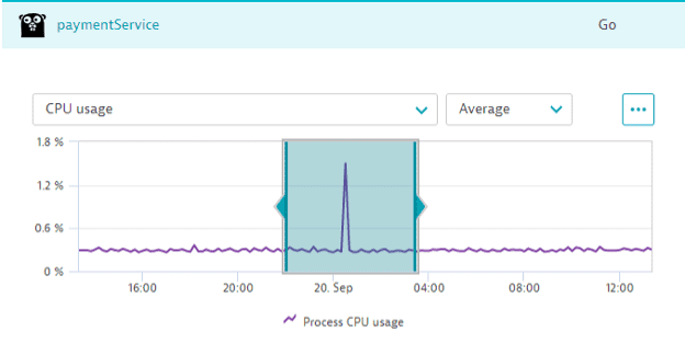
Causal correlation analysis operates with two essential pieces of data:
- Reference time series: the time series you're investigating, along with the selected timeframe, resolution, and scale of the chart where the analysis started. There can only be one reference time series.
- Candidate time series: a set of time series that Davis assembles automatically based on their similarity and relation to the reference time series. To assemble the set, Davis uses the topological and domain context of the reference time series. For example, every metric from a page in the Dynatrace web UI, where you trigger the analysis, is automatically included in the candidate set. The candidate set might consist of hundreds or thousands of time series.
Analysis methodology
Davis compares the reference time series to each candidate time series and calculates a Pearson correlation coefficient. Then, based on this coefficient and penalties for applied transformations, signal adoptions, and relevance assessments, the analysis produces a similarity score for each candidate time series. The similarity score ranges from 0.0 (no similarity) to 1.0 (high similarity).
All analysis steps (for example, resolving context-related metric queries, data conversion, and output formatting) are fully automated.
Because every entity-analysis page in the Dynatrace web UI uses configured topology relationships to load entity and context-relevant information, Davis considers this information for the analysis. Davis adds every time series shown on a page to the candidate set.
For example, starting from a host page means the candidate set includes all host metrics, disk metrics, process metrics, and many more.
Signal transformations
To better cope with signal fluctuations, noise, and uncertainties, Davis applies various transformations to candidate time series. Two types of transformation exist:
- Time shift
- Smoothing
Each transformation applied to a time series produces a penalty to its score. The penalty depends on how much the original signal changed: the more the time series transforms, the higher the penalty. The analysis output never contains multiple variations of the same candidate time series. Only the one with the highest score appears. If multiple variations share the same score, the one with fewer penalties takes precedence.
Time shift transformation
The time shift transformation aims to cope with signals that are similar in behavior but shifted in time. Possible reasons for such a shift include signal source delays or differences in the measurement cycles used by sensors.
The analysis automatically includes positive and negative shifts of up to 2 resolution steps to the candidates set. The image below illustrates this subset of candidates: an original time series in one-minute resolution plus one-minute and two-minute shifts in each direction.
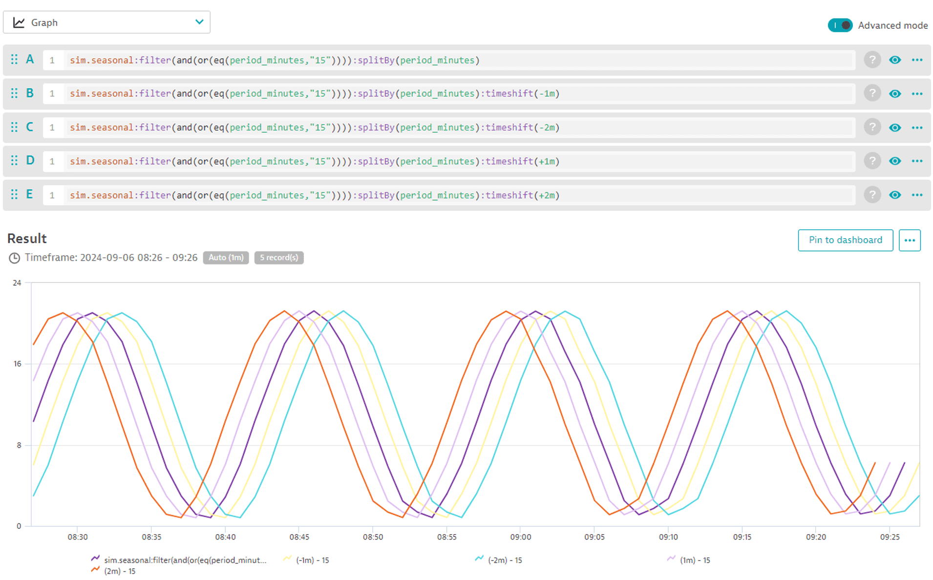
The analysis deducts a penalty of 0.004 from the score per shift in either direction. For example, the time series shifted two steps into the past receives a penalty of 0.008 and the one shifted one step into the future receives a penalty of 0.004.
Show time-shift penalty table
| Time shift (resolution steps) | Penalty |
|---|---|
-2 | 0.008 |
-1 | 0.004 |
0 | 0 |
1 | 0.004 |
2 | 0.008 |
Smoothing transformation
The smoothing transformation aims to distinguish the signal you're interested in from the unwanted noise.
Causal correlation analysis automatically includes smoothing transformations of moving averages of two and three resolution steps to the candidates set. The image below illustrates this subset of candidates: an original time series in one-minute resolution plus two-minute and three-minute moving averages.
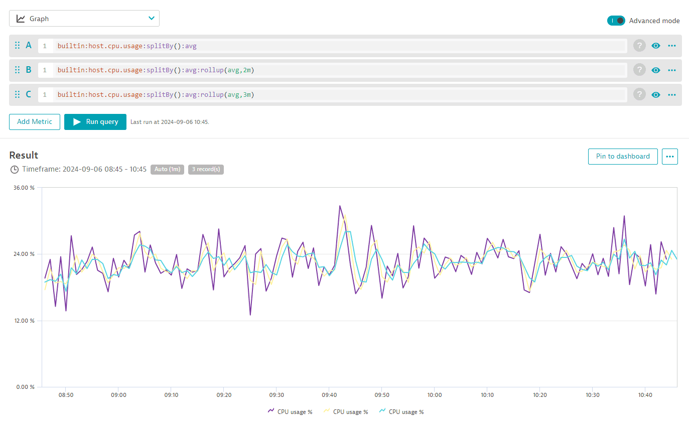
The analysis calculates the penalty for the smoothing transformation using the following formula: 0.01 × (window width − 1).
Show smoothing penalty table
| Window width | Penalty |
|---|---|
1 | 0 |
2 | 0.01 |
3 | 0.02 |
Pearson correlation coefficient
The Pearson correlation coefficient is the basis for the score calculation. Davis correlates a reference time series with each candidate time series, including all transformed variants. For example, for a candidate set of 5000 time series and default transformation settings, a total of 150,000 time series correlations result.
A two-pass algorithm calculates the coefficient. The first pass normalizes each time series (reference and all candidates) by subtracting the mean and dividing by the standard deviation. The second pass calculates the cross-correlation between the normalized reference and each normalized candidate time series.
Time shift handling
A negative shift of X ignores the first X elements of the reference series for the cross-correlation, reducing the number of considered values for both time series. The cross-correlation then compares candidates with earlier time stamps to references with later time stamps.
In turn, a positive shift of X ignores the first X elements of the candidate series. The cross-correlation then compares candidates with later time stamps to references with earlier time stamps.
Smoothing handling
For each reference-candidate pair, a moving mean of the specified window size creates two smoothed (resampled) time series variations. Smoothing applies to reference and candidate time series alike. Only pairs with the same smoothing window produce a correlation result. For example, a reference with a smoothing window of 1 and a candidate with a smoothing window of 2 aren't paired.
Result ranking
The causal correlation analysis returns a score for each candidate based on the Pearson correlation coefficient and transformation penalties. This score describes the similarity of the candidate in the range from 0.0 (no similarity) to 1.0 (high similarity). The score represents a rank within the results list. It's not a percentage measure. Each resulting time series appears with its score.
While the analyzer identifies positive and negative correlations, Dynatrace doesn't distinguish them in the visualization, as both are equally relevant for exploratory analysis.
The threshold of 0.75 applies to the results. Time series with a lower score don't appear in the result.
Correlation threshold | 0.0 | 0.2 | 0.3 | 0.4 | 0.5 | 0.6 | 0.65 | 0.7 | 0.75 | 0.8 | 0.85 | 0.9 | 0.95 |
Minimum data points | 1001 | 261 | 121 | 66 | 41 | 28 | 23 | 19 | 16 | 14 | 12 | 10 | 8 |
A lower threshold would require more data points to make sure unrelated time series have less than a 0.1% chance of appearing in the result by accident. A high threshold requires fewer data points, so 0.75 is the default threshold. The minimal amount of data points uses a Student's t-test.
Start exploratory analysis
You can trigger an exploratory analysis from any unified analysis page (for example, a host overview page or a Kubernetes workload page).
-
In the Dynatrace web UI, navigate to the relevant unified analysis page (host overview, service, Kubernetes workload, or other).
-
Select the phenomenon you want to analyze on a chart.
Every data analysis relies on the quality of your data. The quality of the results significantly improves when you select a phenomenon correctly.
Causal correlation analysis requires that you select portions of normal behavior in a reference time series, both before and after any phenomenon under analysis. For a spike analysis, the spike itself should cover a third of the reference time series, with one third of normal behavior before and one third after.
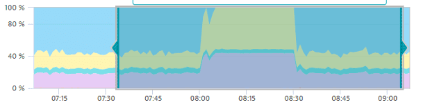 causal correlation analysis 6
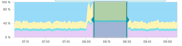
Here's an example of an inaccurate time-series selection: only the plateau appears in the selection, which results in noisy, unexpected results.
 causal correlation analysis 7
 -
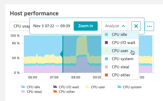
Select Analyze and, if needed, the metric for analysis. If the Analyze option is unavailable (you didn't select enough data points), expand the selection.
 causal correlation analysis 4
 -
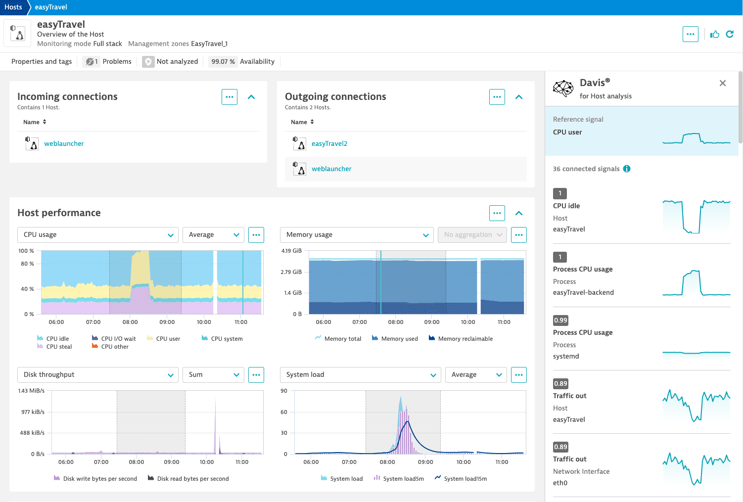
Davis gathers the candidate set, which automatically includes all metrics displayed on the page, and starts the analysis. The results appear in the side panel on the right, ranked by similarity score.
 causal correlation analysis 5
Every chart in the result pane acts as a link to the metric. Select it to go to the original chart. Note that the original chart might look slightly different due to different scaling.
Limitations
- High-quality results require a certain number of data points. A lack of data points significantly increases the chance of inaccurate results.
- Candidate time series must have enough data points in the selected timeframe. Even if you selected enough data points in the reference time series, candidates might miss the data for the same timeframe.
- Signals must have significant variance. Flat time series produce spurious correlations (noisy detections).