Response time analysis
- Latest Dynatrace
- Tutorial
- 3-min read
Response time analysis in Dynatrace helps you quickly identify the key contributors to slow service performance. By analyzing outbound calls, database and queue interactions, and service internals, this feature provides a clear breakdown of where time is being spent. Additionally, it offers an infrastructure perspective, giving insights into key metrics for related infrastructure components.
This analysis is designed to be used both reactively, to investigate specific performance issues, and proactively, to explore potential bottlenecks. You can also compare different timeframes to understand how the response time for services and their endpoints has changed over time.
Key capabilities
| Capability | Description |
|---|---|
Root cause identification | Understand the main contributors to slow service requests, such as CPU heavy service execution, waiting for outbound calls, or heavy database queries. |
Advanced filtering | Use filters to narrow down failures by attributes such as service, endpoint, and more. Timeframe filters allow you to isolate failures within specific periods or compare across time ranges. |
Response time trend chart | Understand how the response time evolves over time or as a histogram distribution chart. |
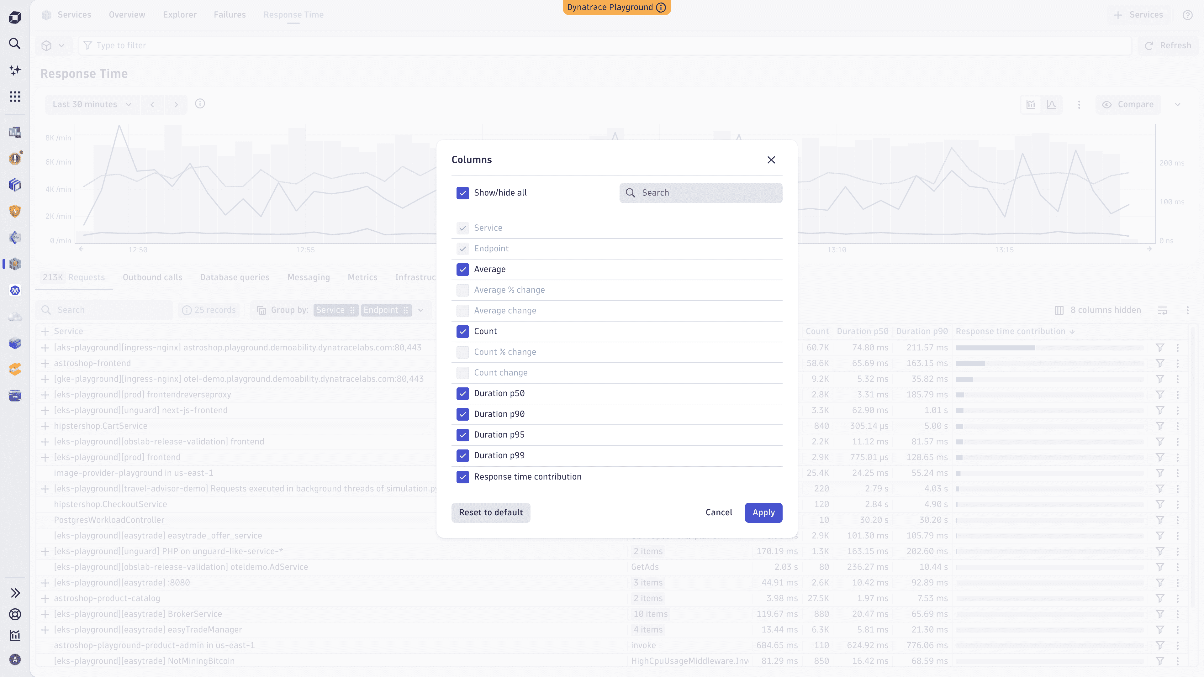
Response time across different percentiles | View average, p50, and p90 response time in time series and histogram charts. Add optional Duration p50, Duration p90, Duration p95, and Duration p99 columns to the service table to compare performance across your services and endpoints. |
Timeframe comparison | Compare the response time between two timeframes to identify trends, assess the impact of changes, or validate fixes. |
Outbound calls | Investigate the impact of downstream dependencies such as downstream services, or third-party APIs to the response time. |
Infrastructure perspective | Gain insights into key metrics for related infrastructure components, helping to identify potential bottlenecks. |
Exploratory and contextual access | Access response time analysis with or without predefined context. When accessed via a problem triggered by a p50 or p90 slowdown, filters are pre-applied and the relevant percentile is automatically selected and highlighted in the service table. You can also explore failures manually by adjusting filters. |
Access and navigation
The new response time analysis is available as a dedicated Response Time tab in  Services. It is designed to support both contextual and exploratory workflows.
Service-specific response time analysis
When you're looking at the details of a specific service, select Analyze response time on top of the response time chart or on a specific endpoint of your service. This opens the Response Time tab with filters based on the selected service.
Contextual access via problems-specific drill-down options
When a response time degradation is identified as the root cause of a problem, the Response Time tab opens with filters based on the affected service and endpoint.
Exploratory access
To explore services and see which are slowest, go to the Response Time tab in Services manually.
- Adjust filters to explore failures across services, endpoints, and timeframes.
- Compare it to different timeframes.
Get started
To find out what's slow
To find out why it's slow
-
Turn on Analyze details above the table for additional details to help you understand what contributed most to the response time of the selected services and traces.
-
Response time analysis provides a detailed breakdown of where time is being spent during service requests. This includes:
Category Description Outbound calls
Shows the time spent waiting for downstream dependencies, such as API calls or frontend processing.
Database interactions
Highlights the time spent on database queries and interactions.
Service internals
Breaks down the time spent within the service itself, including code execution and internal processing.
Infrastructure metrics
Displays key metrics for related infrastructure components, such as CPU usage, memory consumption, and network latency.
Analyze response time using percentiles
Percentiles let you see how response time varies across your services and identify slowdowns that affect only a portion of your traffic.
View percentiles in charts
The time series and histogram charts show Average, p50, and p90 response time. You can compare median performance against average and see how higher-percentile services behave over time.
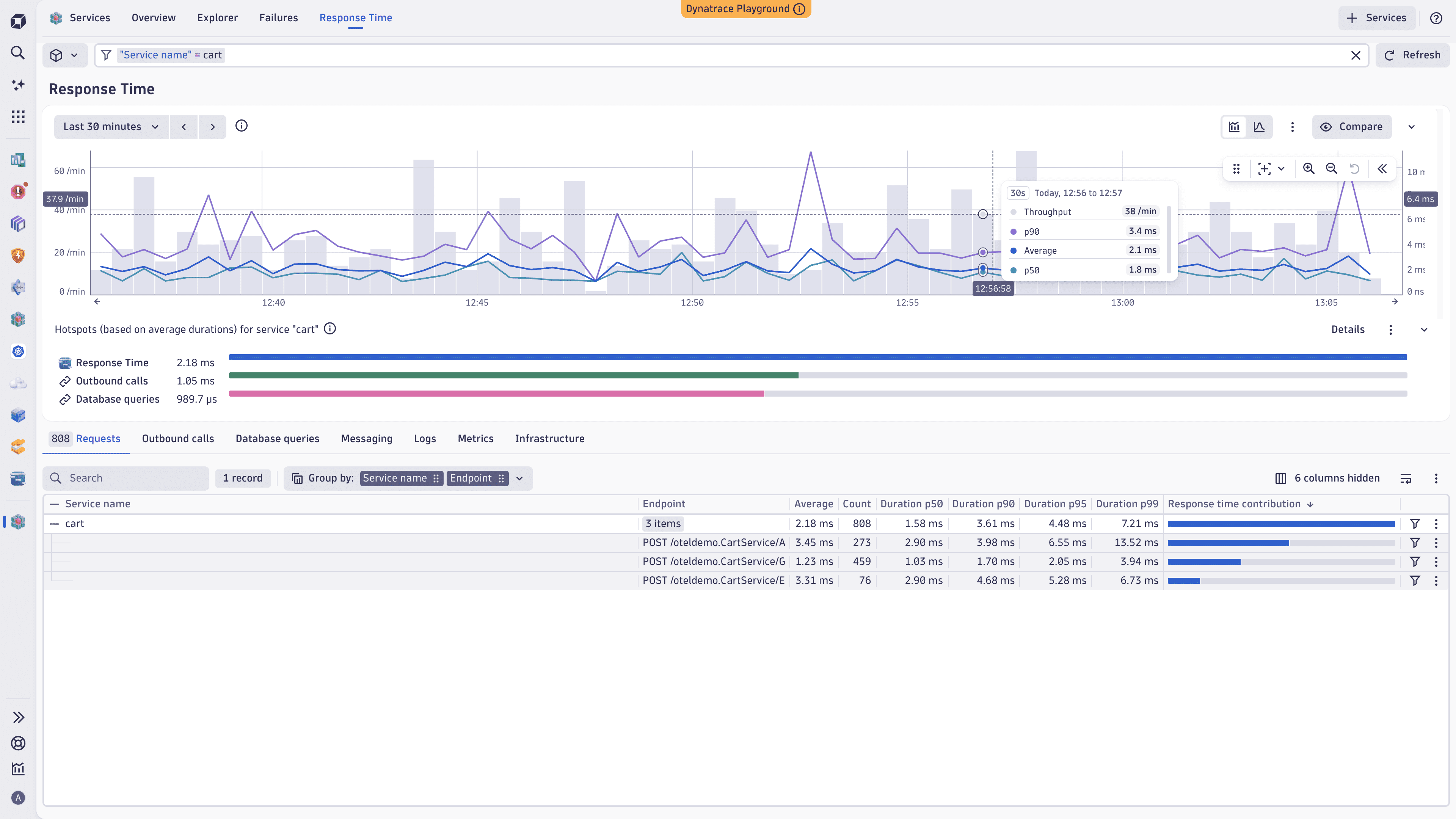
Add percentile columns to the service table
To compare response time across different percentiles
- Select <number> columns hidden above the service table.
- Select one or more of the following columns: Duration p50, Duration p90, Duration p95, Duration p99.
- Select Apply.
Investigate a percentile-triggered problem
When you open response time analysis from a problem caused by a p50 or p90 service slowdown, the affected percentile is automatically selected in the charts and highlighted in the service table. Thanks to that, you can immediately focus on the metric that triggered the problem and compare its performance to the period before the problem occurred.
Use cases
Investigate slow services
When a service is perceived as slow, use response time analysis to:
- Identify whether the issue is caused by service internals, downstream dependencies, database interactions, or infrastructure congestions.
- Drill down into specific areas to pinpoint the root cause of the slowness.
- View related infrastructure metrics to determine if hardware or network issues are contributing to the problem.
Monitor performance proactively
Use response time analysis proactively to:
- Explore potential performance bottlenecks before they impact users.
- Monitor key metrics for critical services and infrastructure components.
- Gain a deeper understanding of how different factors contribute to overall response times.
 Services