Message
- Latest Dynatrace
- Reference
- 2-min read
- Published Jul 13, 2026
A card built from a small, markdown-like content schema: either a simple colored banner (MessageSchema) or a richer card with icon, title, text, and buttons (CardMessage).
Fields
In addition to the shared CoreElement fields (see Elements overview):
| Property | Type | Description |
|---|---|---|
|
| Discriminant. |
|
| The message body. See the two variants below. |
|
| HTML heading level for the card title rendered by |
MessageSchema
A simple colored banner.
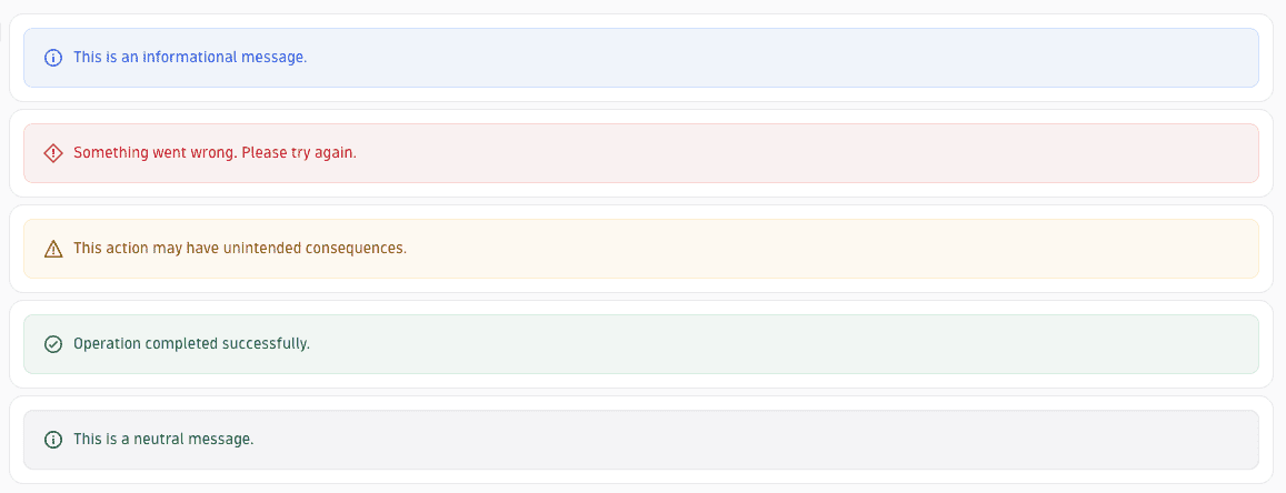
Fields
| Property | Type | Description |
|---|---|---|
|
| Discriminant. |
|
| Banner severity/color. |
|
| Banner text. |
Example
{"type": "MESSAGE","color": "WARNING","text": "This feature is in preview."}
CardMessage
A richer card layout.

Fields
| Property | Type | Description |
|---|---|---|
|
| Discriminant. |
|
| Card title. |
|
| Card body text. |
|
| Icon name. |
|
| Action buttons rendered on the card. |
Example
{"type": "CARD","title": "Need help?","text": "Check the documentation for setup instructions.","actions": [{"displayName": "Open docs","appId": "docs.app","intentId": "open"}]}
See also
 ExtensionsInfrastructure Observability