Spot trends with the log distribution chart
- Latest Dynatrace
- How-to guide
- 2-min read
- Published Jul 02, 2025
Utilize the log distribution chart available in  Logs to spot trends in your logging. You can:
- Quickly spot trends and anomalies. For example, a sudden increase in
ERRORlogs might mean an incident or regression. - Drill down into specific log statuses or time ranges.
- Perform targeted queries without leaving the visualization. By interacting with the chart, you can choose log status and a more precise timeframe for your next query.
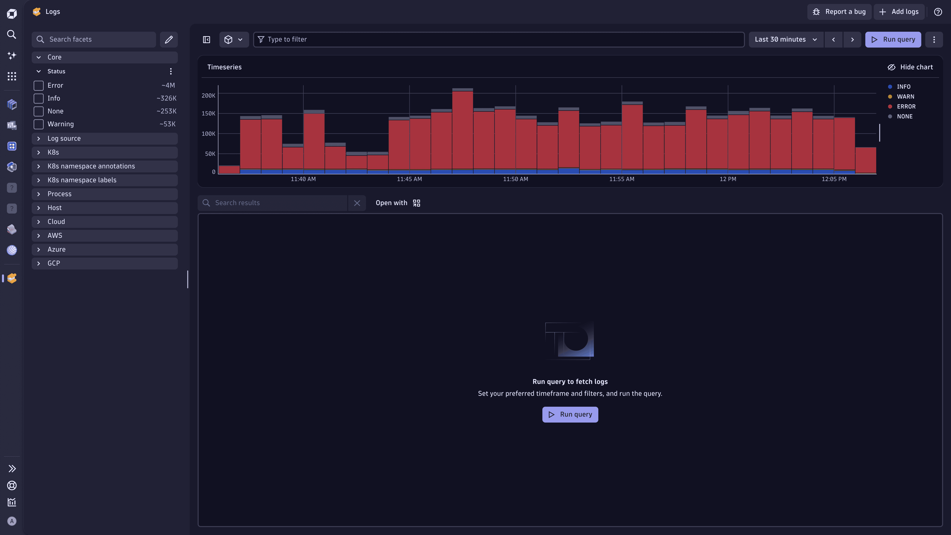
Chart overview
The log distribution chart provides a visual overview of log entries over time.
Log entries are grouped by status. Each status is represented by a distinct color for easy differentiation. The following statuses are available:
INFOWARNERRORNONE
These statuses correspond to the status attribute that is created during log ingestion. For details, see the information on automatic log enrichment for OneAgent- or API-ingested logs.
Interact with log distribution chart
You can interact with the log distribution chart to refine your analysis.
- Highlight specific log statuses.
- Select a status in the chart or legend to focus on that status only.
- To display multiple statuses, use the chart legend.
- Zoom in on a time range. Select a portion of the chart, and then select Zoom to selection.
- Use the chart toolbar. Hover over the chart to display the toolbar.
- Select (Change mode) to switch between the Explore mode (highlight individual statuses), Zoom mode, and Pan mode (explore the chart horizontally).
- Zoom further in or out on the chart.
- Select (Reset) to bring the chart back to its original state.
For quicker and more convenient interaction with the log distribution chart, use the keyboard shortcuts. They're displayed when you hover over the toolbar icons.
Effect on billing
Loading and interacting with the log distribution chart does not consume any query license.
The log distribution chart may be based on sampled data, which means the displayed data is representative, and not every log entry is shown.
LogsLog Analytics