Add a snippet to a dashboard
- Latest Dynatrace
- How-to guide
- 10-min read
- Published Jul 08, 2022
Several data and code snippets are available out of the box. Use our predefined DQL or code snippets to quickly start your data analytics journey.
Select a snippet
To get started based on a snippet
-
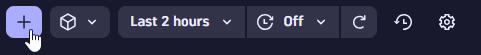
In the upper-right of the dashboard, select Add to open the Add menu.
Keyboard shortcut: Ctrl/Cmd+Shift+Enter
-
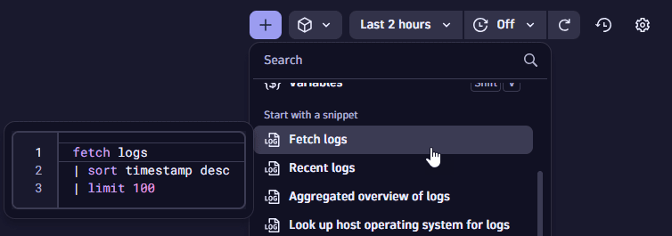
Scroll down to the Start with a snippet section and choose one of the snippets. In this example, we select the Fetch logs snippet, which is displayed in a preview panel.
-
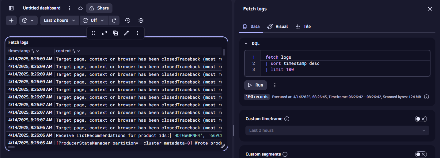
After you select a snippet, the edit panel displays the snippet you added.
-
Edit the query or code (depending on the snippet type you selected) and the visualization settings as needed.
-
Select Run to see results.
-
Close the side panel when you're done.
Examples
Fetch logs
-
In
 Dashboards, select Dashboard to create a new dashboard.
 -
In the upper-right of the dashboard, select Add to open the add menu.
-
In the menu, scroll down to the Start with a snippet section of the menu and select Fetch logs.
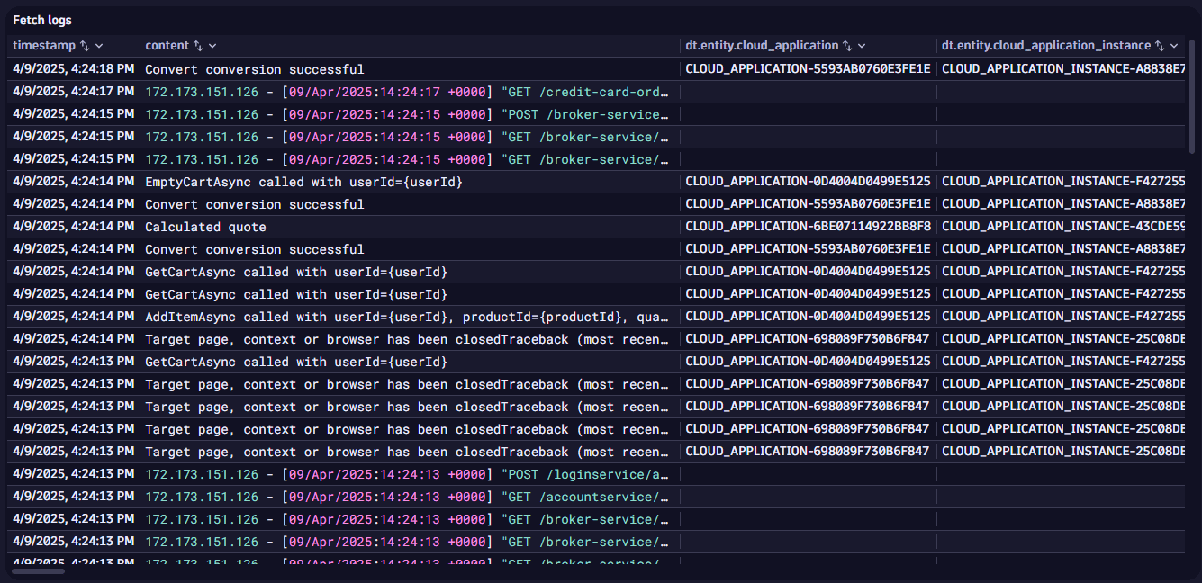
That's it. You have created a dashboard with a DQL tile that fetches the 100 latest logs and displays them starting with the most recent.
The DQL behind your tile is the snippet you selected with Fetch logs:
fetch logs| sort timestamp desc| limit 100
The DQL commands are run in order:
fetch logsgets the log datasort timestamp descsorts the data by timestamp in descending orderlimit 100limits the results to the 100.
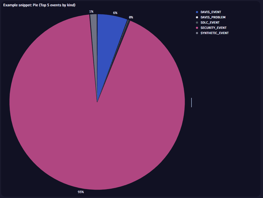
Pie (Top 5 events by kind)
-
In
Dashboards, select Dashboard to create a new dashboard. -
In the upper-right of the dashboard, select Add to open the add menu.
-
In the menu, scroll down to the Start with a snippet section of the menu and select Pie (Top 5 events by kind).
This one creates a tile based on the following DQL:
fetch events| summarize `event count`=count(), by:{event.kind}| limit 5
The results are displayed as a pie chart.
What's next
The list of available snippets is long and growing. Create a new dashboard and try them out.
When you find something interesting:
- Inspect it to see how it works
- See if you can tweak and adapt it to your own purposes